[置顶] React Native未来导航者:react-navigation 使用详解(基础篇)
2017-05-17 11:30
786 查看
刚创建的React Native 微信公众号,欢迎微信扫描关注订阅号,每天定期会分享react native 技术文章,移动技术干货,精彩文章技术推送。同时可以扫描我的微信加入react-native技术交流微信群。欢迎各位大牛,React Native技术爱好者加入交流!


上篇博客和大家分享了关于React Native jsBundle预加载,界面启动优化的内容,详情可点击:
该库包含三类组件:
(1)StackNavigator:用来跳转页面和传递参数
(2)TabNavigator:类似底部导航栏,用来在同一屏幕下切换不同界面
(3)DrawerNavigator:侧滑菜单导航栏,用于轻松设置带抽屉导航的屏幕
(1)react-navigation库属性介绍
(2)StackNavigator、TabNavigator实现界面间跳转,Tab切换
(3)StackNavigator界面间跳转、传值、取值
(4)DrawerNavigator实现抽屉导航菜单
(5)DrawerNavigator扩展功能
1、StackNavigator属性介绍navigationOptions:配置StackNavigator的一些属性。
title:标题,如果设置了这个导航栏和标签栏的title就会变成一样的,不推荐使用
header:可以设置一些导航的属性,如果隐藏顶部导航栏只要将这个属性设置为null
headerTitle:设置导航栏标题,推荐
headerBackTitle:设置跳转页面左侧返回箭头后面的文字,默认是上一个页面的标题。可以自定义,也可以设置为null
headerTruncatedBackTitle:设置当上个页面标题不符合返回箭头后的文字时,默认改成"返回"
headerRight:设置导航条右侧。可以是按钮或者其他视图控件
headerLeft:设置导航条左侧。可以是按钮或者其他视图控件
headerStyle:设置导航条的样式。背景色,宽高等
headerTitleStyle:设置导航栏文字样式
headerBackTitleStyle:设置导航栏‘返回’文字样式
headerTintColor:设置导航栏颜色
headerPressColorAndroid:安卓独有的设置颜色纹理,需要安卓版本大于5.0
gesturesEnabled:是否支持滑动返回手势,iOS默认支持,安卓默认关闭
screen:对应界面名称,需要填入import之后的页面
mode:定义跳转风格
card:使用iOS和安卓默认的风格
modal:iOS独有的使屏幕从底部画出。类似iOS的present效果
headerMode:返回上级页面时动画效果
float:iOS默认的效果
screen:滑动过程中,整个页面都会返回
none:无动画
cardStyle:自定义设置跳转效果
transitionConfig: 自定义设置滑动返回的配置
onTransitionStart:当转换动画即将开始时被调用的功能
onTransitionEnd:当转换动画完成,将被调用的功能
path:路由中设置的路径的覆盖映射配置
initialRouteName:设置默认的页面组件,必须是上面已注册的页面组件
initialRouteParams:初始路由参数
注:大家可能对于path不太理解。path属性适用于其他app或浏览器使用url打开本app并进入指定页面。path属性用于声明一个界面路径,例如:【/pages/Home】。此时我们可以在手机浏览器中输入:app名称://pages/Home来启动该App,并进入Home界面。
2、TabNavigator属性介绍
screen:和导航的功能是一样的,对应界面名称,可以在其他页面通过这个screen传值和跳转。
navigationOptions:配置TabNavigator的一些属性
title:标题,会同时设置导航条和标签栏的title
tabBarVisible:是否隐藏标签栏。默认不隐藏(true)
tabBarIcon:设置标签栏的图标。需要给每个都设置
tabBarLabel:设置标签栏的title。推荐
导航栏配置
tabBarPosition:设置tabbar的位置,iOS默认在底部,安卓默认在顶部。(属性值:'top','bottom')
swipeEnabled:是否允许在标签之间进行滑动
animationEnabled:是否在更改标签时显示动画
lazy:是否根据需要懒惰呈现标签,而不是提前,意思是在app打开的时候将底部标签栏全部加载,默认false,推荐为true
trueinitialRouteName: 设置默认的页面组件
backBehavior:按 back 键是否跳转到第一个Tab(首页), none 为不跳转
tabBarOptions:配置标签栏的一些属性iOS属性
activeTintColor:label和icon的前景色 活跃状态下
activeBackgroundColor:label和icon的背景色 活跃状态下
inactiveTintColor:label和icon的前景色 不活跃状态下
inactiveBackgroundColor:label和icon的背景色 不活跃状态下
showLabel:是否显示label,默认开启 style:tabbar的样式
labelStyle:label的样式安卓属性
activeTintColor:label和icon的前景色 活跃状态下
inactiveTintColor:label和icon的前景色 不活跃状态下
showIcon:是否显示图标,默认关闭
showLabel:是否显示label,默认开启 style:tabbar的样式
labelStyle:label的样式 upperCaseLabel:是否使标签大写,默认为true
pressColor:material涟漪效果的颜色(安卓版本需要大于5.0)
pressOpacity:按压标签的透明度变化(安卓版本需要小于5.0)
scrollEnabled:是否启用可滚动选项卡 tabStyle:tab的样式
indicatorStyle:标签指示器的样式对象(选项卡底部的行)。安卓底部会多出一条线,可以将height设置为0来暂时解决这个问题
labelStyle:label的样式
iconStyle:图标样式
3、DrawerNavigator属性介绍
DrawerNavigatorConfig
drawerWidth - 抽屉的宽度
drawerPosition - 选项是左或右。 默认为左侧位置
contentComponent - 用于呈现抽屉内容的组件,例如导航项。 接收抽屉的导航。 默认为DrawerItems
contentOptions - 配置抽屉内容
initialRouteName - 初始路由的routeName
order - 定义抽屉项目顺序的routeNames数组。
路径 - 提供routeName到路径配置的映射,它覆盖routeConfigs中设置的路径。
backBehavior - 后退按钮是否会切换到初始路由? 如果是,设置为initialRoute,否则为none。 默认为initialRoute行为
DrawerItems的contentOptions属性
activeTintColor - 活动标签的标签和图标颜色
activeBackgroundColor - 活动标签的背景颜色
inactiveTintColor - 非活动标签的标签和图标颜色
inactiveBackgroundColor - 非活动标签的背景颜色
内容部分的样式样式对象
labelStyle - 当您的标签是字符串时,要覆盖内容部分中的文本样式的样式对象从上述中大致了解了react-navigation三种组件的一些基本属性,所以到我们甩起袖子撸代码见证下奇迹了。
4、使用StackNavigator + TabNavigator实现Tab界面切换、界面间导航
API定义:StackNavigator(RouteConfigs, StackNavigatorConfig)、TabNavigator(RouteConfigs, TabNavigatorConfig)
(1)集成 react-navigation:在终端执行 【 npm install react-navigation --save 】
(2)界面中导入必要组件:
import {StackNavigator,TabNavigator,TabBarBottom} from 'react-navigation';
import HomeScreen from './pages/HomePage';
import MineScreen from './pages/MinePage';(3)定义TabNavigator:
(1)第一层参数定义了要切换的界面,即【首页】、【我】两个界面组件,通过screen属性指定。并且通过navigationOptions属性设置相关属性参数。
(2)设置导航栏的属性参数。
TabNavigator定义好之后,需要用StackNavigator,顾名思义,StackNavigator就是以栈的方式来存放整个界面的,而TabNavigator是作为一个界面内不同子界面之间切换。所以还需要我们定义StackNavigator:
(1)指定要跳转的界面组件。同样是screen属性标识界面组件,不多赘述。
(2)定义跳转属性参数,即顶部导航栏的一些参数设置和跳转方式。
可以看到,我们将Tab作为一个界面设置到了StackNavigator。这样就可以实现Tab导航和界面间跳转的效果了。
最后就是在render中引用StackNavigator:
5、界面间跳转、传值、取值
在界面组件注入到StackNavigator中时,界面组件就被赋予了navigation属性,即在界面组件中可以通过【this.props.navigation】获取并进行一些操作。
navigation属性中提供了很多的函数简化界面间操作,简单列举几点:
(1)通过navigate函数实现界面之间跳转:
this.props.navigation.navigate('Mine');参数为我们在StackNavigator注册界面组件时的名称。同样也可以从当前页面返回到上一页:
(3)获取值:
{this.props.navigation.state.params.info}通过state.params来获取传来的参数,后面为key值。此处为info。
以上实现完成,我们就可以愉快的玩耍啦~~ 什么?忽然发现在Android上的效果和IOS效果不一样。老板要界面一致哇~ 怎么办?那就需要我们进行简单的适配了。
API定义:DrawerNavigator(RouteConfigs,DrawerNavigatorConfig)
(1)界面中定义DrawerNavigator:
(2)HomeScreen界面和MineScreen界面:
2、扩展功能
(1)默认DrawerView不可滚动。要实现可滚动视图,必须使用contentComponent自定义容器,如下所示:
如果您嵌套DrawerNavigation,抽屉将显示在父导航下方。
以上就是我们实战中常用的属性和技巧。具体的操作还需要大家在实践过程中测试体会。
源码参考
上篇博客和大家分享了关于React Native jsBundle预加载,界面启动优化的内容,详情可点击:
基于最新版本React Native实现JsBundle预加载,界面秒开优化
一、开源库介绍
今年1月份,新开源的react-natvigation库备受瞩目。在短短不到3个月的时间,github上星数已达4000+。Fb推荐使用库,并且在React Native当前最新版本0.44中将Navigator删除。react-navigation据称有原生般的性能体验效果。可能会成为未来React Native导航组件的主流军。本篇内容基于【 ^1.0.0-beta.9 】版本来介绍关于该库的使用和实战技巧。可以看到,虽然是beta版本,不过基本稳定,大家可放心在项目中使用。奉上 react-navigation 官方文档该库包含三类组件:
(1)StackNavigator:用来跳转页面和传递参数
(2)TabNavigator:类似底部导航栏,用来在同一屏幕下切换不同界面
(3)DrawerNavigator:侧滑菜单导航栏,用于轻松设置带抽屉导航的屏幕
二、react-navigation使用
具体内容大致分为如下:(1)react-navigation库属性介绍
(2)StackNavigator、TabNavigator实现界面间跳转,Tab切换
(3)StackNavigator界面间跳转、传值、取值
(4)DrawerNavigator实现抽屉导航菜单
(5)DrawerNavigator扩展功能
1、StackNavigator属性介绍navigationOptions:配置StackNavigator的一些属性。
title:标题,如果设置了这个导航栏和标签栏的title就会变成一样的,不推荐使用
header:可以设置一些导航的属性,如果隐藏顶部导航栏只要将这个属性设置为null
headerTitle:设置导航栏标题,推荐
headerBackTitle:设置跳转页面左侧返回箭头后面的文字,默认是上一个页面的标题。可以自定义,也可以设置为null
headerTruncatedBackTitle:设置当上个页面标题不符合返回箭头后的文字时,默认改成"返回"
headerRight:设置导航条右侧。可以是按钮或者其他视图控件
headerLeft:设置导航条左侧。可以是按钮或者其他视图控件
headerStyle:设置导航条的样式。背景色,宽高等
headerTitleStyle:设置导航栏文字样式
headerBackTitleStyle:设置导航栏‘返回’文字样式
headerTintColor:设置导航栏颜色
headerPressColorAndroid:安卓独有的设置颜色纹理,需要安卓版本大于5.0
gesturesEnabled:是否支持滑动返回手势,iOS默认支持,安卓默认关闭
screen:对应界面名称,需要填入import之后的页面
mode:定义跳转风格
card:使用iOS和安卓默认的风格
modal:iOS独有的使屏幕从底部画出。类似iOS的present效果
headerMode:返回上级页面时动画效果
float:iOS默认的效果
screen:滑动过程中,整个页面都会返回
none:无动画
cardStyle:自定义设置跳转效果
transitionConfig: 自定义设置滑动返回的配置
onTransitionStart:当转换动画即将开始时被调用的功能
onTransitionEnd:当转换动画完成,将被调用的功能
path:路由中设置的路径的覆盖映射配置
initialRouteName:设置默认的页面组件,必须是上面已注册的页面组件
initialRouteParams:初始路由参数
注:大家可能对于path不太理解。path属性适用于其他app或浏览器使用url打开本app并进入指定页面。path属性用于声明一个界面路径,例如:【/pages/Home】。此时我们可以在手机浏览器中输入:app名称://pages/Home来启动该App,并进入Home界面。
2、TabNavigator属性介绍
screen:和导航的功能是一样的,对应界面名称,可以在其他页面通过这个screen传值和跳转。
navigationOptions:配置TabNavigator的一些属性
title:标题,会同时设置导航条和标签栏的title
tabBarVisible:是否隐藏标签栏。默认不隐藏(true)
tabBarIcon:设置标签栏的图标。需要给每个都设置
tabBarLabel:设置标签栏的title。推荐
导航栏配置
tabBarPosition:设置tabbar的位置,iOS默认在底部,安卓默认在顶部。(属性值:'top','bottom')
swipeEnabled:是否允许在标签之间进行滑动
animationEnabled:是否在更改标签时显示动画
lazy:是否根据需要懒惰呈现标签,而不是提前,意思是在app打开的时候将底部标签栏全部加载,默认false,推荐为true
trueinitialRouteName: 设置默认的页面组件
backBehavior:按 back 键是否跳转到第一个Tab(首页), none 为不跳转
tabBarOptions:配置标签栏的一些属性iOS属性
activeTintColor:label和icon的前景色 活跃状态下
activeBackgroundColor:label和icon的背景色 活跃状态下
inactiveTintColor:label和icon的前景色 不活跃状态下
inactiveBackgroundColor:label和icon的背景色 不活跃状态下
showLabel:是否显示label,默认开启 style:tabbar的样式
labelStyle:label的样式安卓属性
activeTintColor:label和icon的前景色 活跃状态下
inactiveTintColor:label和icon的前景色 不活跃状态下
showIcon:是否显示图标,默认关闭
showLabel:是否显示label,默认开启 style:tabbar的样式
labelStyle:label的样式 upperCaseLabel:是否使标签大写,默认为true
pressColor:material涟漪效果的颜色(安卓版本需要大于5.0)
pressOpacity:按压标签的透明度变化(安卓版本需要小于5.0)
scrollEnabled:是否启用可滚动选项卡 tabStyle:tab的样式
indicatorStyle:标签指示器的样式对象(选项卡底部的行)。安卓底部会多出一条线,可以将height设置为0来暂时解决这个问题
labelStyle:label的样式
iconStyle:图标样式
3、DrawerNavigator属性介绍
DrawerNavigatorConfig
drawerWidth - 抽屉的宽度
drawerPosition - 选项是左或右。 默认为左侧位置
contentComponent - 用于呈现抽屉内容的组件,例如导航项。 接收抽屉的导航。 默认为DrawerItems
contentOptions - 配置抽屉内容
initialRouteName - 初始路由的routeName
order - 定义抽屉项目顺序的routeNames数组。
路径 - 提供routeName到路径配置的映射,它覆盖routeConfigs中设置的路径。
backBehavior - 后退按钮是否会切换到初始路由? 如果是,设置为initialRoute,否则为none。 默认为initialRoute行为
DrawerItems的contentOptions属性
activeTintColor - 活动标签的标签和图标颜色
activeBackgroundColor - 活动标签的背景颜色
inactiveTintColor - 非活动标签的标签和图标颜色
inactiveBackgroundColor - 非活动标签的背景颜色
内容部分的样式样式对象
labelStyle - 当您的标签是字符串时,要覆盖内容部分中的文本样式的样式对象从上述中大致了解了react-navigation三种组件的一些基本属性,所以到我们甩起袖子撸代码见证下奇迹了。
4、使用StackNavigator + TabNavigator实现Tab界面切换、界面间导航
API定义:StackNavigator(RouteConfigs, StackNavigatorConfig)、TabNavigator(RouteConfigs, TabNavigatorConfig)
(1)集成 react-navigation:在终端执行 【 npm install react-navigation --save 】
(2)界面中导入必要组件:
import {StackNavigator,TabNavigator,TabBarBottom} from 'react-navigation';
import HomeScreen from './pages/HomePage';
import MineScreen from './pages/MinePage';(3)定义TabNavigator:
const Tab = TabNavigator(
{
Home:{
screen:HomeScreen,
navigationOptions:({navigation}) => ({
tabBarLabel:'首页',
tabBarIcon:({focused,tintColor}) => (
<TabBarItem
tintColor={tintColor}
focused={focused}
normalImage={require('./imgs/nav_fav@2x.png')}
selectedImage={require('./imgs/nav_fav_actived@3x.png')}
/>
)
}),
},

Mine:{
screen:MineScreen,
navigationOptions:({navigation}) => ({
tabBarLabel:'我',
tabBarIcon:({focused,tintColor}) => (
<TabBarItem
tintColor={tintColor}
focused={focused}
normalImage={require('./imgs/tab_me_nor@3x.png')}
selectedImage={require('./imgs/tab_me_selected@2x.png')}
/>
)
}),
},
},

{
tabBarComponent:TabBarBottom,
tabBarPosition:'bottom',
swipeEnabled:false,
animationEnabled:false,
lazy:true,
tabBarOptions:{
activeTintColor:'#06c1ae',
inactiveTintColor:'#979797',
style:{backgroundColor:'#ffffff',},
labelStyle: {
fontSize: 20, // 文字大小
},
}

}

);TabBarItem为封装的组件:import React,{Component} from 'react';
import {Image} from 'react-native';
export default class TabBarItem extends Component {
render() {
return(
<Image source={ this.props.focused ? this.props.selectedImage : this.props.normalImage }
style={ { tintColor:this.props.tintColor,width:25,height:25 } }
/>
)
}
}可以看到,我们定义了一个名称为【Tab】的TabNavigator的导航组件。在组件中,分为两层参数:(1)第一层参数定义了要切换的界面,即【首页】、【我】两个界面组件,通过screen属性指定。并且通过navigationOptions属性设置相关属性参数。
(2)设置导航栏的属性参数。
TabNavigator定义好之后,需要用StackNavigator,顾名思义,StackNavigator就是以栈的方式来存放整个界面的,而TabNavigator是作为一个界面内不同子界面之间切换。所以还需要我们定义StackNavigator:
const Navigator = StackNavigator(

{
Tab:{screen:Tab},
Product:{screen:ProductScreen}
},

{
navigationOptions:{
headerBackTitle:null,
headerTintColor:'#333333',
showIcon:true,
swipeEnabled:false,
animationEnabled:false,
},

mode:'card',
});看起来和TabNavigator很相似,同样是指定了两个参数:(1)指定要跳转的界面组件。同样是screen属性标识界面组件,不多赘述。
(2)定义跳转属性参数,即顶部导航栏的一些参数设置和跳转方式。
可以看到,我们将Tab作为一个界面设置到了StackNavigator。这样就可以实现Tab导航和界面间跳转的效果了。
最后就是在render中引用StackNavigator:
export default class Demo extends Component {

render() {
return (
<Navigator />
);
}
}StackNavigator还提供了onNavigationStateChange回调方法,用来监听导航状态的改变。具体不再赘述。实现了界面跳转和切换,那么就该来增加下界面之间的感情了,来看看如何实现界面之间的传值和取值。5、界面间跳转、传值、取值
在界面组件注入到StackNavigator中时,界面组件就被赋予了navigation属性,即在界面组件中可以通过【this.props.navigation】获取并进行一些操作。
navigation属性中提供了很多的函数简化界面间操作,简单列举几点:
(1)通过navigate函数实现界面之间跳转:
this.props.navigation.navigate('Mine');参数为我们在StackNavigator注册界面组件时的名称。同样也可以从当前页面返回到上一页:
// 返回上一页
this.props.navigation.goBack();
(2)跳转时传值:
this.props.navigation.navigate('Mine',{info:'传值过去'});第一个参数同样为要跳转的界面组件名称,第二个参数为要传递的参数,info可以理解为key,后面即传递的参数。(3)获取值:
{this.props.navigation.state.params.info}通过state.params来获取传来的参数,后面为key值。此处为info。
以上实现完成,我们就可以愉快的玩耍啦~~ 什么?忽然发现在Android上的效果和IOS效果不一样。老板要界面一致哇~ 怎么办?那就需要我们进行简单的适配了。
三、DrawerNavigator实现抽屉导航
1、导航实现API定义:DrawerNavigator(RouteConfigs,DrawerNavigatorConfig)
(1)界面中定义DrawerNavigator:
import {StackNavigator,TabNavigator,DrawerNavigator} from 'react-navigation';
import HomeScreen from './pages/HomePage';
import MineScreen from './pages/MinePage';

export default class Demo extends Component {

render() {
return (
<Navigator />
);
}
}
const Navigator = DrawerNavigator({

Home:{screen:HomeScreen},
Mine:{screen:MineScreen},
});

const styles = StyleSheet.create({

container: {
flex: 1,
},
});

AppRegistry.registerComponent('Demo', () => Demo);定义方式和StackNavigator基本类似,不再赘述。(2)HomeScreen界面和MineScreen界面:
export default class HomePage extends Component {

static navigationOptions = {
drawerLabel: '首页',
drawerIcon:({tintColor}) => (
<Image
source={require('./../imgs/ic_happy.png')}
style={[styles.icon, {tintColor: tintColor}]}/>
),
};

render() {
return(
<View style={{flex:1}}>
<Text onPress={this._skip.bind(this)}>点击跳转</Text>
</View>
);
}

_skip() {
this.props.navigation.navigate("Mine");
}
}

export default class MinePage extends Component {

static navigationOptions = {
drawerLabel:'我',
drawerIcon: ({ tintColor }) => (
<Image
source={require('./../imgs/ic_h.png')}
style={[styles.icon, {tintColor: tintColor}]}
/>
),
};

render() {
return(
<View style={{flex:1}}>
<Text onPress={this._skip.bind(this)}>返回上一界面</Text>
</View>
);
}

/**
* 跳转
*/
_skip() {
this.props.navigation.goBack();
}
}代码很简单,实现了界面之间的跳转。2、扩展功能
(1)默认DrawerView不可滚动。要实现可滚动视图,必须使用contentComponent自定义容器,如下所示:
{
drawerWidth:200,
抽屉位置:“对”
contentComponent:props => <ScrollView> <DrawerItems {... props} /> </ ScrollView>
}(2)可以覆盖导航使用的默认组件,使用DrawerItems自定义导航组件:import {DrawerItems} from 'react-navigation';
const CustomDrawerContentComponent = (props) => (
<View style = {style.container}>
<DrawerItems {... props} />
</View>
);(3)嵌套抽屉导航如果您嵌套DrawerNavigation,抽屉将显示在父导航下方。
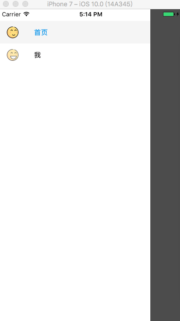
五、效果图
抽屉导航:以上就是我们实战中常用的属性和技巧。具体的操作还需要大家在实践过程中测试体会。
源码参考

相关文章推荐
- [置顶] React Native未来导航者:react-navigation 使用详解(进阶篇)
- React Native未来导航者:react-navigation 使用详解
- React Native未来导航者:react-navigation 使用详解
- React Native未来导航者:react-navigation 使用详解
- React Native未来导航者:react-navigation 使用详解
- 【转载】React Native未来导航者:react-navigation 使用详解
- React Native未来导航者:react-navigation 使用详解
- [置顶] React-Navigation与Redux整合详解
- 官方推荐react-navigation的具体使用详解
- react native使用react-navigation跳转后多页面数据传递总结
- React Native导航器之react-navigation使用
- react-navigation 使用详解
- react-navigation 使用详解
- React Native react-navigation 导航使用详解
- React Native导航器之react-navigation使用
- React Native填坑之旅 -- 使用react-navigation代替Navigator
- React Native之Redux使用详解之Actions(29)
- [置顶] Android 底部导航栏 BottomNavigationBar的简单使用
- [深入剖析React Native]热更新之react-native-pushy使用指南(IOS)