使用CoordinatorLayout
2016-12-08 19:55
399 查看
CoordinatorLayout是Android.support.design.widget包中定义的用于实现滚动屏幕时,自动伸缩顶部ToolBar的控件,该控件继承于ViewGroup,故可以作为容器控件存放若干子控件,很多商业应用使用了CoordinatorLayout:
下面是豌豆荚APP滑动前、滑动中和滑动后的效果,可见当滑动过程中,搜索框随着下面的可滚动控件一起向上滑动,最终隐藏。

滑动前

正在滑动

滑动完毕
下面是chrome浏览器滑动前、滑动中和滑动后的效果,可见当滑动过程中,地址栏随着下面的页面一起向上滑动,最终隐藏。

滑动前

正在滑动

滑动完毕
下面是本文将要介绍的demo的实现效果,CoordinatorLayout是其中的重点。
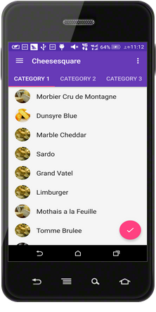
滑动前
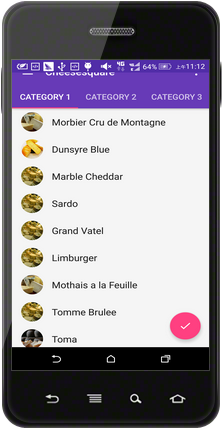
正在滑动
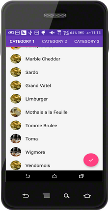
滑动完毕
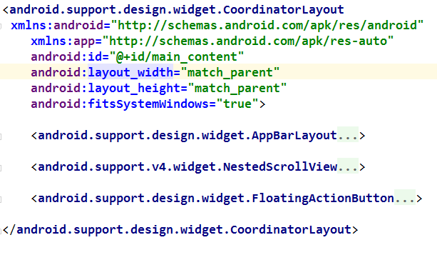
界面布局如下
2
3
4
5
6
7
8
9
10
11
12
13
14
15
16
17
18
19
20
21
22
23
24
25
26
27
28
29
30
31
32
33
34
35
36
37
38
39
40
41
42
1
2
3
4
5
6
7
8
9
10
11
12
13
14
15
16
17
18
19
20
21
22
23
24
25
26
27
28
29
30
31
32
33
34
35
36
37
38
39
40
41
42
CoordinatorLayout使用要点:
使用CoordinatorLayout前,需在build.gradle的dependencies中加入依赖
AppBarLayout是也是在

需要在CoordinatorLayout中定义一个可以滚动的控件,本demo用的是ViewPager,而且需要“告诉”CoordinatorLayout,ViewPager是可以滚动的,即需要在ViewPager中添加入如下属性
要使CoordinatorLayout响应滚动事件,重点是需要CoordinatorLayout的属性
代码如下:
2
3
4
5
6
7
8
9
10
11
12
13
14
15
16
17
18
19
20
21
22
23
24
25
26
27
28
29
30
31
32
33
34
35
36
37
38
39
40
41
42
43
44
45
46
47
48
49
50
51
52
53
54
55
56
57
58
59
60
61
62
63
64
65
66
67
68
69
70
71
72
73
74
75
76
77
78
79
80
81
82
83
84
85
86
87
88
89
90
91
92
93
94
95
96
97
98
99
100
101
102
103
104
105
106
107
108
109
110
111
112
113
114
115
116
117
118
119
120
121
122
123
124
125
126
127
128
129
130
131
132
133
134
135
136
137
138
139
140
141
142
143
144
145
146
147
148
149
150
151
152
153
154
155
156
157
158
159
160
161
162
163
164
165
166
167
168
169
170
171
172
173
174
175
176
177
178
179
180
181
182
183
184
185
186
187
188
189
190
191
192
193
194
195
196
197
198
199
200
201
202
203
204
205
206
207
208
209
210
211
212
213
214
215
216
217
218
219
220
221
222
223
224
225
226
227
228
1
2
3
4
5
6
7
8
9
10
11
12
13
14
15
16
17
18
19
20
21
22
23
24
25
26
27
28
29
30
31
32
33
34
35
36
37
38
39
40
41
42
43
44
45
46
47
48
49
50
51
52
53
54
55
56
57
58
59
60
61
62
63
64
65
66
67
68
69
70
71
72
73
74
75
76
77
78
79
80
81
82
83
84
85
86
87
88
89
90
91
92
93
94
95
96
97
98
99
100
101
102
103
104
105
106
107
108
109
110
111
112
113
114
115
116
117
118
119
120
121
122
123
124
125
126
127
128
129
130
131
132
133
134
135
136
137
138
139
140
141
142
143
144
145
146
147
148
149
150
151
152
153
154
155
156
157
158
159
160
161
162
163
164
165
166
167
168
169
170
171
172
173
174
175
176
177
178
179
180
181
182
183
184
185
186
187
188
189
190
191
192
193
194
195
196
197
198
199
200
201
202
203
204
205
206
207
208
209
210
211
212
213
214
215
216
217
218
219
220
221
222
223
224
225
226
227
228
同理,根节点依然是CoordinatorLayout,它包含3个子控件,如下所示:
AppBarLayout,NestedScrollView,FloatingActionBar
要点:
同样地,NestedScrollView是可以滚动的控件,需要用CoordinatorLayout的属性
重点是控件CollapsingToolbarLayout,该控件对ToolBarLayout进行扩展,使其可以滚动,其中属性
与app:layout_collapseParallaxMultiplier=”1”配合使用,表示ToolBar随滚动内容伸展和收缩时的位移差,当属性app:layout _collapseParallaxMultiplier的值为0时,表示ToolBar中的图片与滚动的内容没有位移差,它们是一起滚动的,当值为1时,ToolBar中的图片不滚动,就定格在屏幕上;
未滚动时
正在滚动
滚动完毕
下面是豌豆荚APP滑动前、滑动中和滑动后的效果,可见当滑动过程中,搜索框随着下面的可滚动控件一起向上滑动,最终隐藏。
滑动前
正在滑动
滑动完毕
下面是chrome浏览器滑动前、滑动中和滑动后的效果,可见当滑动过程中,地址栏随着下面的页面一起向上滑动,最终隐藏。
滑动前
正在滑动
滑动完毕
下面是本文将要介绍的demo的实现效果,CoordinatorLayout是其中的重点。
滑动前
正在滑动
滑动完毕
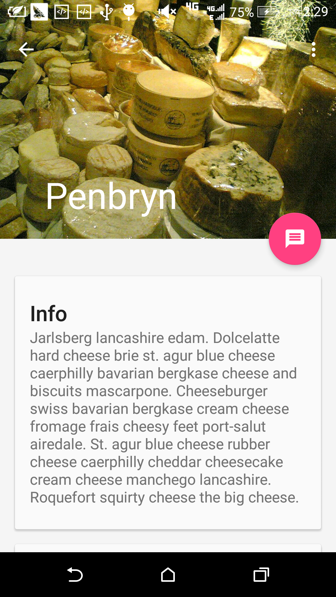
主界面的XML布局要点
界面布局如下<android.support.design.widget.CoordinatorLayout xmlns:android="http://schemas.android.com/apk/res/android" xmlns:app="http://schemas.android.com/apk/res-auto" android:id="@+id/main_content" android:layout_width="match_parent" android:layout_height="match_parent"> <android.support.design.widget.AppBarLayout android:id="@+id/appbar" android:layout_width="match_parent" android:layout_height="wrap_content" android:theme="@style/ThemeOverlay.AppCompat.Dark.ActionBar"> <android.support.v7.widget.Toolbar android:id="@+id/toolbar" android:layout_width="match_parent" android:layout_height="?attr/actionBarSize" android:background="?attr/colorPrimary" app:layout_scrollFlags="scroll|enterAlways|snap" app:popupTheme="@style/ThemeOverlay.AppCompat.Light" /> <android.support.design.widget.TabLayout android:id="@+id/tabs" android:layout_width="match_parent" android:layout_height="wrap_content" /> </android.support.design.widget.AppBarLayout> <android.support.v4.view.ViewPager android:id="@+id/viewpager" android:layout_width="match_parent" android:layout_height="match_parent" app:layout_behavior="@string/appbar_scrolling_view_behavior" /> <android.support.design.widget.FloatingActionButton android:id="@+id/fab" android:layout_width="wrap_content" android:layout_height="wrap_content" android:layout_gravity="end|bottom" android:layout_margin="@dimen/fab_margin" android:src="@drawable/ic_done" /> </android.support.design.widget.CoordinatorLayout>1
2
3
4
5
6
7
8
9
10
11
12
13
14
15
16
17
18
19
20
21
22
23
24
25
26
27
28
29
30
31
32
33
34
35
36
37
38
39
40
41
42
1
2
3
4
5
6
7
8
9
10
11
12
13
14
15
16
17
18
19
20
21
22
23
24
25
26
27
28
29
30
31
32
33
34
35
36
37
38
39
40
41
42
CoordinatorLayout使用要点:
使用CoordinatorLayout前,需在build.gradle的dependencies中加入依赖
compile 'com.android.support:design:23.+';
AppBarLayout是也是在
android.support.design.widget中定义的控件,该该控件继承于LinearLayout,需要和CoordinatorLayout配合使用,它是整个界面顶部的部分,如下所示:
需要在CoordinatorLayout中定义一个可以滚动的控件,本demo用的是ViewPager,而且需要“告诉”CoordinatorLayout,ViewPager是可以滚动的,即需要在ViewPager中添加入如下属性
app:layout_behavior="@string/appbar_scrolling_view_behavior";
要使CoordinatorLayout响应滚动事件,重点是需要CoordinatorLayout的属性
app:layout_scrollFlags="scroll|enterAlways|snap"写在滚动时隐藏的控件Toolbar中,用值”scoll”声明,若不加该值就会ToolBar就会像TabLayout一样固定在顶端;属性”enterAlways”表示无论滑到什么地方只要向上滚动,ToolBar就会显示出来,而不是滚动到顶部才显示出来;属性”snap”起到依附作用,当ToolBar有一般在屏幕外时,ToolBar会整个移出或移入屏幕。
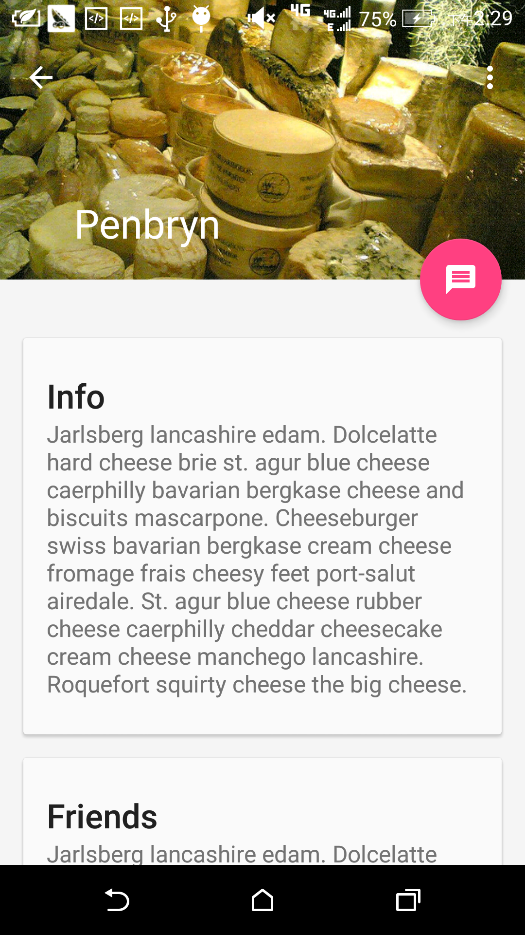
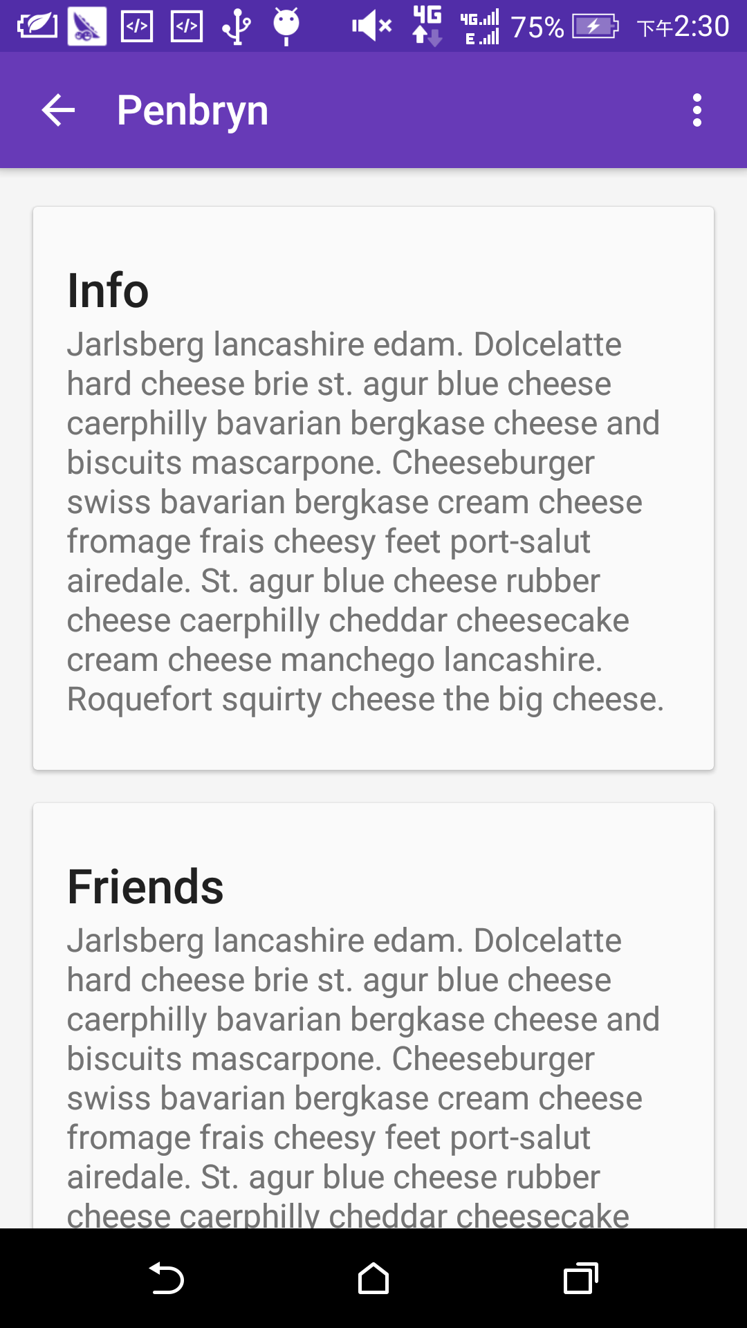
每个item的XML布局要点
代码如下:<?xml version="1.0" encoding="utf-8"?> <android.support.design.widget.CoordinatorLayout xmlns:android="http://schemas.android.com/apk/res/android" xmlns:app="http://schemas.android.com/apk/res-auto" android:id="@+id/main_content" android:layout_width="match_parent" android:layout_height="match_parent" android:fitsSystemWindows="true"> <android.support.design.widget.AppBarLayout android:id="@+id/appbar" android:layout_width="match_parent" android:layout_height="@dimen/detail_backdrop_height" android:fitsSystemWindows="true" android:theme="@style/ThemeOverlay.AppCompat.Dark.ActionBar"> <android.support.design.widget.CollapsingToolbarLayout android:id="@+id/collapsing_toolbar" android:layout_width="match_parent" android:layout_height="@dimen/detail_backdrop_height" android:fitsSystemWindows="true" app:contentScrim="?attr/colorPrimary" app:expandedTitleMarginEnd="64dp" app:expandedTitleMarginStart="48dp" app:layout_scrollFlags="scroll|exitUntilCollapsed"> <ImageView android:id="@+id/backdrop" android:layout_width="match_parent" android:layout_height="match_parent" android:fitsSystemWindows="true" android:scaleType="centerCrop" app:layout_collapseMode="parallax" app:layout_collapseParallaxMultiplier="1" /> <android.support.v7.widget.Toolbar android:id="@+id/toolbar" android:layout_width="match_parent" android:layout_height="?attr/actionBarSize" app:layout_collapseMode="pin" app:popupTheme="@style/ThemeOverlay.AppCompat.Light" /> </android.support.design.widget.CollapsingToolbarLayout> </android.support.design.widget.AppBarLayout> <android.support.v4.widget.NestedScrollView android:layout_width="match_parent" android:layout_height="match_parent" app:layout_behavior="@string/appbar_scrolling_view_behavior"> <LinearLayout android:layout_width="match_parent" android:layout_height="match_parent" android:orientation="vertical" android:paddingTop="24dp"> <android.support.v7.widget.CardView android:layout_width="match_parent" android:layout_height="wrap_content" android:layout_margin="@dimen/card_margin"> <LinearLayout style="@style/Widget.CardContent" android:layout_width="match_parent" android:layout_height="wrap_content"> <TextView android:layout_width="match_parent" android:layout_height="wrap_content" android:text="Info" android:textAppearance="@style/TextAppearance.AppCompat.Title" /> <TextView android:layout_width="match_parent" android:layout_height="wrap_content" android:text="@string/cheese_ipsum" /> </LinearLayout> </android.support.v7.widget.CardView> <android.support.v7.widget.CardView android:layout_width="match_parent" android:layout_height="wrap_content" android:layout_marginBottom="@dimen/card_margin" android:layout_marginLeft="@dimen/card_margin" android:layout_marginRight="@dimen/card_margin"> <LinearLayout style="@style/Widget.CardContent" android:layout_width="match_parent" android:layout_height="wrap_content"> <TextView android:layout_width="match_parent" android:layout_height="wrap_content" android:text="Friends" android:textAppearance="@style/TextAppearance.AppCompat.Title" /> <TextView android:layout_width="match_parent" android:layout_height="wrap_content" android:text="@string/cheese_ipsum" /> </LinearLayout> </android.support.v7.widget.CardView> <android.support.v7.widget.CardView android:layout_width="match_parent" android:layout_height="wrap_content" android:layout_marginBottom="@dimen/card_margin" android:layout_marginLeft="@dimen/card_margin" android:layout_marginRight="@dimen/card_margin"> <LinearLayout style="@style/Widget.CardContent" android:layout_width="match_parent" android:layout_height="wrap_content"> <TextView android:layout_width="match_parent" android:layout_height="wrap_content" android:text="Related" android:textAppearance="@style/TextAppearance.AppCompat.Title" /> <TextView android:layout_width="match_parent" android:layout_height="wrap_content" android:text="@string/cheese_ipsum" /> </LinearLayout> </android.support.v7.widget.CardView> <android.support.v7.widget.CardView android:layout_width="match_parent" android:layout_height="wrap_content" android:layout_margin="@dimen/card_margin"> <LinearLayout style="@style/Widget.CardContent" android:layout_width="match_parent" android:layout_height="wrap_content"> <TextView android:layout_width="match_parent" android:layout_height="wrap_content" android:text="Info" android:textAppearance="@style/TextAppearance.AppCompat.Title" /> <TextView android:layout_width="match_parent" android:layout_height="wrap_content" android:text="@string/cheese_ipsum" /> </LinearLayout> </android.support.v7.widget.CardView> <android.support.v7.widget.CardView android:layout_width="match_parent" android:layout_height="wrap_content" android:layout_marginBottom="@dimen/card_margin" android:layout_marginLeft="@dimen/card_margin" android:layout_marginRight="@dimen/card_margin"> <LinearLayout style="@style/Widget.CardContent" android:layout_width="match_parent" android:layout_height="wrap_content"> <TextView android:layout_width="match_parent" android:layout_height="wrap_content" android:text="Friends" android:textAppearance="@style/TextAppearance.AppCompat.Title" /> <TextView android:layout_width="match_parent" android:layout_height="wrap_content" android:text="@string/cheese_ipsum" /> </LinearLayout> </android.support.v7.widget.CardView> <android.support.v7.widget.CardView android:layout_width="match_parent" android:layout_height="wrap_content" android:layout_marginBottom="@dimen/card_margin" android:layout_marginLeft="@dimen/card_margin" android:layout_marginRight="@dimen/card_margin"> <LinearLayout style="@style/Widget.CardContent" android:layout_width="match_parent" android:layout_height="wrap_content"> <TextView android:layout_width="match_parent" android:layout_height="wrap_content" android:text="Related" android:textAppearance="@style/TextAppearance.AppCompat.Title" /> <TextView android:layout_width="match_parent" android:layout_height="wrap_content" android:text="@string/cheese_ipsum" /> </LinearLayout> </android.support.v7.widget.CardView> </LinearLayout> </android.support.v4.widget.NestedScrollView> <android.support.design.widget.FloatingActionButton android:layout_width="wrap_content" android:layout_height="wrap_content" android:layout_margin="@dimen/fab_margin" android:clickable="true" android:src="@drawable/ic_discuss" app:layout_anchor="@id/appbar" app:layout_anchorGravity="bottom|right|end" /> </android.support.design.widget.CoordinatorLayout>1
2
3
4
5
6
7
8
9
10
11
12
13
14
15
16
17
18
19
20
21
22
23
24
25
26
27
28
29
30
31
32
33
34
35
36
37
38
39
40
41
42
43
44
45
46
47
48
49
50
51
52
53
54
55
56
57
58
59
60
61
62
63
64
65
66
67
68
69
70
71
72
73
74
75
76
77
78
79
80
81
82
83
84
85
86
87
88
89
90
91
92
93
94
95
96
97
98
99
100
101
102
103
104
105
106
107
108
109
110
111
112
113
114
115
116
117
118
119
120
121
122
123
124
125
126
127
128
129
130
131
132
133
134
135
136
137
138
139
140
141
142
143
144
145
146
147
148
149
150
151
152
153
154
155
156
157
158
159
160
161
162
163
164
165
166
167
168
169
170
171
172
173
174
175
176
177
178
179
180
181
182
183
184
185
186
187
188
189
190
191
192
193
194
195
196
197
198
199
200
201
202
203
204
205
206
207
208
209
210
211
212
213
214
215
216
217
218
219
220
221
222
223
224
225
226
227
228
1
2
3
4
5
6
7
8
9
10
11
12
13
14
15
16
17
18
19
20
21
22
23
24
25
26
27
28
29
30
31
32
33
34
35
36
37
38
39
40
41
42
43
44
45
46
47
48
49
50
51
52
53
54
55
56
57
58
59
60
61
62
63
64
65
66
67
68
69
70
71
72
73
74
75
76
77
78
79
80
81
82
83
84
85
86
87
88
89
90
91
92
93
94
95
96
97
98
99
100
101
102
103
104
105
106
107
108
109
110
111
112
113
114
115
116
117
118
119
120
121
122
123
124
125
126
127
128
129
130
131
132
133
134
135
136
137
138
139
140
141
142
143
144
145
146
147
148
149
150
151
152
153
154
155
156
157
158
159
160
161
162
163
164
165
166
167
168
169
170
171
172
173
174
175
176
177
178
179
180
181
182
183
184
185
186
187
188
189
190
191
192
193
194
195
196
197
198
199
200
201
202
203
204
205
206
207
208
209
210
211
212
213
214
215
216
217
218
219
220
221
222
223
224
225
226
227
228
同理,根节点依然是CoordinatorLayout,它包含3个子控件,如下所示:
AppBarLayout,NestedScrollView,FloatingActionBar
要点:
同样地,NestedScrollView是可以滚动的控件,需要用CoordinatorLayout的属性
app:layout_behavior="@string/appbar_scrolling_view_behavior"声明;
重点是控件CollapsingToolbarLayout,该控件对ToolBarLayout进行扩展,使其可以滚动,其中属性
app:layout_scrollFlags="scroll|exitUntilCollapsed"的”scroll”属性表示它可以随NestedScrollView一起滑动,并可以隐藏和出现,属性”exitUntilCollapsed”表示ToolBar收缩到其最小高度为止;属性
app:contentScrim="?attr/colorPrimary"表示ToolBar收缩到最小高度时的颜色,一般可设置为ToolBar的颜色或图片的颜色;属性
app:expandedTitleMarginEnd="64dp"

app:expandedTitleMarginStart="48dp"
表示ToolBar伸展开以后标题与屏幕边缘的距离;属性app:layout_collapseMode=”parallax”
与app:layout_collapseParallaxMultiplier=”1”配合使用,表示ToolBar随滚动内容伸展和收缩时的位移差,当属性app:layout _collapseParallaxMultiplier的值为0时,表示ToolBar中的图片与滚动的内容没有位移差,它们是一起滚动的,当值为1时,ToolBar中的图片不滚动,就定格在屏幕上;
演示效果
未滚动时
正在滚动
滚动完毕

相关文章推荐
- Map-Reduce
- 为github帐号添加SSH keys
- 【Dongle】【Java】从字符串中获得二维数组
- OpenCV学习笔记(五):OpenCV2.4.13+VS2013的配置(非本机使用)
- EventBus粘性事件
- 跳跃表(skiplist)实现及简单分析
- mongodb数组和嵌入文档操作
- iPhone6爆炸真是小概率事件吗?
- 南邮微机实验(基于中断的动态显示)
- Express jade
- 阶乘函数
- LA 3041 Colored Cubes (暴力枚举+贪心)
- 实验11——指针的基础应用
- roundcube
- 【C++学习】【阶段一】数据初始化&运算符优先级&条件循环语句
- VS2013/MFC编程入门之三十七(文档、视图和框架:各对象之间的关系)
- 剑指offer——面试题39:二叉树的深度
- 【Caffe】Ubuntu安装Protobuf2.5
- STM32学习2
- quartz (从原理到应用)详解篇