插图 引用 同一行两个插图_提出食物主题中的插图
插图 引用 同一行两个插图
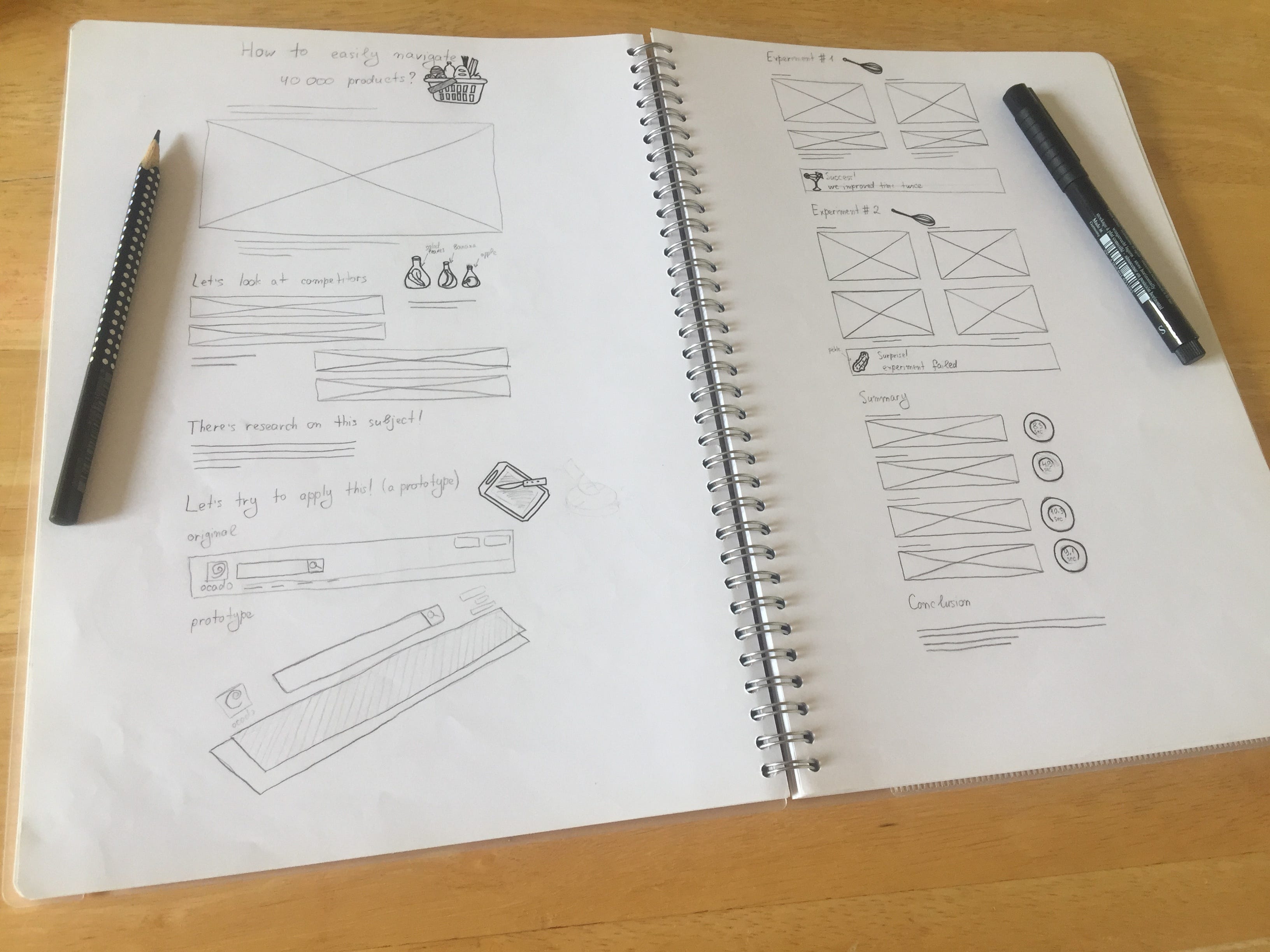
I have a page in my portfolio, which is about search functionality. I wanted that page to feel fun and engaging, to convey a positive vibe, so I decided to add illustrations to it.
我的投资组合中有一个页面与搜索功能有关。 我希望该页面充满乐趣和吸引力,传达积极的氛围,因此我决定在其中添加插图。
确定主题 (Deciding on a theme)
寻找关键字 (Looking for keywords)
插图应该有一个共同的主题 (Illustrations should have a common theme)
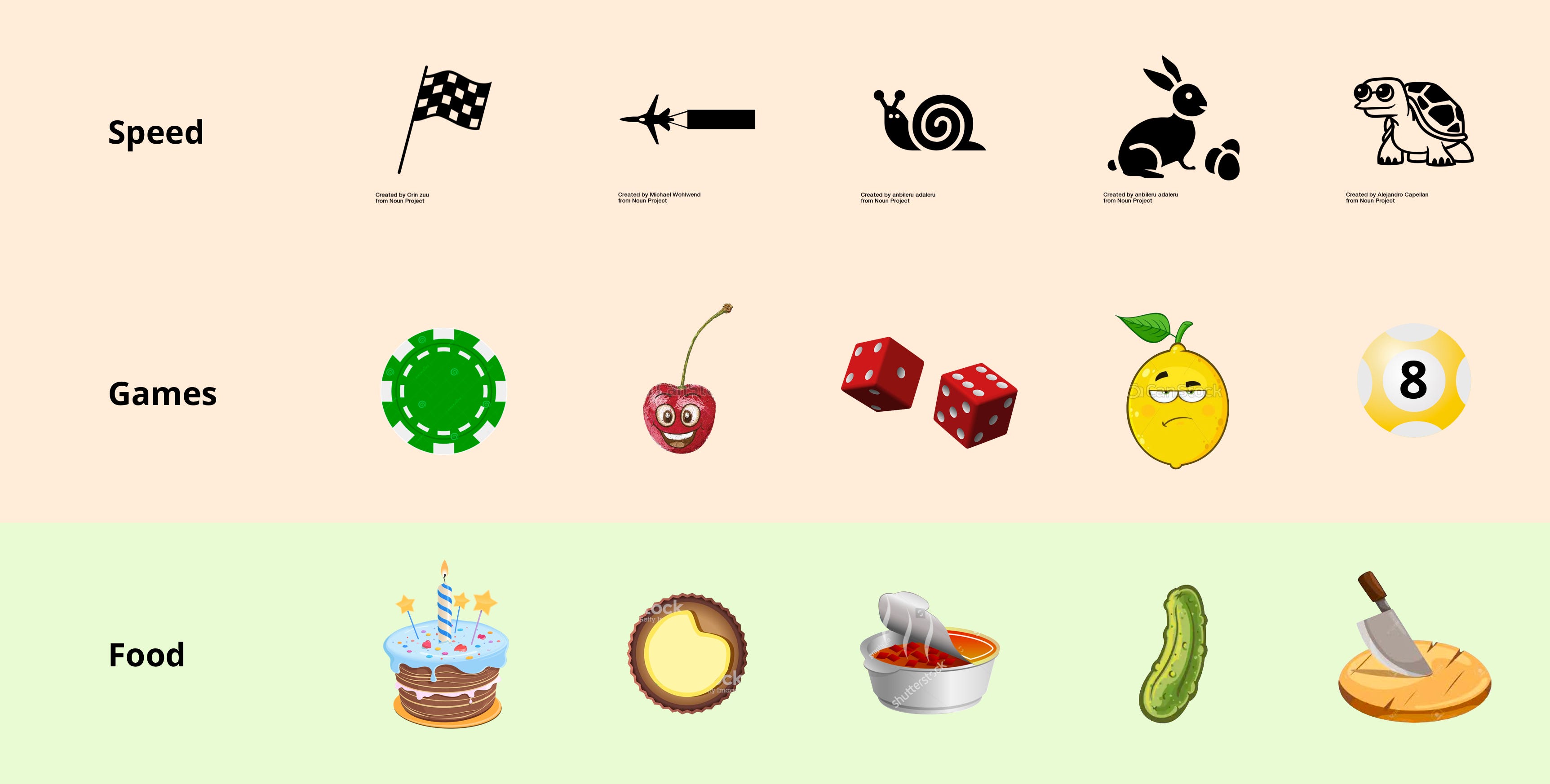
Ultimately, the food theme is the closest one to the supermarket and allows for a great deal of creativity. Also, icons illustrating the process of cooking can be very engaging.
最终,美食主题是距离超市最近的主题,并带来了极大的创造力。 同样,说明烹饪过程的图标也可能非常吸引人。
提出食物主题中的插图 (Coming up with illustrations within a food theme)
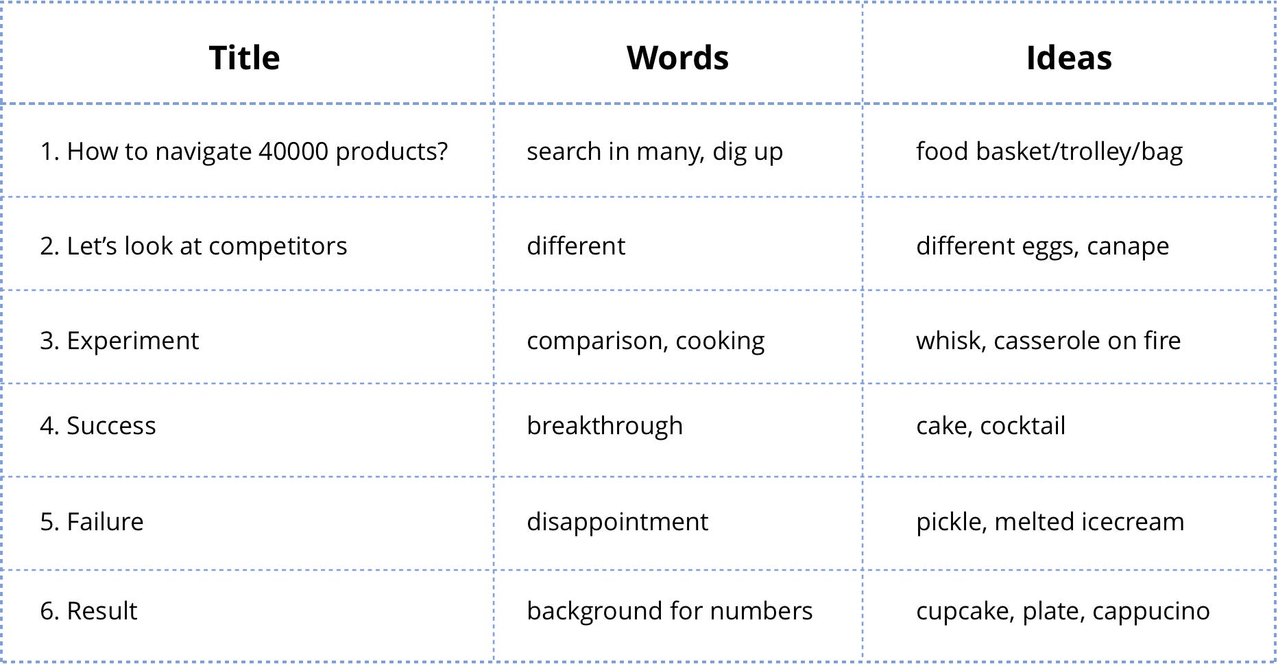
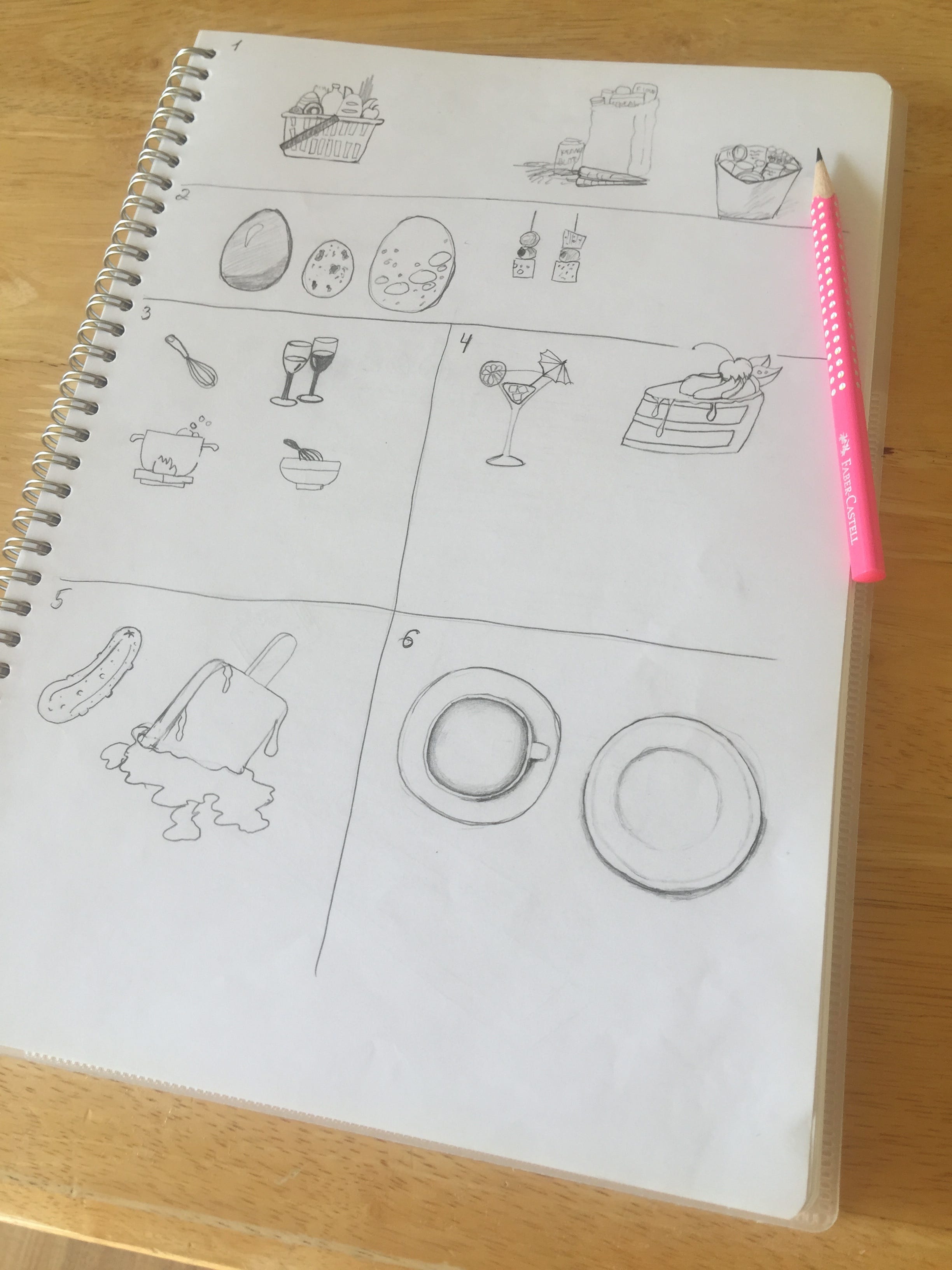
扩大思路 (Expanding ideas)
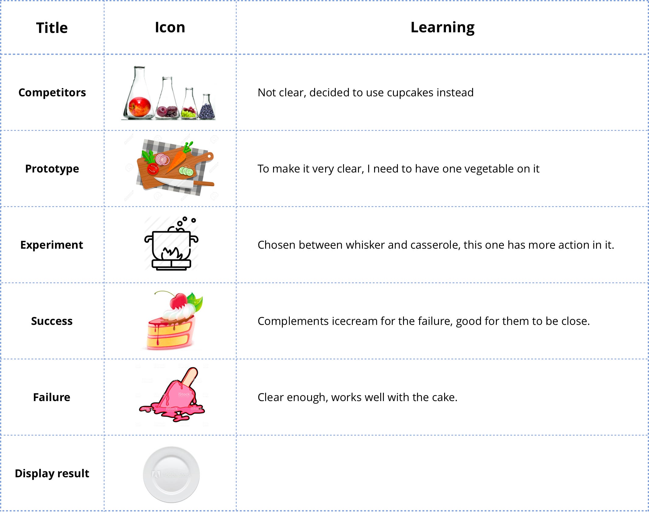
Ideation began with 2 words: success and failure. I then wrote down a list of words I wanted to express and came up with a few ideas for each word.
构想以两个词开始:成功和失败。 然后,我写下了要表达的单词列表,并为每个单词提出了一些想法。

进行面试 (Conducting an interview)
For each “title” I had several candidates. I brought top choice illustrations into a page mock-up and interviewed several people. For each illustration there were alternatives from which I asked people to pick the best and explain their choice.
对于每个“标题”,我都有几个候选人。 我将最佳选择插图放入页面模型中,并采访了几个人。 对于每个插图,我都要求人们从中选择最佳并解释他们的选择。
总结候选人 (Summing up candidates)
开发插图 (Developing illustrations)
制定规则 (Setting the rules)
To ensure illustrations had the same style, I wanted them to have the same:
为了确保插图具有相同的样式,我希望它们具有相同的样式:
- colour scheme; 配色方案;
- perspective; 透视;
- split into colour blocks; 分成色块;
- highlights. 强调。
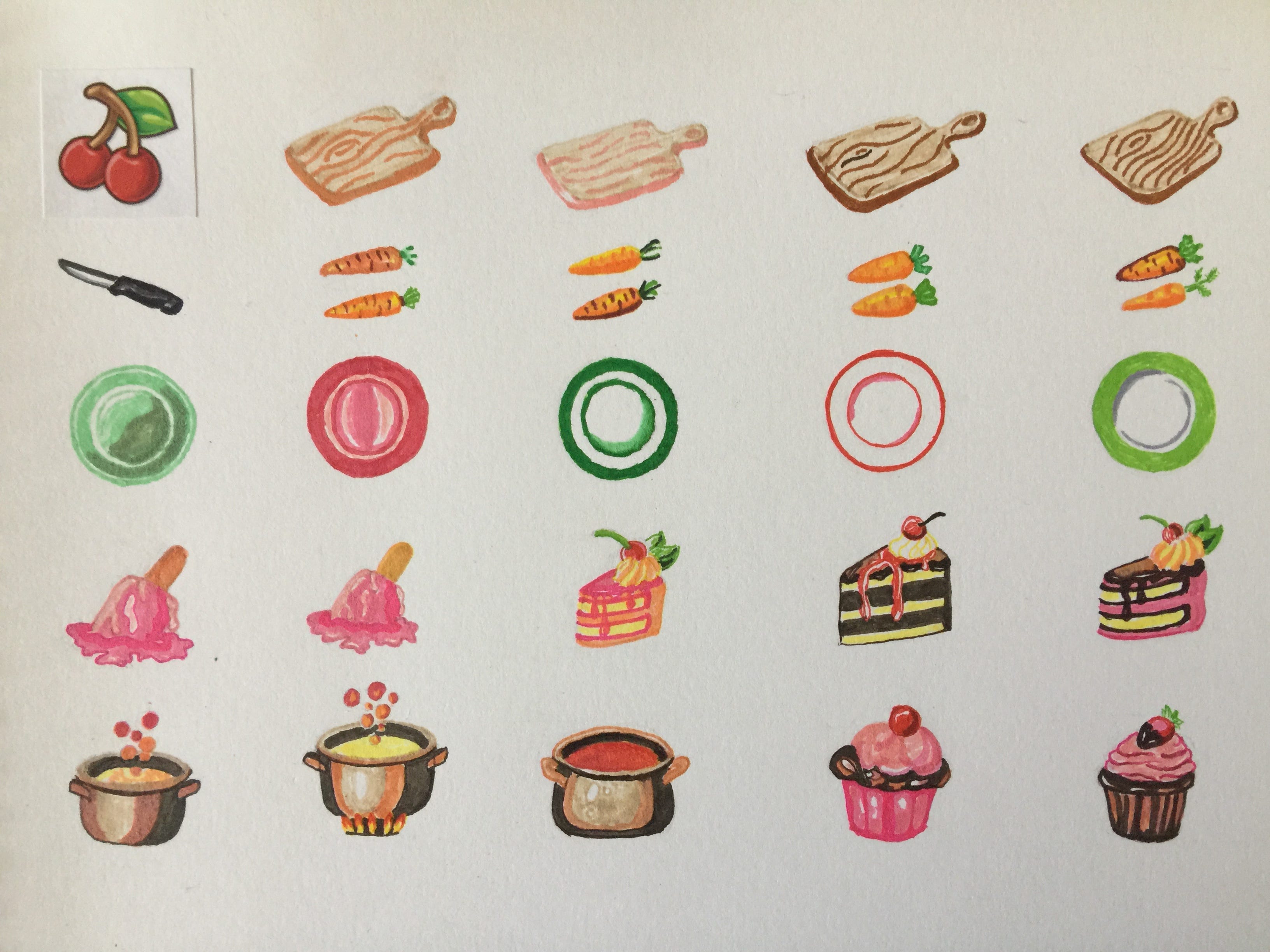
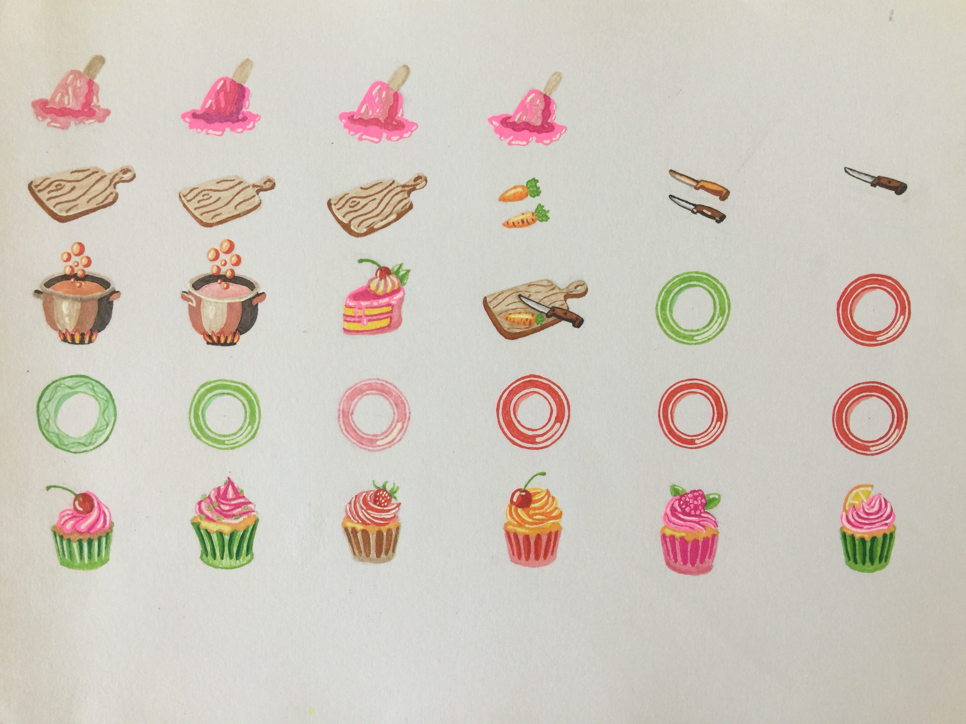
样式样本 (Style sample)
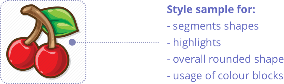
Some of the illustrations I studied in more details.
我更详细地研究了一些插图。
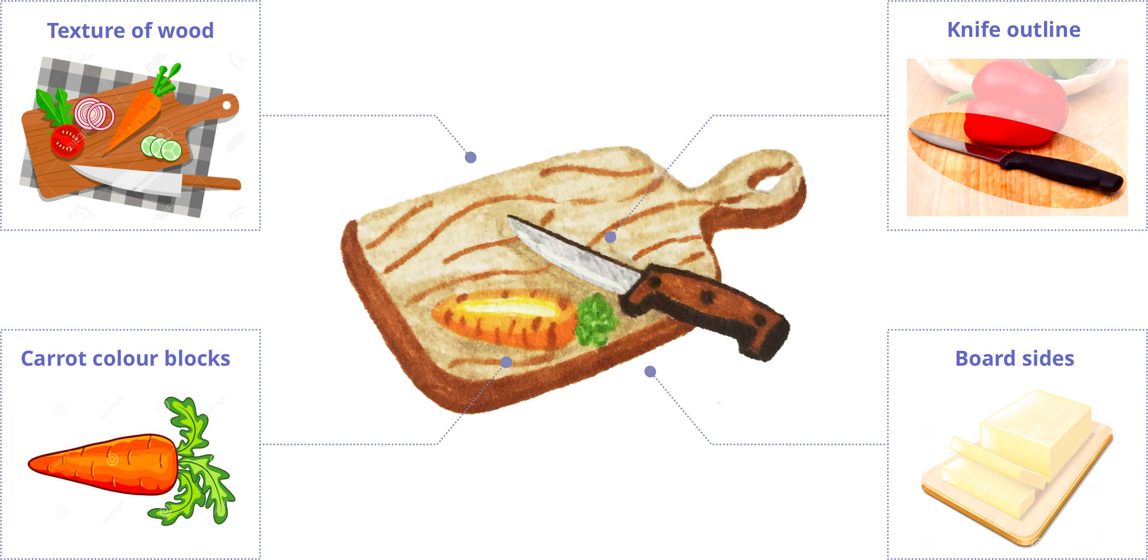
切菜板 (Cutting board)
First, I decided on the shape and colour of the elements on the board. I then took several photographs of the items to see how they would look in perspective and what composition would work best for placing those items on the board. This was followed by sketching to determine, how the perspective would work best with the shape of the board.
首先,我确定了板上元素的形状和颜色。 然后,我为这些项目拍摄了几张照片,以查看它们的透视图以及哪种组合物最适合将这些项目放置在板上。 随后进行草绘,以确定透视图如何与板的形状一起最佳工作。
研究 (Study)
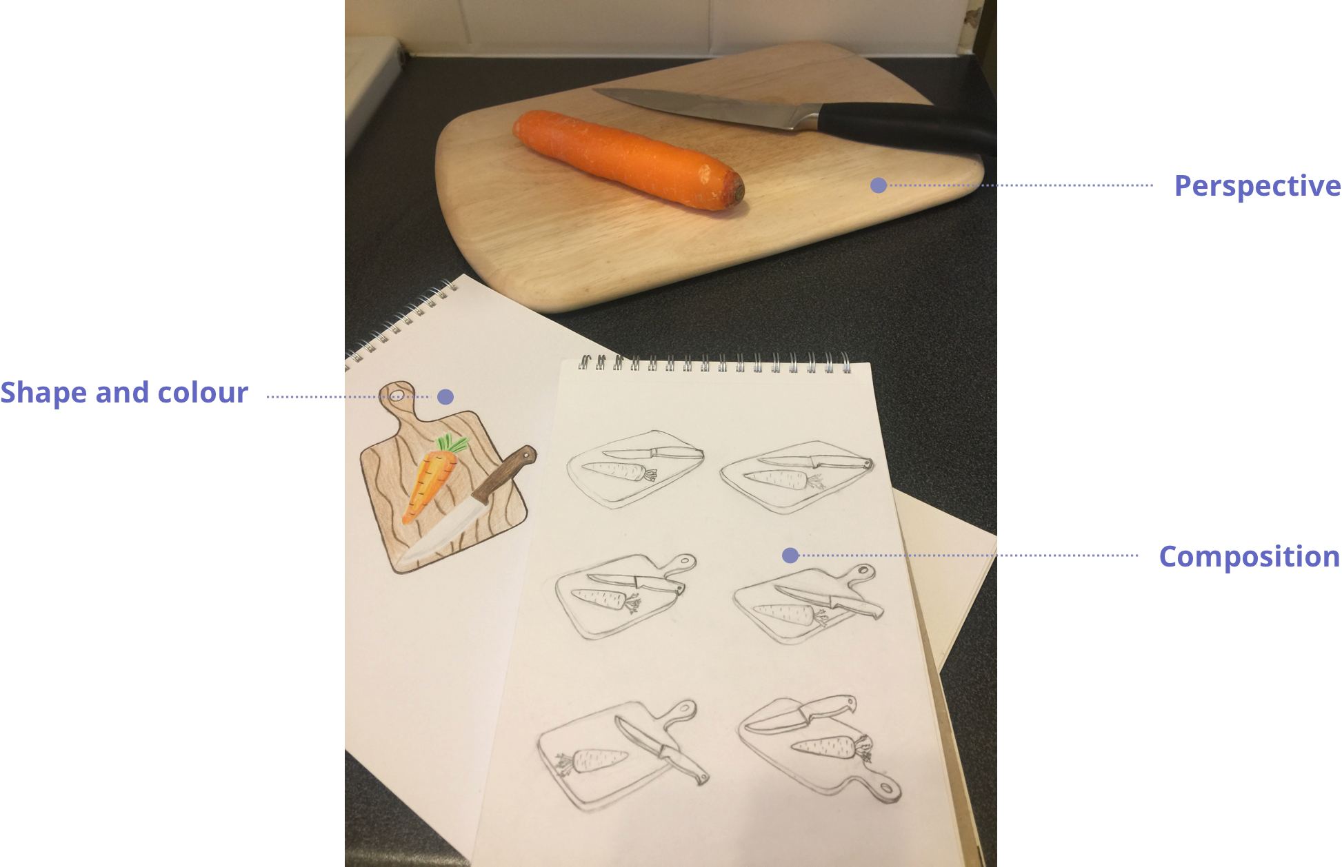
建筑 (Architecture)
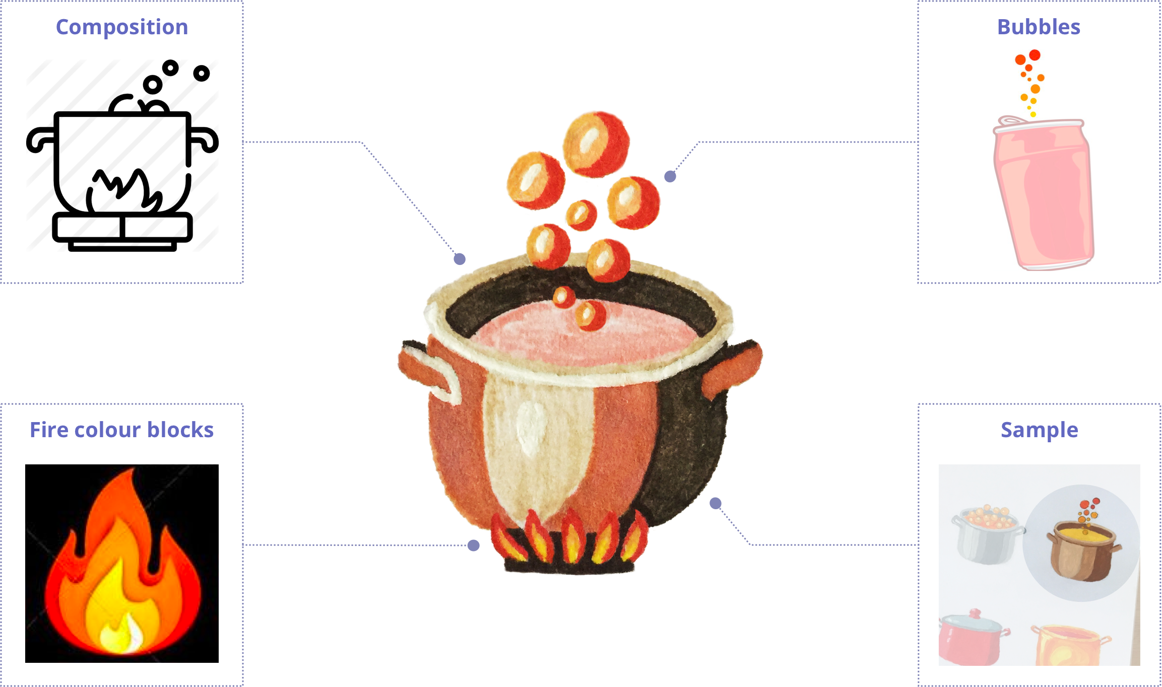
沙锅 (Casserole)
In the interview 3 out 5 people preferred casserole for the “Experiment”. The casserole on fire with bubbles looks entertaining and vibrant, so I took the sample 2D outline icon and converted it into a colourful casserole with perspective. To narrow down the shape and colours I did a small study in acrylics and ended up picking one of the samples.
在访谈中,有五分之三的人选择“实验”作为砂锅菜。 着火的带有气泡的砂锅看上去既有趣又充满活力,因此我将示例2D轮廓图标转换为带有透视图的彩色砂锅。 为了缩小形状和颜色,我对丙烯酸进行了一次小型研究,最后选择了其中一个样品。
研究 (Study)
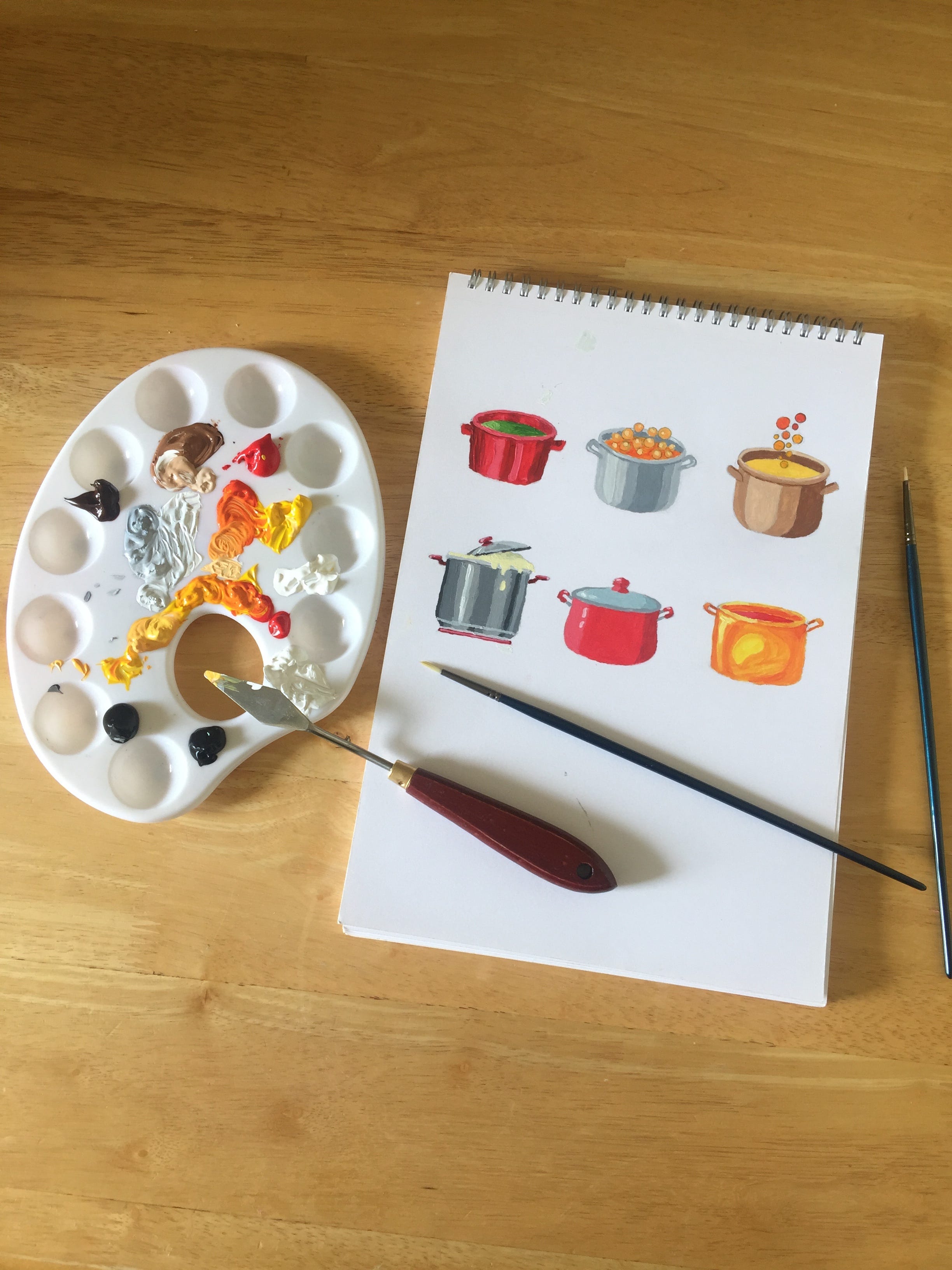
建筑 (Architecture)
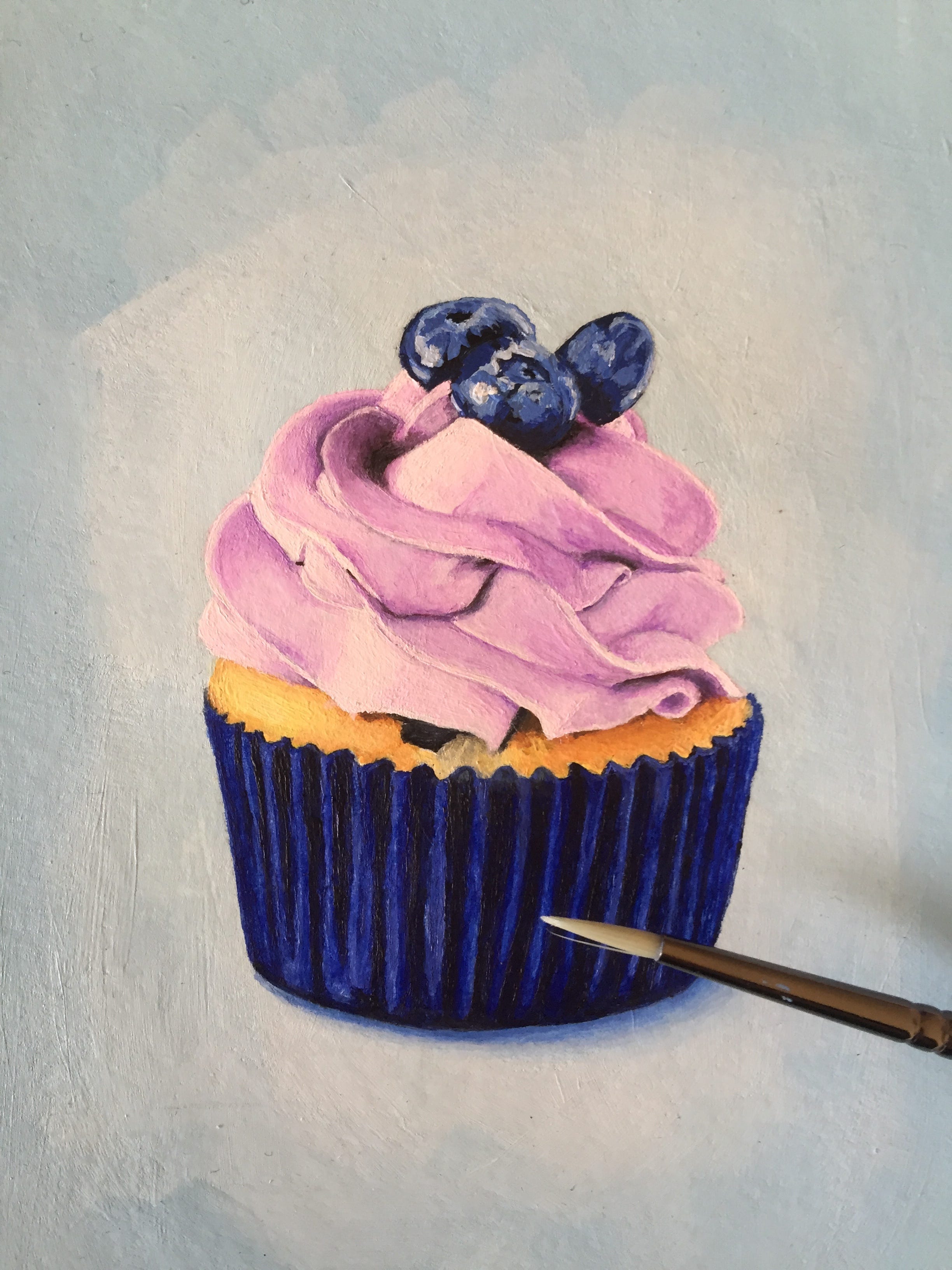
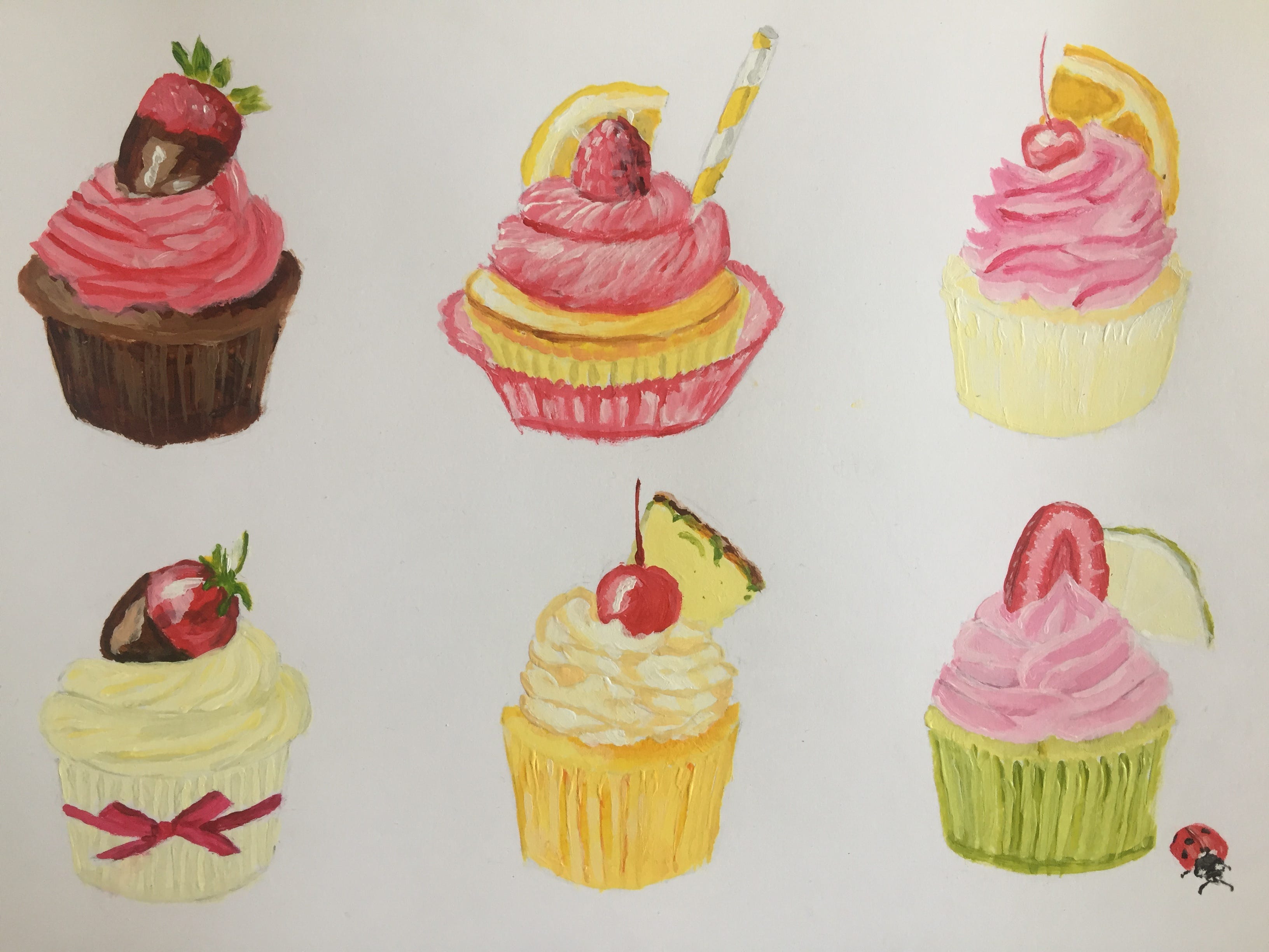
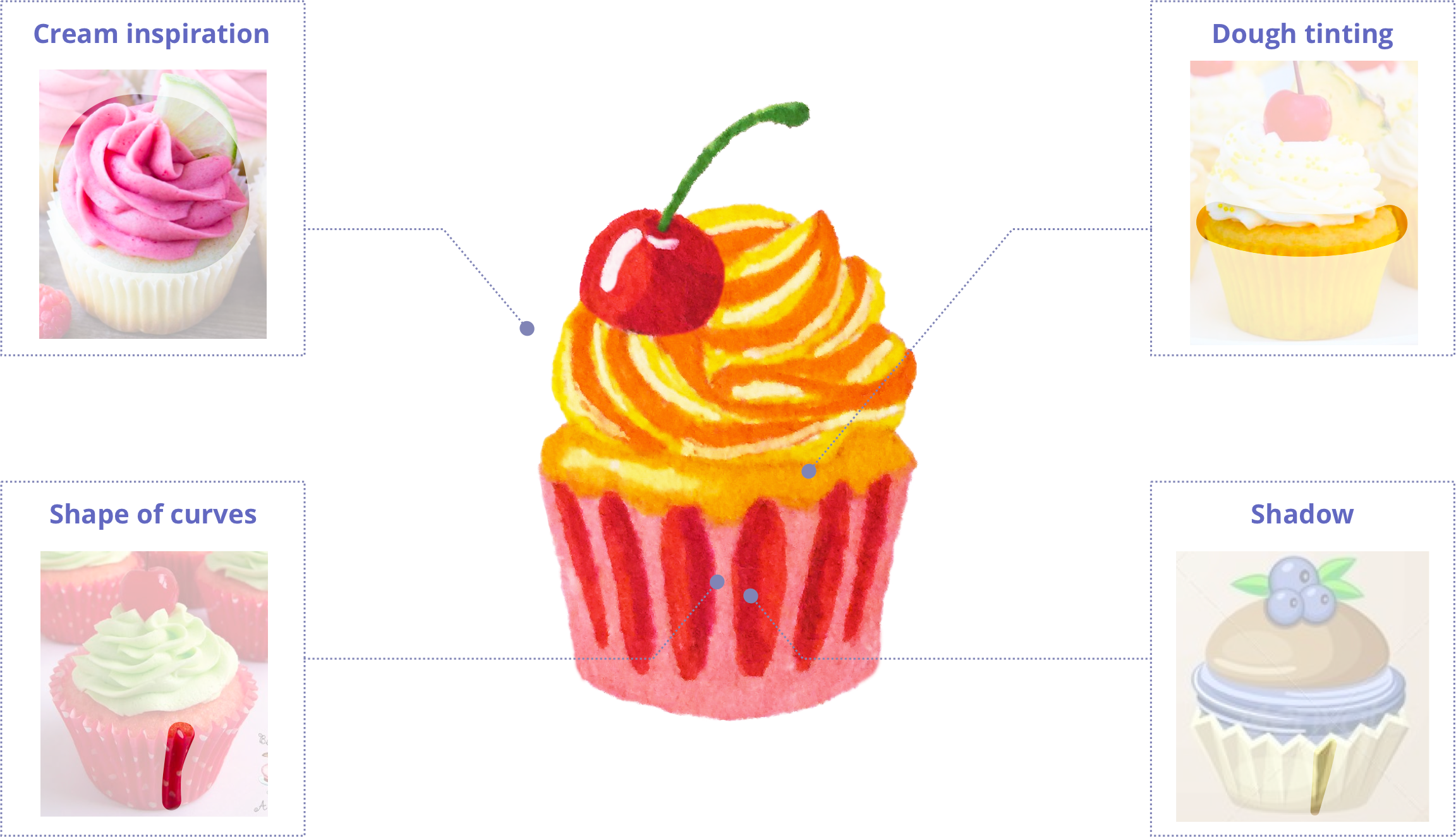
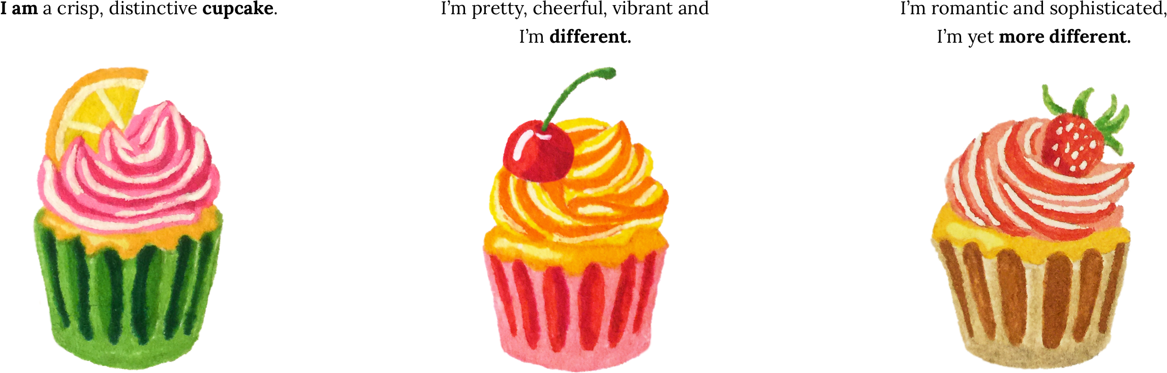
纸杯蛋糕 (Cupcakes)
The cupcakes stand for “Competitors”, for difference. The idea was to come up with 3 different cupcakes.
纸杯蛋糕代表“竞争对手”,代表差异。 当时的想法是拿出3种不同的纸杯蛋糕。
挑战 (The challenge)
- my chosen colourscheme 我选择的色彩设计
- shape of the bottom simplified but realistic 底部形状简化但逼真
- colour contrast between top and bottom 顶部和底部之间的颜色对比
- contrast between cream and base 奶油和底霜之间的对比
- wavy creamy top 波浪奶油上衣
- top same width and height as bottom 顶部和底部的宽度和高度相同
- decoration on top to make it taller 顶部的装饰使其更高
研究 (Study)
Painting and sketching cupcakes from photos helped me to familiarise myself with their features.
用照片绘画和素描纸杯蛋糕有助于我熟悉它们的功能。
建筑 (Architecture)
纸杯蛋糕订单背后的信息 (The message behind the order of the cupcakes)
图纸加工 (Drawing and processing)
用笔和纸绘图 (Drawing with pen and paper)
The next step was to elaborate on detail. That’s why I went for drawing real-size, on paper, used gelly pens and tombows. Cherries in the top left corner worked as an example.
下一步是详细说明。 这就是为什么我要在纸上用胶笔和墓碑画出真实尺寸的原因。 以左上角的樱桃为例。
精制 (Refining)
Illustrations drawn on paper have an advantage over those rendered in vector: they have a lively texture, and they looked so nice that I decided to keep them hand drawn. All I added was a bit of processing to clean them up a little and ensure they look like they get same amount of light.
纸上绘制的插图比矢量上绘制的插图更具优势:它们具有活泼的纹理,而且看起来非常好,我决定保留它们为手工绘制。 我添加的只是一些处理,以将它们清理一点并确保它们看起来像它们得到的光一样。
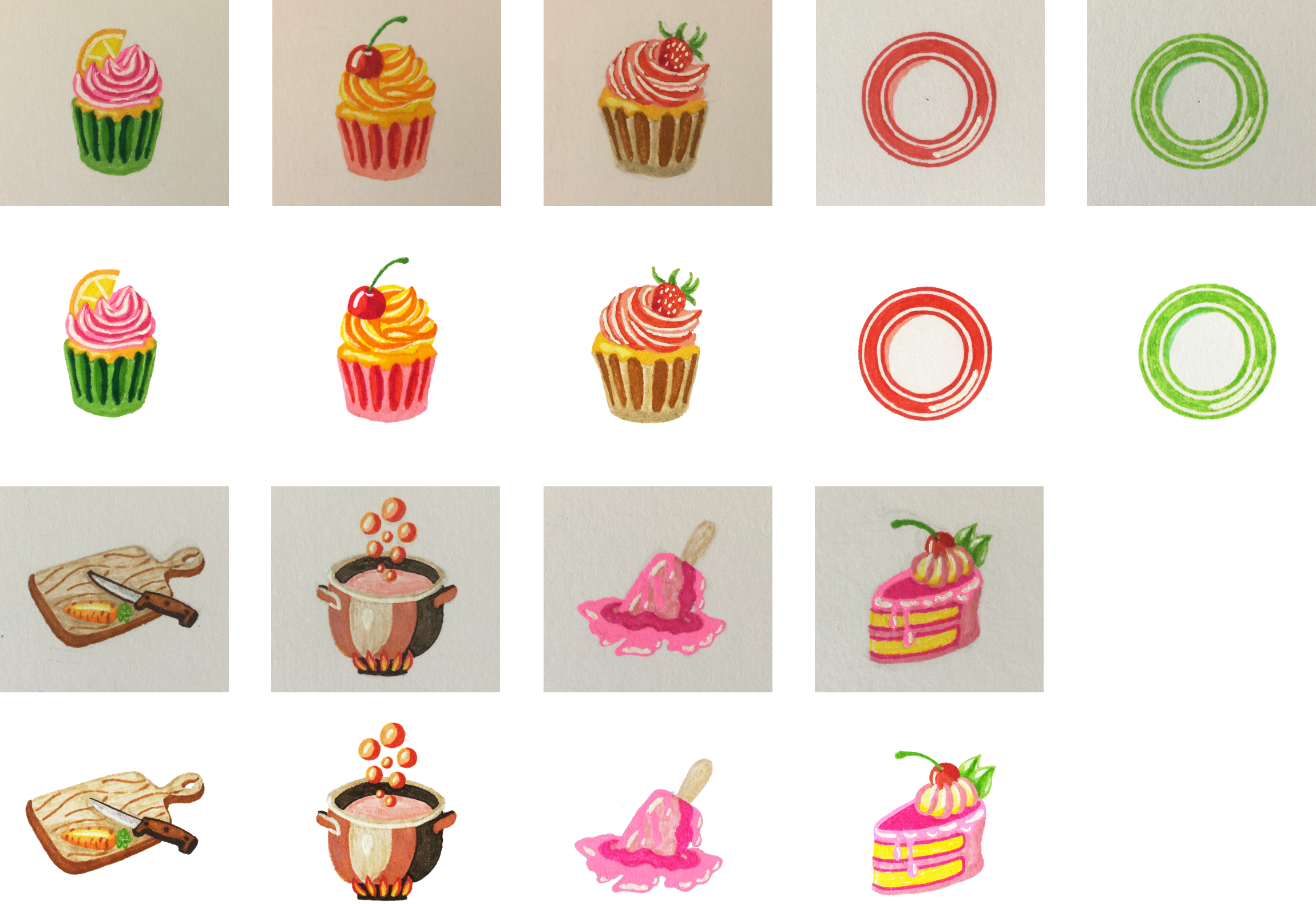
决赛-我的骄傲和喜悦 (Final set — my pride and joy)

Thanks for reading!
谢谢阅读!
翻译自: https://medium.com/@emiliya_san/how-i-designed-illustrations-for-a-portfolio-page-454dd0ad4da4
插图 引用 同一行两个插图

- JavaSE8基础 ==和equals 比较两个引用类型的变量的地址值是否相同
- 两个项目中 一个项目对另一个项目的引用
- 两个类相互包含引用的问题--类前向声明
- Java中堆内存和栈内存_在建立一个对象时从两个地方都分配内存,在堆中分配的内存实际建立这个对象,而在堆栈中分配的内存只是一个指向这个堆对象的指针(引用)。修改栈指针就可以把栈中的内容销毁.这样最快
- Python如何以两个字符一行方式输出"Hello World"
- 在HTML中,让两个DIV在同一行显示
- Word文档中同一行放置两个图片且标题在同一行的方法
- ListView一行显示两个Item并实现单选功能
- C++两个类相互包含引用的问题
- 同一个页面中引用两个同样的Jquery树
- 当两个div无法放在一行的解决办法
- c++中两个类相互包含引用的相关问题
- c语言:引用指针变量比较两个整数的大小
- Asp.Net主题/皮肤切换,以及遇到的两个问题
- 一行代码是有两个??
- GridView行选择事件,单击GridView中某一行任意位置提出这条记录
- 两个input在同一行为什么对不齐
- 如何使两个div在同一行显示
- 级联两个bootstrap-table。一张表显示相关的数据,通过点击这张表的某一行,传过去对应的ID,刷新另外一张表。
- 两个桌面主题