根据图片获得配色方案_配色系列(1)—从图片中获得配色灵感
根据图片获得配色方案
前言 (Foreword)
When we start designing mobile web pages, we always need to determine the color scheme of the web page first. Well, at this time, unless the customer proposes a color scheme, most of the situations we have to face is to create a color scheme based on the customer’s needs. Here, I want to teach you how to get inspiration from the “picture” source and create a color scheme.
当我们开始设计移动网页时,我们总是需要首先确定网页的配色方案。 好吧,目前,除非客户提出颜色方案,否则我们必须面对的大多数情况是根据客户的需求创建颜色方案。 在这里,我想教您如何从“图片”来源中获得灵感并创建配色方案。
1.选择图片 (1. Select the picture)
First of all, go to the major websites to search for your favorite pictures. The choice of pictures should try to choose a color tone that changes and the contrast between light and dark is also more obvious, because black and white or low contrast tones will only make your final color scheme look less vivid.
首先,转到主要网站以搜索您喜欢的图片。 图片的选择应尝试选择变化的色调,并且明暗之间的对比度也更加明显,因为黑白或低对比度色调只会使最终的配色方案看起来不那么生动。
It is good to choose the pictures to go to the following websites:https://unsplash.comhttp://500px.com/https://www.flickr.com
最好选择图片访问以下网站: https: //unsplash.com http://500px.com/ https://www.flickr.com
Choose from pictures that appeal to yourself in terms of color matching.
从色彩匹配方面吸引自己的图片中选择。
二,吸收色彩 (Second, absorb color)
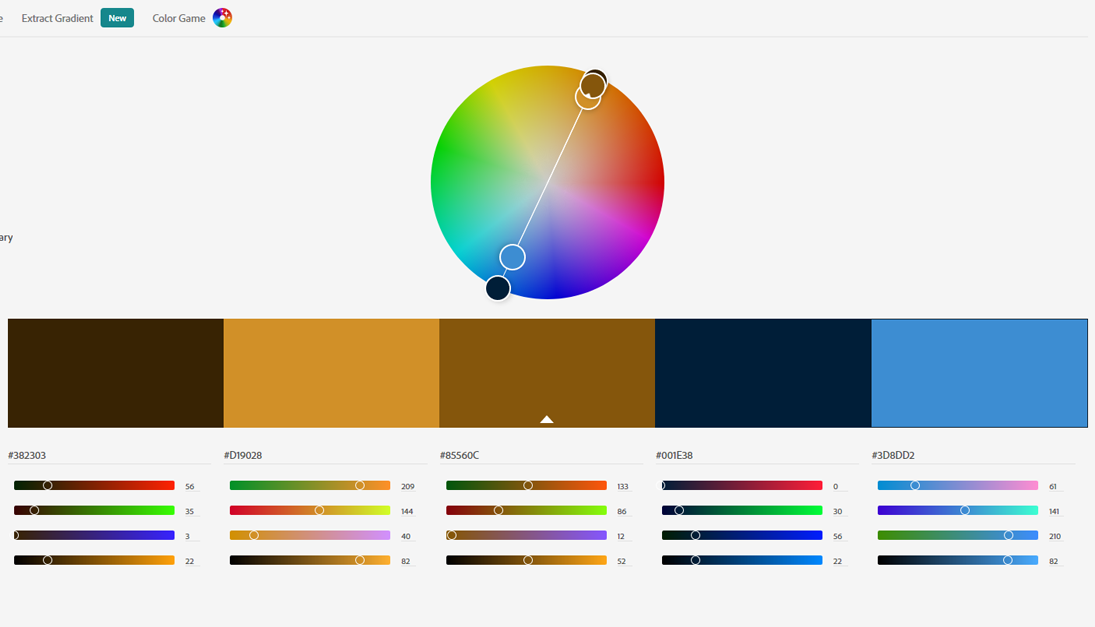
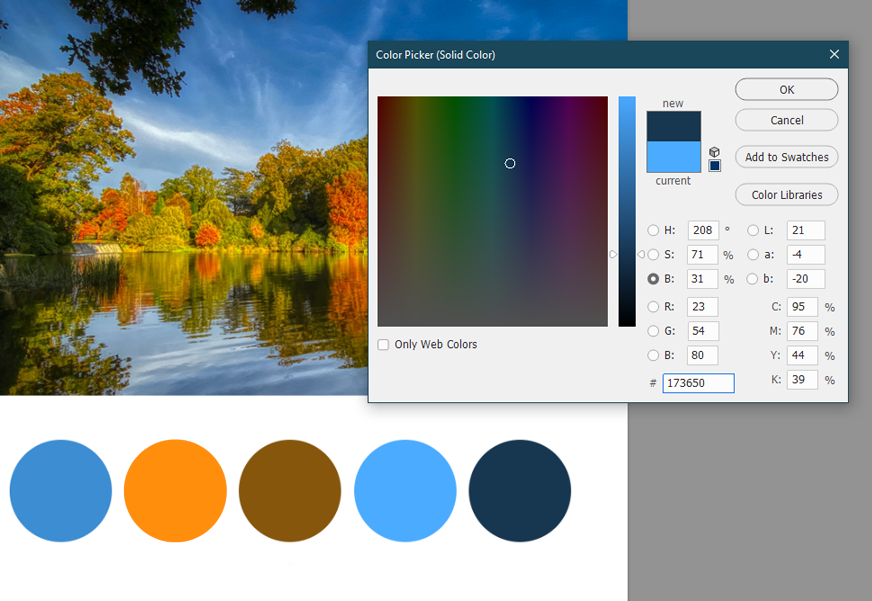
Open this picture in PS and absorb the colors. To absorb color is not to choose the color you like arbitrarily. According to the color distribution of the entire picture, first find the main color of the picture.
在PS中打开此图片并吸收颜色。 吸收色彩不是随意选择自己喜欢的色彩。 根据整个图片的颜色分布,首先找到图片的主要颜色。
The selection of the main color depends on the most widely distributed color in the entire image. In this picture, we can see that the most widely distributed is blue. These blues show different levels of light and dark levels. Therefore, from dark blue to light In Blue, I chose a medium blue with the most balanced transition. This blue color shows the colors of clouds.
主色的选择取决于整个图像中分布最广泛的颜色。 在这张照片中,我们可以看到分布最广的是蓝色。 这些蓝色表示明暗级别不同。 因此,从深蓝色到浅蓝色,我选择了过渡最平衡的中等蓝色。 此蓝色显示云的颜色。
3.建立自己的配色方案 (3. Build your own color scheme)
Choose to create a new file, draw a circle with a white background and the selected color in the picture as the foreground color. This circle is also the first color in your color scheme: the main color.
选择创建一个新文件,画一个带有白色背景的圆,并将图片中的选定颜色作为前景色。 这个圆圈也是配色方案中的第一种颜色:主色。

1.主要色彩的应用范围 (1. The application range of main colors)
When designing a web page, the main color is used in the area where the color area of the entire web page is large, for example, on the background or shape elements of the web page. Of course, one color cannot be designed, so we will choose the second color next.
设计网页时,主要颜色用于整个网页的色彩区域较大的区域,例如网页的背景或形状元素上。 当然,不能设计一种颜色,因此我们接下来将选择第二种颜色。
Auxiliary color selection The auxiliary color is usually a color that can be contrasted and echoed with it. If the main color is a cool color, then the auxiliary color tends to be a warm color. Because a color-rich picture must have colors that are both warm and cold, you will then choose between the main color and the opposite color temperature.
辅助颜色选择辅助颜色通常是可以与之形成对比和回显的颜色。 如果主色是冷色,则辅助色往往是暖色。 因为色彩丰富的图片必须同时具有冷暖色彩,所以您将在主要色彩和相反的色温之间进行选择。
Here I chose the warm orange from the trees and balanced it with the blue cold feeling.
在这里,我从树木中选择了温暖的橙色,并与蓝色的寒冷感觉保持了平衡。

2.辅助色的应用范围 (2. Application range of auxiliary colors)
Auxiliary colors are usually used for fonts and small area elements in web design. If the auxiliary color forms a complementary color with the main color, it will produce a strong contrast. At this time, the contrast color will also have an emphasis. When you want to highlight an element on a web page, you can try accent color.
辅助颜色通常用于网页设计中的字体和小区域元素。 如果辅助色与主色形成互补色,则会产生强烈的对比度。 此时,对比色也将受到重视。 当您要突出显示网页上的元素时,可以尝试强调颜色。
So what is contrasting color? It is just the relative colors on the color circle, for example: red and green, purple and orange, blue and yellow.
那么什么是对比色? 它只是色环上的相对颜色,例如:红色和绿色,紫色和橙色,蓝色和黄色。
If you feel that your choice of secondary color emphasis is not strong enough, you can additionally choose the contrasting color of the primary color from the color circle on the basis of the primary color as the third color scheme.
如果您觉得对次要色彩强调的选择不够强烈,则可以基于原色作为第三种配色方案,从色环中另外选择原色的对比色。
 https://color.adobe.com/createhttps://color.adobe.com/create
 3.高光和阴影 (3. Highlights and shadows)
This usually refers to the highlights and shadows shown in the main tone of the picture. At this time, it is no longer necessary to completely rely on pictures. Three colors have been selected in our color scheme, and the remaining colors are adjusted based on the main color.
这通常是指图片主色调中显示的高光和阴影。 此时,不再需要完全依赖图片。 在我们的配色方案中选择了三种颜色,其余的颜色则根据主要颜色进行调整。
When the main color is increased, the white color will be changed into the highlight part as the fourth color.
当增加主色时,白色将变为第四部分的高光部分。

If your design color is heavy, you can add black to the main color as the fifth color choice.
如果您的设计颜色很重,则可以在主色上添加黑色,作为第五种颜色选择。
The highlight and shadow colors are also used as a decoration color choice on the web page, please use it with caution. One of the highlight and shadow colors can be selected as the neutral color. Because of the rich color gradation using black and white changes, there will be a lot of choices here. This requires you to adjust according to the actual situation in the final color scheme.
高亮和阴影颜色也用作网页上的装饰颜色选择,请谨慎使用。 可以选择高亮和阴影颜色之一作为中性色。 由于使用了黑白变化的色彩层次丰富,因此这里有很多选择。 这要求您根据最终配色方案中的实际情况进行调整。
4.确定配色方案 (4. Determine the color scheme)
After the color scheme is selected, it is best to ensure that the overall color does not exceed 3 colors: primary color, auxiliary color, highlight / shadow color. Even with three colors, the hue will not deviate from the overall blue tone.
选择配色方案后,最好确保整体颜色不超过3种颜色:原色,辅助色,突出显示/阴影色。 即使使用三种颜色,色相也不会偏离整体蓝色调。
四,使用配色方案 (Fourth, the use of color schemes)
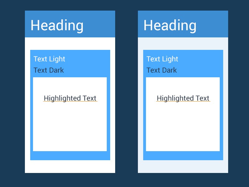
When using colors, there will also be flexible use of black, white, and gray, but make sure that the appearance of these colors does not interfere with the overall sense of color harmony (left).
使用颜色时,也可以灵活使用黑色,白色和灰色,但是请确保这些颜色的外观不会干扰整体的颜色和谐感(左图)。
Most of the time, we do n’t necessarily want pure white as our undertone. To make the overall look elegant, it is essential to add a bit of the main color with very low transparency as the background (right).
大多数时候,我们不一定要把纯白色作为我们的底色。 为了使整体外观优雅,必须添加一些主色(透明度很低)作为背景(右)。
根据图片获得配色方案

- Js获取图片主色调,近似色,互补色,以及根据图片颜色获取主题配色方案详解、插件。
- 根据图片完整路径,获得图片的宽和高,判断是横版还是竖版图片
- COCO数据集根据给定的种类id获得符合条件的图片id
- RColorBrewer的配色方案(根据谢佳标老师讲课整理)
- android典型代码系列(二十一)------根据文件后缀名获得对应的MIME类型
- 从assets里取图片和从drawable里面根据图片的名字获得图片相应的id值
- 根据路径获得图片并压缩,返回bitmap用于显示
- 根据每一帧数据获得图片
- Android 把bitmap转换成String,计算图片的缩放值,根据路径获得突破并压缩返回bitmap用于显示,获取保存 隐患检查的图片文件夹名称,获取保存图片的目录,根据路径删除图片,添加到图库
- 常用方法(3)------根据图片的url路径获得图片物理路径
- 根据某个View获得图片
- Android之根据Uri获得图片或视频文件路径(解决4.4以上版本得不到路径的情况)
- 常用方法(2)------根据图片的url路径获得Bitmap对象
- java根据图片路径下载到服务器方案 (转)
- IT民工系列——c#操作PhotoBucket上传图片(再来一款图床备选方案,速度超快!)
- 根据 图片路径 获得精灵
- Android之根据Uri获得图片或视频文件路径(解决4.4以上版本得不到路径的情况)
- 从零学python系列之教你如何根据图片生成字符画
- 放大镜系列之三:ie8下对图片的旋转以及放大镜效果的兼容方案
- Android编程根据系列图片绘制动画实例总结