携程移动端——flex布局+精灵图案例
2020-06-05 05:46
232 查看
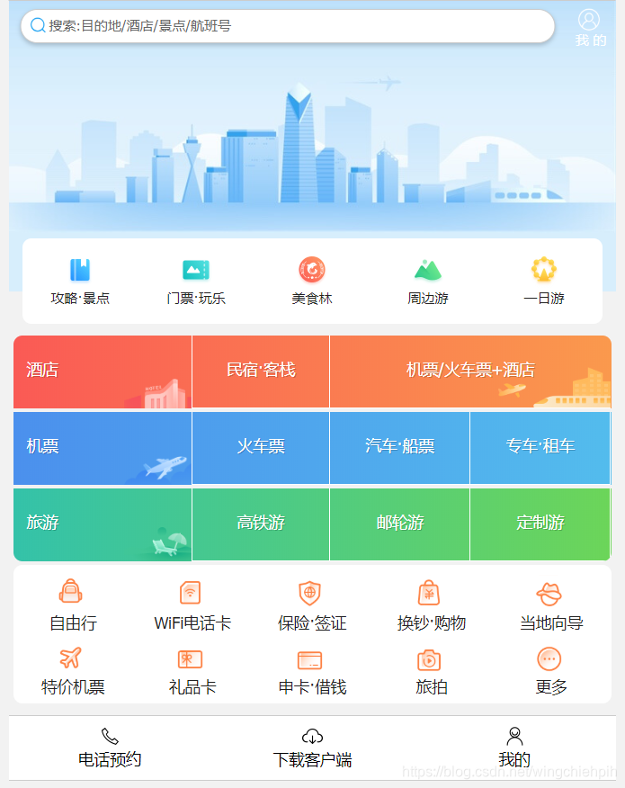
最终效果展示
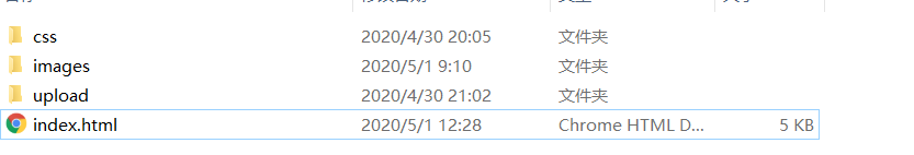
1、文件布局结构
2、HTML代码
<!DOCTYPE html>
<html lang="en">
<head>
<meta charset="UTF-8" />
<meta name="viewport" content="width=device-width, initial-scale=1.0" />
<meta http-equiv="X-UA-Compatible" content="ie=edge" />
<link rel="stylesheet" href="css/normalize.css" />
<link rel="stylesheet" href="css/index.css" />
<title>携程旅游</title>
</head>

<body>
<!-- 顶部搜索 -->
<div class="search-index">
<div class="search">搜索:目的地/酒店/景点/航班号</div>
<a href="#" class="user">我 的</a>
</div>
<!-- 焦点图模块 -->
<div class="focus">
<img src="upload/focus.jpg" alt="" />
</div>
<!-- 局部导航栏 -->
<ul class="local-nav">
<li>
<a href="#" title="攻略·景点">
<span class="local-nav-icon-icon1"></span>
<span>攻略·景点</span>
</a>
</li>
<li>
<a href="#" title="门票·玩乐">
<span class="local-nav-icon-icon2"></span>
<span>门票·玩乐</span>
</a>
</li>
<li>
<a href="#" title="美食林">
<span class="local-nav-icon-icon3"></span>
<span>美食林</span>
</a>
</li>
<li>
<a href="#" title="周边游">
<span class="local-nav-icon-icon4"></span>
<span>周边游</span>
</a>
</li>
<li>
<a href="#" title="一日游">
<span class="local-nav-icon-icon5"></span>
<span>一日游</span>
</a>
</li>
</ul>

<!-- 主导航栏 -->
<nav>
<div class="nav-common">
<div class="nav-items nav-items-tl">
<a href="#">酒店</a>
</div>
<div class="nav-items nav-items-tc">
<a href="#">民宿·客栈</a>
</div>
<div class="nav-items nav-items-tr">
<a href="#">机票/火车票+酒店 </a>
</div>
</div>
<div class="nav-common">
<div class="nav-items nav-items-tl">
<a href="#">机票</a>
</div>
<div class="nav-items nav-items-tc">
<a href="#">火车票</a>
</div>
<div class="nav-items nav-items-ttr">
<a href="#">汽车·船票</a>
</div>
<div class="nav-items nav-items-ttr">
<a href="#">专车·租车</a>
</div>
</div>
<div class="nav-common">
<div class="nav-items nav-items-tl">
<a href="#">旅游</a>
</div>
<div class="nav-items nav-items-tc">
<a href="#">高铁游</a>
</div>
<div class="nav-items nav-items-ttr">
<a href="#">邮轮游</a>
</div>
<div class="nav-items nav-items-ttr">
<a href="#">定制游</a>
</div>
</div>
</nav>
<!-- 侧导航栏 -->
<ul class="subnav-entry">
<li>
<a href="#">
<span class="subnav-entry-icon"></span>
<span>自由行</span>
</a>
</li>
<li>
<a href="#">
<span class="subnav-entry-icon"></span>
<span>WiFi电话卡</span>
</a>
</li>
<li>
<a href="#">
<span class="subnav-entry-icon"></span>
<span>保险·签证</span>
</a>
</li>
<li>
<a href="#">
<span class="subnav-entry-icon"></span>
<span>换钞·购物</span>
</a>
</li>
<li>
<a href="#">
<span class="subnav-entry-icon"></span>
<span>当地向导</span>
</a>
</li>
<li>
<a href="#">
<span class="subnav-entry-icon"></span>
<span>特价机票</span>
</a>
</li>
<li>
<a href="#">
<span class="subnav-entry-icon"></span>
<span>礼品卡</span>
</a>
</li>
<li>
<a href="#">
<span class="subnav-entry-icon"></span>
<span>申卡·借钱</span>
</a>
</li>
<li>
<a href="#">
<span class="subnav-entry-icon"></span>
<span>旅拍</span>
</a>
</li>
<li>
<a href="#">
<span class="subnav-entry-icon"></span>
<span>更多</span>
</a>
</li>
</ul>
<!-- 底部导航 -->
<div class="tool-box">
<div class="fybox">
<img src="images/电话.png" alt="" />
<span>电话预约</span>
</div>
<div class="fybox">
<img src="images/下载.png" alt="" />
<span>下载客户端</span>
</div>
<div class="fybox">
<img src="images/我的.png" alt="" />
<span>我的</span>
</div>
</div>
</body>
</html>
2、css代码
body {
max-width: 540px;
min-width: 320px;
margin: 0 auto;
font: normal 14px/1.5 Tahoma, 'Lucida Grande', Verdana, 'Microsoft Yahei',
STXihei, hei;
color: #000;
background: #f2f2f2;
overflow-x: hidden;
-webkit-tap-highlight-color: transparent;
}

ul {
list-style: none;
margin: 0;
padding: 0;
}

a {
text-decoration: none;
color: #222;
}

div {
box-sizing: border-box;
}

/* 搜索模块 */

.search-index {
display: flex;
/* 设置定位后再设置margin是无效的 */
position: fixed;
left: 50%;
transform: translateX(-50%);
/* 固定的盒子应该有宽度 */
width: 100%;
min-width: 320px;
max-width: 540px;
height: 44px;
border-top: 1px solid #ccc;
}

.search {
position: relative;
height: 30px;
line-height: 28px;
border: 1px solid #ccc;
flex: 1;
font-size: 12px;
color: #666;
margin: 7px 10px;
background-color: #fff;
padding-left: 25px;
border-radius: 15px;
box-shadow: 0 2px 4px rgba(0, 0, 0, 0.2);
}

.search::before {
content: '';
position: absolute;
top: 6px;
left: 8px;
width: 15px;
height: 15px;
background: url(../images/sprite.png) no-repeat;
background-size: 20px auto;
}

.user {
width: 44px;
height: 44px;
font-size: 12px;
text-align: center;
color: #fff;
}

.user::before {
content: '';
display: block;
width: 23px;
height: 23px;
background: url(../images/sprite.png) no-repeat 0 -32px;
background-size: 20px auto;
margin: 4px auto -2px;
}

.focus img {
width: 100%;
}

/* local-nav */

.local-nav {
display: flex;
position: relative;
height: 64px;
margin: -52px 12px 10px;
padding: 4px 0 8px;
background-color: #fff;
border-radius: 8px;
}

.local-nav li {
flex: 1;
}

.local-nav a {
display: flex;
flex-direction: column;
/* 侧轴居中对齐 因为是单行 */
align-items: center;
font-size: 12px;
}

.local-nav li [class^='local-nav-icon'] {
width: 32px;
height: 32px;
background-color: pink;
margin-top: 8px;
background: url(../images/localnav_bg.png) no-repeat 0 0;
background-size: 32px auto;
}

.local-nav li .local-nav-icon-icon2 {
background-position: 0 -32px;
}

.local-nav li .local-nav-icon-icon3 {
background-position: 0 -64px;
}

.local-nav li .local-nav-icon-icon4 {
background-position: 0 -96px;
}

.local-nav li .local-nav-icon-icon5 {
background-position: 0 -128px;
}

/* nav */

nav {
overflow: hidden;
border-radius: 8px;
margin: 0 4px 3px;
}

.nav-common {
display: flex;
height: 65px;
}

.nav-common:nth-child(2) {
margin: 3px 0;
}
.nav-items-tl {
width: 30%;
}
.nav-items-tc {
width: 23%;
}
.nav-items-tr {
width: 47%;
}
.nav-items-ttr {
width: 23.5%;
border-right: 1px solid #fff;
}
.nav-items {
display: flex;
flex-direction: column;
}

.nav-items a {
flex: 1;
text-align: center;
line-height: 60px;
color: #fff;
font-size: 14px;
/* 文字阴影 */
text-shadow: 1px 1px rgba(0, 0, 0, 0.2);
}
.nav-items a:nth-child(1) {
border-bottom: 1px solid #fff;
}
.nav-common .nav-items:nth-child(1) a {
padding-left: 12px;
text-align: left;
border: 0;
background: url(../upload/picht.png) no-repeat bottom right;
background-size: 60px auto;
}
.nav-common:nth-child(2) .nav-items:nth-child(1) a {
border: 0;
background: url(../upload/picpl.png) no-repeat bottom right;
background-size: 60px auto;
}
.nav-common:nth-child(3) .nav-items:nth-child(1) a {
border: 0;
background: url(../upload/pictr.png) no-repeat bottom right;
background-size: 60px auto;
}
.nav-common .nav-items-tr {
border: 0;
background: url(../upload/pictrr.png) no-repeat bottom right;
background-size: 100px auto;
}
/* -n+2就是选择前面两个元素 */

.nav-items:nth-child(-n + 2) {
border-right: 1px solid #fff;
}

.nav-common:nth-child(1) {
background: -webkit-linear-gradient(left, #fa5a55, #fa994d);
}

.nav-common:nth-child(2) {
background: -webkit-linear-gradient(left, #4b90ed, #53bced);
}

.nav-common:nth-child(3) {
background: -webkit-linear-gradient(left, #34c2a9, #6cd559);
}

/* subnav-entry */

.subnav-entry {
display: flex;
border-radius: 8px;
background-color: #fff;
margin: 0 4px;
flex-wrap: wrap;
padding: 5px 0;
}

.subnav-entry li {
/* 里面的子盒子可以写 % 相对于父级来说的 */
flex: 20%;
}

.subnav-entry a {
display: flex;
flex-direction: column;
align-items: center;
}

.subnav-entry-icon {
padding: 2px;
width: 28px;
height: 28px;
margin-top: 4px;
background: url(../images/subnav-bg.png) no-repeat;
background-size: 28px auto;
}
.subnav-entry li:nth-child(2) a .subnav-entry-icon {
background: url(../images/subnav-bg.png) no-repeat 0px -27px;
background-size: 28px auto;
}
.subnav-entry li:nth-child(3) a .subnav-entry-icon {
background: url(../images/subnav-bg.png) no-repeat 0px -54px;
background-size: 28px auto;
}
.subnav-entry li:nth-child(4) a .subnav-entry-icon {
background: url(../images/subnav-bg.png) no-repeat 0px -82px;
background-size: 28px auto;
}
.subnav-entry li:nth-child(5) a .subnav-entry-icon {
background: url(../images/subnav-bg.png) no-repeat 0px -109px;
background-size: 28px auto;
}
.subnav-entry li:nth-child(6) a .subnav-entry-icon {
background: url(../images/subnav-bg.png) no-repeat 0px -137px;
background-size: 28px auto;
}
.subnav-entry li:nth-child(7) a .subnav-entry-icon {
background: url(../images/subnav-bg.png) no-repeat 0px -164px;
background-size: 28px auto;
}
.subnav-entry li:nth-child(8) a .subnav-entry-icon {
background: url(../images/subnav-bg.png) no-repeat 0px -191px;
background-size: 28px auto;
}
.subnav-entry li:nth-child(9) a .subnav-entry-icon {
background: url(../images/subnav-bg.png) no-repeat 0px -219px;
background-size: 28px auto;
}
.subnav-entry li:nth-child(10) a .subnav-entry-icon {
background: url(../images/subnav-bg.png) no-repeat 0px -248px;
background-size: 28px auto;
}
/* 底部 */
.tool-box {
display: flex;
align-items: center;
margin-top: 10px;
padding: 8px 0;
border-top: 1px solid #ccc;
border-bottom: 1px solid #ccc;
width: 100%;
background-color: #fff;
}
.fybox {
display: flex;
flex: 1;
flex-flow: column;
align-items: center;
}

.fybox img {
width: 20px;
height: 20px;
}
代码优化不足,仅用HTML+CSS

相关文章推荐
- flex 常见布局 案例
- flex.css,移动端flex布局神器,兼容微信,UC,webview等移动端主流浏览器08.10
- 【分享】css3最全flex布局,搞定移动端所有布局结构
- 移动端flex布局
- flex布局案例
- flex布局兼容性写法,使用于任何移动端安卓苹果
- 移动端 顶部、底部和内容之间的小技巧 用flex布局来解决
- 移动端弹性布局--flex
- Flex布局做出自适应页面--语法和案例
- 移动端Web页面的CSS3 flex布局快速上手指南
- 移动端的布局:flex布局
- 移动端Flex 布局新旧混合兼容
- Flex布局做出自适应页面--语法和案例
- css3移动端flex弹性盒子布局
- 移动端开发-webview 不支持css3 flex布局
- 移动端布局方式--flex布局
- flex布局小案例
- 从移动端webAPP谈起:flex弹性布局
- 移动端 css/html (box-flex)自适应、等比布局
- 移动端之flex布局