使用Matplotlib绘制不同颜色的带箭头的线实例
2020-04-18 07:11
781 查看
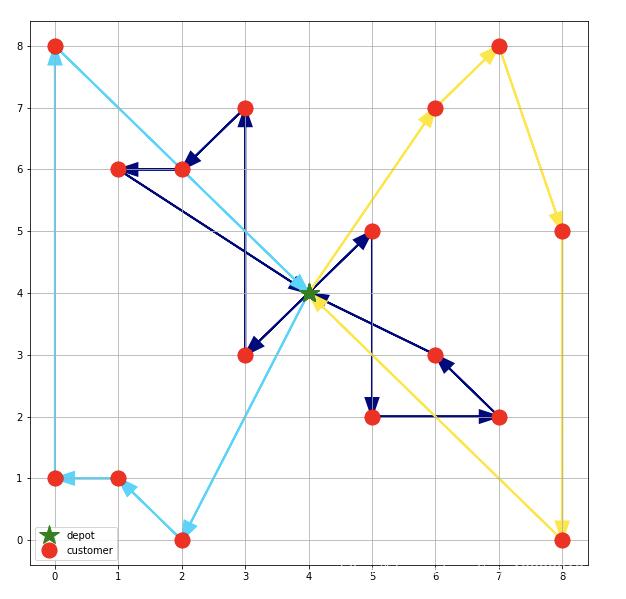
周五的时候计算出来一条线路,但是计算出来的只是类似与
0->10->19->2->..0
这样的线路只有写代码的人才能看的懂无法直观的表达出来,让其它同事看的不清晰,所以考虑怎样直观的把线路图画出来。
&esp; 当然是考虑用matplotlib了,
导入相关的库
import matplotlib.pyplot as plt
import numpy
import matplotlib.colors as colors
import matplotlib.cm as cmx
后面两个主要是用于处理颜色的。
准备数据
_locations = [
(4, 4), # depot
(4, 4), # unload depot_prime
(4, 4), # unload depot_second
(4, 4), # unload depot_fourth
(4, 4), # unload depot_fourth
(4, 4), # unload depot_fifth
(2, 0),
(8, 0), # locations to visit
(0, 1),
(1, 1),
(5, 2),
(7, 2),
(3, 3),
(6, 3),
(5, 5),
(8, 5),
(1, 6),
(2, 6),
(3, 7),
(6, 7),
(0, 8),
(7, 8)
]
画图
plt.figure(figsize=(10, 10))
p1 = [l[0] for l in _locations]
p2 = [l[1] for l in _locations]
plt.plot(p1[:6], p2[:6], 'g*', ms=20, label='depot')
plt.plot(p1[6:], p2[6:], 'ro', ms=15, label='customer')
plt.grid(True)
plt.legend(loc='lower left')

way = [[0, 12, 18, 17, 16, 4, 14, 10, 11, 13, 5], [0, 6, 9, 8, 20, 3], [0, 19, 21, 15, 7, 2]]  #
cmap = plt.cm.jet
cNorm = colors.Normalize(vmin=0, vmax=len(way))
scalarMap = cmx.ScalarMappable(norm=cNorm,cmap=cmap)

for k in range(0, len(way)):
way0 = way[k]
colorVal = scalarMap.to_rgba(k)
for i in range(0, len(way0)-1):
start = _locations[way0[i]]
end = _locations[way0[i+1]]
#     plt.arrow(start[0], start[1], end[0]-start[0], end[1]-start[1], length_includes_head=True,
#         head_width=0.2, head_length=0.3, fc='k', ec='k', lw=2, ls=lineStyle[k], color='red')
plt.arrow(start[0], start[1], end[0]-start[0], end[1]-start[1],
length_includes_head=True, head_width=0.2, lw=2,
color=colorVal)
plt.show()
cmap = plt.cm.jet
cNorm = colors.Normalize(vmin=0, vmax=len(way))
scalarMap = cmx.ScalarMappable(norm=cNorm,cmap=cmap)
cmap可以理解为颜色库,cNorm设置颜色的范围,有几条线路就设置几种颜色,scalarMap颜色生成完毕。最后在绘图的时候,根据索引获得相应的颜色就可以了。
结果如下:
补充知识:Python包matplotlib绘图--如何标注某点--附代码
# -*- coding: utf-8 -*-
import matplotlib as mpl
import matplotlib.pyplot as plt
import numpy as np
plt.style.use('classic')
plt.rcParams['font.sans-serif'] = ['SimHei'] #解决中文显示
plt.rcParams['axes.unicode_minus'] = False #解决符号无法显示
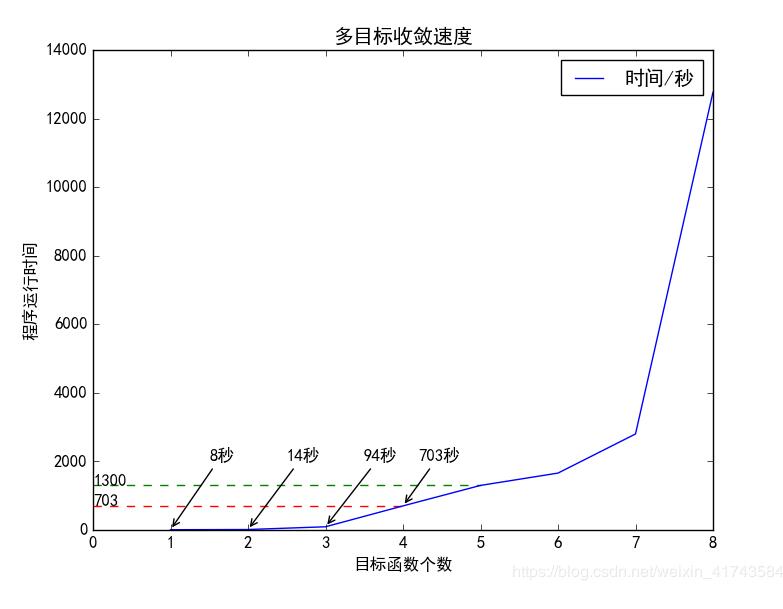
x=np.array([1,2,3,4,5,6,7,8])
y1=np.array([3,5,35,300,800,600,1200,4000])
y2=np.array([8,14,94,703,1300,1660,2801,12768])
fig1 = plt.figure()
ax = plt.axes()
ax.plot(x, y2,label='时间/秒')
ax.set(xlabel='目标函数个数', ylabel='程序运行时间',title='多目标收敛速度')
plt.hlines(703, 0, 4, colors='r', linestyle="--")
plt.text(0, 703, "703")
plt.hlines(1300, 0, 5, colors='g', linestyle="--")
plt.text(0, 1300, "1300")
# annotate
plt.annotate("703秒", (4,703), xycoords='data',
xytext=(4.2, 2000),
arrowprops=dict(arrowstyle='->'))
plt.annotate("94秒", (3,94), xycoords='data',
xytext=(3.5, 2000),
arrowprops=dict(arrowstyle='->'))
plt.annotate("14秒", (2,14), xycoords='data',
xytext=(2.5, 2000),
arrowprops=dict(arrowstyle='->'))
plt.annotate("8秒", (1,8), xycoords='data',
xytext=(1.5, 2000),
arrowprops=dict(arrowstyle='->'))
plt.legend()
plt.show()
fig1.savefig('my_figure1.png')
import numpy as np
from matplotlib import pyplot as plt
from matplotlib.path import Path
from matplotlib.patches import PathPatch

# Use seaborn to change the default graphics to something nicer
import seaborn as sns
# And set a nice color palette
sns.set_color_codes('deep')

# Create the plot object
fig, ax = plt.subplots(figsize=(5, 4))
x = np.linspace(0, 1000)

# Add finishing constraint: x2 <= 100/2 - x1/2
plt.plot(x, 50/4 - 3*x/4, linewidth=3, label='First constraint')
plt.fill_between(x, 0, 100/2 - x/2, alpha=0.1)

# Add carpentry constraint: x2 <= 80 - x1
plt.plot(x, 30 - 2*x, linewidth=3, label='Second constraint')
plt.fill_between(x, 0, 100 - 2*x, alpha=0.1)

# Add non-negativity constraints
plt.plot(np.zeros_like(x), x, linewidth=3, label='$x$ Sign restriction')
plt.plot(x, np.zeros_like(x), linewidth=3, label='$y$ Sign restriction')

#====================================================
# This part is different from giapetto_feasible.py
# Plot the possible (x1, x2) pairs
pairs = [(x, y) for x in np.arange(101)
for y in np.arange(101)
if (300*x + 400*y) <= 5000
and (200*x + 100*y) <= 3000]

# Split these into our variables
chairs, tables = np.hsplit(np.array(pairs), 2)

# Caculate the objective function at each pair
z =8*chairs + 9*tables

# Plot the results
plt.scatter(chairs, tables, c=z, cmap='jet', edgecolor='gray', alpha=0.5, label='Profit at each point', zorder=3)

# Colorbar
cb = plt.colorbar()
cb.set_label('Profit Colormap ($)')
#====================================================

# Labels and stuff
plt.xlabel('Package A')
plt.ylabel('Package B')
plt.xlim(-0.5, 20)
plt.ylim(-0.5, 20)
plt.legend()
fig01 = plt.figure()
plt.show()
以上这篇使用Matplotlib绘制不同颜色的带箭头的线实例就是小编分享给大家的全部内容了,希望能给大家一个参考

相关文章推荐
- Python+matplotlib绘制不同大小和颜色散点图实例
- Python matplotlib绘制图形实例(包括点,曲线,注释和箭头)
- Matplotlib -多组线用不同的线性、颜色、节点绘制
- Matplotlib -多组线用不同的线性、颜色、节点绘制
- 使用Matplotlib绘制正余弦函数、抛物线
- 使用 matplotlib 绘制文氏图(venn)
- pyqt中使用matplotlib绘制动态曲线 – pythonic
- 使用 Matplotlib 绘制精美的数学图形
- python的绘图工具matplotlib使用实例
- 【原】使用Tkinter绘制GUI并结合Matplotlib实现交互式绘图
- matplotlib中使用imshow绘制二维图
- 利用matplotlib+numpy绘制多种绘图的方法实例
- 在python3的matplotlib下实现不同颜色散点图
- 不同版本中Python matplotlib.pyplot.draw()界面绘制异常问题的解决
- Python使用matplotlib实现绘制自定义图形功能示例
- python之matplotlib学习绘制动态更新图实例代码
- 《机器学习实战》第三章 3.2 在Python中使用Matplotlib注解绘制树形图
- python使用matplotlib绘制折线图教程
- python使用matplotlib绘制柱状图教程
- 特征选择与评分的可视化显示 - 在Python中使用Matplotlib绘制“横着的”条形图