React的Web端自适应布局(rem+flex)
2018-03-27 14:44
736 查看
React的Web端自适应布局(rem+flex)
搭好react项目后开始画页面的时候才发现react不支持百分比布局,mmp!后来经过一系列的调查后,决定使用rem自适应布局,
rem(font size of the root element)是指相对于根元素的字体大小的单位。
原理
通过js代码换算出各个屏幕的字体大小,然后1rem会等于换算出的字体大小,从而达到自适应的目的
用法
在js中引入换算算法
!(function(doc, win) {
var docEle = doc.documentElement,
evt = "onorientationchange" in window ? "orientationchange" : "resize",
fn = function() {
var width = docEle.clientWidth;
width && (docEle.style.fontSize = 20 * (width / 320) + "px");
};

win.addEventListener(evt, fn, false);
doc.addEventListener("DOMContentLoaded", fn, false);
H5上添加mata标签
<meta name="viewport" content="width=device-width,minimum-scale=1.0,maximum-scale=1.0,user-scalable=no">
flex就不用说了,我直接贴我整理的css代码
.rowCenter{
display:flex;flex-direction:row;justify-content:center;
align-items:center;
}
.rowCenterStart{
display:flex;flex-direction:row;justify-content:center;
align-items:flex-start;
}
.rowSpaceAround{
display:flex;flex-direction:row;justify-content:space-around;
align-items:center;
}
.rowAroundAround{
display:flex;flex-direction:row;justify-content:space-around;
align-items:baseline;
}
.rowStart{
display:flex;flex-direction:row;justify-content:flex-start;
align-items:center;
}
.rowStartWrap{
display:flex;flex-direction:row;justify-content:flex-start;
align-items:center;flex-wrap: wrap;
}
.rowFlexEnd{
display:flex;flex-direction:row;justify-content:flex-end;
align-items:center;
}
.rowFlexStartEnd{
display:flex;flex-direction:row;justify-content:flex-start;
align-items: flex-end;
}
.rowSpaceBetween{
display:flex;flex-direction:row;justify-content: space-between ;
align-items:center;
}
.columnCenter{
display:flex;flex-direction:column;justify-content:center;
align-items:center;
}
.columnStartStart{
display:flex;flex-direction:column;justify-content:flex-start;
align-items:flex-start;
}
.columnStartCenter{
display:flex;flex-direction:column;justify-content:flex-start;
align-items:center;
}
.columnCenterStart{
display:flex;flex-direction:column;justify-content:center;
align-items:flex-start;
}
.columnCenterAround{
display:flex;flex-direction:column;justify-content:center;
align-items:space-around;
}
.columnEnd{
display:flex;flex-direction:column;justify-content:flex-end;
align-items:center;
}
.columnEndStart{
display:flex;flex-direction:column;justify-content:flex-end;
align-items:flex-start;
}
.columnSpaceAround{
display:flex;flex-direction:column;justify-content:space-around;
align-items:center;
}
.columnSpaceStart{
display:flex;flex-direction:column;justify-content:space-around;
align-items:flex-start;
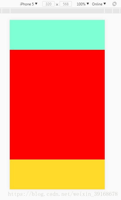
}效果
拿最经典的三段式布局来试验
react代码:
function Head(){
return (
<div className={style.headStyle}></div>
)
}
function Body(){
return (
<div className={style.bodyStyle}></div>
)
}

function Bottom(){
return (
<div className={style.bottomStyle}></div>
)
}

function Content(){
return (
<div className={universal.columnCenter}>
<Head></Head>
<Body></Body>
<Bottom></Bottom>
</div>
)
}

ReactDOM.render(<Content />, document.getElementById('app'))
iphone5
iphone6

iphone6puls


相关文章推荐
- 【web】强大的屏幕适配布局rem响应式 实现一套web代码多端自适应适配
- 【web】强大的屏幕适配布局rem响应式 实现一套web代码多端自适应适配
- 手机端页面自适应解决方案—rem布局
- React Native Flexbox布局
- 移动端自适应rem布局
- React native FlexBox布局的基本用法
- 手机端页面自适应解决方案-rem布局
- React Native系列之flexbox布局详解
- Web布局中的几种宽高自适应
- 手机端页面自适应解决方案—rem布局进阶版
- React Native-4.React Native布局属性练习之flexBox模型实战
- rem是如何实现自适应布局的
- rem是如何实现自适应布局的?
- flex布局无法自动适应的bug以及实现textarea根据内容自适应
- rem自适应布局-移动端自适应必备
- rem是如何实现自适应布局的?
- flex.css,移动端flex布局神器,兼容微信,UC,webview等移动端主流浏览器08.10
- css 一列固定一列自适应布局-flex布局实现
- 【web布局】多个高度一致的子元素按各自宽度比例铺满容器,自适应窗口大小