图片动画汇总-响应式布局_媒体查询
2018-01-06 18:39
423 查看
视频教学:https://www.imooc.com/learn/473
CSS:
<style>
body, figure, figcaption {
margin: 0;
padding: 0;
}
figure {
position: relative;
width: 33.33%;
height: 350px;
overflow: hidden;
float: left;
}
figcaption {
position: absolute;
top: 0px;
left: 0px;
color: #fff;
font-family: "微软雅黑";
}
figure img {
opacity: 0.9;
transition: all 0.35s;
}
figure figcaption p, h2, span, div {
transition: all 0.35s;
}
@media screen and (min-width:1001px) {
figure {
width: 33.33%;
}
}
@media screen and (max-width:600px) {
figure {
width: 100%;
}
}
@media screen and (min-width:601px) and (max-width:1000px) {
figure {
width: 50%;
}
}
.test1 {
background: #000;
}
.test1 figcaption p {
background: #fff;
color: #333;
margin: 5px;
text-align: center;
transform: translate(-120px,0px);
}
.test1 figcaption p:nth-of-type(1) {
transition-delay: 0.05s;
}
.test1 figcaption p:nth-of-type(2) {
transition-delay: 0.1s;
}
.test1 figcaption p:nth-of-type(3) {
transition-delay: 0.15s;
}
.test1 figcaption {
padding: 20px;
}
.test1:hover figcaption p {
transform: translate(0px,0px);
}
.test1:hover img {
transform: translate(-20px,0px);
opacity: 0.5;
}
.test2 {
background: #000;
}
.test2 figcaption {
width: 100%;
height: 100%;
}
.test2 figcaption h2 {
margin-top: 15%;
margin-left: 15%;
}
.test2 figcaption p {
margin-left: 15%;
opacity: 0;
transform: translate(0px,20px);
}
.test2 figcaption div {
border: 2px solid #FFF;
width: 80%;
height: 80%;
position: absolute;
top: 10%;
left: 10%;
transform: translate(0px,-350px) rotate(0deg);
}
.test2:hover figcaption div {
transform: translate(0px,0px) rotate(360deg);
}
.test2:hover img {
opacity: 0.5;
}
.test2:hover figcaption p {
opacity: 1;
transform: translate(0px,0px);
}
.test3 {
background: #000;
}
.test3 figcaption {
top: 30%;
left: 40%;
}
.test3:hover img {
opacity: 0.5;
}
.test3 figcaption h2 {
transform: skew(90deg);
}
.test3:hover figcaption h2 {
transform: skew(0deg);
}
.test3 figcaption p {
transform: skew(90deg);
transition-delay: 0.2s;
}
.test3:hover figcaption p {
transform: skew(0deg);
}
.test4 {
background:#000;
}
.test4 figcaption {
width:100%;
height:100%;
}
.test4 figcaption div {
border: 2px solid #FFF;
width: 80%;
height: 80%;
position: absolute;
top: 10%;
left: 10%;
transform:scale(1.5);
}
.test4 figcaption h2 {
margin-top:10%;
margin-left:15%;
}
.test4 figcaption p {
margin-left:15%;
}
.test4:hover figcaption div{
transform:scale(1);
}
.test4:hover figcaption h2{
transform:scale(0.8);
}
.test4:hover figcaption p{
transform:scale(0.8);
}
.test4:hover img {
transform:scale(1.1);
opacity:0.5;
}
</style>
body:
<body>
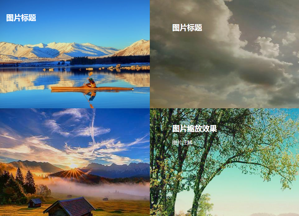
<figure class="test1">
<img src="phto/051552412060.jpg" />
<figcaption>
<h2>图片标题</h2>
<p>图片注解1</p>
<p>图片注解2</p>
<p>图片注解3</p>
</figcaption>
</figure>
<figure class="test2">
<img src="phto/73C58PIC8uq_1024.jpg" />
<figcaption>
<h2>图片标题</h2>
<p>图片注解</p>
<div></div>
</figcaption>
</figure>
<figure class="test3">
4000
<img src="phto/u=159389783,3102223341&fm=214&gp=0.jpg" />
<figcaption>
<h2>倾斜动画</h2>
<p>图片倾斜动画注解</p>
</figcaption>
</figure>
<figure class="test4">
<img src="phto/29358PICQjG_1024.jpg" />
<figcaption>
<h2>图片缩放效果</h2>
<p>图片注解</p>
<div></div>
</figcaption>
</figure>
</body>

相关文章推荐
- 响应式布局:CSS3媒体查询Media Queries
- 响应式布局之媒体查询功能
- 超赞的jQuery图片滑块动画特效代码汇总
- 响应式布局 媒体查询 media query的用法
- 响应式布局之媒体查询
- 创建响应式布局--显示表格数据,使用测量单位,使用媒体查询
- 响应式布局--媒体查询
- CSS3---媒体查询与响应式布局
- css3媒体查询实现网站响应式布局
- 前端性能优化:使用媒体查询加载指定大小的背景图片
- 媒体查询响应式布局
- 超赞的jQuery图片滑块动画特效代码汇总
- 媒体查询——响应式布局
- 响应式布局之媒体查询
- 响应式布局之媒体查询 @media
- 响应式布局 css3 media 媒体查询 和js+rem
- html5中的图片css3Media Queries媒体查询
- CSS@media媒体查询,实现简单的响应式布局
- Android 媒体库图片,音频,视频,文件的查询
- 响应式布局原理,media query媒体查询简单写法