响应式布局--媒体查询
2015-11-05 23:06
316 查看
手机浏览器会将一个标准网页缩小至与设备可视区域(标准技术术语叫做“视口”)恰好匹配。然后用户在自己感兴趣的内容区域上放大浏览
大多数情况下,根据视口大小为用户提供与之匹配的视觉效果还是优先选择
用厂商前缀时,遵循样式表的层叠特性,将无前缀的代码放在最后,这样如果该特性可用,则会覆盖之前的声明
使用CSS的@import指令在当前样式表中按条件引入其他样式表,eg:
@import url("phone.css") screen and (max-width:360px);
使用CSS的@import方式会增加HTTP请求(这会影响加载速度)
媒体查询能检测的一部分特性
创建媒体查询时,最常用的是设备的视口宽度(width)和屏幕宽度(device-width)。
width:视口宽度
height:视口高度
device-width:渲染表面的宽度(对我们来说,就是设备屏幕的宽度)
device-height:同上(设备屏幕的高度)
orientation:检查设备处于横向还是纵向
aspect-ratio:基于视口宽度和高度的宽高比。一个16:9比例的显示屏可以这样定义aspect-ratio:16/9
device-aspect-ratio:基于设备渲染平面宽度和高度的宽高比
color:每种颜色的位数。例如min-color:16会检测设备是否拥有16位颜色
resolution:用来检测屏幕或打印机的分辨率,如min-resolution:300dpi。还可以接受每厘米像素点数的度量值,如min-resolution:118dpcm
上述所有特性中,都可使用min和max前缀来创建一个查询范围
CSS层叠样式表,所谓层叠,就是指样式表中后面的样式会覆盖前面相同的样式(除非前面的样式具有更高的针对性)。可以在样式表的开头设置基本样式,以便适应所有设计,然后使用媒体查询来进一步重写相应的部分
iOS上的Safari浏览器默认是在980像素宽的画布上渲染页面,然后将画布缩小到与视口大小匹配
阻止移动浏览器自动调整页面大小
viewport meta元素覆盖默认的画面缩放设置
<meta name="viewport" content="initial-scale=2.0,width=device-width"/>
content="initial-scale=2.0"的意思是将页面放大两倍,width=device-width告诉浏览器页面的宽度应该等于设备宽度。
<meta>标签还可以控制页面可缩放的范围,下面代码允许用户将页面最多放大至设备宽度的3倍,最下亚索至设备宽度的一半
<meta name="viewport" content="width=device-width,maximum-scale=3,minimum-scale=0.5"/>
禁止用户缩放:
<meta name="viewport" content="initial-scale=1.0,user-scalable=no"/>
user-scalable=no即是禁止缩放
将缩放比例设置为1.0,表示浏览器将按照其视口的实际大小来渲染页面。将宽度设置为设备宽度,意味着支持该特性的浏览器都将会按照设备宽度的实际大小来渲染页面
<meta name="viewport" content="width=device-width,initial-scale=1.0"/>
原来代码结构片段:
<div id="sidebar">
<p>here is the sidebar</p>
</div>
<div id="content">
<p>here is the content</p>
</div>
互换位置后:
<div id="content">
<p>here is the content</p>
</div>
<div id="sidebar">
<p>here is the sidebar</p>
</div>
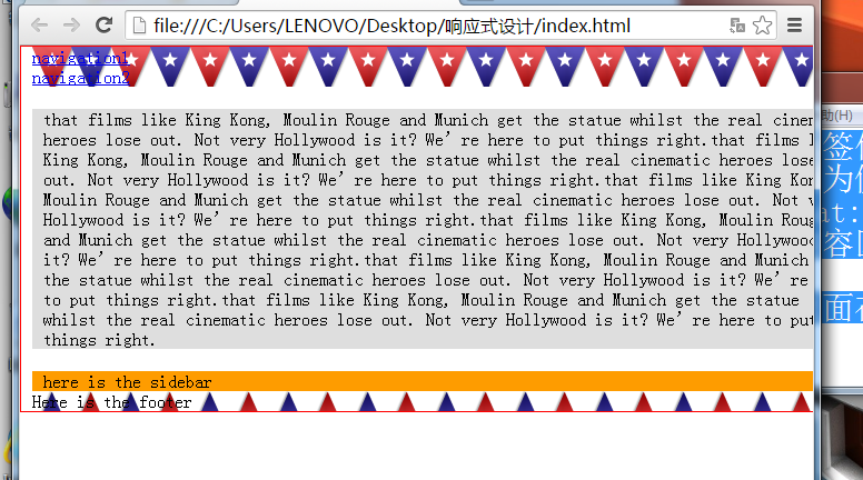
虽然我们互换了标签位置,但页面在大视口中的显示效果没有变化,因为侧边栏和内容区分别使用了float:left和float:right属性。但是在iPad上,则变成了首先显示内容区,下面才是侧边栏
流动布局,保证页面在媒体查询断点之间的显示效果平滑流畅

大多数情况下,根据视口大小为用户提供与之匹配的视觉效果还是优先选择
用厂商前缀时,遵循样式表的层叠特性,将无前缀的代码放在最后,这样如果该特性可用,则会覆盖之前的声明
使用CSS的@import指令在当前样式表中按条件引入其他样式表,eg:
@import url("phone.css") screen and (max-width:360px);
使用CSS的@import方式会增加HTTP请求(这会影响加载速度)
媒体查询能检测的一部分特性
创建媒体查询时,最常用的是设备的视口宽度(width)和屏幕宽度(device-width)。
width:视口宽度
height:视口高度
device-width:渲染表面的宽度(对我们来说,就是设备屏幕的宽度)
device-height:同上(设备屏幕的高度)
orientation:检查设备处于横向还是纵向
aspect-ratio:基于视口宽度和高度的宽高比。一个16:9比例的显示屏可以这样定义aspect-ratio:16/9
device-aspect-ratio:基于设备渲染平面宽度和高度的宽高比
color:每种颜色的位数。例如min-color:16会检测设备是否拥有16位颜色
resolution:用来检测屏幕或打印机的分辨率,如min-resolution:300dpi。还可以接受每厘米像素点数的度量值,如min-resolution:118dpcm
上述所有特性中,都可使用min和max前缀来创建一个查询范围
CSS层叠样式表,所谓层叠,就是指样式表中后面的样式会覆盖前面相同的样式(除非前面的样式具有更高的针对性)。可以在样式表的开头设置基本样式,以便适应所有设计,然后使用媒体查询来进一步重写相应的部分
iOS上的Safari浏览器默认是在980像素宽的画布上渲染页面,然后将画布缩小到与视口大小匹配
阻止移动浏览器自动调整页面大小
viewport meta元素覆盖默认的画面缩放设置
<meta name="viewport" content="initial-scale=2.0,width=device-width"/>
content="initial-scale=2.0"的意思是将页面放大两倍,width=device-width告诉浏览器页面的宽度应该等于设备宽度。
<meta>标签还可以控制页面可缩放的范围,下面代码允许用户将页面最多放大至设备宽度的3倍,最下亚索至设备宽度的一半
<meta name="viewport" content="width=device-width,maximum-scale=3,minimum-scale=0.5"/>
禁止用户缩放:
<meta name="viewport" content="initial-scale=1.0,user-scalable=no"/>
user-scalable=no即是禁止缩放
将缩放比例设置为1.0,表示浏览器将按照其视口的实际大小来渲染页面。将宽度设置为设备宽度,意味着支持该特性的浏览器都将会按照设备宽度的实际大小来渲染页面
<meta name="viewport" content="width=device-width,initial-scale=1.0"/>
原来代码结构片段:
<div id="sidebar">
<p>here is the sidebar</p>
</div>
<div id="content">
<p>here is the content</p>
</div>
互换位置后:
<div id="content">
<p>here is the content</p>
</div>
<div id="sidebar">
<p>here is the sidebar</p>
</div>
虽然我们互换了标签位置,但页面在大视口中的显示效果没有变化,因为侧边栏和内容区分别使用了float:left和float:right属性。但是在iPad上,则变成了首先显示内容区,下面才是侧边栏
流动布局,保证页面在媒体查询断点之间的显示效果平滑流畅
<body>
<div id="wrapper">
<div id="header">
<div id="navigation">
<ul>
<li><a href="#">navigation1</a></li>
</ul><a href="#">navigation2</a></li>
</ul>
</div>
</div>

<div id="content">
<p>that films like King Kong, Moulin Rouge and Munich get the statue whilst the real cinematic heroes lose out. Not very Hollywood is it?
We’re here to put things right.that films like King Kong, Moulin Rouge and Munich get the statue whilst the real cinematic heroes lose out. Not very Hollywood is it?
We’re here to put things right.that films like King Kong, Moulin Rouge and Munich get the statue whilst the real cinematic heroes lose out. Not very Hollywood is it?
We’re here to put things right.that films like King Kong, Moulin Rouge and Munich get the statue whilst the real cinematic heroes lose out. Not very Hollywood is it?
We’re here to put things right.that films like King Kong, Moulin Rouge and Munich get the statue whilst the real cinematic heroes lose out. Not very Hollywood is it?
We’re here to put things right.that films like King Kong, Moulin Rouge and Munich get the statue whilst the real cinematic heroes lose out. Not very Hollywood is it?
We’re here to put things right.</p>
</div>

<div id="sidebar">
<p>here is the sidebar</p>
</div>

<div id="footer">
<p>Here is the footer</p>
</div>
</div>
</body>
*{
padding:0;
margin:0;
}
#wrapper{
margin-right:auto;
margin-left:auto;
width:960px;
border:1px solid red;
}
#header{
margin-right:10px;
margin-left:10px;
width:940px;
background-image:url(images/buntingFW.png);
}
#navigation ul li{
display:inline-block;
}
#sidebar{
margin-right:10px;
margin-left:10px;
float:left;
background-color:#fe9c00;
width:220px;
}
#content{
margin-right:10px;
margin-left:10px;
float:right;
width:700px;
background-color:#dedede;
}
#footer{
margin-right:10px;
margin-left:10px;
clear:both;
background-image:url(images/buntingFWinvert.png);
width:940px;
}

@media screen and (max-width:768px){
#wrapper{
width:768px;
}
#header,#footer,#navigation{
width:748px;
}
#content,#sidebar{
margin-top:20px;
padding-right:10px;
padding-left:10px;
width:728px;
}
}

相关文章推荐
- 线程同步
- hdoj2041(走楼梯 实为Fibonacci数列
- IOS调用WebView加载数据
- [LeetCode] Search Insert Position
- 字符串逆转-压缩连续空格
- 螺旋矩阵
- leetcode55 Jump Game
- Python基础(dict类)
- 统计难题【字典树】
- 统计难题【字典树】
- 设计模式--适配器、代理、装饰、外观模式的区别与联系
- spring+velocity+javamail发送模板邮件
- 发现使用专业服务器租用的好处和优势
- 用IIS配置反向代理实现方法(图文)
- 百度官方分享:让蜘蛛抓取网页的四种方式
- Xcode6工程重命名
- solr配置文件schema.xml解析
- ASP.NET WebAPI 10 Action的选择(二)
- 20150928初步认识数据库
- opencv3 实现模版匹配-matchTemplate函数