react native ScrollView 使用详解
2017-04-18 15:08
806 查看
ScrollView 是一个滚动控件,当内容显示不全时可以通过滚动显示。
属性:
View props… :View的所有属性
contentContainerStyle:内容容器的样式,所有的子视图都会包裹在内容容器内。
horizontal:为true时,横向滚动
keyboardDismissMode :用户拖拽滚动视图的时候,是否要隐藏软键盘。
none(默认值):拖拽时不隐藏软键盘。
on-drag :当拖拽开始的时候隐藏软键盘。
interactive: 软键盘伴随拖拽操作同步地消失,并且如果往上滑动会恢复键盘。安卓设备上 不支持这个选项,会表现的和none一样。
keyboardShouldPersistTaps: 如果当前界面有软键盘,那么点击scrollview后是否收起键盘
never(默认值):点击TextInput以外的子组件会使当前的软键盘收起。此时子元素不会收到点击事件。
always:键盘不会自动收起,ScrollView也不会捕捉点击事件,但子组件可以捕获。
handled:当点击事件被子组件捕获时,键盘不会自动收起。这样切换TextInput时键盘可以保持状态。多数带有TextInput的情况下你应该选择此项。
false:已过期,请使用’never’代替。
true:已过期,请使用’always’代替。
onContentSizeChange:ScrollView内部可滚动内容的视图发生变化时调用,参数为内容视图的宽和高
onScroll:滚动的过程中,每帧最多调用一次此回调函数
refreshControl:可以进行指定RefreshControl组件。这样可以为ScrollView添加下拉刷新的功能.
showsHorizontalScrollIndicator:显示水平滚动条
showsVerticalScrollIndicator:显示垂直滚动条
style:样式属性
Flexbox…
ShadowProp#style…
Transforms…
backfaceVisibility enum(‘visible’, ‘hidden’)
backgroundColor string
borderColor string
borderTopColor string
borderRightColor string
borderBottomColor string
borderLeftColor string
borderRadius number
borderTopLeftRadius number
borderTopRightRadius number
borderBottomLeftRadius number
borderBottomRightRadius number
borderStyle enum(‘solid’, ‘dotted’, ‘dashed’)
borderWidth number
borderTopWidth number
borderRightWidth number
borderBottomWidth number
borderLeftWidth number
opacity number
4000
overflow enum(‘visible’, ‘hidden’)
shadowColor string
shadowOffset {width: number, height: number}
shadowOpacity number
shadowRadius number
pagingEnabled:当值为true时,滚动条会停在滚动视图的尺寸的整数倍位置。这个可以用在水平分页上。默认值为false。比如我们滚动到多余半个屏幕的时候松手,控件会自动滚到下一页的位置。
scrollEnabled:是否可以滚动
scrollTo : (y: number | { x?: number, y?: number, animated?: boolean }, x: number, animated: boolean)
滚动到指定的x, y偏移处。第三个参数为是否启用平滑滚动动画。
scrollToEnd: 滚动到视图底部(水平方向的视图则滚动到最右边)scrollToEnd({animated: true})则启用平滑滚动动画
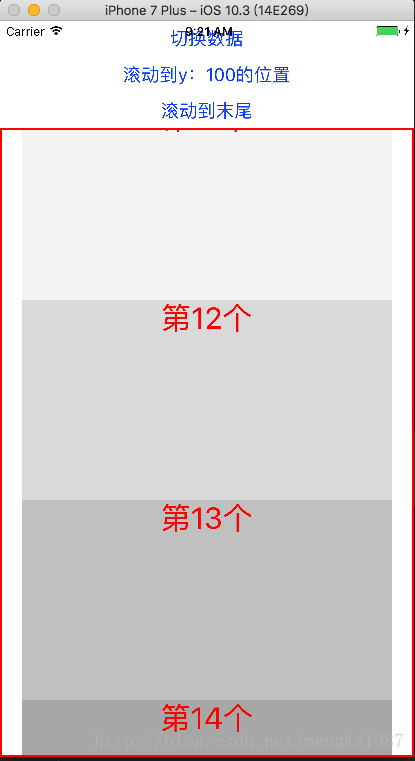
Demo
效果图
github下载地址
属性:
View props… :View的所有属性
contentContainerStyle:内容容器的样式,所有的子视图都会包裹在内容容器内。
horizontal:为true时,横向滚动
keyboardDismissMode :用户拖拽滚动视图的时候,是否要隐藏软键盘。
none(默认值):拖拽时不隐藏软键盘。
on-drag :当拖拽开始的时候隐藏软键盘。
interactive: 软键盘伴随拖拽操作同步地消失,并且如果往上滑动会恢复键盘。安卓设备上 不支持这个选项,会表现的和none一样。
keyboardShouldPersistTaps: 如果当前界面有软键盘,那么点击scrollview后是否收起键盘
never(默认值):点击TextInput以外的子组件会使当前的软键盘收起。此时子元素不会收到点击事件。
always:键盘不会自动收起,ScrollView也不会捕捉点击事件,但子组件可以捕获。
handled:当点击事件被子组件捕获时,键盘不会自动收起。这样切换TextInput时键盘可以保持状态。多数带有TextInput的情况下你应该选择此项。
false:已过期,请使用’never’代替。
true:已过期,请使用’always’代替。
onContentSizeChange:ScrollView内部可滚动内容的视图发生变化时调用,参数为内容视图的宽和高
onScroll:滚动的过程中,每帧最多调用一次此回调函数
refreshControl:可以进行指定RefreshControl组件。这样可以为ScrollView添加下拉刷新的功能.
showsHorizontalScrollIndicator:显示水平滚动条
showsVerticalScrollIndicator:显示垂直滚动条
style:样式属性
Flexbox…
ShadowProp#style…
Transforms…
backfaceVisibility enum(‘visible’, ‘hidden’)
backgroundColor string
borderColor string
borderTopColor string
borderRightColor string
borderBottomColor string
borderLeftColor string
borderRadius number
borderTopLeftRadius number
borderTopRightRadius number
borderBottomLeftRadius number
borderBottomRightRadius number
borderStyle enum(‘solid’, ‘dotted’, ‘dashed’)
borderWidth number
borderTopWidth number
borderRightWidth number
borderBottomWidth number
borderLeftWidth number
opacity number
4000
overflow enum(‘visible’, ‘hidden’)
shadowColor string
shadowOffset {width: number, height: number}
shadowOpacity number
shadowRadius number
pagingEnabled:当值为true时,滚动条会停在滚动视图的尺寸的整数倍位置。这个可以用在水平分页上。默认值为false。比如我们滚动到多余半个屏幕的时候松手,控件会自动滚到下一页的位置。
scrollEnabled:是否可以滚动
scrollTo : (y: number | { x?: number, y?: number, animated?: boolean }, x: number, animated: boolean)
滚动到指定的x, y偏移处。第三个参数为是否启用平滑滚动动画。
scrollToEnd: 滚动到视图底部(水平方向的视图则滚动到最右边)scrollToEnd({animated: true})则启用平滑滚动动画
Demo
import React, {Component} from 'react';
import {
StyleSheet,
View,
Text,
ScrollView,
TextInput,
ToastAndroid,
Button,
} from 'react-native';

export default class ScrollViewDemo extends Component {

state = {
data:['第1个', '第2个', '第3个', '第4个', '第5个', '第6个', '第7个', '第8个', '第9个', '第10个'],
}

_scroll;

render() {
return (
<View style={{flex:1}}>
<Button title='切换数据' onPress={()=>{
this.setState({
data:['第11个', '第12个', '第13个', '第14个', '第15个', '第16个', '第17个', '第18个', '第19个', '第20个','第21个'],
});
}}></Button>
<Button  title='滚动到y:100的位置' onPress={()=>{
this._scroll.scrollTo({y:100});
}}/>
<Button  title='滚动到末尾' onPress={()=>{
this._scroll.scrollToEnd();
}}/>
<ScrollView
ref={(scroll)=>this._scroll = scroll}
style={{borderColor:'red',borderWidth:2}}
contentContainerStyle={{paddingLeft:20,paddingTop:20,paddingRight:20}}
keyboardDismissMode='on-drag'
keyboardShouldPersistTaps='never'
showsVerticalScrollIndicator={true}
scrollEnabled={true}
pagingEnabled={true}
horizontal={false}
onContentSizeChange={(contentWidth, contentHeight)=>{
var msg = 'onContentSizeChange:'+contentWidth+','+contentHeight;
ToastAndroid.show(msg,ToastAndroid.SHORT);
}}
onScroll={(e)=>{
console.warn('onScroll');
}}>
<Text style={{height:50,backgroundColor:'black',color:'white'}}>悬浮在顶部</Text>
<TextInput />

{
this.state.data.map((item, index) => {
var color = index * 23 + 10;
return <Text style={[styles.text,{backgroundColor:color}]}>{item}</Text>
})
}
</ScrollView>
</View>
);
}
}

const styles = StyleSheet.create({
text: {
height: 200,
textAlign: 'center',
textAlignVertical: 'center',
color: 'red',
fontSize: 30
}
})
效果图
github下载地址

相关文章推荐
- react native scrollview深入详解触摸滚动事件
- react native ViewPagerAndroid 使用详解
- react native scrollview深入详解触摸滚动事件
- 【React Native开发】React Native控件之WebView组件详解以及实例使用(22)
- React Native 之 Using a ScrollView
- react-native scrollView 中部分有用事件
- React Native之Redux使用详解之Actions(29)
- React-Native之ViewPagerAndroid的使用
- WebView使用详解(一)——Native与JS相互调用(附JadX反编译)
- React Native按钮详解|Touchable系列组件使用详解
- 混合开发的大趋势之一React Native ScrollView (拉伸视图), ListView(列表视图)
- React-native 之WebView的使用
- 混合开发的大趋势之一React Native ScrollView (拉伸视图),ListView(列表视图)
- react native中使用react-native-viewpager实现的商品展示添加点击事件
- React-Native 之 View使用
- Android中ScrollView和HorizontalScrollView使用详解.
- React Native ScrollView 添加图片数组
- React Native之Redux使用详解之Reducers(30)
- WebView使用详解(一)——Native与JS相互调用(附JadX反编译)
- React Native-12.React Native WebView组件详解