9款基于CSS3 Transitions实现的鼠标经过图标悬停特效
2015-02-05 13:59
1056 查看
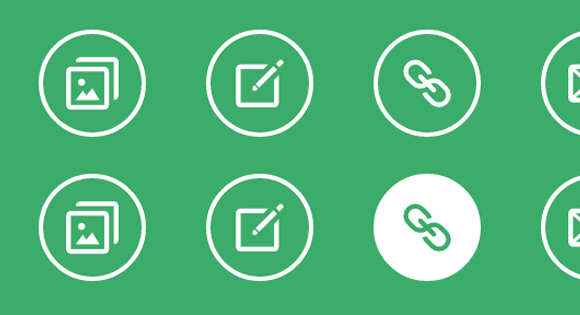
之前给大家分享了很多css3实现的按钮特效。今天给大家分享9款基于CSS3 Transitions实现的鼠标经过图标悬停特效。这款特效适用浏览器:360、FireFox、Chrome、Safari、Opera、傲游、搜狗、世界之窗. 不支持IE8及以下浏览器。效果图如下:
在线预览 源码下载
实现的代码。
html代码:
css3代码:
via:/article/1211348.html
在线预览 源码下载
实现的代码。
html代码:
<div class="hi-icon-wrap hi-icon-effect-1 hi-icon-effect-1a">
<a href="#" class="hi-icon hi-icon-mobile">Mobile</a>
<a href="#" class="hi-icon hi-icon-screen">Desktop</a>
<a href="#" class="hi-icon hi-icon-earth">Partners</a>
<a href="#" class="hi-icon hi-icon-support">Support</a>
<a href="#" class="hi-icon hi-icon-locked">Security</a>
</div>
css3代码:
.hi-icon-effect-6 .hi-icon {
box-shadow: 0 0 0 4px rgba(255,255,255,1);
transition: background 0.2s, color 0.2s;
}

.no-touch .hi-icon-effect-6 .hi-icon:hover {
background: rgba(255,255,255,1);
color: #64bb5d;
}

.no-touch .hi-icon-effect-6 .hi-icon:hover:before {
animation: spinAround 2s linear infinite;
}

@keyframes spinAround {
from {
transform: rotate(0deg)
}
to {
transform: rotate(360deg);
}
}via:/article/1211348.html

相关文章推荐
- 9款基于CSS3 Transitions实现的鼠标经过图标悬停特效
- 基于9款CSS3鼠标悬停相册预览特效
- 30款css3实现的鼠标经过图片显示描述特效
- 30款css3实现的鼠标经过图片显示描述特效
- 一款基于css3非常实用的鼠标悬停特效
- 一款纯css3实现的鼠标经过按钮特效教程
- 一款基于css3鼠标经过圆形旋转特效
- 一款纯css3实现的鼠标经过按钮特效
- 基于css3的鼠标经过动画显示详情特效
- 一款纯css3实现的鼠标经过图片显示描述特效(二)
- css3实现的鼠标经过按钮特效
- 一款基于css3非常实用的鼠标悬停特效
- 30款css3实现的鼠标经过图片显示描述特效
- 基于CSS3和jQuery实现跟随鼠标方位的Hover特效
- 一款纯css3实现的非常实用的鼠标悬停特效演示
- 一款纯css3实现的鼠标经过按钮特效
- css3实现鼠标悬停动画特效
- css3实现的鼠标经过按钮特效
- 30款css3实现的鼠标经过图片显示描述特效
- 一款基于css3鼠标经过圆形旋转特效