Jetpack Compose学习(5)——从登录页美化开始学习布局组件使用
原文:Jetpack Compose学习(5)——从登录页美化开始学习布局组件使用 | Stars-One的杂货小窝
本篇主要讲解常用的布局,会与原生Android的布局控件进行对比说明,请确保了解Android原生基本布局的知识,否则阅读文章会存在有难度
之前我也是在第一篇中的入门实现了一个简单的登录页面,也是有读者评论说我界面太丑了💢
当时入门便是想整的简单些,今天我便是实现美化来学习下布局的相关使用,这位同学看好了哦!😏
本系列以往文章请查看此分类链接Jetpack compose学习
登录页的美化工作
首先,我是先到网上找到了一份比较好看的登录页,地址为登录页|UI|APP界面|喵喵wbh - 原创作品 - 站酷 (ZCOOL),如下图所示

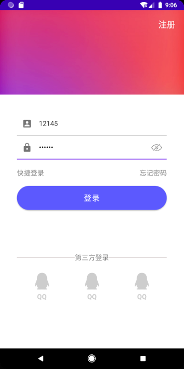
我们照着实现,最终效果是这样的(可能稍微有点不太像,不过应该还凑合看得过去吧!!)
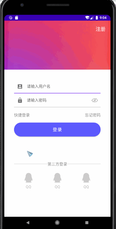
背景图设置和注册按钮
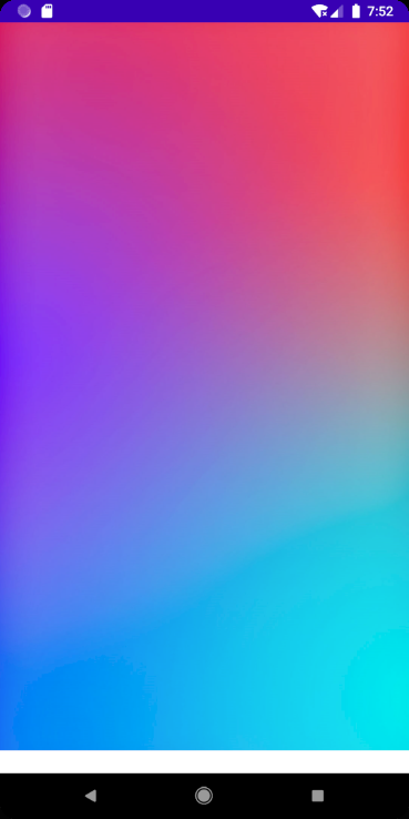
按照UI设计图,我们需要设置背景图,这里compose并不想之前Android原生组件,可以直接设置图片,我是采取的Box布局来实现
Box布局与Frameayout相似,组件会按照顺序从下向上排(z轴方向)
图片由于设计图没给出来,于是我自己随便找了张图片代替
Box(Modifier.fillMaxSize()) {
Image(painter = painterResource(id = R.drawable.bg_login), contentDescription = null)
}
Modifier.fillMaxSize()作用是让布局填充满宽度(与原生中的match_parent同作用)
效果如下图所示
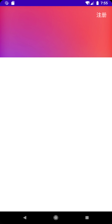
这个时候我们考虑右上角加上有个注册按钮,同时,还需要个白色背景(放输入框和登录按钮等),于是我们可以这样写
Box(Modifier.fillMaxSize()) {
Image(painter = painterResource(id = R.drawable.bg_login), contentDescription = null)
Text(
text = "注册",
color = Color.White,
fontSize = 20.sp,
textAlign = TextAlign.End,
modifier = Modifier
.fillMaxWidth()
.padding(20.dp)
)
Column() {
Spacer(modifier = Modifier.weight(1f))
Column(
modifier = Modifier
.weight(3f)
.background(Color.White)
.padding(40.dp)
.fillMaxWidth()
) {
//后面输入框等组件在这里加,由于代码过长,为了方便阅读,后续贴出的代码都是在这里的代码
}

3ff8
}
}
上述代码,我们将注册的文字设置在右上方,且又加上加上了个Column,这个时候我们是将Column又分成了两个组件,一个是Spacer(占1/4),一个是Column(占3/4)
由于上方是Spacer,其背景色是透明的,所以不会影响展示注册文字按钮(当然这里,我是用的Text组件,其实也可以使用TextButton组件)
效果如下所示
输入框样式调整
接下来我们调整下输入框的样式
val pwdVisualTransformation = PasswordVisualTransformation()
var showPwd by remember {
mutableStateOf(true)
}

val transformation = if (showPwd) pwdVisualTransformation else VisualTransformation.None

Column() {
TextField(
modifier = Modifier.fillMaxWidth(),
value = name,
placeholder = {
Text("请输入用户名")
},
onValueChange = { str -> name = str },
colors = TextFieldDefaults.textFieldColors(backgroundColor = Color.Transparent),
leadingIcon = {
Icon(
imageVector = Icons.Default.AccountBox,
contentDescription = null
)
})
TextField(
value = pwd, onValueChange = { str -> pwd = str },
modifier = Modifier.fillMaxWidth(),
placeholder = {
Text("请输入密码")
},
visualTransformation = transformation,
colors = TextFieldDefaults.textFieldColors(backgroundColor = Color.Transparent),
leadingIcon = {
Icon(
imageVector = Icons.Default.Lock,
contentDescription = null
)
},trailingIcon = {
if (showPwd) {
IconButton(onClick = { showPwd = !showPwd}) {
Icon(painter = painterResource(id = R.drawable.eye_hide), contentDescription =null,Modifier.size(30.dp))
}
} else {
IconButton(onClick = { showPwd = !showPwd}) {
Icon(painter = painterResource(id = R.drawable.eye_show), contentDescription =null,Modifier.size(30.dp))
}
}
}
)
}}
这里设置了输入框的背景色,改为了
Color.Transparent,且给前面设置了一个图标
密码则是有个显示和隐藏密码的开关,具体解释可以看之前文章Jetpack Compose学习(3)——图标(Icon) 按钮(Button) 输入框(TextField) 的使用 | Stars-One的杂货小窝
效果如下图所示

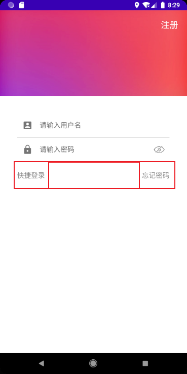
快捷登录与忘记密码
Row(horizontalArrangement = Arrangement.SpaceBetween,modifier = Modifier.fillMaxWidth()) {
Text(text = "快捷登录", fontSize = 16.sp, color = Color.Gray)
Text(text = "忘记密码", fontSize = 16.sp, color = Color.Gray)
}
horizontalArrangement设置Row水平排列方式,取值感觉和前端的Flex布局很相似SpaceBetween的效果是布局里的组件元素左右两边对齐
效果如下
登录按钮
Button(
modifier = Modifier.fillMaxWidth(),
onClick = {
if (name == "test" && pwd == "123") {
Toast.makeText(context, "登录成功", Toast.LENGTH_SHORT).show()
} else {
Toast.makeText(context, "登录失败", Toast.LENGTH_SHORT).show()
}
},
shape = RoundedCornerShape(50),
colors = ButtonDefaults.buttonColors(backgroundColor = Color(0xff5c59fe)),
contentPadding = PaddingValues(12.dp, 16.dp)
) {
Text("登录", color = Color.White, fontSize = 18.sp)
}
登录按钮设置为圆角的按钮,且改变了下颜色
注意: 颜色的设置好像不支持这种类型:
#5c59fe,使用的使用应该这样使用:Color(0xff5c59fe),需要把#替换为0xff
第三方登录
Row(horizontalArrangement = Arrangement.SpaceBetween,verticalAlignment = Alignment.CenterVertically) {
Row(
Modifier
.height(1.dp)
.weight(1f)
.background(Color(0xFFCFC5C5))
.padding(end = 10.dp)){}
Text(text = "第三方登录", fontSize = 16.sp, color = Color.Gray)
Row(
Modifier
.height(1.dp)
.weight(1f)
.background(Color(0xFFCFC5C5))
.padding(start = 10.dp)){}
}

Spacer(modifier = Modifier.height(20.dp))
Row(Modifier.fillMaxWidth(),horizontalArrangement = Arrangement.Center) {
repeat(3){
Column(Modifier.weight(1f),verticalArrangement = Arrangement.Center,horizontalAlignment = Alignment.CenterHorizontally) {
Image(modifier = Modifier.size(50.dp),painter = painterResource(id = R.drawable.qq), contentDescription = null)
Text("QQ", color = Color(0xffcdcdcd), fontSize = 16.sp,fontWeight = FontWeight.Bold)
}
}
}
下面的第三方登录左右两边各有一个横线,我是使用了Row作为线条(compose里也没有组件,这样做应该没啥大问题)
至于底部的布局,每个Item是个Column,并使用居中堆积,且使用了权重平分了外面一个Row布局
这里简单起见,就直接用了个循环(不会告诉你我懒得下图标了)😑
至此,美化的工作就到这里了,下面针对上述出现的布局进行使用的讲解
源码
@Preview(showBackground = true)
@Composable
fun LoginPageDemo() {
var name by remember { mutableStateOf("") }
var pwd by remember { mutableStateOf("") }

val pwdVisualTransformation = PasswordVisualTransformation()
var showPwd by remember {
mutableStateOf(true)
}

val transformation = if (showPwd) pwdVisualTransformation else VisualTransformation.None

ComposeDemoTheme {

Box(Modifier.fillMaxSize()) {
Image(painter = painterResource(id = R.drawable.bg_login), contentDescription = null)
Text(
text = "注册",
color = Color.White,
fontSize = 20.sp,
textAlign = TextAlign.End,
modifier = Modifier
.fillMaxWidth()
.padding(20.dp)
)
Column() {
Spacer(modifier = Modifier.weight(1f))
Column(
modifier = Modifier
.weight(3f)
.background(Color.White)
.padding(40.dp)
.fillMaxWidth()
) {
Column() {
TextField(
modifier = Modifier.fillMaxWidth(),
value = name,
placeholder = {
Text("请输入用户名")
},
onValueChange = { str -> name = str },
colors = TextFieldDefaults.textFieldColors(backgroundColor = Color.Transparent),
leadingIcon = {
Icon(
imageVector = Icons.Default.AccountBox,
contentDescription = null
)
})
TextField(
value = pwd, onValueChange = { str -> pwd = str },
modifier = Modifier.fillMaxWidth(),
placeholder = {
Text("请输入密码")
},
visualTransformation = transformation,
colors = TextFieldDefaults.textFieldColors(backgroundColor = Color.Transparent),
leadingIcon = {
Icon(
imageVector = Icons.Default.Lock,
contentDescription = null
)
}, trailingIcon = {
if (showPwd) {
IconButton(onClick = { showPwd = !showPwd }) {
Icon(
painter = painterResource(id = R.drawable.eye_hide),
contentDescription = null,
Modifier.size(30.dp)
)
}
} else {
IconButton(onClick = { showPwd = !showPwd }) {
Icon(
painter = painterResource(id = R.drawable.eye_show),
contentDescription = null,
Modifier.size(30.dp)
)
}
}
}
)
}
Spacer(modifier = Modifier.height(20.dp))
Row(horizontalArrangement = Arrangement.SpaceBetween,modifier = Modifier.fillMaxWidth()) {
Text(text = "快捷登录", fontSize = 16.sp, color = Color.Gray)
Text(text = "忘记密码", fontSize = 16.sp, color = Color.Gray)
}Spacer(modifier = Modifier.height(20.dp))
Button(
modifier = Modifier
.fillMaxWidth(),
onClick = {
if (name == "test" && pwd == "123") {
Toast.makeText(context, "登录成功", Toast.LENGTH_SHORT).show()
} else {
Toast.makeText(context, "登录失败", Toast.LENGTH_SHORT).show()
}
},
shape = RoundedCornerShape(50),
colors = ButtonDefaults.buttonColors(backgroundColor = Color(0xff5c59fe)),
contentPadding = PaddingValues(12.dp, 16.dp)
) {
Text("登录", color = Color.White, fontSize = 18.sp)
}

Spacer(modifier = Modifier.height(100.dp))
Row(horizontalArrangement = Arrangement.SpaceBetween,verticalAlignment = Alignment.CenterVertically) {
Row(
Modifier
.height(1.dp)
.weight(1f)
.background(Color(0xFFCFC5C5))
.padding(end = 10.dp)){}
Text(text = "第三方登录", fontSize = 16.sp, color = Color.Gray)
Row(
Modifier
.height(1.dp)
.weight(1f)
.background(Color(0xFFCFC5C5))
.padding(start = 10.dp)){}
}
Spacer(modifier = Modifier.height(20.dp))
Row(Modifier.fillMaxWidth(),horizontalArrangement = Arrangement.Center) {
repeat(3){
Column(Modifier.weight(1f),verticalArrangement = Arrangement.Center,horizontalAlignment = Alignment.CenterHorizontally) {
Image(modifier = Modifier.size(50.dp),painter = painterResource(id = R.drawable.qq), contentDescription = null)
Text("QQ", color = Color(0xffcdcdcd), fontSize = 16.sp,fontWeight = FontWeight.Bold)
}
}
}
}
}
}
}
}
布局容器
Box
首先介绍一下Box布局,和FrameLayout的特性一样,是按顺序排的
fun Box(
modifier: Modifier = Modifier,
contentAlignment: Alignment = Alignment.TopStart,
propagateMinConstraints: Boolean = false,
content: @Composable BoxScope.() -> Unit
)
- modifier 修饰符(下一篇讲)
- contentAlignment 内容对齐方式(之前在Image图片使用的时候提过了,详见上一篇)
- propagateMinConstraints 是否应将传入的最小约束传递给内容,不太懂具体是什么效果 😂
Row
Row(
modifier: Modifier = Modifier,
horizontalArrangement: Arrangement.Horizontal = Arrangement.Start,
verticalAlignment: Alignment.Vertical = Alignment.Top,
content: @Composable RowScope.() -> Unit
)
-
horizontalArrangement 子元素的水平方向排列效果
-
verticalAlignmentment 子元素的垂直方向对齐效果
horizontalArrangement
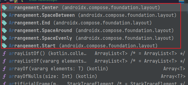
由上述代码提示图片,取值有五种,分别为:
Arrangement.Start
左排列Arrangement.Center
居中排列Arrangement.End
右排列Arrangement.SpaceBetween
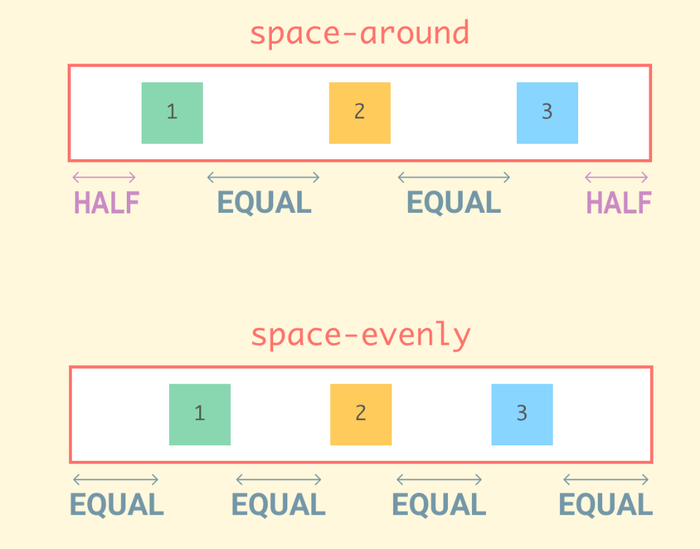
左右对齐排列,最左和最右组件元素靠边Arrangement.SpaceArround
左右对齐排列,最左和左右组件元素有间隔,且间隔相同,中间则是平分Arrangement.SpaceEvenly
左右对齐排列,且各组件元素间距相同
注意:使用此布局也是需要Row布局的宽度并不是自适应的
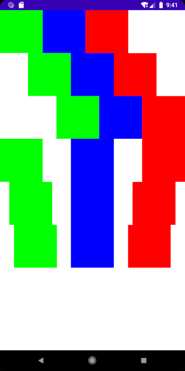
Column() {
Row(horizontalArrangement = Arrangement.Start,modifier = Modifier.fillMaxWidth()) {
Box(
Modifier
.background(Color.Green)
.size(100.dp)) {
}
Box(
Modifier
.background(Color.Blue)
.size(100.dp)) {
}
Box(
Modifier
.background(Color.Red)
.size(100.dp)) {
}
}
Row(horizontalArrangement = Arrangement.Center,modifier = Modifier.fillMaxWidth()) {
Box(
Modifier
.background(Color.Green)
.size(100.dp)) {

16c0
}
Box(
Modifier
.background(Color.Blue)
.size(100.dp)) {
}
Box(
Modifier
.background(Color.Red)
.size(100.dp)) {
}
}
Row(horizontalArrangement = Arrangement.End,modifier = Modifier.fillMaxWidth()) {
Box(
Modifier
.background(Color.Green)
.size(100.dp)) {
}
Box(
Modifier
.background(Color.Blue)
.size(100.dp)) {
}
Box(
Modifier
.background(Color.Red)
.size(100.dp)) {
}
}
Row(horizontalArrangement = Arrangement.SpaceBetween,modifier = Modifier.fillMaxWidth()) {
Box(
Modifier
.background(Color.Green)
.size(100.dp)) {
}
Box(
Modifier
.background(Color.Blue)
.size(100.dp)) {
}
Box(
Modifier
.background(Color.Red)
.size(100.dp)) {
}
}
Row(horizontalArrangement = Arrangement.SpaceAround,modifier = Modifier.fillMaxWidth()) {
Box(
Modifier
.background(Color.Green)
.size(100.dp)) {
}
Box(
Modifier
.background(Color.Blue)
.size(100.dp)) {
}
Box(
Modifier
.background(Color.Red)
.size(100.dp)) {
}
}
Row(horizontalArrangement = Arrangement.SpaceEvenly,modifier = Modifier.fillMaxWidth()) {
Box(
Modifier
.background(Color.Green)
.size(100.dp)) {
}
Box(
Modifier
.background(Color.Blue)
.size(100.dp)) {
}
Box(
Modifier
.background(Color.Red)
.size(100.dp)) {
}
}
}
PS: 感觉和前端的Flex布局很像,这里用文字描述可能不太清楚,可以参考下我的文章CSS Flex 弹性布局使用 | Stars-One的杂货小窝或者参考下Flex布局的学习资料
补充下,Row本身是不支持滚动的(Column同理),但是想要滚动的话,可以使用
Modifier.horizontalScroll()来实现,代码如下
Row(Modifier.horizontalScroll(rememberScrollState())) {
}
Modifier.horizontalScroll()
水平滚动Modifier.verticalScroll()
垂直滚动
注意:compose似乎不支持一个水平滚动嵌套垂直滚动(或垂直滚动中嵌套水平滚动),所以相应布局需要合理设计
此外,提及下,如果想使用像
ListView或
RecyclerView那样的列表组件,在Compose中可以使用
LazyRow或
LazyColumn,这部分内容之后会讲解到,敬请期待
verticalAlignmentment
取值有三个值:
- Alignment.CenterVertically 居中
- Alignment.Top 靠顶部
- Alignment.Bottom 靠底部
与上面一样,布局高度如果是自适应的,则不会有效果
Row(verticalAlignment = Alignment.CenterVertically) {
Box(
Modifier
.background(Color.Green)
.size(100.dp)) {
}
Box(
Modifier
.background(Color.Blue)
.size(100.dp)) {
}
Box(
Modifier
.background(Color.Red)
.size(100.dp)) {
}
}
Column
此布局和Row布局的参数一样,只是名字有所区别,使用方法和上面都一样
- verticalArrangement 垂直方向排列
- horizontalAlignmentment 水平方向对齐
Spacer
Spacer,直接翻译的话,应该是空格,其主要就是充当margin的作用,一般使用
modifier修饰符来设置宽高占位来达到margin效果
Card
官方封装好的Material Design的卡片布局
fun Card(
modifier: Modifier = Modifier,
shape: Shape = MaterialTheme.shapes.medium,
backgroundColor: Color = MaterialTheme.colors.surface,
contentColor: Color = contentColorFor(backgroundColor),
border: BorderStroke? = null,
elevation: Dp = 1.dp,
content: @Composable () -> Unit
)
- shape 形状,使用详见Jetpack Compose学习(3)——图标(Icon) 按钮(Button) 输入框(TextField) 的使用 | Stars-One的杂货小窝
- backgroundColor 背景色
- contentColor 内容的背景色
- border 边框,使用详见Jetpack Compose学习(3)——图标(Icon) 按钮(Button) 输入框(TextField) 的使用 | Stars-One的杂货小窝
- elevation 阴影高度
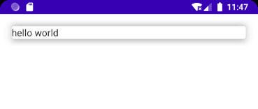
Card(modifier = Modifier.fillMaxWidth().padding(20.dp),elevation = 10.dp) {
Text(text = "hello wo
ad0
rld")
}
效果如下:
参考

- 初步学习JetPack组件——Paging
- Windows窗体编程基础学习:使用 NotifyIcon 组件向任务栏添加应用程序图标
- asp.net 2.0中使用OWC组件学习小结
- 转载 openlayers使用笔记1 从例子开始学习openlayers
- Windows窗体编程基础学习:使用 NotifyIcon 组件向任务栏添加应用程序图标
- 学习YUI.Ext 第四天--开始使用Grid
- 开始学习使用Eclipse
- Android开发之基本组件学习-----------TextView的使用
- javaFx 学习--之组件篇1(边框与布局管理1菜单)
- Ext JS 学习(3) Ext.Window 组件的使用
- cakephp学习:大部分动作使用Auth组件来控制权限,但少部分不用,如何实现?
- Windows窗体编程基础学习:使用 NotifyIcon 组件向任务栏添加应用程序图标
- 今天开始使用这个blog来记录我的学习中遇到的问题吧
- ZendFramework学习第三章(核心组件—访问控制列表ACL的创建并使用)
- ZendFramework学习第三章(核心组件—过滤器之过滤器的使用方法)
- Android布局学习四:layout_weight 的使用
- asp.net 2.0中使用OWC组件学习小结
- 从今天开始使用csdn的blog开始记录学习历程
- 开始学习VS2005使用winpcap
- 开始学习LUA,在LUA中使用UNICODE字符串