如何在UI设计中制作完美阴影
重点 (Top highlight)
Shadows are everywhere in modern UI Designs. They are one of the most essential part of the UI elements right behind the fill, stroke, and cornder radius. 😉
现代UI设计中到处都有阴影。 它们是UI元素中最重要的部分之一,紧随填充,笔触和Cornder半径之后。 😉
Completely flat design is no longer a significant trend. With this short tutorial, you will learn how to create stunning shadows for your cards, buttons, or whatever UI control you want.
完全扁平化的设计已不再是一个重要趋势。 通过这个简短的教程, 您将学习如何为卡片,按钮或所需的任何UI控件创建惊人的阴影 。
So, grab the mug of your favorite coffee, and let me show you 6 easy steps for impressive shadows!
因此,拿起您最喜欢的咖啡的杯子,让我向您展示6个简单的步骤即可获得令人印象深刻的阴影!
1.不要使用阴影默认值 (1. Do not use shadow defaults)
It does not matter if you use Sketch, Figma, or Adobe XD. All default shadow presents from design tools are awful. Do not use them! If you want to make them look clean and modern, you always have to modify their appearance.
使用Sketch,Figma或Adobe XD都没有关系。 设计工具提供的所有默认阴影效果都很糟糕。 不要使用它们! 如果要使它们看起来干净现代,则必须始终修改其外观。
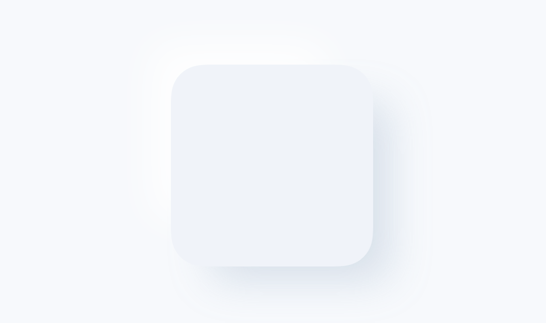
 Defaults, bleh… 默认值,令人沮丧…
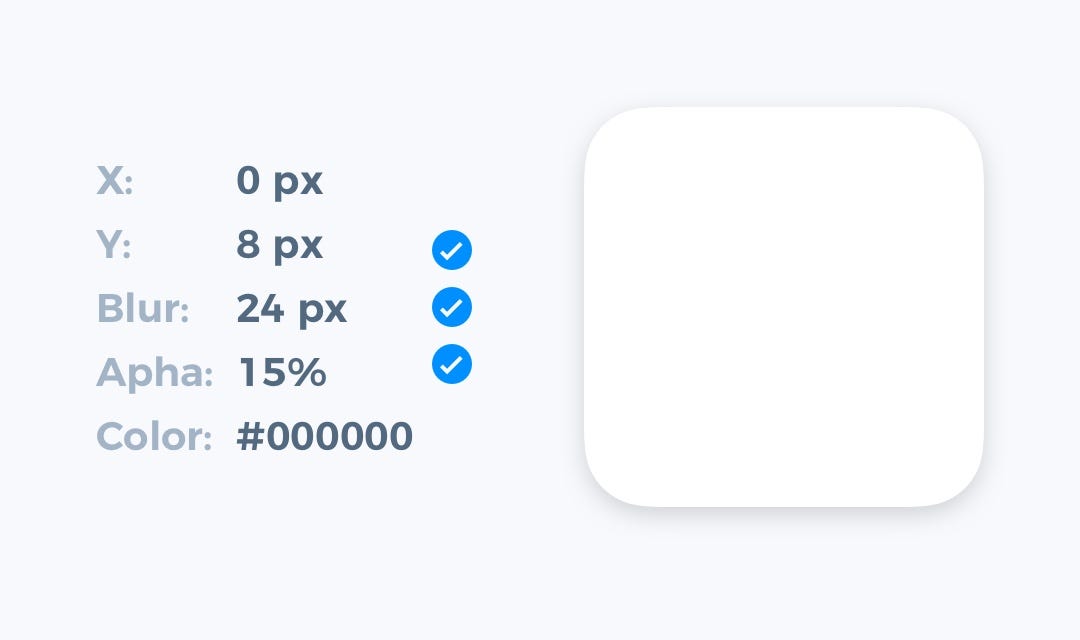
 2.使阴影看起来柔和 (2. Make Shadows Look Soft)
Most of the nice shadows are the soft ones. To enhance their look — lower opacity (10–30%) and set the higher level of blur (16px-40px). Now look at your shadow — this setup instantly improved its appearance.
大多数漂亮的阴影是柔和的阴影。 要增强外观-降低不透明度(10–30%),并设置更高的模糊度(16px-40px)。 现在查看您的阴影-此设置可立即改善其外观。
 This is nicer… 更好…
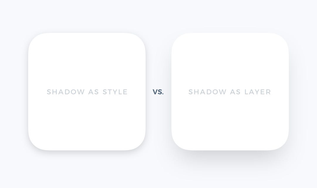
 3.考虑将阴影创建为带有模糊的图层 (3. Consider Creating Shadows As a Layer with Blur)
Standard shadow style is easier to implement, but if you would like to stand out, try to make a separate layer with a blur as a shadow. Thanks to this technique, you will gain more control over the shadow position and its size.
标准阴影样式更易于实现,但是如果您想脱颖而出,请尝试使用模糊作为阴影来制作单独的图层。 借助此技术,您将可以更好地控制阴影位置及其大小。
I know… developers may hate this technique, but you may help them with this site! 😎
我知道……开发人员可能讨厌这种技术,但是您可以在此站点上为他们提供帮助 ! 😎
 Did you know that trick? 你知道那个把戏吗?
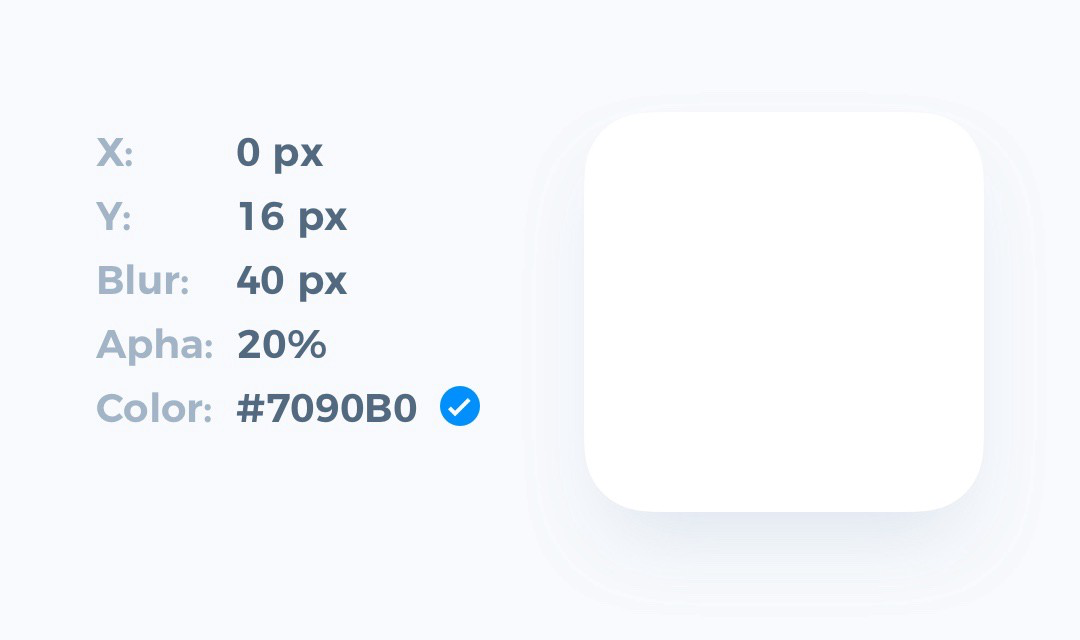
 4.使阴影颜色更自然 (4. Make shadow color more natural)
100% pure grey never looks good (except pure black-white theme). Look, the real-world shadows always got a subtle color. Add the tone of your UIs neutral color to the shadow, and it will look much better.
100%纯灰色永远看起来都不错(纯黑白主题除外)。 看,真实世界的阴影总是带有微妙的颜色。 将您的UI中性色调添加到阴影中,它将看起来更好。
 And just a little dose of color… 还有一点点颜色……
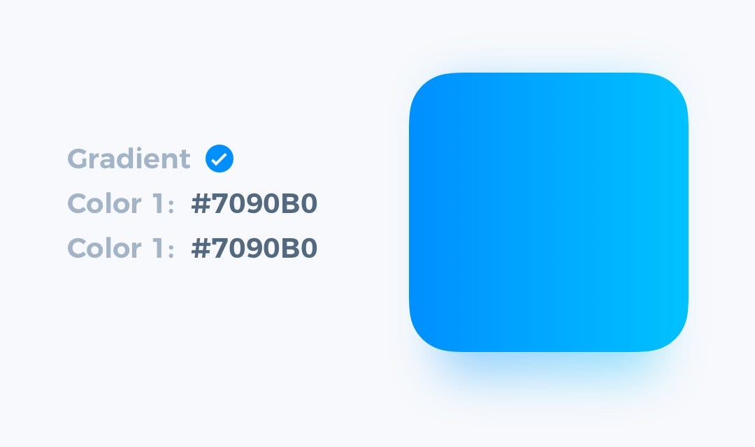
 5.使材料颜色为阴影 (5. Make Material Colors As Shadow)
Look at some materials from the real-world, especially semi-transparent ones. Their shadows inherit the color of the object. You may use these tones to create the illustration of that type of material. It will look fresh!
看一下真实世界中的一些材料,尤其是半透明的材料。 它们的阴影继承了对象的颜色。 您可以使用这些色调创建该类型材料的图示。 看起来很新鲜!
6.从现实世界中激发自己 (6. Inspire yourself from the real world)
The example from the above is just a beginning. Observehow other objects and materials interact with the lighting. See how they cast shadows — colors, blurs, angle. Remarkable results start with a spark of inspiration.
以上示例只是一个开始。 观察其他物体和材料如何与照明交互。 了解他们如何投射阴影-颜色,模糊,角度。 出色的结果始于灵感的火花。
总结一下。 (To conclude.)
This 6 easy to apply steps will move your shadows to the next level. When you apply the simple tricks, repeat, and adjust them to your projects, you will notice how the quality of your work enhances.
这6个易于应用的步骤将使您的阴影更上一层楼。 当您应用简单的技巧 ,重复这些技巧并将其调整到您的项目中时,您会注意到工作质量如何提高。
If you found the tutorial useful, share it to let your friends know how to make their UI better!
如果您觉得本教程有用,请与他人分享,以使您的朋友知道如何改善他们的UI!
This article is an extension of my blog post ✍️, which has its origin in the Instagram tutorial 📷.
本文是我的博客文章 ✍️的扩展,其起源于Instagram教程 📷。
Thanks for reading!
谢谢阅读!
翻译自: https://blog.prototypr.io/how-to-make-perfect-shadows-in-ui-design-2773e32074da

- ArcGIS教程:ArcGIS实用制图技巧——如何制作“阴影”效果
- 杭州UI设计新手如何制作出别具特色的作品集
- 如何制作出一个完美的网站
- 教你如何用PS制作多款按钮UI设计教程
- ArcGIS实用制图技巧——如何制作“阴影”效果
- 如何制作完美消音伴奏
- 如何制作一个完美的全屏视频H5
- 【原创】[PS技巧]如何制作翘角纸条的阴影效果
- 如何制作完美消音伴奏
- PPT中如何制作两圆交叉阴影图
- Visual C# 2005 - 如何制作多变化字体之阴影字
- Delphi 如何制作带阴影窗体
- Visual C# 2005 - 如何制作多变化字体之阴影字
- 如何制作EDM邮件营销模板之图片注意事项
- windowsxp主题包教大家如何制作windows7主题包
- 如何制作android的开机动画botanimation.zip
- 如何制作高水平简历?&& 制作简历时需要注意的问题
- 如何给边框添加阴影效果:box-shadow
- 帝国CMS教程:如何制作手机网站
- 如何制作高清视频并传到酷6