评估分类器模型性能
It’s 4am and you’re on your seventh coffee. You’ve trawled the forums to find the most sophisticated model you can. You’ve set up your preprocessing pipeline and you’ve picked your hyperparameters. Now, time to evaluate your model’s performance.
现在是凌晨4点,您正在喝第七杯咖啡。 您已经在论坛上进行了搜索,找到了可以找到的最复杂的模型。 您已经建立了预处理管道,并选择了超参数。 现在,该评估模型的性能了。
You’re shaking with excitement (or it could be the caffeine overdose). This is it — your big debut onto the Kaggle world stage. As your predictions are being submitted, your thoughts turn to what you’re going to do with the prize money. A Lamborghini or a Ferrari? And in what colour? The red goes best with cream upholstery, but at the same time…
您正在兴奋地颤抖(或者可能是咖啡因过量)。 就是这样-您首次登上Kaggle世界舞台。 在提交您的预测时,您的想法转向了您将要使用的奖金。 兰博基尼还是法拉利? 什么颜色? 红色最适合搭配奶油色内饰,但同时…
The leader board pops up on your screen as if to announce something.
排行榜会在屏幕上弹出,好像要宣布某件事一样。
Your model performance has gotten worse. You sit in silence for what seems like an age.
您的模型性能变得更差。 你沉默了一个年龄。
Eventually, you sigh, close your laptop lid, and go to bed.
最终,您叹了口气,合上笔记本电脑的盖子,然后上床睡觉。
If you’ve tried building a model before, you’ll know that it’s an iterative process. Progress isn’t linear — there can be long periods where it seems like you’re getting no closer to your objective, or even going backwards — until that breakthrough occurs and you surge forward… and right into the next problem.
如果您曾经尝试过构建模型,那么您将知道这是一个迭代过程。 进度不是线性的-在很长一段时间内,您似乎离目标越来越近,甚至倒退-直到出现突破并向前迈进……然后进入下一个问题。
Monitoring model performance on a validation set is an excellent way to get feedback on whether what you’re doing is working. It’s also a great tool for comparing two different models — ultimately, our aim is to build better, more accurate models that will help us make better decisions in real world applications. When we’re trying to communicate the value of a model to a stakeholder in a particular situation, they’re going to want to know why they should care: what’s in it for them? How is it going to make their life easier? We need to be able to compare what we’ve built to the systems that are already in place.
监视验证集上的模型性能是获得有关您正在执行的操作是否正常的反馈的绝佳方法。 它也是比较两个不同模型的好工具-最终,我们的目标是建立更好,更准确的模型,以帮助我们在现实世界的应用程序中做出更好的决策。 当我们试图在特定情况下向利益相关者传达模型的价值时,他们会想知道为什么他们应该关心:对他们来说有什么意义? 如何使他们的生活更轻松? 我们需要能够将我们所构建的内容与已经存在的系统进行比较。
Evaluating model performance can tell us if our approach is working — this turns out to be helpful. We can continue to explore and see how far we can push our existing conceptualisation of the problem we’re working on. It can also tell us if our approach isn’t working — this turns out to be even more helpful because if our adjustments are making the model worse at what it’s supposed to be doing, then it indicates that we may have misunderstood our data or the situation being modelled.
评估模型性能可以告诉我们我们的方法是否有效—事实证明这是有帮助的。 我们可以继续探索,看到我们可以将我们现有的问题概念推进多远。 它还可以告诉我们我们的方法是否不起作用-事实证明它会更加有用,因为如果我们的调整使模型在应做的事情上变得更糟,则表明我们可能误解了我们的数据或情况正在建模。
So evaluation of model performance is useful — but how exactly do you do it?
因此,对模型性能的评估非常有用-但是您如何做到这一点呢?
通过示例进行探索 (Exploring by way of an example)
For the moment, we are going to concentrate on a particular class of model — classifiers. These models are used to put unseen instances of data into a particular class — for example, we could set up a binary classifier (two classes) to distinguish whether a given image is of a dog or a cat. More practically, a binary classifier could be used to decide whether an incoming email should classified as spam, whether a particular financial transaction is fraudulent, or whether a promotional email should be sent to a particular customer of an online store based on their shopping history.
目前,我们将专注于特定类别的模型-分类器。 这些模型用于将看不见的数据实例放入特定的类中-例如,我们可以设置一个二进制分类器 (两个类)来区分给定图像是狗还是猫。 更实际地,可以使用二进制分类器来确定传入的电子邮件是否应分类为垃圾邮件,特定的金融交易是否为欺诈行为,或者是否应基于购物历史将促销电子邮件发送给在线商店的特定客户。
The techniques and metrics used to assess the performance of a classifier will be different from those used for a regressor, which is a type of model that attempts to predict a value from a continuous range. Both types of model are common, but for now, let’s limit our analysis to classifiers.
用于评估分类器性能的技术和指标将与用于回归器的技术和指标不同, 回归器是一种试图从连续范围预测值的模型。 两种类型的模型都很常见,但是现在,让我们将分析范围限于分类器。
To illustrate some of the important concepts, we’ll set up a simple classifier that predicts whether an image of a particular image is a seven or not. Let’s use the famous NMIST dataset to train and test our model.
为了说明一些重要概念,我们将建立一个简单的分类器,以预测特定图像的图像是否为7。 让我们使用著名的NMIST数据集来训练和测试我们的模型。
(If you want to see the full Python code or follow along at home, check out the notebook used to produce this work on GitHub!)
(如果您想查看完整的Python代码或在家中学习,请查看用于在GitHub上进行此项工作的笔记本 !)
Below, we use Scikit-Learn to download our data and to build our classifier. First, import NumPy for maths and Matplotlib for plotting:
下面,我们使用Scikit-Learn下载数据并构建分类器。 首先,导入用于数学的NumPy和用于绘图的Matplotlib:
# Import modules for maths and plotting
import numpy as np
import matplotlib.pyplot as plt
import matplotlib.style as style
style.use(‘seaborn’)
Then, use scikit-learn’s built-in helper function to download the data. The data comes as a dictionary — we can use the “data” key to access instances of training and test data (the images of the digits) and the “target” key to access the labels (what the digits have been hand-labelled as).
然后,使用scikit-learn的内置帮助器功能下载数据。 数据以字典的形式出现-我们可以使用“数据”键访问训练和测试数据的实例(数字的图像),并使用“目标”键访问标签(数字被手工标记为)。
# Fetch and load data
from sklearn.datasets import fetch_openmlmnist = fetch_openml(“mnist_784”, version=1)
mnist.keys()# dict_keys(['data', 'target', 'frame', 'categories', 'feature_names', 'target_names', 'DESCR', 'details', 'url'])
The full dataset contains a whopping 70,000 images — let’s take a subset of 10% of the data to make it easier to quickly train and test our model.
完整的数据集包含多达70,000张图像-让我们抽取10%的数据子集,以便更轻松地快速训练和测试我们的模型。
# Extract features and labels
data, labels = mnist[“data”], mnist[“target”].astype(np.uint8)# Split into train and test datasets
train_data, test_data, train_labels, test_labels = data[:6000], data[60000:61000], labels[:6000], labels[60000:61000]
Now, let’s briefly inspect the first few digits in our training data. Each digit is actually represented by 784 values from 0 to 255, which represent how dark each pixel in a 28 by 28 grid should be. We can easily reshape the data into a grid and plot the data using matplotlib’s imshow() function:
现在,让我们简要检查一下训练数据中的前几位。 每个数字实际上由784个从0到255的值表示,这些值表示28 x 28网格中每个像素应有多暗。 我们可以轻松地将数据重塑为网格并使用matplotlib的imshow()函数绘制数据:
# Plot a selection of digits from the dataset
example_digits = train_data[9:18]# Set up plotting area
fig = plt.figure(figsize=(6,6))# Set up subplots for each digit — we’ll plot each one side by side to illustrate the variation
ax1, ax2, ax3 = fig.add_subplot(331), fig.add_subplot(332), fig.add_subplot(333)
ax4, ax5, ax6 = fig.add_subplot(334), fig.add_subplot(335), fig.add_subplot(336)
ax7, ax8, ax9 = fig.add_subplot(337), fig.add_subplot(338), fig.add_subplot(339)
axs = [ax1, ax2, ax3, ax4, ax5, ax6, ax7, ax8, ax9]# Plot the digits
for i in range(9):

 ax = axs[i]
 ax.imshow(example_digits[i].reshape(28, 28), cmap=”binary”)
 ax.set_xticks([], [])
 ax.set_yticks([], [])
 A sample of nine digts from our dataset 来自我们数据集中的九位数的样本
 Now, let’s create a new set of labels — we are only interested at the moment in whether an image of a seven or not. Once that’s done, we can train a model to hopefully pick up the characteristics that make a digit “seven-y”:
现在,让我们创建一组新的标签-目前,我们仅关注图像是否为七个。 一旦完成,我们就可以训练一个模型来希望获得使数字变成“七年制”的特征:
# Create new labels based on whether a digit is a 7 or not
train_labels_7 = (train_labels == 7)
test_labels_7 = (test_labels == 7)# Import, instantiate and fit model
from sklearn.linear_model import SGDClassifiersgd_clf_7 = SGDClassifier(random_state=0)
sgd_clf_7.fit(train_data, train_labels_7)# Make predictions using our model for the nine digits shown above
sgd_clf_7.predict(example_digits)# array([False, False, False, False, False, False,  True, False, False])
For our model, we’ve used an SGD (or Stochastic Gradient Descent) classifier. And for our array of nine example digits, it looks like our model is doing the right kind of thing — it has correctly identified the one seven from the eight other not-sevens. Let’s make predictions on our data using 3-fold cross-validation:
对于我们的模型,我们使用了SGD (或随机梯度下降 )分类器。 对于由9个示例数字组成的数组,看起来我们的模型正在做正确的事情-它已正确地从其他8个非7位中识别出7个。 让我们使用三重交叉验证对数据进行预测:
from sklearn.model_selection import cross_val_predict# Use 3-fold cross-validation to make “clean” predictions on our training data
train_data_predictions = cross_val_predict(sgd_clf_7, train_data, train_labels_7, cv=3)train_data_predictions# array([False, False, False, ..., False, False, False])
Ok — now we have a set of predictions for each instance in our training set. It may sound strange that we are making predictions on our training data, but we avoid making predictions on data the model has already been trained on by using cross-validation — follow the link to learn more.
好的-现在我们对训练集中的每个实例都有一组预测。 我们正在对训练数据进行预测可能听起来很奇怪,但是我们避免通过使用交叉验证对已经对模型进行过训练的数据进行预测-请单击链接以了解更多信息。
真假肯定/假肯定 (True and false positives/negatives)
At this point, let’s take a step back and think about the different situations we might find ourselves in for a given model prediction.
在这一点上,让我们退后一步,考虑对于给定的模型预测我们可能会遇到的不同情况。
- The model may predict a 7, and the image is actually a 7 (true positive); 该模型可以预测为7,而图像实际为7(真正)。
- The model may predict a 7, and the image is actually not a 7 (false positive); 该模型可以预测7,而图像实际上不是7(假阳性)。
- The model may predict a not-7, and the image is actually a 7 (false negative); and 该模型可能会预测为not-7,而图像实际上是7(假阴性); 和
- The model may predict a not-7, and the image is actually not a 7 (true negative). 该模型可能会预测为not-7,而图像实际上不是7(真负)。
We use the terms true/false positive (TP/FP) and true/false negative (TN/FN) to describe each of the four possible outcomes listed above. The true/false part refers to whether the model was correct or not. The positive/negative part refers to whether the instance being classified actually was or was not the instance we wanted to identify.
我们使用术语“真/假阳性”(TP / FP)和“真/假阴性”(TN / FN)来描述上述四种可能的结果。 正确/错误部分是指模型是否正确。 正/负部分指的是被分类的实例实际上是否是我们想要识别的实例。
A good model will have a high level of true positive and true negatives, because these results indicate where the model has got the right answer. A good model will also have a low level of false positives and false negatives, which indicate where the model has made mistakes.
一个好的模型将具有很高的真实肯定率和真实否定率,因为这些结果表明该模型在哪里得到了正确的答案。 好的模型还将具有较低的误报率和误报率,这表明模型在哪里犯了错误。
These four numbers can tell us a lot about how the model is doing and what we can do to help. Often, it’s helpful to represent them as a confusion matrix.
这四个数字可以告诉我们很多有关模型的运行方式以及我们可以提供帮助的内容。 通常,将它们表示为混淆矩阵会很有帮助。
混淆矩阵 (Confusion matrix)
We can use sklearn to easily extract the confusion matrix:
我们可以使用sklearn轻松提取混淆矩阵:
from sklearn.metrics import confusion_matrix# Show confusion matrix for our SGD classifier’s predictions
confusion_matrix(train_labels_7, train_data_predictions)# array([[5232,  117],
         [  72,  579]], dtype=int64)
The columns of this matrix represent what our model has predicted — not-7 on the left and 7 on the right. The rows represent what each instance that the model predicted actually was — not-7 on the top and 7 on the bottom. The number in each position tells us the number of each situation that was observed when comparing our predictions to the actual results.
该矩阵的列表示我们的模型所预测的结果-左边不是7,右边是7。 这些行代表模型实际预测的每个实例的内容-顶部不是7,底部是7。 每个位置的数字告诉我们在将我们的预测与实际结果进行比较时观察到的每种情况的数量。
So in summary, out of 6,000 test cases, we observed (considering a “positive” result as being a 7 and a “negative” one being some other digit):
因此,总而言之,在6,000个测试用例中,我们观察到了(将“正”结果设为7,将“负”结果设为其他数字):
- 579 predicted 7s that were actually 7s (TPs); 579个预测的7s实际上是7s(TP);
- 72 predicted not-7s that were actually 7s (FNs); 72个预测的非7s实际上是7s(FNs);
- 117 predicted 7s that were actually not-7s (FPs); and 117个预测的7s实际上不是7s(FP); 和
- 5,232 predicted not-7s that were actually not-7s (TNs). 5,232个预测的非7s实际上不是7s(TN)。
You may have noticed that ideally our confusion matrix would be diagonal — that is, only consisting of true positives and true negatives. The fact that our classifier seems to be struggling more with false positives than false negatives gives us useful information when deciding how we should proceed to improve our model further.
您可能已经注意到,理想情况下,我们的混淆矩阵将是对角线的-也就是说,仅由正值和负值组成。 当我们决定如何着手进一步改进模型时,分类器似乎更多地在假阳性而不是假阴性方面苦苦挣扎,这一事实为我们提供了有用的信息。
精度和召回率 (Precision and recall)
 Photo by Markus Spiske on Unsplash Markus Spiske在Unsplash上拍摄的照片
 We can use the information encoded in the confusion matrix to calculate some further useful quantities. Precision is defined as the number of true positives as a proportion of all (true and false) positives. Effectively, this number represents how many of the model’s positive predictions actually turned out to be right.
我们可以使用混淆矩阵中编码的信息来计算一些其他有用的量。 精度定义为真实阳性的数量占所有(真实和错误)阳性的比例。 实际上,这个数字代表实际上有多少个模型的肯定预测是正确的。
For our model above, the precision is 579 / (579 + 117) = 83.2%. This means that out of all the digits we predicted to be 7s in our dataset, only 83.2% were actually 7s.
对于上述模型,精度为579 /(579 + 117)= 83.2%。 这意味着在我们预测的数据集中所有数字为7s中,只有83.2% 实际上是 7s。
However, precision must also be considered in tandem with recall. Recall is defined as the number of true positives as a proportion of both true positives and false negatives. Remember that both true positives and false negatives relate to cases where the digit being considered actually was a 7. So in summary, recall represents how good the model is at correctly identifying positive instances.
但是,精度也必须与召回一起考虑。 召回率定义为真阳性与真阴性和假阴性的比例。 请记住,正确肯定和错误否定都与实际考虑的数字为7的情况有关。因此,总而言之,召回率代表模型在正确识别肯定实例方面的表现。
For our model above, the recall is 579 / (579 + 72) = 88.9%. In other words, our model only caught 88.9% of the digits that were actually 7s.
对于上述模型,召回率为579 /(579 + 72)= 88.9%。 换句话说,我们的模型只捕获了88.9%的数字,实际上是7s。
We can also save ourselves from having to calculate these quantities manually by getting them directly from our model:
通过直接从我们的模型中获取这些数量,我们还可以避免手动计算这些数量:
from sklearn.metrics import precision_score, recall_score# Calculate and print precision and recall as percentages
print(“Precision: “ + str(round(precision_score(train_labels_7, train_data_predictions)*100,1))+”%”)print(“Recall: “ + str(round(recall_score(train_labels_7, train_data_predictions)*100,1))+”%”)# Precision: 83.2%
# Recall: 88.9%
We can set a desired level of precision or recall by playing about with the threshold of the model. In the background, our SGD classifier has come up with a decision score for each digit in the data which corresponds to how “seven-y” a digit is. Digits that appear to be very seven-y will have a higher score. Digits that the model doesn’t think look like sevens at all will have a low score. Ambiguous cases (perhaps poorly drawn sevens that look a bit like ones) will be somewhere in the middle. All digits with a decision score above the model’s threshold will be predicted to be 7s, and all those with scores below the threshold will be predicted as not-7s. Hence, if we want to increase our recall (and increase the number of 7s that we successfully identify) we can lower the threshold. By doing this, we are effectively saying to the model, “Lower your standards for identifying sevens a bit”. We will then catch more of the ambiguous sevens, the proportion of the actual 7s in the data that we correctly identify will increase, and our recall will go up. In addition to increasing the number of TPs, we will also lower the number of FNs — 7s that were previously mistakenly identified as not-7s will start to be correctly identified.
我们可以通过模拟模型的阈值来设置所需的精度或召回率 。 在后台,我们的SGD分类器为数据中的每个数字提供了一个决策分数 ,该分数对应于数字的“七位数”。 看起来非常七位数的数字将获得更高的分数。 该模型认为根本不像7的数字得分较低。 模棱两可的情况(也许是画得不好的七点形看上去有点像个七分之一)将位于中间。 决策得分高于模型阈值的所有数字将被预测为7s,得分低于阈值的所有数字将被预测为非7s。 因此,如果我们想增加召回率(并增加成功识别的7位数),可以降低阈值。 通过这样做,我们有效地对模型说:“降低识别七位数的标准”。 然后,我们将捕获更多不明确的7,在我们正确识别的数据中实际7所占的比例将增加,并且召回率将上升。 除了增加TP的数量外,我们还将减少FN的数量-以前被错误地识别为not-7的7s将开始被正确识别。
You may have noticed, however, that in reducing the threshold, we are likely to now misclassify more not-7s. That one which was drawn to look a bit like a seven may now be predicted incorrectly to be a 7. Hence, we will start to get an increasing number of false positive results and our precision will trend downwards as our recall increases. This is the precision–recall trade-off. You can’t have your cake and eat it too. The best models will be able to strike a good balance between the two so that both precision and recall are at an acceptable level.
但是,您可能已经注意到,在降低阈值时,我们现在可能会误分类更多非7分。 现在被误认为是7的那个现在可能被错误地预测为7。因此,我们将得到越来越多的假阳性结果,并且随着召回率的提高 , 我们的精度将趋于下降。 这是精度-召回权衡。 你不能吃蛋糕也不能吃。 最好的模型将能够在两者之间取得良好的平衡,从而使精度和召回率都处于可接受的水平。
What level of precision and recall constitutes “acceptable”? That depends on how the model is going to be applied. If the consequences of failing to identify a positive instance are severe, for example, if you were a doctor aiming to detect the presence a life-threatening disease, you may be willing to suffer a few more false positives (and send some people who don’t have the disease for some unnecessary further tests) to reduce false negatives (a circumstance under which someone would not receive the life-saving treatment they need). Similarly, if you had a situation in which it was necessary to be very confident in your positive predictions, for example, if you were choosing a property to purchase or picking a location for a new oil well, you may be happy to pass up a few opportunities (ie have your model predict a few more false negatives) if it means that you are less likely to invest time and money as a result of a false positive.
精度和召回率的多少构成“可接受的”? 这取决于如何应用模型。 如果未能识别出阳性病例的后果很严重,例如,如果您是一位旨在检测存在威胁生命的疾病的医生,那么您可能愿意遭受更多的假阳性(并派遣一些无需进行一些不必要的进一步检查就可以避免这种疾病),以减少假阴性(在这种情况下,某人将无法获得所需的挽救生命的治疗)。 同样,如果您有必要对自己的积极预测非常自信,例如,如果您选择购买物业或选择新油井的位置,您可能很乐意放弃如果这意味着您不太可能由于误报而浪费时间和金钱,则机会很少(即您的模型预测了更多的误报)。
可视化精确度-召回权衡 (Visualising the precision–recall trade-off)
We can observe how precision and recall vary with the decision threshold (for the calculation of our metrics above, scikit-learn has used a threshold of zero):
我们可以观察到精度和召回率如何随决策阈值而变化(对于上述指标的计算,scikit-learn使用的阈值为零):
# Use cross_val_predict to get our model’s decision scores for each digit it has predicted
train_data_decision_scores = cross_val_predict(sgd_clf_7, train_data, train_labels_7, cv=3,
 method=”decision_function”)from sklearn.metrics import precision_recall_curve# Obtain possible combinations of precisions, recalls, and thresholds
precisions, recalls, thresholds = precision_recall_curve(train_labels_7, train_data_decision_scores)# Set up plotting area
fig, ax = plt.subplots(figsize=(12,9))# Plot decision and recall curves
ax.plot(thresholds, precisions[:-1], label=”Precision”)
ax.plot(thresholds, recalls[:-1], label=”Recall”)[...] # Plot formatting
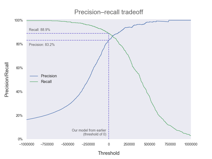
As you can see, precision and recall are two sides of the same coin. Generally (that is, in the absence of a specific reason to seek out more of one at the possible expense of the other) we will want to tune our model so that our decision threshold is set in the region where both precision and recall are high.
如您所见,精度和召回率是同一枚硬币的两个方面。 通常(也就是说,在没有特定原因的情况下,以其他可能的代价来寻找更多一个),我们将需要调整模型,以便将决策阈值设置在精度和召回率都很高的区域。
We can also plot precision and recall directly against each other as the decision threshold is varied:
随着决策阈值的变化,我们还可以绘制精度并彼此直接回忆:
# Set up plotting area
fig, ax = plt.subplots(figsize=(12,9))# Plot pairs of precision and recall for differing thresholds
ax.plot(recalls, precisions, linewidth=2)[...] # Plot formatting
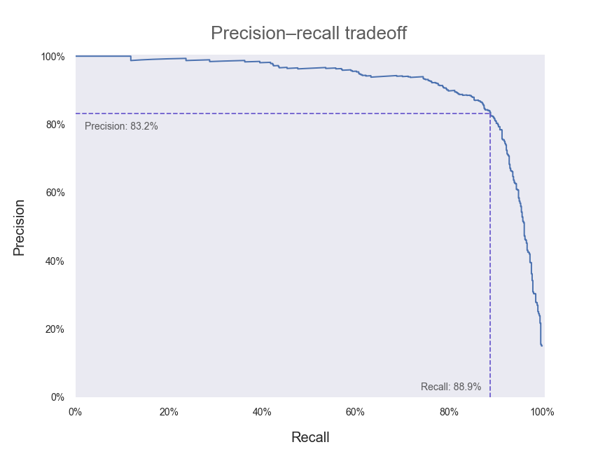
We’ve also included the point along the curve where our current model (with a decision threshold of zero) lies. In an ideal world, we would have a model that could achieve both 100% precision and 100% recall — that is, we would want a precision–recall curve that passes through the top right-hand corner of our plot above. Hence, any adjustments that we make to our model that push our curve outwards and towards the upper right can be regarded as improvements.
我们还沿曲线包括了当前模型(决策阈值为零)所在的点。 在理想的世界中,我们将拥有一个可以同时实现100%的精度和100%的查全率的模型-也就是说,我们希望有一条通过上面图右上角的查准率-查全率曲线。 因此,我们对模型所做的任何将曲线向外推向右上方的调整都可以视为改进。
F1分数 (F1 score)
For applications where precision and recall are of similar importance, it is often convenient to combine them into a single quantity called the F1 score. The F1 score is defined as being the harmonic mean of the precision and recall scores. It’s a bit harder to intuitively interpret the F1 score than it is for precision and recall individually, but it may be desirable to summarise the two quantities into one, easy-to-compare metric.
对于精度和召回率具有相似重要性的应用程序,通常将它们组合为一个称为F1分数的数量通常很方便。 F1分数定义为精确度和查全率分数的调和平均值。 直观地解释F1分数要比精确度和单独回忆起来要难一些,但是可能需要将两个量汇总为一个易于比较的度量。
To obtain a high F1 score, a model needs to have both high precision and recall. This is because the F1 score is dragged down quite significantly when taking the harmonic mean if one of precision or recall is low.
为了获得较高的F1分数,模型需要兼具高精度和召回性。 这是因为,如果精度或召回率之一很低,则在采用谐波均值时,F1分数会显着下降。
from sklearn.metrics import f1_score# Obtain and print F1 score as a percentage
print(“F1 score: “ + str(round(f1_score(train_labels_7, train_data_predictions)*100,1))+”%”)# F1 score: 86.0%
ROC(接收机工作特性)和AUC(曲线下面积) (ROC (receiver operating characteristic) and AUC (area under curve))
Another common way of assessing (and visualising) model performance is by using the ROC curve. Historically, it has its origins in signal detection theory and was first used in the context of detecting enemy aircraft in World War II, where the ability of a radar receiver operator to detect and make decisions based on incoming signals was referred to as Receiver Operating Characteristic. Although the precise context in which it is generally used today has changed, the name has stuck.
评估(和可视化)模型性能的另一种常用方法是使用ROC曲线。 从历史上讲,它起源于信号检测理论,并且在第二次世界大战中首次用于检测敌机的情况下,雷达接收器操作员根据传入信号检测和做出决策的能力被称为接收器操作特性。 尽管今天通常使用它的确切上下文已更改,但名称仍然存在。
 Photo by Marat Gilyadzinov on Unsplash Marat Gilyadzinov在Unsplash上的照片
 The ROC curve plots how the True Positive rate and the False Positive rate change as the model threshold is varied. The true positive rate is simply the percentage of positive instances that were correctly identified (ie the number of 7s we correctly predicted). The false positive rate is, correspondingly, the number of negative instances that were incorrectly identified as being positive (ie the number of not-7s that were incorrectly predicted to be 7s). You may have noticed that the definition for the true positive rate is equivalent to that of recall. And you’d be correct — these are simply different names for the same metric.
ROC曲线绘制了随着模型阈值的变化, 真阳性率和假阳性率如何变化。 真正的阳性率只是正确识别的阳性实例的百分比(即,我们正确预测的7秒数量)。 假阳性率相应地是被错误识别为阳性的否定实例的数量(即被错误地预测为7s的not-7s的数量)。 您可能已经注意到,真实阳性率的定义等同于召回率。 您会说正确的-这些只是同一度量的不同名称。
To get a bit of an intuition about what a good and a bad ROC curve would look like (as it’s often a bit tricky to think about what these more abstract quantities actually mean), let’s consider the extreme cases — the best and worst possible classifiers we could possibly have.
为了对ROC曲线的好坏有一个直观的了解(考虑这些更抽象的量的实际含义通常有些棘手),让我们考虑一下极端情况-最好和最坏的分类器我们可能有。
The worst possible classifier will essentially make a random, 50/50 guess as to whether a given digit is a 7 or not a 7 — it has made no attempt to learn what distinguishes the two classes. The decision scores for each instance will essentially be randomly distributed. Say we initially set the decision threshold at a very high value so that all instances are classified as negative. We will have identified no positive instances — true or false — so both the true positive and false positive rates are zero. As we decrease the decision threshold, we will gradually start classifying equal numbers of positive and negative instances as being positive, so that the true and false positive rates increase at the same pace. This continues until our threshold is at some very low value where we have the reverse of the situation we started with — correctly classifying all positive instances (so true positive rate is equal to one) but also incorrectly classifying all negative instances (false positive rate also one). Hence, the ROC curve for a random, 50/50 classifier is a diagonal line from (0,0) to (1,1).
最坏的可能的分类器实际上将对给定的数字是7还是7进行50/50的随机猜测-它没有尝试了解区分这两个类别的内容。 每个实例的决策得分将基本上是随机分布的。 假设我们最初将决策阈值设置为非常高的值,以便将所有实例归类为否定。 我们将没有发现任何肯定的实例-是或否-因此,真正的肯定和错误的肯定率均为零。 随着我们降低决策阈值,我们将逐渐开始将相等数量的阳性和阴性实例分类为阳性,从而使真假率和假阳性率以相同的速度增长。 这种情况一直持续到我们的阈值处于某个非常低的值时为止,在这种情况下,我们与开始时的情况相反—正确地对所有阳性实例进行分类(因此,真实的阳性率等于一个),而且还错误地对所有阴性实例进行了分类(错误的阳性率也之一)。 因此, 随机50/50分类器的ROC曲线是从(0,0)到(1,1)的对角线。
(You may think it’s possible to have an even worse classifier than this — perhaps a classifier that gets every digit wrong by predicting the opposite every time. But in that case, then the classifier would essentially be a perfect classifier — to be so wrong, the model would have needed to learn the classification perfectly and then just switch around the outputs before making a prediction!)
(您可能会认为,可能有一个比这更糟糕的分类器-也许是通过每次预测相反的数字而使每个数字错误的分类器。但是在那种情况下,分类器本质上将是一个完美的分类器-是这样,该模型将需要完美地学习分类,然后在做出预测之前仅切换输出!)
The best possible classifier will be able to correctly predict every given instance as positive or negative with 100% accuracy. The decision scores for all positive instances will be some high value, to represent the fact that the model is supremely confident in its predictions, and equally so for every digit it has been given. All negative instances will have some low decision score, since the model is, again, supremely and equally confident that all these instances are negative. If we start the decision threshold at a very high value so that all instances are classified as negative, we have the same situation as described for the 50/50 classifier — both true and false positive rates are zero because we have not predicted any positive instances. In the same way, when the decision threshold is very low, we will predict all instances to be positive and so will have a value of one for both true and false positive rates. Hence, the ROC curve will start at (0,0) and end at (1,1), as for the 50/50 classifier. However, when the decision threshold is set at any level between the high and low decision scores that identify positive and negative instances, the classifier will operate perfectly with a 100% true positive rate and a 0% false positive rate. Amazing! The consequences of the above is that the ROC curve for our perfect classifier is the curve that joins up (0,0), (0,1) and (1,1) — a curve that hugs the upper left-hand corner of the plot.
最好的分类器将能够以100%的准确度正确地预测每个给定实例为正或负。 所有积极实例的决策得分都将具有较高的价值,以表示该模型对其预测具有最高的信心,并且对于给出的每个数字同样如此。 所有否定实例的决策得分都将较低,因为该模型再次对所有这些实例均具有否定性充满信心。 如果我们以很高的值开始决策阈值,以便将所有实例都归为否定,我们将具有与针对50/50分类器所描述的相同情况-正确率和错误率均为零,因为我们没有预测到任何积极实例。 同样,当决策阈值非常低时,我们将预测所有实例均为正值,因此对于真假率和假阳性率,其值均为1。 因此,对于50/50分类器,ROC曲线将从(0,0)开始,至(1,1)结束。 但是,当将决策阈值设置在识别阳性和阴性实例的高决策分数和低决策分数之间的任何水平时,分类器将以100%的真实肯定率和0%的假阳性率完美运行。 惊人! 上面的结果是,对于我们的理想分类器而言,ROC曲线是将(0,0),(0,1)和(1,1)连接起来的曲线-一条曲线情节。
Most real-world classifiers will be somewhere between these two extremes. Ideally, we will want our classifier’s ROC curve to be closer to looking like a perfect classifier than one that guesses randomly — so a ROC curve that lies closer to the upper left-hand corner of the plot (closer to the behaviour of a perfect classifier) represents a superior model.
大多数现实世界中的分类器将介于这两个极端之间。 理想情况下,我们希望分类器的ROC曲线比随机猜测的分类器更接近完美分类器,因此ROC曲线更接近图的左上角(更接近完美分类器的行为) )代表了上乘的模型。
Armed with this new knowledge, let’s plot some ROC curves.
有了这些新知识,让我们绘制一些ROC曲线。
from sklearn.metrics import roc_curve# Set up plotting area
fig, ax = plt.subplots(figsize=(9,9))# Obtain possible combinations of true/false positive rates and thresholds
fpr, tpr, thresholds = roc_curve(train_labels_7, train_data_decision_scores)# Plot random guess, 50/50 classifier
ax.plot([0,1], [0,1], “k — “, alpha=0.5, label=”Randomly guessing”)# Plot perfect, omniscient classifier
ax.plot([0.002,0.002], [0,0.998], “slateblue”, label=”Perfect classifier”)
ax.plot([0.001,1], [0.998,0.998], “slateblue”)# Plot our SGD classifier with threshold of zero
ax.plot(fpr, tpr, label=”Our SGD classifier”)[...] # Plot formatting
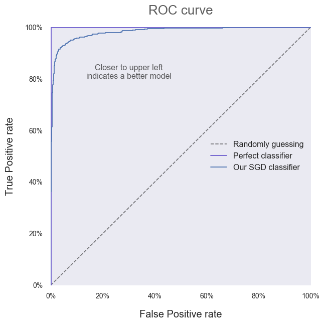
It’s clear that our SGD classifier is doing better than one that guesses randomly! All that work was worth it after all. Instead of relying on the vague statement that “closer to the upper left corner is better”, we can quantify model performance by calculating the Area Under a model’s ROC Curve — referred to as the AUC.
显然,我们的SGD分类器比随机猜测的分类器要好! 毕竟所有的工作都是值得的。 不必依靠模糊的说法“越靠近左上角越好”,我们可以通过计算模型的ROC曲线下面积(称为AUC)来量化模型性能。
If you remember your formulae for calculating the area of a triangle, you should be able to see that the AUC for the random classifier is 0.5. You should also be able to see that the AUC for the perfect classifier is 1. Hence, a higher AUC is better and we will want to aim for an AUC as close to 1 as possible. Our SGD classifier’s AUC can be obtained as follows:
如果您记得用于计算三角形面积的公式,则应该能够看到随机分类器的AUC为0.5。 您还应该能够看到完美分类器的AUC为1。因此,较高的AUC更好,我们希望将AUC的目标设置为尽可能接近1。 我们的SGD分类器的AUC可以通过以下方式获得:
from sklearn.metrics import roc_auc_score# Obtain and print AUC
print(“Area Under Curve (AUC): “ + str(round(roc_auc_score(train_labels_7, train_data_predictions),3)))# Area Under Curve (AUC): 0.934
In isolation, it’s hard to tell exactly what our AUC of 0.934 means. As with the metrics was saw earlier based on precision and recall, these are standard comparative tools. We should use them purposefully to develop and tune our current model, and to compare our model to other algorithms to seek out the best possible performance at our particular task.
孤立地讲,很难确切说明0.934的AUC意味着什么。 与之前基于精度和召回率看到的指标一样,这些都是标准的比较工具。 我们应该有目的地使用它们来开发和调整我们的当前模型,并将我们的模型与其他算法进行比较,以在特定任务中寻求最佳性能。
结论 (Conclusion)
We covered a lot of ground today, so congratulations if you made it all the way through! When first taking on a problem, it’s easy to become overwhelmed by the sheer range of algorithms, methods and parameters that could be used as part of an approach to solving it. Model performance metrics can act as the compass that guides us through this wilderness — as long as we break a problem down, decide on an initial approach (we can change later if needed), and use sensible tools like those explained above to evaluate whether we are making progress, we will be moving towards where we need to go. And as heart-breaking as it is to not see hours of research and tinkering with a model reflected in an improvement in a particular performance metric, it’s always better to know whether we are moving forwards or backwards.
今天我们涵盖了很多领域,如果您能顺利完成,那么恭喜您! 刚开始处理问题时,很容易被众多算法,方法和参数所淹没,这些算法,方法和参数可以用作解决问题的方法的一部分。 模型性能指标可以作为指导我们走过这片荒野的指南针-只要我们分解问题,决定采用初始方法(如果需要,我们可以稍后进行更改),并使用上述合理的工具评估我们是否在取得进展,我们将朝着需要去的地方迈进。 尽管看不到花费大量时间进行研究和修改模型以反映特定性能指标的改进,但令人心碎,但最好还是知道我们前进还是后退。
So get stuck in — and don’t get too invested in a particular method if the numbers show that it’s not working out. Review and compare models and approaches dispassionately. If you can manage that, you’ll be sitting in that Ferrari with the cream upholstery in no time at all.
因此,请坚持使用-如果数字表明该方法行不通,则不要对特定方法投入过多。 审慎地比较和比较模型和方法。 如果您能解决这个问题,那么您将立即坐在那辆法拉利(Ferrari)那里,享受奶油装饰。
积分和更多信息 (Credits and more info)
Andrew Hetherington is an actuary-in-training and data enthusiast based in London, UK.
安德鲁·赫瑟灵顿 ( Andrew Hetherington)是英国伦敦的精算师和数据爱好者。
Check out my website.
查看我的网站 。
Connect with me on LinkedIn.
在LinkedIn上与我联系。
See what I’m tinkering with on GitHub.
在GitHub上查看我正在修补的内容。
The notebook used to produce the work in this article can be found here.
可在此处找到用于制作本文工作的笔记本。
Code chunks in this work have been adapted from A. Géron’s 2019 book, Hands-On Machine Learning with Scikit-Learn, Keras, and TensorFlow, 2nd Edition, by Aurélien Géron (O’Reilly). Copyright 2019 Kiwisoft S.A.S., 978–1–492–03264–9.
这项工作中的代码块改编自A.Géron于2019年出版的书 《AusélienGéron (O'Reilly)的Kes和Scikit-Learn的动手机器学习,第二版》。 版权所有2019 Kiwisoft SAS,978–1–492–03264–9。
Photos by AbsolutVision, Markus Spiske and Marat Gilyadzinov.
AbsolutVision, Markus Spiske和Marat Gilyadzinov摄 。
翻译自: https://towardsdatascience.com/evaluating-classifier-model-performance-6403577c1010

- 性能指标(模型评估)之mAP
- 性能测试模型和评估
- Sklearn之分类器性能评估
- 机器学习 —— 性能度量和比较检验、模型评估方法
- 目标检测模型中的性能评估——MAP(Mean Average Precision)
- 机器学习实战笔记(Python实现)-07-模型评估与分类性能度量
- 分类模型的性能评估——以SAS Logistic回归为例(1): 混淆矩阵
- 斯坦福大学机器学习笔记——当训练模型性能不好时的措施(假设评估、模型选择和交叉验证集、正则化、学习曲线)
- 机器学习(一)~模型评估与选择 之 *性能度量
- 分类器性能评估
- 分类模型的性能评估——以SAS Logistic回归为例(2): ROC和AUC
- 分类模型的性能评估——以SAS Logistic回归为例(3): Lift和Gain
- 分类模型的性能评估——以SAS Logistic回归为例(1): 混淆矩阵
- 分类器的性能评估
- 分类模型的性能评估——以SAS Logistic回归为例(1): 混淆矩阵
- 分类器的性能评估指标:混淆矩阵、精度、召回率、ROC曲线等等
- 分类模型的性能评估——以SAS Logistic回归为例(1): 混淆矩阵
- 分类模型的性能评估——以SAS Logistic回归为例(2): ROC和AUC
- 模型性能评估之 Friedman 检验与 Nemenyi 后续检验