Bootstrap栅格系统理解
2020-06-28 04:32
471 查看
Bootstrap布局容器
由于Boostrap全部依赖于jQuery, 所以在引入Bootstrap 的js文件之前一定要先引入 Jquery。
这篇文章的目的主要是记录自己对boostrap栅格的理解。
视频教程推荐HTML中文网,最全最详细的资料还是在Bootstrap官网
三个特点:
- 必须使用HTML5的文档类型;
<!DOCTYPE html>
<html>
...
</html>
- 移动设备优先;
- 布局容器;
container和
container-fluid不能嵌套。
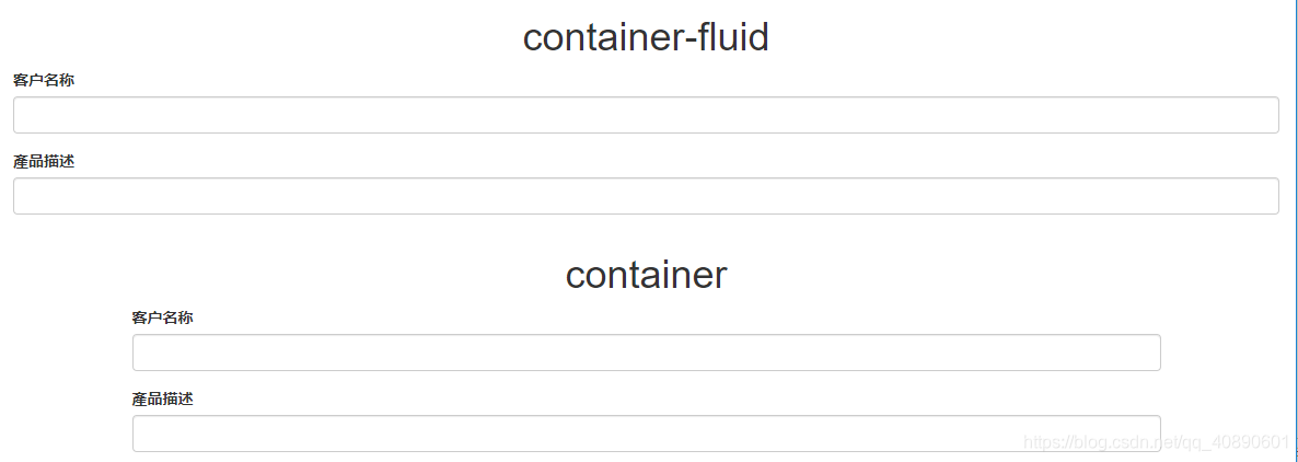
检测
container和
container-fluid的区别:
container-fluid默认占满全屏,而
container则边距更大,只有在xs下才会占满全屏。一般使用container的情况更多。
栅格系统
行
row必须包含在布局容器(
container或
container-fluid)里,列包含在
row里。
首先得明白这个lg,md,sm,xs它们是宽度界限。
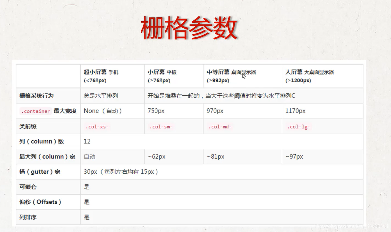
这里有个比较重要的点就是如何确定我们应该使用lg,md,sm或者xs去布局呢,看上图的栅格系统行为,这个小格子开始是堆叠在一起的(xs的时候默认全是堆叠在一起的),当大于这些阈值时就会变为水平排列,举个例子。以下是我定义的一个水平表单(horizontal-form 只能在Bootstrap 3中定义),我使用的是
md,那么大于md的lg上这个表单也是水平排列的,而小于md的sm和xs就是堆叠在一起的。如下。
<!DOCTYPE html>
<html>
<head>
<meta charset="utf-8">
<title>水平表单</title>
<link href="bootstrap-3.3.7-dist/css/bootstrap.min.css" rel="stylesheet">
<script src="jquery1.11.3.min.js"></script>
<script src="bootstrap-3.3.7-dist/js/bootstrap.min.js"></script>
</head>
<body>
<div class="container">
<form class=" form-horizontal">
<div class="form-group">
<label class="col-md-2" for="customer2">客户名称</label>
<div class="col-md-10">
<input type="text" id="customer2" class="form-control">
</div>
</div>
<div class="form-group ">
<label for="proDescription2" class="col-md-2">產品描述</label>
<div class="col-md-10">
<input type="text" class="form-control" id="proDescription2">
</div>
</div>
</form>
</div>

</body>
</html>
在md和lg上的显示

在sm和xs上的显示。

栅格部分很重要,而且支持响应式,相当方便。

相关文章推荐
- Bootstrap 栅格系统 理解与总结
- Bootstrap 栅格系统 理解与总结
- bootstrap 栅格系统 理解与总结
- Bootstrap 栅格系统 理解与总结
- 深入理解BootStrap之栅格系统(布局)
- 深入理解BootStrap-- 栅格系统(布局)7
- Bootstrap栅格系统的使用和理解2
- 深入理解BootStrap-- 栅格系统
- Bootstrap3 栅格系统-实例:响应列重置(Responsive column resets)
- Bootstrap3基础 栅格系统 col-md-offset 向右偏移
- 栋栋晓08:Bootstrap学习总结:栅格系统
- BootStrap的栅格系统的基本写法(布局)
- Bootstrap中的栅格系统所用类
- Bootstrap的栅格系统
- Bootstrap3基础 栅格系统 col-lg/md/sm/xs-* 简单示例
- Bootstrap3 栅格系统-媒体查询
- bootstrap栅格系统中同行div高度不一致的解决方法
- Bootstrap3 栅格系统-Less mixin 和变量
- Bootstrap栅格系统用法--Bootstrap基础
- 【Bootstrap】自动适应PC、平板、手机的Bootstrap栅格系统