CSS实现三栏布局中间一栏自适应且随文字大小变化宽度的示例代码
2020-06-20 11:47
1146 查看
百度面试碰到的题,要实现如下布局效果
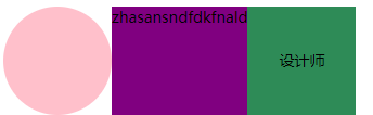
其中中间这紫色的一栏的大小随字体的多少而变宽/变窄,且多出的文字自动省略为[...],右边的绿色栏要紧紧连着紫色这一栏。 主要对紫色这一栏的操作为:
1.flex: 0 1 auto (自适应)
2.text-overflow:ellipsis;(自动省略文字)
overflow:hidden;
white-space: nowrap;
完整的代码如下
// CSS 部分
.container {
display: flex;
}
.pic {
width: 100px;
height: 100px;
border-radius: 50%;
background-color: pink;
}
.name {
flex:0 1 auto;
height: 100px;
background-color: purple;
text-overflow:ellipsis;
overflow:hidden;
white-space: nowrap;
}
.tag {
width: 100px;
height: 100px;
text-align: center;
line-height: 100px;
background-color: seagreen;
}
// HTML 部分
<div class="container">
<div class="pic"></div>
<div class="name">
zhasansndfdkfnald
</div>
<div class="tag">设计师</div>
</div>
总结
到此这篇关于CSS实现三栏布局中间一栏自适应且随文字大小变化宽度的示例代码的文章就介绍到这了,更多相关css三栏布局内容请搜索脚本之家以前的文章或继续浏览下面的相关文章,希望大家以后多多支持脚本之家!

相关文章推荐
- CSS实现左右栏宽度固定中间栏宽度变化且各栏高度自适应背景色不同的三栏布局
- 前端经典面试题之CSS实现三栏布局,左右宽度固定,中间宽度自适应
- 前端经典面试题之CSS实现三栏布局,左右宽度固定,中间宽度自适应
- 【CSS】三列布局(左右div固定宽度,中间div随浏览器窗口自适应变化宽度)
- CSS实现比例固定且大小随浏览器窗变化的自适应三栏布局
- HTML/CSS学习之 三列布局,其中左侧和右侧的部分宽度固定,中间部分宽度随浏览器宽度的变化而自适应变化
- 用两种不同的方式来实现一个三列布局,其中左侧和右侧的部分宽度固定,中间部分宽度随浏览器宽度的变化而自适应变化
- CSS三栏布局(两边固定中间自适应宽度)的方法
- CSS三栏布局——中间固定两边自适应宽度
- 使用CSS实现三栏自适应布局(两边宽度固定,中间自适应)
- 使用CSS实现三栏自适应布局--两边宽度固定,中间自适应
- CSS三栏布局(两边固定中间自适应宽度)的方法
- CSS三栏布局探讨——中间固定宽度两边自适应宽度
- CSS实现自适应高度布局:头部底部固定,中间自适应铺满屏幕剩余高度,中间盒子里左盒子固定右盒子自适应宽度
- 使用CSS实现三栏自适应布局(两边宽度固定,中间自适应)
- CSS三栏布局——中间固定两边自适应宽度
- CSS float的初步理解:用两种不同的方式来实现一个三列布局,其中左侧和右侧的部分宽度固定,中间部分宽度随浏览器宽度的变化而自适应变化
- CSS实现三栏自适应布局(两边宽度固定,中间自适应)
- CSS三栏布局(两边固定中间自适应宽度)的方法
- 记一道css面试题 : 三栏布局两边宽度固定,中间宽度自适应,并且布局随屏幕大小改变。