前端经典面试题之CSS实现三栏布局,左右宽度固定,中间宽度自适应
2019-03-20 18:23
645 查看
前端常问的面试题,题目:
假设高度一定,请写出三栏布局,左右宽度300px,中间自适应。
下面提供这道题的五种解决方案:
首先要写好整个页面的布局(初始化等)
<style>
html * {
padding: 0;
margin: 0;
}

.layout {
margin-top: 20px;
}

.layout article div {
min-height: 100px;
}
</style>
1.浮动的解决方案
<!-- 浮动布局解决方案 -->
<section class="layout float">
<style>
.layout.float .left {
float: left;
width: 300px;
background: red;
}

.layout.float .right {
float: right;
width: 300px;
background: blue;
}

.layout.float .center {
background: yellow;
}
</style>
<article class="left-center-right">
<div class="left"></div>
<div class="right"></div>
<div class="center">
<h1>浮动解决方案</h1>
<p>1.这是布局的中间部分</p>
<p>2.这是布局的中间部分</p>
</div>
</article>
</section>
2.绝对定位的解决方案
<!-- 绝对定位的解决方案 -->
<section class="layout absolute">
<style>
.layout.absolute .left-center-right>div {
position: absolute;
}

.layout.absolute .left {
left: 0;
width: 300px;
background: red;
}

.layout.absolute .center {
left: 300px;
right: 300px;
background: yellow;
}

.layout.absolute .right {
right: 0;
width: 300px;
background: blue;
}
</style>
<article class="left-center-right">
<div class="left"></div>
<div class="center">
<h1>绝对定位的解决方案</h1>
<p>
20000
1.这是布局的中间部分</p>
<p>2.这是布局的中间部分</p>
</div>
<div class="right"></div>
</article>
</section>
3.flexbox的解决方案
<!-- flexbox解决方案 -->
<section class="layout flexbox">
<style>
.layout.flexbox {
margin-top: 140px;
}

.layout.flexbox .left-center-right {
display: flex;
}

.layout.flexbox .left {
width: 300px;
background: red;
}

.layout.flexbox .center {
flex: 1;
background: yellow;
}

.layout.flexbox .right {
width: 300px;
background: blue;
}
</style>
<article class="left-center-right">
<div class="left"></div>
<div class="center">
<h1>flexbox的解决方案</h1>
<p>1.这是布局的中间部分</p>
<p>2.这是布局的中间部分</p>
</div>
<div class="right"></div>
</article>
</section>
4.表格布局的解决方案
<!-- 表格布局的解决方案 -->
<section class="layout table">
<style>
.layout.table .left-center-right {
width: 100%;
display: table;
height: 100px;
}

.layout.table .left-center-right>div {
display: table-cell;
}

.layout.table .left {
width: 300px;
background: red;
}

.layout.table .center {
background: yellow;
}

.layout.table .right {
width: 300px;
background: blue;
}
</style>
<article class="left-center-right">
<div class="left"></div>
<div class="center">
<h1>表格布局的解决方案</h1>
<p>1.这是布局的中间部分</p>
<p>2.这是布局的中间部分</p>
</div>
<div class="right"></div>
</article>
</section>
5.网格布局的解决方案
<!-- 网格布局的解决方案     -->
<section class="layout grid">
<style>
.layout.grid .left-center-right {
display: grid;
width: 100%;
grid-template-rows: 100px;
grid-template-columns: 300px auto 300px;
}

.layout.grid .left {
background: red;
}

.layout.grid .center {
background: yellow;
}

.layout.grid .right {
background: blue;
}
</style>
<article class="left-center-right">
<div class="left"></div>
<div class="center">
<h1>网格布局的解决方案</h1>
<p>1.这是布局的中间部分</p>
<p>2.这是布局的中间部分</p>
</div>
<div class="right"></div>
</article>
</section>
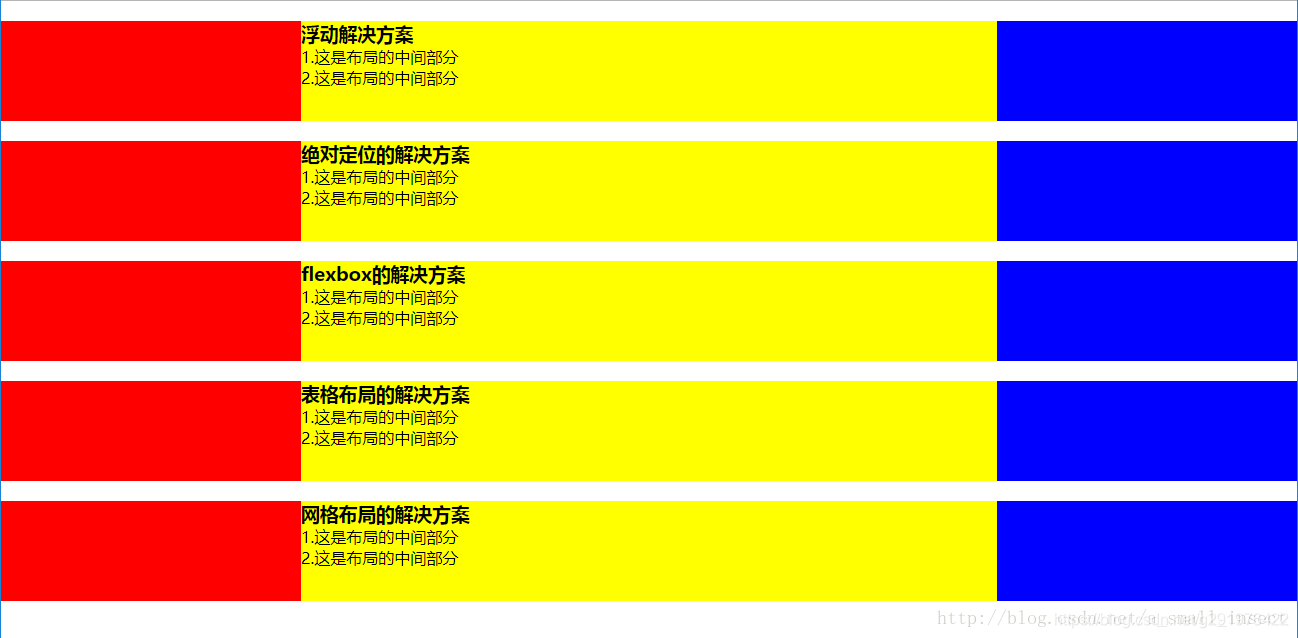
最终的效果图:

相关文章推荐
- 前端经典面试题之CSS实现三栏布局,左右宽度固定,中间宽度自适应
- CSS实现左右栏宽度固定中间栏宽度变化且各栏高度自适应背景色不同的三栏布局
- CSS三栏布局探讨——中间固定宽度两边自适应宽度
- CSS三栏布局——中间固定两边自适应宽度
- CSS三栏布局(两边固定中间自适应宽度)的方法
- 使用CSS实现三栏自适应布局(两边宽度固定,中间自适应)
- css实现三列布局,左右固定值,中间自适应。
- 三栏自适应布局实现(左右固定宽度,中间自适应)
- 使用CSS实现三栏自适应布局--两边宽度固定,中间自适应
- CSS三栏布局——中间固定两边自适应宽度
- 面试题:写一个左中右布局占满屏幕,其中左右两块是固定宽度200 , 中间自适应宽,要求先加载中间块,请写出结构及样式:
- html css实现左右两列固定宽度中间自适应效果
- css实现左右布局,左侧div固定不变,右侧div宽度自适应
- 使用CSS实现三栏自适应布局(两边宽度固定,中间自适应)
- DIV+CSS经典??三列布局(左右固定 中间自适应)
- CSS 布局实例系列(三)如何实现一个左右宽度固定,中间自适应的三列布局——也聊聊双飞翼
- CSS三栏布局(两边固定中间自适应宽度)的方法
- 【CSS】三列布局(左右div固定宽度,中间div随浏览器窗口自适应变化宽度)
- CSS实现自适应高度布局:头部底部固定,中间自适应铺满屏幕剩余高度,中间盒子里左盒子固定右盒子自适应宽度
- 【前端攻城狮之路】CSS三列布局——两侧固定宽度、中间自适应