H5+CSS3写的旋转立方体
2020-01-15 07:25
92 查看
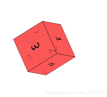
用CSS3的动画写出来的,代码很少,技能锻炼代码能力,也能提高思维能力,有兴趣的小伙伴可以试一试哈!
CSS代码
<style>
*{padding:0;margin:0;}
ul{
/*background: 150px;*/
/*position: relative;*/
margin:200px auto;
transform-style:preserve-3d;
/* perspective:2000px;*/
transform:rotateY(10deg) rotateY(10deg);
animation:rotate1 linear 5s infinite;
transform-origin:76px 76px -76px;
width: 152px;
height: 152px;
}
li{ list-style: none;
border:1px solid #000;
width: 150px;
height: 150px;
position: absolute;
background: rgba(252,81,81,0.8);
font-size: 50px;
text-align: center;
line-height: 150px;
/* transition:1s;*/

}
li:nth-child(1){
transform:translateZ(0px);
}
li:nth-child(2){
transform-origin:center top;
transform:rotateX(-90deg);

}
li:nth-child(3){
transform-origin:center bottom;
transform:rotateX(90deg);
}
li:nth-child(4){
transform-origin:left center;
transform:rotateY(90deg);
}
li:nth-child(5){
transform-origin:right center;
transform:rotateY(-90deg);
}
li:nth-child(6){
transform:translateZ(-150px);
}

@keyframes rotate1{
0%{
transform:rotateX(0deg) rotateY(0deg) rotateZ(0deg)
}
100%{
/* transform:rotate3d(10,10,10,360deg);*/
transform:rotateX(360deg) rotateY(360deg) rotateZ(360deg);
}
}
</style>
HTML代码!!
<ul>
<li>1</li>
<li>2</li>
<li>3</li>
<li>4</li>
<li>5</li>
<li>6</li>
</ul>
- 点赞
- 收藏
- 分享
- 文章举报
 曲径通幽~
发布了8 篇原创文章 · 获赞 6 · 访问量 873
私信
关注
曲径通幽~
发布了8 篇原创文章 · 获赞 6 · 访问量 873
私信
关注
