三栏布局的几种实现方式
2018-12-04 00:01
155 查看
问题:假设高度已知,请写出三栏布局,左栏、右栏宽度300px,中间宽度自适应。
实现改布局的方式有下面五种:
1、浮动方式 ;2、绝对定位方式;3、flex方式 ;4、表格方式–display:table及display:table-cell实现;5、网格布局方式–display:grid;
接下来通过代码的方式分别介绍一下这五种实现三栏布局的方式:
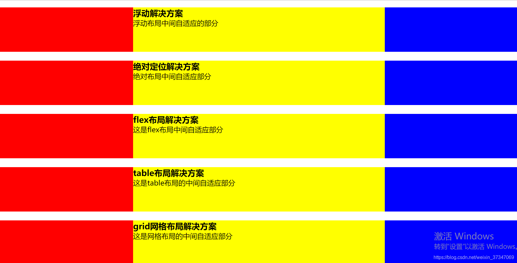
1、浮动布局方式
<section class='layout float'>
<style media="screen">
.layout.float .left{
width: 300px;
float: left;
background: red;
}
.layout.float .right{
width: 300px;
float: right;
background: blue;
}
.layout.float .center{
background: yellow;
}
</style>
<article class="left-center-right">
<div class="left"></div>
<div class="right"></div>
<div class="center">
<h1>浮动解决方案</h1>
浮动布局中间自适应的部分
</div>
</article>
</section>
浮动元素是脱离文档流的,所以浮动布局会存在高度塌陷、例子中当center部分内容超出100px时内容会溢出等问题。
浮动布局的兼容性比较好,只要做好清除浮动,是没有什么问题的。
清除浮动的方式及优缺点
2、绝对定位布局
<section class='layout absoult'>
<style media="screen">
.layout.absoult .left-center-right>div{
position: absolute;
}
.layout.absoult .left{
left:0;
width: 300px;
background: red;
}
.layout.absoult .right{
right:0;
width: 300px;
background: blue;
}
.layout.absoult .center{
left:300px;
right:300px;
background: yellow;
}
</style>
<article class="left-center-right">
<div class="left"></div>
<div class="center">
<h1>绝对定位解决方案</h1>
绝对布局中间自适应部分
</div>
<div class="right"></div>
</article>
</section>
绝对定位布局优点,很快捷,设置很方便,而且也不容易出问题;缺点就是,绝对定位是脱离文档流的,意味着下面的所有子元素也会脱离文档流,这就导致了这种方法的有效性和可使用性是比较差的。
3、flex布局方式
<section class='layout flex'>
<style media="screen">
.layout.flex{
margin-top:140px;
}
.layout.flex .left-center-right{
display: flex;
}
.layout.flex .left{
width: 300px;
background: red;
}
.layout.flex .right{
width: 300px;
background: blue;
}
.layout.flex .center{
background: yellow;
flex: 1;
}
</style>
<article class="left-center-right">
<div class="left"></div>
<div class="center">
<h1>flex布局解决方案</h1>
这是flex布局中间自适应部分
</div>
<div class="right"></div>
</article>
</section>
felxbox布局是css3里新出的一个,它就是为了解决上述两种方式的不足出现的,是比较完美的一个。目前移动端的布局也都是用flexbox。
felxbox的缺点就是不能兼容IE8及以下浏览器
4、表格布局方式
<section class='layout table'>
<style media="screen">
.layout.table .left-center-right{
width:100%;
display: table;
height: 100px;
}
.layout.table .left-center-right>div{
display:table-cell;
}
.layout.table .left{
width: 300px;
background: red;
}
.layout.table .center{
background: yellow;
}
.layout.table .right{
width: 300px;
background: blue;
}
</style>
<article class="left-center-right">
<div class="left"></div>
<div class="center">
<h1>table布局解决方案</h1>
这是table布局的中间自适应部分
</div>
<div class="right"></div>
</article>
</section>
表格布局在历史上遭到很多人的摒弃,说表格布局麻烦,操作比较繁琐,其实这是一种误解,在很多场景中,表格布局还是很适用的,比如这个三栏布局,用表格布局就轻易写出来了。还有表格布局的兼容性很好,在flex布局不兼容的时候,可以尝试表格布局。
表格布局也是有缺陷的,当其中一个单元格高度超出的时候,两侧的单元格也是会跟着一起变高的,而有时候这种效果不是我们想要的。
5、网格布局方式
网格布局介绍
<section class='layout grid'>
<style media="screen">
.layout.grid .left-center-right{
display: grid;
grid-template-columns: 300px auto 300px;
}
.layout.grid .left{
background: red;
}
.layout.grid .center{
background: yellow;
}
.layout.grid .right{
background: blue;
}
</style>
<article class="left-center-right">
<div class="left"></div>
<div class="center">
<h1>grid网格布局解决方案</h1>
这是网格布局的中间自适应部分
</div>
<div class="right"></div>
</article>
</section>

相关文章推荐
- css瀑布流布局的几种实现方式
- css左右布局的几种实现方式和优缺点
- 三栏布局的几种实现方式
- 圣杯布局、双飞翼布局、Flex布局和绝对定位布局的几种经典布局的具体实现示例
- PHP跳转页面的几种实现方式
- spring的事务管理有几种方式实现,如何实现
- [android] 安卓消息推送的几种实现方式
- JavaScript实现页面跳转的几种方式
- 瀑布流布局的三种实现方式
- RecyclerView 几种布局效果的实现
- 实现Spring AOP 应用的几种方式
- 多线程 +1操作的几种实现方式,及效率对比
- 单例模式的几种实现方式
- 用Jsp来实现文件下载功能的几种方式
- Python中的单例模式的几种实现方式的及优化
- 网页瀑布流效果实现的几种方式
- 实现RSS 解析的几种方式
- Javascript实现页面跳转的几种方式
- 获取View宽高的几种方式及View和ViewGroup测量的简单实现
- abap动态编程的几种实现方式