Python Matplotlib绘制气温图表
2018-04-10 10:39
591 查看
代码中数据从 www.wunderground.com/history/ 下载
#coding=utf-8
import csv
from datetime import datetime
from matplotlib import pyplot as plt
# 从文件中获取日期和最高气温
filename = 'sitka_weather_2014.csv'
with open(filename) as f:
reader = csv.reader(f)
header_row = next(reader)
# 打印文件头及其位置
# print header_row
# for index, column_header in enumerate(header_row):
# print index, column_header
dates, highs, lows = [], [], []
for row in reader:
current_date = datetime.strptime(row[0], "%Y-%m-%d")
dates.append(current_date)
high = int(row[1])
highs.append(high)
low = int(row[3])
lows.append(low)
# 根据数据绘制图形
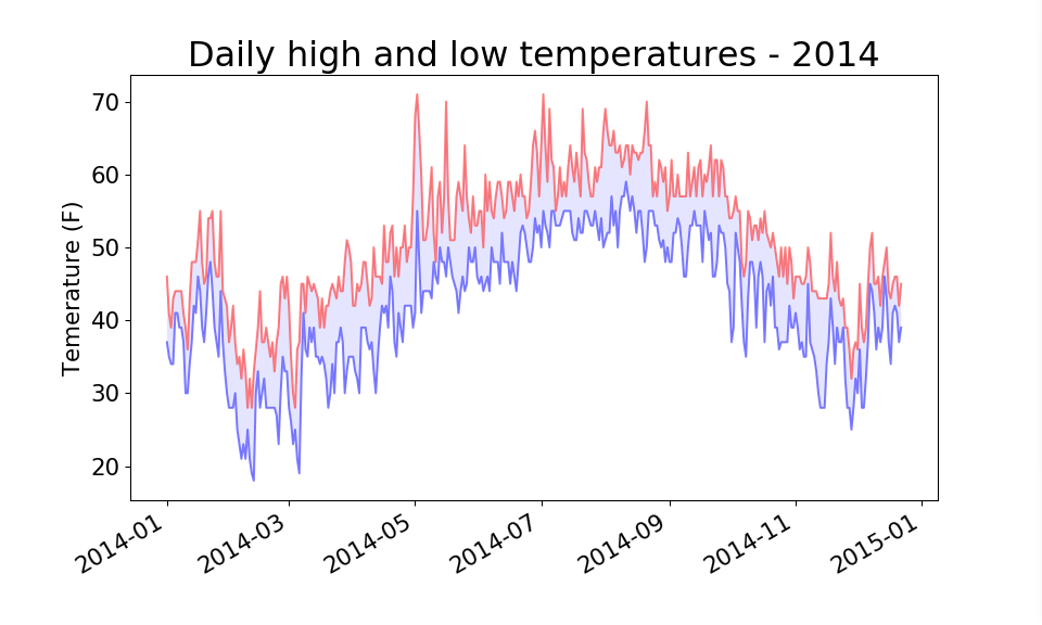
fig = plt.figure(dpi=96, figsize=(10, 6))
plt.plot(dates, highs, c='red', alpha=0.5)
plt.plot(dates, lows, c='blue', alpha=0.5)
plt.fill_between(dates, highs, lows, facecolor='blue', alpha=0.1)
# 设置图形的格式
plt.title("Daily high and low temperatures - 2014", fontsize=24)
plt.xlabel('', fontsize=16)
fig.autofmt_xdate()
plt.ylabel("Temerature (F)", fontsize=16)
plt.tick_params(axis='both', which='major', labelsize=16)
plt.show()

相关文章推荐
- python 使用numpy matplotlib绘制图表
- Python图表绘制:matplotlib绘图库入门
- Python图表绘制:matplotlib绘图库入门
- Python.matplotlib -- Python二维图表绘制
- Python图表绘制:matplotlib绘图库入门
- Python图表绘制:matplotlib绘图库入门
- Python图表绘制:matplotlib绘图库入门
- Python:使用matplotlib绘制图表
- Python图表绘制:matplotlib绘图库入门
- Python图表绘制:matplotlib绘图库入门
- Python:使用matplotlib绘制图表
- Python图表绘制:matplotlib绘图库入门
- 【转载】Python图表绘制:matplotlib绘图库入门
- matplotlib--python绘制图表 | PIL--python图像处理
- Python图表绘制:matplotlib绘图库入门(转)
- Python图表绘制:matplotlib绘图库入门
- Python图表绘制:matplotlib绘图库入门
- Python:使用matplotlib绘制图表
- Python图表绘制:matplotlib绘图库入门
- 使用python matplotlib绘制高级图表