仿响应式html:JS来判断页面是在手机端还是在PC端打开的方法
2017-12-08 15:50
531 查看
我们想要的效果是pc文件和mobile文件统一入口,适配不同的设备。
先看看项目的目录:
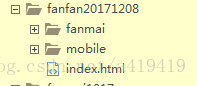
在index.html里面配置js控制选择那一个文件夹下的文件就可以了。
我们要利用:Navigator 对象,Navigator 对象包含有关浏览器的信息。
index.html很简单,直接上码吧:


先看看项目的目录:
在index.html里面配置js控制选择那一个文件夹下的文件就可以了。
我们要利用:Navigator 对象,Navigator 对象包含有关浏览器的信息。
index.html很简单,直接上码吧:
<!DOCTYPE html>
<html>
<head>
<meta charset="UTF-8">
<meta name="viewport" content="initial-scale=1, maximum-scale=1, user-scalable=no" />
<script type="text/javascript">
function browserRedirect() {
var sUserAgent = navigator.userAgent.toLowerCase();
var bIsIpad = sUserAgent.match(/ipad/i) == "ipad";
var bIsIphoneOs = sUserAgent.match(/iphone os/i) == "iphone os";
var bIsMidp = sUserAgent.match(/midp/i) == "midp";
var bIsUc7 = sUserAgent.match(/rv:1.2.3.4/i) == "rv:1.2.3.4";
var bIsUc = sUserAgent.match(/ucweb/i) == "ucweb";
var bIsAndroid = sUserAgent.match(/android/i) == "android";
var bIsCE = sUserAgent.match(/windows ce/i) == "windows ce";
var bIsWM = sUserAgent.match(/windows mobile/i) == "windows mobile";
if (bIsIpad || bIsIphoneOs || bIsMidp || bIsUc7 || bIsUc || bIsAndroid || bIsCE || bIsWM) {
//跳转移动端页面
window.location.href="http://f.jcngame.com/fanfan20171208/mobile/index.html";
} else {
//跳转pc端页面
window.location.href="http://f.jcngame.com/fanfan20171208//fanmai/index.html";
}
}
browserRedirect();
</script>
</head>
<body>

</body>
</html>

相关文章推荐
- 简单的利用JS来判断页面是在手机端还是在PC端打开的方法
- 简单的利用JS来判断页面是在手机端还是在PC端打开的方法
- 简单的利用JS来判断页面是在手机端还是在PC端打开的方法
- 简单的利用JS来判断页面是在手机端还是在PC端打开的方法
- 简单的利用JS来判断页面是在手机端还是在PC端打开的方法
- 简单的利用JS来判断页面是在手机端还是在PC端打开的方法
- 利用JS来判断页面是在手机端还是在PC端打开的方法
- JS判断页面是在手机端还是PC端打开
- js判断当前页面在移动设备还是在PC端中打开
- 前端 js 判断设备类型是手机还是PC 并打开不同设备下的页面
- js判断是手机端还是电脑端打开的网页页面
- js判断当前页面在移动设备还是在PC端中打开
- 判断手机端还是PC端打开的页面
- js判断当前页面在移动设备还是在PC端中打开
- [PHP学习]Js判断跳转PC还是Wap端网站方法
- js判断当前页面用什么浏览器打开的方法
- 通过JS判断打开PC或H5页面
- 判断手机端用户打开页面时是android还是ios,并将判断结果通过ajax返回给url接口,传递回去
- js判断手机端,还是pc端
- JS判断页面是否在微信浏览器、QQ浏览器等打开的方法