简析在React Native中如何适配iPhoneX
2017-12-05 13:20
776 查看
一、介绍
iPhone X 发布也有一段时间了,独特的 "齐刘海",以及 "小嘴巴" 带给了苹果粉们无限的遐想,同时也带来众多的吐槽。前几天,招商银行公众号在微信推送了一条消息,11月招商银行App要发布最新版本,完美适配iPhoneX,是国内第一家银行App适配iPhoneX。感兴趣的朋友可以去下载体验一下。作为App开发者,此时你的心情是欣喜若狂,还是一万个XXX奔腾而过。欣喜也许是因为又可以在自己开发App中"大展拳脚",而一万个XXX奔腾而过,也许完美表达了你的真心,又该乖乖的去做适配了。
扯了这么多,终于上道了。本篇博客内容就是要和大家分享在React Native开发的App中,我们该如何去做适配。首先在做适配之前,我们先了解下iPhoneX在UI上的一些变化。iPhoneX版本引入了一个新名词: 【安全区域】
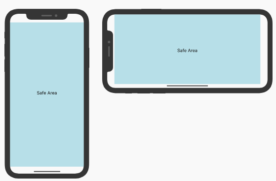
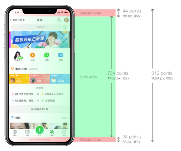
以上图竖屏为例,安全区域即从顶部传感器之下,底部Home区域之上的可视交互区域。那么和之前的iPhone系列有什么不同呢?
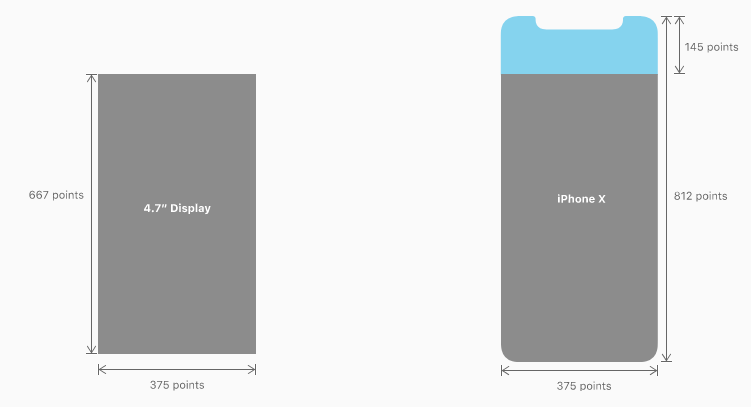
iOS11前屏幕的分辨率为 375 * 667,而iPhoneX屏幕的高度则变为812,顶部高出145。所以适配的问题基本围绕UI来解决,并且适配的核心思路就是:【避开安全区域,使布局自适应】,我们来看几个对比图:
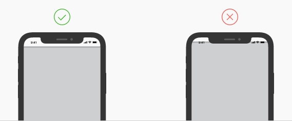
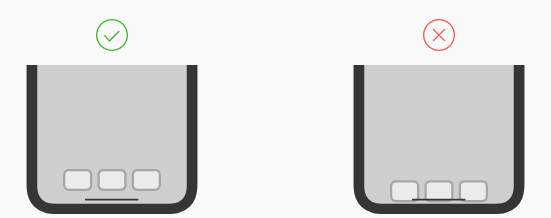
(1)状态栏部分
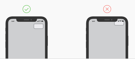
(2)底部导航部分
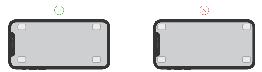
(3)横屏状态
二、适配
iOS11前导航栏的高度是64,其中状态栏(StatusBar)的高度为20。iPhoneX的状态栏(StatusBar)高度变为了44(传感器区域高度),如果是自定义的TopBar,这部分需要做相应的适配。iPhoneX的底部增加了虚拟Home区,由于安全区域的原因默认TabBar的高度由49变为83,增高了34(Home区高度),所以自定义的底部TabBar也需要需改其适配方案。
图片来源:http://fighting300.com/2017/09/14/iOS11-UI-adjust/
解决这个问题,最简单的方式就是给每个界面的顶部布局和底部有导航的布局曾加高度,修改PaddingTop或者PaddingBottom。同时为了iOS11之前同样适用,我们需要根据版本来让系统选择不同的Style即可。所以第一步我们需要判定当前的手机设备是否为iPhoneX。如何判断呢?很简单,可以根据一个很明显的改变:屏幕高度。
[javascript]
view plain
copy
import {
Platform,
Dimensions
} from 'react-native';
// iPhoneX
const X_WIDTH = 375;
const X_HEIGHT = 812;
// screen
const SCREEN_WIDTH = Dimensions.get('window').width;
const SCREEN_HEIGHT = Dimensions.get('window').height;
export function isIphoneX() {
return (
Platform.OS === 'ios' &&
((SCREEN_HEIGHT === X_HEIGHT && SCREEN_WIDTH === X_WIDTH) ||
(SCREEN_HEIGHT === X_WIDTH && SCREEN_WIDTH === X_HEIGHT))
)
}
有了上述条件,我们可以根据设备版本来选择不同的Style样式即可。
[javascript]
view plain
copy
export function ifIphoneX (iphoneXStyle, regularStyle) {
if (isIphoneX()) {
return iphoneXStyle;
} else {
return regularStyle
}
}
然后在你的样式文件中添加样式
[javascript]
view plain
copy
const styles = StyleSheet.create({
topBar: {
backgroundColor: '#ffffff',
...ifIphoneX({
paddingTop: 44
}, {
paddingTop: 20
})
},
})
三、扩展
想必大家都知道,React Native 在前两天发布了0.50.1版本。幸运的是,在该版本中,添加了一个SafeAreaView的Component,来完美支持iPhoneX的适配。并且React-Navigation导航控件库也在^1.0.0-beta.16版本添加对iPhoneX的支持。小伙伴们终于可以轻松的燥起来了。此时也会有一个新的问题,不能升级RN版本的童靴怎么办呢?也不用急,React社区react-community开源了一个JsOnly版本的SafeAreaView,使得在低版本上同样可以解决iPhoneX的适配问题,使用方式也很简单:[html]
view plain
copy
<SafeAreaView>
<View>
<Text>Look, I'm safe!</Text>
</View>
</SafeAreaView>
只要将SafeAreaView作为最外层控件即可。
四、SafeAreaView 核心源码简析
SafeAreaView的index.js文件中的核心代码,分析实现大致分为如下:(1)测量,设置触摸安全区域
[html]
view plain
copy
componentDidMount() {
InteractionManager.runAfterInteractions(() => {
this._onLayout();
});
}
.....
_onLayout = () => {
if (!this.view) return;
const { isLandscape } = this.props;
const { orientation } = this.state;
const newOrientation = isLandscape ? 'landscape' : 'portrait';
if (orientation && orientation === newOrientation) {
return;
}
const WIDTH = isLandscape ? X_HEIGHT : X_WIDTH;
const HEIGHT = isLandscape ? X_WIDTH : X_HEIGHT;
this.view.measureInWindow((winX, winY, winWidth, winHeight) => {
let realY = winY;
let realX = winX;
if (realY >= HEIGHT) {
realY = realY % HEIGHT;
} else if (realY < 0) {
realY = realY % HEIGHT + HEIGHT;
}
if (realX >= WIDTH) {
realX = realX % WIDTH;
} else if (realX < 0) {
realX = realX % WIDTH + WIDTH;
}
const touchesTop = realY === 0;
const touchesBottom = realY + winHeight >= HEIGHT;
const touchesLeft = realX === 0;
const touchesRight = realX + winWidth >= WIDTH;
this.setState({
touchesTop,
touchesBottom,
touchesLeft,
touchesRight,
orientation: newOrientation,
});
});
};
(2)获取设备环境
[html]
view plain
copy
const isIPhoneX = (() => {
if (minor >= 50) {
return isIPhoneX_deprecated;
}
return (
Platform.OS === 'ios' &&
((D_HEIGHT === X_HEIGHT && D_WIDTH === X_WIDTH) ||
(D_HEIGHT === X_WIDTH && D_WIDTH === X_HEIGHT))
);
})();
const isIPad = (() => {
if (Platform.OS !== 'ios' || isIPhoneX) return false;
// if portrait and width is smaller than iPad width
if (D_HEIGHT > D_WIDTH && D_WIDTH < PAD_WIDTH) {
return false;
}
// if landscape and height is smaller that iPad height
if (D_WIDTH > D_HEIGHT && D_HEIGHT < PAD_WIDTH) {
return false;
}
return true;
})();
const statusBarHeight = isLandscape => {
if (isIPhoneX) {
return isLandscape ? 0 : 44;
}
if (isIPad) {
return 20;
}
return isLandscape ? 0 : 20;
};
(3)根据设备环境版本,触摸区域,获取对应的Padding样式,并赋值给safeAreaStyle
[html]
view plain
copy
_getSafeAreaStyle = () => {
const { touchesTop, touchesBottom, touchesLeft, touchesRight } = this.state;
const { forceInset, isLandscape } = this.props;
const style = {
paddingTop: touchesTop ? this._getInset('top') : 0,
paddingBottom: touchesBottom ? this._getInset('bottom') : 0,
paddingLeft: touchesLeft ? this._getInset('left') : 0,
paddingRight: touchesRight ? this._getInset('right') : 0,
};
if (forceInset) {
Object.keys(forceInset).forEach(key => {
let inset = forceInset[key];
if (inset === 'always') {
inset = this._getInset(key);
}
if (inset === 'never') {
inset = 0;
}
switch (key) {
case 'horizontal': {
style.paddingLeft = inset;
style.paddingRight = inset;
break;
}
case 'vertical': {
style.paddingTop = inset;
style.paddingBottom = inset;
break;
}
case 'left':
case 'right':
case 'top':
case 'bottom': {
const padding = `padding${key[0].toUpperCase()}${key.slice(1)}`;
style[padding] = inset;
break;
}
}
});
}
return style;
};
_getInset = key => {
const { isLandscape } = this.props;
switch (key) {
case 'horizontal':
case 'right':
case 'left': {
return isLandscape ? (isIPhoneX ? 44 : 0) : 0;
}
case 'vertical':
case 'top': {
return statusBarHeight(isLandscape);
}
case 'bottom': {
return isIPhoneX ? (isLandscape ? 24 : 34) : 0;
}
}
};
(4)将样式传递给顶层布局View,使得布局自使用
[html]
view plain
copy
class SafeView extends Component {
componentWillReceiveProps() {
this._onLayout();
}
render() {
const { forceInset = false, isLandscape, children, style } = this.props;
if (Platform.OS !== 'ios') {
return <View style={style}>{this.props.children}</View>;
}
if (!forceInset && minor >= 50) {
return <SafeAreaView style={style}>{this.props.children}</SafeAreaView>;
}
const safeAreaStyle = this._getSafeAreaStyle();
return (
<View
ref={c => (this.view = c)}
onLayout={this._onLayout}
style={[style, safeAreaStyle]}
>
{this.props.children}
</View>
);
}
}
基本的思路都是根据设备环境,以及屏幕状态,设置对应的Padding样式,从而自适应布局即可。
转载http://blog.csdn.net/u013718120/article/details/78488285?locationNum=5&fps=1

相关文章推荐
- 简析React-Native中如何适配iPhoneX
- [置顶] 简析在React Native中如何适配iPhoneX
- 动手试试!手把手教你如何适配 iPhone X
- 如何创建一个android的react-native组件(二)
- iOS 如何适配iOS 11 && IPhone X 资料
- unity如何适配iphoneX的全面屏
- RN(react native)入坑指南-08,如何加载远程数据
- [React Native] Use the SafeAreaView Component in React Native for iPhone X Compatibility
- React Native如何做跨平台设计
- React Native之无fixed属性,如何开发一个悬浮按钮
- react-native如何搭建开发环境搭建上手教程(转)
- React Native之Permissions权限适配
- 携程是如何做React Native优化的
- React Native之原生UI组件封装---适配Android
- 如何创建一个依赖Android AAR文件的React Native组件
- ReactNative开发如何加载iOS程序包里的文件
- React Native多平台适配-Android ios h5 Web
- React native 分辨率适配