宝宝购物网站前端设计(一)div + css 布局技术
2017-10-22 09:49
851 查看
转载请注明出处:http://blog.csdn.net/chengbao315/article/details/78308194
开始学习web数日有余,深觉实践和写博客是提高技术的有效途径。没有什么项目资源,也没有什么人指导,仅凭我的一腔热情和闯劲,想做出一些有价值、有意义的事情,不足之处希望大家给予包容。
根据“我的Web开发学习路线”,决定先做一个购物网站的项目,毕竟现在购物网站见得多了,参考也多,所以入手就选它了。本篇实现的功能是主页的布局设计,主要采用的技术是div + css,关于html、css的基础和概念请参考其他学习网站学习,本篇不做介绍。
好了,下面看一下我的目标是做出类似下面这样的一个购物网站:

简单设计了一个主页的页面,作为案例说明,非商业用途,如有影响,联系本人删除
看似简单的界面,对于我这个小白还是废了不少周折的,因为整体页面比较复杂,今天主要实现页面的布局功能。目前为止,页面布局方式有表单、表格、div
+ css 以及一些框架,其中最常用的方式就是div + css 了,因为<div>
元素是常用的布局工具,他可以轻松的通过css来进行定位。
下面来讲代码,创建html 文件 index.html 和css文件 index.css ,在html中引入css,创建基本布局 div头部,div主体,div底部。代码如下:
下面来实现样式,根据UI设计,头部、主体、底部的高度分别是210px,1000px,100px,为了方便观察,分别设置成不同的背景颜色,代码实现如下:
大体布局出来了,下面要实现具体的模块布局了。头部又分为三块,分别是登录、购物车等菜单块,Logo及搜索框块,商品分类块,继续使用div元素,添加三个部分。
划重点:注意下面介绍本篇的重点技术啦!
1、div 块内部再加入div 时,css定义子样式需要继承父样式,写法如:#head #head-top{}
2、div块 默认的布局方式纵向累加,如果想要横向布局,一定要加float 属性,设置值为left 或 right,如:width: 190px ; float: left ;
下面上一下效果图,如图所示
看着有一点别扭,原因就是内容没有居中,大家可以观察一下,现在的网站内容大多都在中间显示,两边留白(用来打广告,哈哈),那么这个怎么实现的呢?只需要在css中加一个类选择器 .auto 就可以了。
.auto{
width:1190px;
margin: 0 auto;
}代码的含义是设置块的宽度是1190,位置居中。
重点3、设置块居中可以使用类选择器,margin属性进行设置。
好了,剩下的主体和底部部分的实现和头部是没有区别的,这里不做讲解了,最后看下最终的效果图:
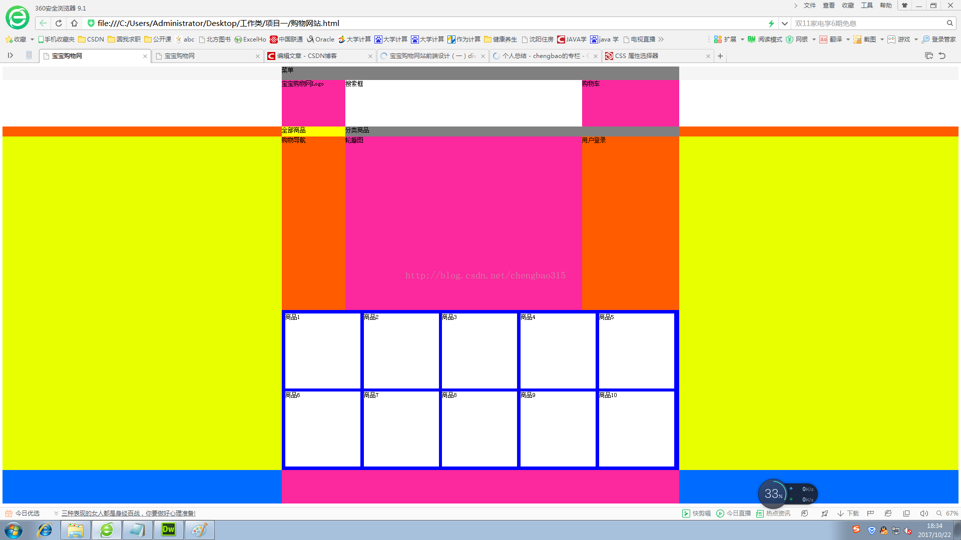
看完效果图,本篇的内容就要结束了,本篇只完成了页面布局部分,后续还会继续做里面的内容,等项目全部完成再将代码上传到csdn,如有问题欢迎留言,作者会认真回复。
开始学习web数日有余,深觉实践和写博客是提高技术的有效途径。没有什么项目资源,也没有什么人指导,仅凭我的一腔热情和闯劲,想做出一些有价值、有意义的事情,不足之处希望大家给予包容。
根据“我的Web开发学习路线”,决定先做一个购物网站的项目,毕竟现在购物网站见得多了,参考也多,所以入手就选它了。本篇实现的功能是主页的布局设计,主要采用的技术是div + css,关于html、css的基础和概念请参考其他学习网站学习,本篇不做介绍。
好了,下面看一下我的目标是做出类似下面这样的一个购物网站:
简单设计了一个主页的页面,作为案例说明,非商业用途,如有影响,联系本人删除
看似简单的界面,对于我这个小白还是废了不少周折的,因为整体页面比较复杂,今天主要实现页面的布局功能。目前为止,页面布局方式有表单、表格、div
+ css 以及一些框架,其中最常用的方式就是div + css 了,因为<div>
元素是常用的布局工具,他可以轻松的通过css来进行定位。
下面来讲代码,创建html 文件 index.html 和css文件 index.css ,在html中引入css,创建基本布局 div头部,div主体,div底部。代码如下:
<head>
<meta http-equiv="Content-Type" content="text/html; charset=utf-8" />
<title>宝宝购物网</title>
<link rel="stylesheet" type="text/css" href="css/index.css" />
</head>
<body>
<div id = "head">头部 </div>
<div id = "body">主体 </div>
<div id = "footer">底部 </div>
</body>
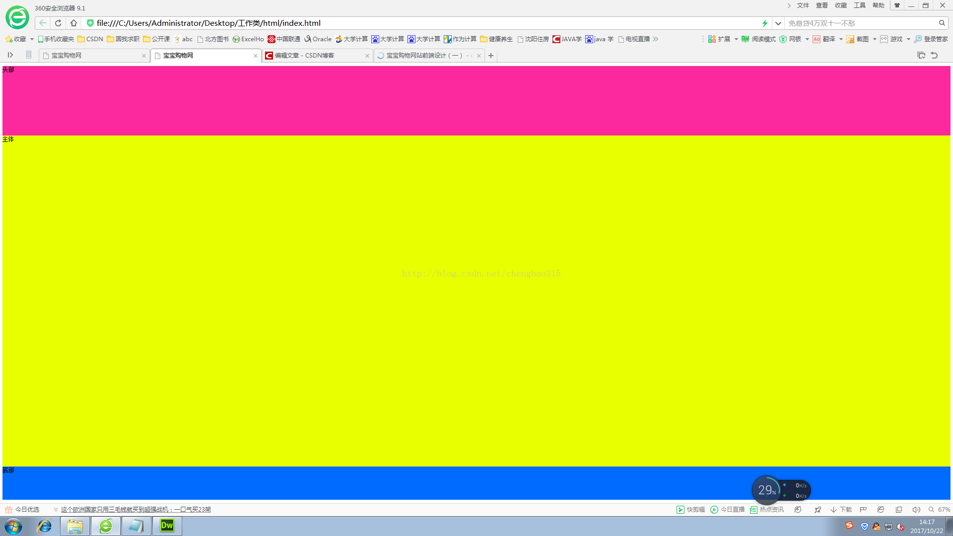
下面来实现样式,根据UI设计,头部、主体、底部的高度分别是210px,1000px,100px,为了方便观察,分别设置成不同的背景颜色,代码实现如下:
#head{
height:210px;
background-color:rgba(251,40,158,1.00)
}

#body{
height:1000px;
background-color:rgba(232,255,0,1.00)
}

#footer{
height:100px;
background-color:rgba(0,108,255,1.00)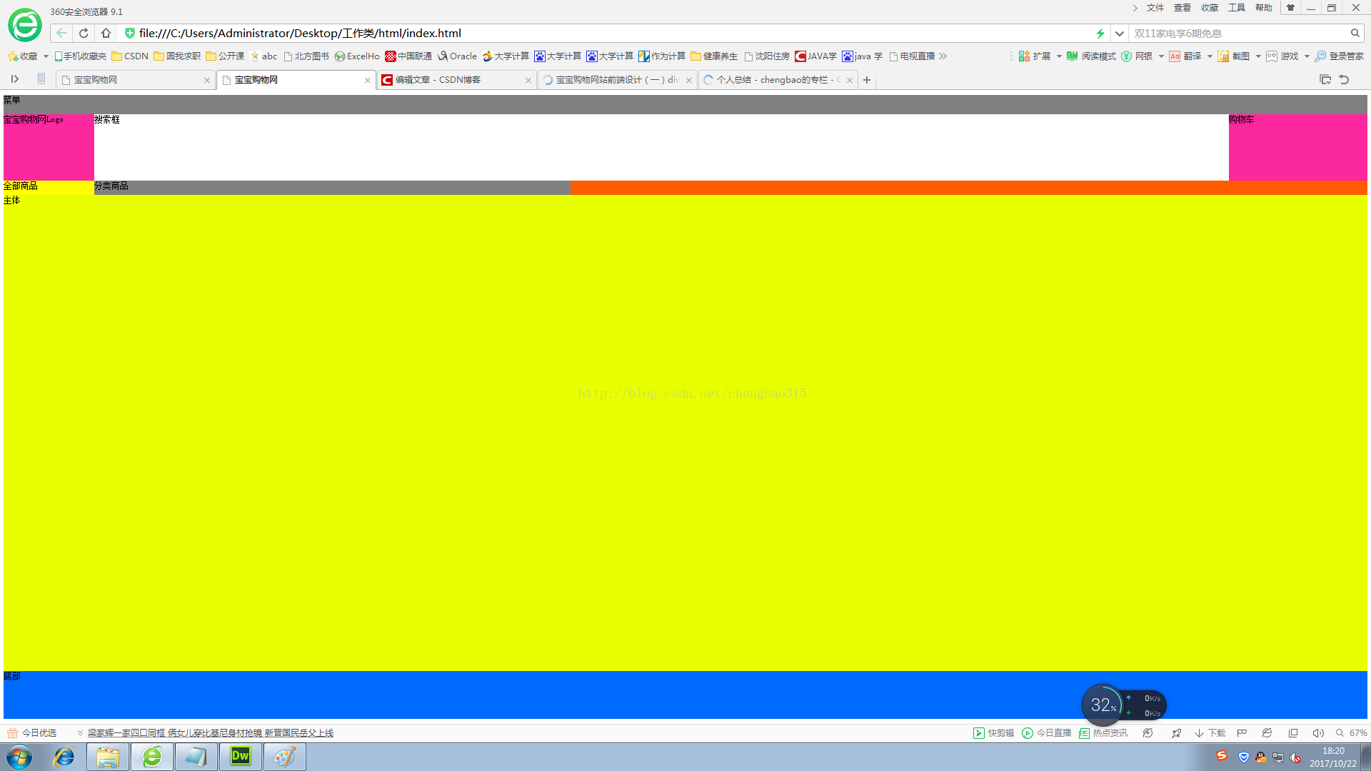
}可以看到现在的效果图如下图所示:大体布局出来了,下面要实现具体的模块布局了。头部又分为三块,分别是登录、购物车等菜单块,Logo及搜索框块,商品分类块,继续使用div元素,添加三个部分。
<div id = "head">头部
<div id ="head-top">
</div>
<div id ="head-center">
</div>
<div id ="head-bottom">
</div>
</div>css 代码:
#head #head-top{
height: 40px;
background-color: rgb(245,245,245);
}

#head #head-center{
height: 140px;
background-color: white;
}

#head #head-bottom{
height: 30px;
background-color: rgb(255,92,0);
}这样,头部又划分为三个部分,我们再将三个部分的内容填充进去<div id ="head-top">css代码:
<div id="head-top-content" class="auto">
菜单
</div></div><div id ="head-center">
<div id="head-center-left">
宝宝购物网Logo
</div><div id="head-center-center">
搜索框
</div><div id="head-center-right">
购物车
</div></div><div id ="head-bottom">
<div id="head-bottom-left">
全部商品
</div><div id="head-bottom-right">
分类商品
</div></div>
#head #head-top{
height: 40px;
background-color: rgb(245,245,245);
}
#head #head-top #head-top-content
{
height: 40px;
background-color: gray;
}

#head #head-center{
height: 140px;
background-color: white;
}
#head #head-center  #head-center-left
{
height: 140px;
width: 190px;
float:left;
background-color: rgba(251,40,158,1.00)
}
#head #head-center #head-center-center
{
height: 140px;
width: 710px;
float:left;
background-color: white;
}
#head #head-center #head-center-right
{
height: 140px;
width: 290px;
float:right;
background-color: rgba(251,40,158,1.00);
}

#head #head-bottom{
height: 30px;
background-color: rgb(255,92,0);
}
#head #head-bottom #head-bottom-left
{
height: 30px;
width: 190px;
float:left;
background-color: yellow;
}
#head #head-bottom #head-bottom-right
{
height: 30px;
width:1000px;
float:left;
background-color: gray;
}
划重点:注意下面介绍本篇的重点技术啦!
1、div 块内部再加入div 时,css定义子样式需要继承父样式,写法如:#head #head-top{}
2、div块 默认的布局方式纵向累加,如果想要横向布局,一定要加float 属性,设置值为left 或 right,如:width: 190px ; float: left ;
下面上一下效果图,如图所示
看着有一点别扭,原因就是内容没有居中,大家可以观察一下,现在的网站内容大多都在中间显示,两边留白(用来打广告,哈哈),那么这个怎么实现的呢?只需要在css中加一个类选择器 .auto 就可以了。
.auto{
width:1190px;
margin: 0 auto;
}代码的含义是设置块的宽度是1190,位置居中。
重点3、设置块居中可以使用类选择器,margin属性进行设置。
好了,剩下的主体和底部部分的实现和头部是没有区别的,这里不做讲解了,最后看下最终的效果图:
看完效果图,本篇的内容就要结束了,本篇只完成了页面布局部分,后续还会继续做里面的内容,等项目全部完成再将代码上传到csdn,如有问题欢迎留言,作者会认真回复。

相关文章推荐
- 技术前沿 DIV+CSS布局网页对网站SEO的影响
- <div+css页面布局课堂笔记>11---页面布局网站首页设计实例__终极版(仿csdn首页)
- 收藏网站制作常用经典css.div.布局.设计实例打包下载1
- 使用Div+CSS布局设计网站的优点
- Div+CSS布局 网站设计的优点!
- 收藏网站制作常用经典css.div.布局.设计实例打包下载(下方有其他链接)
- Div+CSS布局 网站设计的优点!
- DIV+CSS汇总网页布局及网站设计常犯错误来源
- <div+css页面布局课堂笔记>10---页面布局网站首页设计实例__2
- 使用Div+CSS布局设计网站的优点
- Div+CSS布局 网站设计的优点!
- <div+css页面布局课堂笔记>9---页面布局网站首页设计实例__1
- 收藏网站制作常用经典css.div.布局.设计实例打包下载
- Div+CSS布局 网站设计的优点!
- DIV+CSS网页布局及网站设计常犯错误
- 收藏网站制作常用经典css.div.布局.设计实例打包下载2
- 收藏网站制作常用经典css.div.布局.设计实例打包下载2
- DIV+CSS网页布局及网站设计常犯错误
- 网站建设设计前端开发需要学习html和div+css
- DIV+CSS布局网站