vue 封装自定义组件--tabal列表编辑单元格组件
2017-09-07 16:11
776 查看
vue 封装自定义组件
tabal列表编辑单元格组件<template>
<div class="editable-cell">
<div class="editable-cell-input-wrapper" v-if='editable'>
<el-input class="editInput" v-model="cellValue" placeholder="请输入内容" v-loading="editLoading" size="small"></el-input>
<el-button type="text"><i class="el-icon-check" @click='check'></i></el-button>
</div>
<div class="editable-cell-text-wrapper" v-else>
{{cellValue || ' '}}
<el-button type="text"><i class="el-icon-edit" @click='edit'></i></el-button>
</div>
</div>
</template>
<script>
import util from '../../common/js/util';
import $ from 'jquery';
import axios from './../../common/ajax/axios.js';
export default {
data() {
return {
cellValue:this.value,
editable:false,
editLoading:false,
};
},
props : [
'value'
],
methods: {
check(){
const self = this;
function callback(){
self.editLoading = false;
self.editable=false;
}
this.editLoading = true;
self.$emit('cellChange',self.cellValue,callback)
},
edit(){
this.editable = true;
}
}
};
</script>
<style lang="less" scoped>
.taskDetail{
margin-left: 10px;
margin-top:10px;
}
.editInput{
width: 200px;
height: 30px;
}
.el-icon-edit{
margin-left: 20px;
}
.el-icon-check{
margin-left: 20px;
}
</style>
<style>
.editInput .el-loading-spinner .circular{
width:20px;
}
</style>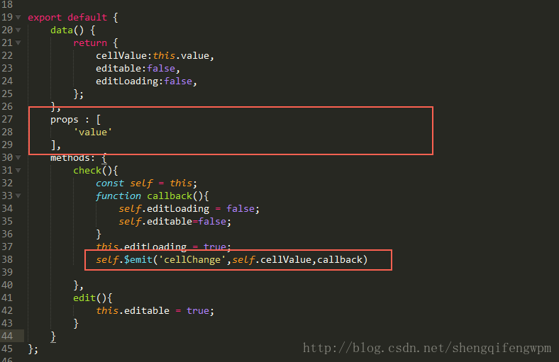
解释一下:
props:父组件传递给子组件的值;
$emit(‘方法名’,数据) 返回父级数据,会触发父组件中调用子组件的方法;
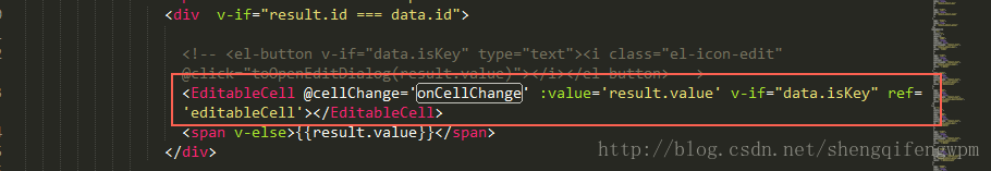
父组件中的使用方法:
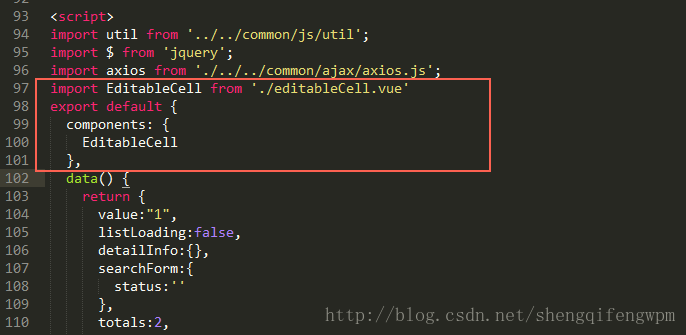
1.先将组件import 进来;
2.然后将组件暴露出去,这样父组件就可以用了;

相关文章推荐
- vue2.0 自定义组件的方法(vue组件的封装)
- Vue.js组件封装——下拉列表
- 【vue 组件 mint-ui】 看了一下源码,给轮播图Swiper封装自定义跳转的函数
- 从零开始封装自己的自定义Vue组件
- vue自定义组件和列表循环--vue学习笔记
- vue2.0项目 calendar.js(日历组件封装)
- ionic 封装Echarts,自定义组件方便开发调用
- vue2.0 自定义 饼状图 (Echarts)组件的方法
- 数据列表实现方式(基于Vue.js封装)
- 手把手教你封装 Vue 组件并使用 NPM 发布
- Vue.js自定义事件的表单输入组件方法
- SWING学习:JTable实现自定义的编辑单元格 (1)
- Vue 2.0 制作列表组件,实现分页、搜索、批量操作等
- vue进阶(1) ---自定义组件
- vue脚手架中自定义全局组件的方法
- vue 自定义组件使用v-model
- vue.js2.0 自定义组件初体验
- vue学习系列-完成一个分页组件的封装
- vue 自定义组件的写法与用法