自定义组合控件--自定义标题栏模板
2017-09-01 20:03
190 查看
前言: 在实际开发的时候,标题栏往往有很多共通性。在编写布局代码的时候可能会遇到每个页面都有一个标题栏,但是标题栏之间的差别又不是很大,而在每一个页面都去写一个标题栏那就是严重影响开发进度了,而且让一个脑力活变成了一个体力活。而且在开发其他项目的时候恰好也有一个类似的标题栏,在之前的项目中的代码的复用性就变差了。这篇博客将我实现自定义标题的方法分享一下。
一、先看一下标题栏效果,标题栏比较简单。重在演示如何自定义标题栏。
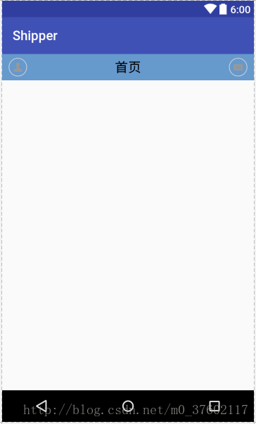
思路: 在这里我们使用自定义组合控件的方式来设计这个标题栏,首先可以看到这个标题栏中间都有些什么内容,左右两端有两个控件,用来显示我的和消息的两张图片,所以就可以想到这是两个ImageView。然后中间有一个标题,显然这是一个TextView。有了思路之后,我们来看看代码如何编写。
二、代码
1、首先我们在layout布局中新建一个布局,来搭建我们的布局。PS:这里布局有两种方式,代码和XML,在这里我不采用代码方式。因为如果通过代码的方式来写的话会变的很繁琐。
2、这里我们需要定义一些自定义属性,让我们能够在控件属性中就能控制我们标题栏的一些属性。比如标题字体的大小颜色等等,我们在res/values下创建一个资源文件attrs。在attrs中name为自定义属名,format为自定义属性类型。
可以从自定义属性中看到,我给标题控件定义了text、color、size三个属性,给两边的两个图片控件添加了一个src属性。
3、自定义标题栏Java代码
可以中代码中看到,定义了一个类继承至FrameLayout。重写构造方法,在构造方法中首先是填充布局。然后获取自定义属性数组,然后获取自定义的属性,在获取完属性一定要typedArray.recycle();做回收操作,最后设置属性。最后定义两个设置左右两个控件是否显示的方法,因为View的显示默认就是为true,所以两个控件默认就是为显示。
一、先看一下标题栏效果,标题栏比较简单。重在演示如何自定义标题栏。
思路: 在这里我们使用自定义组合控件的方式来设计这个标题栏,首先可以看到这个标题栏中间都有些什么内容,左右两端有两个控件,用来显示我的和消息的两张图片,所以就可以想到这是两个ImageView。然后中间有一个标题,显然这是一个TextView。有了思路之后,我们来看看代码如何编写。
二、代码
1、首先我们在layout布局中新建一个布局,来搭建我们的布局。PS:这里布局有两种方式,代码和XML,在这里我不采用代码方式。因为如果通过代码的方式来写的话会变的很繁琐。
<?xml version="1.0" encoding="utf-8"?>
<RelativeLayout xmlns:android="http://schemas.android.com/apk/res/android"
android:layout_width="match_parent"
android:layout_height="40dp"
android:background="#6699cc"
>
<ImageView
android:id="@+id/iv_topbar_left"
android:layout_width="wrap_content"
android:layout_height="wrap_content"
android:src="@drawable/main_title_me"
android:layout_marginLeft="10dp"
android:layout_centerVertical="true"
/>
<TextView
android:id="@+id/tv_topbar_titletext"
android:layout_width="wrap_content"
android:layout_height="wrap_content"
android:text="首页"
android:textColor="#000000"
android:textSize="20dp"
android:layout_centerInParent="true"
/>
<ImageView
android:id="@+id/iv_topbar_right"
android:layout_width="wrap_content"
android:layout_height="wrap_content"
android:src="@drawable/main_title_message"
android:layout_alignParentRight="true"
android:layout_centerVertical="true"
android:layout_marginRight="10dp"
/>
</RelativeLayout>
2、这里我们需要定义一些自定义属性,让我们能够在控件属性中就能控制我们标题栏的一些属性。比如标题字体的大小颜色等等,我们在res/values下创建一个资源文件attrs。在attrs中name为自定义属名,format为自定义属性类型。
<?xml version="1.0" encoding="utf-8"?>
<resources>
<declare-styleable name="CustomXmlTopBar">
<!--topbar中间文字属性-->
<attr name="titleText" format="string"/>
<attr name="titleTextColor" format="color"/>
<attr name="titleTextSize" format="dimension"/>

<!--topbar左边控件属性-->
<attr name="leftSrc" format="reference"/>

<!--topbar左边控件属性-->
<attr name="rightSrc" format="reference"/>
</declare-styleable>
</resources>
可以从自定义属性中看到,我给标题控件定义了text、color、size三个属性,给两边的两个图片控件添加了一个src属性。
3、自定义标题栏Java代码
package vunke.com.android.shipper.view;

import android.content.Context;
import android.content.res.TypedArray;
import android.graphics.drawable.Drawable;
import android.os.Build;
import android.support.annotation.RequiresApi;
import android.util.AttributeSet;
import android.view.LayoutInflater;
import android.view.View;
import android.widget.FrameLayout;
import android.widget.ImageView;
import android.widget.TextView;

import org.w3c.dom.Text;

import vunke.com.android.shipper.R;

/**
* Created by 大家都说名字长不会被发现 on 2017/8/24.
*/

public class CustomXmlTopBar extends FrameLayout {

//定义控件变量
private ImageView iv_topbar_left,iv_topbar_right;
private TextView tv_topbar_titletext;

//属性变量
private String titleText;
private int titleTextColor;
private float titleTextSize;

private Drawable leftSrc;
private Drawable rightSrc;

public CustomXmlTopBar(Context context) {
super(context);
}

public CustomXmlTopBar(Context context, AttributeSet attrs) {
super(context, attrs);

//填充布局
LayoutInflater.from(context).inflate(R.layout.customtopbar_item,this);
iv_topbar_left = (ImageView) findViewById(R.id.iv_topbar_left);
iv_topbar_right = (ImageView) findViewById(R.id.iv_topbar_right);
tv_topbar_titletext = (TextView) findViewById(R.id.tv_topbar_titletext);

//获取自定义属性数组
TypedArray typedArray = context.obtainStyledAttributes(attrs, R.styleable.CustomXmlTopBar);

//获取属性
titleText = typedArray.getString(R.styleable.CustomXmlTopBar_titleText);
titleTextColor = typedArray.getColor(R.styleable.CustomXmlTopBar_titleTextColor,000000);
titleTextSize = typedArray.getDimension(R.styleable.CustomXmlTopBar_titleTextSize,20);

leftSrc = typedArray.getDrawable(R.styleable.CustomXmlTopBar_leftSrc);

rightSrc = typedArray.getDrawable(R.styleable.CustomXmlTopBar_rightSrc);

typedArray.recycle();

//设置属性
iv_topbar_left.setImageDrawable(leftSrc);
iv_topbar_right.setImageDrawable(rightSrc);
tv_topbar_titletext.setText(titleText);
tv_topbar_titletext.setTextColor(titleTextColor);
tv_topbar_titletext.setTextSize(titleTextSize);
}

public CustomXmlTopBar(Context context, AttributeSet attrs, int defStyleAttr) {
super(context, attrs, defStyleAttr);
}

@RequiresApi(api = Build.VERSION_CODES.LOLLIPOP)
public CustomXmlTopBar(Context context, AttributeSet attrs, int defStyleAttr, int defStyleRes) {
super(context, attrs, defStyleAttr, defStyleRes);
}
//设置左控件是否显示,默认为显示
public void setLeftIsvisable(boolean isvisableFlag){

if (isvisableFlag){
iv_topbar_left.setVisibility(View.VISIBLE);
}else {
iv_topbar_left.setVisibility(View.GONE);
}
}
//设置右控件是否显示,默认为显示
public void setRightIsvisable(boolean isvisableFlag){
if (isvisableFlag){
iv_topbar_right.setVisibility(View.VISIBLE);
}else {
iv_topbar_right.setVisibility(View.GONE);
}
}
}
可以中代码中看到,定义了一个类继承至FrameLayout。重写构造方法,在构造方法中首先是填充布局。然后获取自定义属性数组,然后获取自定义的属性,在获取完属性一定要typedArray.recycle();做回收操作,最后设置属性。最后定义两个设置左右两个控件是否显示的方法,因为View的显示默认就是为true,所以两个控件默认就是为显示。

相关文章推荐
- Android之自定义标题栏(组合控件)
- 安卓自定义组合控件实现标题栏
- 圆形进度条+二维码扫描+自定义组合控件标题栏+自定义矩形view+接口回调方法
- 群英传笔记 自定义view之 通过组合(复合)控件创建一个通用标题栏view
- 自定义标题栏组合控件
- 自定义view:经典的标题栏(组合控件)
- 组合View-标题栏自绘控件圆形进度条/扫描二维码/自定义ViewGroup阶梯布局
- Android进阶——自定义View之重写ViewGroup组合系统控件实现自定义ToolBar模板
- 自定义安卓的组合控件
- Android自定义控件之自定义组合控件(三)
- Android自定义组合控件---教你如何自定义下拉刷新和左滑删除
- D23_06_组合到一起(自定义窗体作为模板)
- android 自定义组合控件总结(两个Button点击切换)
- Android 自定义组合控件小结
- 自定义组件(二)------使用系统控件组合的自定义控件
- 自定义组合控件之——旋转的菜单(老优酷菜单)
- android项目自定义组合控件添加属性
- 自定义组合控件——TitleTextView
- 自定义组合控件
- android:自定义组合控件Weight(高仿猫眼底部菜单栏)