基于zepto或jquery的手机端弹出框成功,失败,加载特效
2017-08-15 14:50
260 查看
html:
<!DOCTYPE html>
<html lang="en">
<head>
<meta charset="UTF-8">
<meta name="viewport" content="width=device-width, initial-scale=1.0, maximum-scale=1.0, user-scalable=1.0" />
<title>基于jquery的手机端对话框特效 - 素材家园</title>
<link rel="stylesheet" type="text/css" href="mdialog.css">
<style type="text/css">
input {
margin: 100px auto;
}
input[type="button"] {
padding: 15px 25px;
}
</style>
</head>
<body>
<center>
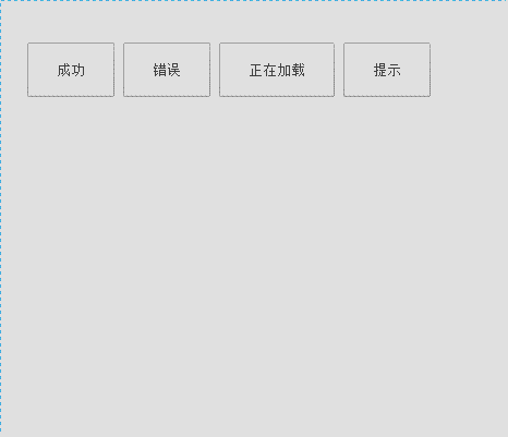
<input type="button" id="success" value="成功" />
<input type="button" id="error" value="错误" />
<input type="button" id="load" value="正在加载" />
<input type="button" id="tip" value="提示" />
</center>
<script type="text/javascript" src="jquery-1.11.1.min.js"></script>
<script type="text/javascript" src="mdialog.js"></script>
<script type="text/javascript">
//成功
$("#success").click(function() {
new TipBox({
setTime: 1500,
type: 'success',
str: '操作成功',
hasBtn: true
});
});
//错误
$("#error").click(function() {
new TipBox({
type: 'error',
str: '对不起,出错了!',
hasBtn: true
});
});
//提示
$("#tip").click(function() {
new TipBox({
type: 'tip',
str: '这是提示信息',
clickDomCancel: true,
setTime: 10000500,
hasBtn: true
});
});
//加载
$("#load").click(function() {
new TipBox({
type: 'load',
str: "努力加载中..",
setTime: 1500,
callBack: function() {
new TipBox({
type: 'success',
str: '操作成功',
hasBtn: true
});
}
});
});
</script>
</body>
</html>css:
#animationTipBox {
font-family: "Microsoft Yahei","微软雅黑",Arial,Tahoma;
font-size: 14px;
width: 250px;
height: auto;
background-color: #fff;
border-radius: 8px;
position: fixed;
left: 50%;
top: 50%;
margin-left: -125px;
margin-top: -85px;
z-index: 1001;
-webkit-animation: alertAnimation .3s ease-in-out 0 1;
-moz-animation: alertAnimation .3s ease-in-out 0 1;
animation: alertAnimation .3s ease-in-out 0 1
}

#sm-load {
width: 20px;
height: 20px;
padding: 0;
background: 0;
padding: 0;
position: relative;
float: left;
vertical-align: middle;
margin-right: 5px;
top: 0;
left: 0;
margin: 0;
-webkit-animation: none;
-moz-animation: none;
animation: none
}

#sm-load .load {
width: 20px;
height: 20px;
border: 0;
margin: 0 auto;
top: 0
}

#sm-load .icon_box {
margin: 0 auto
}

#sm-load .load .cirBox
1bf78
1,#sm-load .load .cirBox2,#sm-load .load .cirBox3 {
width: 20px;
height: 20px;
position: absolute;
left: 0;
top: 0
}

#sm-load .load .cirBox1>div,#sm-load .load .cirBox2>div,#sm-load .load .cirBox3>div {
width: 4px;
height: 4px;
border-radius: 100%;
background-color: #fff;
position: absolute
}

#sm-load .load .icon_box {
width: 20px;
height: 20px
}

#animationTipBox .icon {
position: relative;
width: 80px;
height: 80px;
border-radius: 50px;
border: 4px solid #6c3;
margin: 15px auto 5px auto
}

#animationTipBox .icon_box {
width: 80px;
height: 80px;
margin: 0 auto;
text-align: center;
position: relative
}

.tip .icon {
width: 80px;
height: 80px;
background-color: #6c3;
border-radius: 100%;
color: #fff;
font-size: 80px;
text-align: center;
line-height: 80px
}

#animationTipBox .lose .icon {
border-color: #ff9090
}

#animationTipBox .lose .icon_box {
-webkit-animation: lose_Animation .5s;
-moz-animation: lose_Animation .5s;
animation: lose_Animation .5s
}

#animationTipBox .dec_txt {
font-size: 16px;
text-align: center;
color: #666;
line-height: 26px;
height: 26px;
padding: 5px 0 10px 0
}

.success .line_short {
width: 25px;
height: 5px;
position: absolute;
left: 14px;
top: 46px;
border-radius: 4px;
background-color: #6c3;
-webkit-transform: rotate(45deg);
-moz-transform: rotate(45deg);
transform: rotate(45deg);
-webkit-animation: success_short_Animation .65s;
-moz-animation: success_short_Animation .65s;
animation: success_short_Animation .65s
}

.success .line_long {
width: 47px;
height: 5px;
position: absolute;
right: 8px;
top: 38px;
border-radius: 4px;
background-color: #6c3;
-webkit-transform: rotate(-45deg);
-moz-transform: rotate(-45deg);
transform: rotate(-45deg);
-webkit-animation: success_long_Animation .65s;
-moz-animation: success_long_Animation .65s;
animation: success_long_Animation .65s
}

.lose .line_left,.lose .line_right {
width: 47px;
height: 5px;
position: absolute;
left: 17px;
top: 37px;
border-radius: 4px;
background-color: #ff9090;
-webkit-transform: rotate(45deg);
-moz-transform: rotate(45deg);
transform: rotate(45deg)
}

.lose .line_right {
right: 11px;
top: 37px;
-webkit-transform: rotate(-45deg);
-moz-transform: rotate(-45deg);
transform: rotate(-45deg)
}

@keyframes alertAnimation {
0% {
transform: scale(0.5)
}

45% {
transform: scale(1.25)
}

80% {
transform: scale(0.95)
}

100% {
transform: scale(1)
}
}

@-webkit-keyframes alertAnimation {
0% {
-webkit-transform: scale(0.5)
}

45% {
-webkit-transform: scale(1.25)
}

80% {
-webkit-transform: scale(0.95)
}

100% {
-webkit-transform: scale(1)
}
}

@-moz-keyframes alertAnimation {
0% {
-moz-transform: scale(0.5)
}

45% {
-moz-transform: scale(1.25)
}

80% {
-moz-transform: scale(0.95)
}

100% {
-moz-transform: scale(1)
}
}

@-webkit-keyframes success_short_Animation {
0% {
width: 0;
left: 1px;
top: 19px
}

54% {
width: 0;
left: 1px;
top: 19px
}

70% {
width: 50px;
left: -4px;
top: 37px
}

84% {
width: 17px;
left: 21px;
top: 48px
}

100% {
width: 25px;
left: 14px;
top: 45px
}
}

@-moz-keyframes success_short_Animation {
0% {
width: 0;
left: 1px;
top: 19px
}

54% {
width: 0;
left: 1px;
top: 19px
}

70% {
width: 50px;
left: -4px;
top: 37px
}

84% {
width: 17px;
left: 21px;
top: 48px
}

100% {
width: 25px;
left: 14px;
top: 45px
}
}

@keyframes success_short_Animation {
0% {
width: 0;
left: 1px;
top: 19px
}

54% {
width: 0;
left: 1px;
top: 19px
}

70% {
width: 50px;
left: -4px;
top: 37px
}

84% {
width: 17px;
left: 21px;
top: 48px
}

100% {
width: 25px;
left: 14px;
top: 45px
}
}

@-webkit-keyframes success_long_Animation {
0% {
width: 0;
right: 46px;
top: 54px
}

65% {
width: 0;
right: 46px;
top: 54px
}

84% {
width: 55px;
right: 0;
top: 35px
}

100% {
width: 47px;
right: 8px;
top: 38px
}
}

@-moz-keyframes success_long_Animation {
0% {
width: 0;
right: 46px;
top: 54px
}

65% {
width: 0;
right: 46px;
top: 54px
}

84% {
width: 55px;
right: 0;
top: 35px
}

100% {
width: 47px;
right: 8px;
top: 38px
}
}

@keyframes success_long_Animation {
0% {
width: 0;
right: 46px;
top: 54px
}

65% {
width: 0;
right: 46px;
top: 54px
}

84% {
width: 55px;
right: 0;
top: 35px
}

100% {
width: 47px;
right: 8px;
top: 38px
}
}

@-webkit-keyframes lose_Animation {
0% {
-webkit-transform: scale(0.6);
opacity: .2
}

50% {
-webkit-transform: scale(0.6);
opacity: .5
}

80% {
-webkit-transform: scale(1.15);
opacity: .8
}

100% {
-webkit-transform: scale(1);
opacity: 1.0
}
}

@-moz-keyframes lose_Animation {
0% {
-moz-transform: scale(0.6);
opacity: .2
}

50% {
-moz-transform: scale(0.6);
opacity: .5
}

80% {
-moz-transform: scale(1.15);
opacity: .8
}

100% {
-moz-transform: scale(1);
opacity: 1.0
}
}

@keyframes lose_Animation {
0% {
transform: scale(0.6);
opacity: .2
}

50% {
transform: scale(0.6);
opacity: .5
}

80% {
transform: scale(1.15);
opacity: .8
}

100% {
transform: scale(1);
opacity: 1.0
}
}

@-webkit-keyframes load_Animation {
0% {
-webkit-transform: scale(0.6);
opacity: .2
}

50% {
-webkit-transform: scale(0.6);
opacity: .5
}

80% {
-webkit-transform: scale(1.15);
opacity: .8
}

100% {
-webkit-transform: scale(1);
opacity: 1.0
}
}

@-moz-keyframes load_Animation {
0% {
-moz-transform: scale(0.6);
opacity: .2
}

50% {
-moz-transform: scale(0.6);
opacity: .5
}

80% {
-moz-transform: scale(1.15);
opacity: .8
}

100% {
-moz-transform: scale(1);
opacity: 1.0
}
}

@keyframes load_Animation {
0% {
transform: scale(0.6);
opacity: .2
}

50% {
transform: scale(0.6);
opacity: .5
}

80% {
transform: scale(1.15);
opacity: .8
}

100% {
transform: scale(1);
opacity: 1.0
}
}

.load {
position: relative;
width: 60px;
height: 80px;
border-radius: 50px;
border: 4px solid #fff;
margin: 15px auto 5px auto;
top: 10px
}

.load .icon_box {
margin: 10px auto;
width: 60px;
height: 60px
}

.load .cirBox1,.load .cirBox2,.load .cirBox3 {
width: 60px;
height: 60px;
position: absolute;
left: 0;
top: 0
}

.load .cirBox1>div,.load .cirBox2>div,.load .cirBox3>div {
width: 10px;
height: 10px;
border-radius: 100%;
background-color: #ccc;
position: absolute
}

.load .cirBox1 {
-webkit-transform: rotate(30deg);
-moz-transform: rotate(30deg);
transform: rotate(30deg)
}

.load .cirBox2 {
-webkit-transform: rotate(60deg);
-moz-transform: rotate(60deg);
transform: rotate(60deg)
}

.load .cirBox3 {
-webkit-transform: rotate(90deg);
-moz-transform: rotate(90deg);
transform: rotate(90deg)
}

.load .cir1 {
left: 0;
top: 0
}

.load .cir2 {
right: 0;
top: 0
}

.load .cir3 {
right: 0;
bottom: 0
}

.load .cir4 {
left: 0;
bottom: 0
}

.load .cir1,.load .cir2,.load .cir3,.load .cir4 {
-webkit-animation: cir_Animation 1.2s ease 0 infinite;
-moz-animation: cir_Animation 1.2s ease 0 infinite;
animation: cir_Animation 1.2s ease 0 infinite
}

.cirBox1 .cir2 {
-webkit-animation-delay: -1.1s;
-moz-animation-delay: -1.1s;
animation-delay: -1.1s
}

.cirBox1 .cir3 {
-webkit-animation-delay: -0.8s;
-moz-animation-delay: -0.8s;
animation-delay: -0.8s
}

.cirBox1 .cir4 {
-webkit-animation-delay: -0.5s;
-moz-animation-delay: -0.5s;
animation-delay: -0.5s
}

.cirBox2 .cir2 {
-webkit-animation-delay: -1.0s;
-moz-animation-delay: -1.0s;
animation-delay: -1.0s
}

.cirBox2 .cir3 {
-webkit-animation-delay: -0.7s;
-moz-animation-delay: -0.7s;
animation-delay: -0.7s
}

.cirBox2 .cir4 {
-webkit-animation-delay: -0.4s;
-moz-animation-delay: -0.4s;
animation-delay: -0.4s
}

.cirBox3 .cir2 {
-webkit-animation-delay: -0.9s;
-moz-animation-delay: -0.9s;
animation-delay: -0.9s
}

.cirBox3 .cir3 {
-webkit-animation-delay: -0.6s;
-moz-animation-delay: -0.6s;
animation-delay: -0.6s
}

.cirBox3 .cir4 {
-webkit-animation-delay: -0.3s;
-moz-animation-delay: -0.3s;
animation-delay: -0.3s
}

@-webkit-keyframes cir_Animation {
0%,80%,100% {
-webkit-transform: scale(0.4)
}

40% {
-webkit-transform: scale(1.0)
}
}

.mask {
width: 100%;
height: 100%;
background-color: #000;
opacity: .8;
position: fixed;
left: 0;
top: 0;
z-index: 1000
}

#animationTipBox .okoButton {
width: 80px;
display: block;
height: 35px;
margin: 0 auto;
border: 0;
padding: 0;
border-radius: 5px;
background: #6c3;
color: #fff;
font-size: 22px;
}

#animationTipBox .redOkoButton {
background: #ff9090
}

/*www.sucaijiayuan.com*/
js:
/*
* @弹出提示层 ( 加载动画(load), 提示动画(tip), 成功(success), 错误(error), )
* @method  tipBox
* @description 默认配置参数
* @time    2014-12-19
* @param {Number} width -宽度
* @param {Number} height -高度
* @param {String} str -默认文字
* @param {Object} windowDom -载入窗口 默认当前窗口
* @param {Number} setTime -定时消失(毫秒) 默认为0 不消失
* @param {Boolean} hasMask -是否显示遮罩
* @param {Boolean} hasMaskWhite -显示白色遮罩
* @param {Boolean} clickDomCancel -点击空白取消
* @param {Function} callBack -回调函数 (只在开启定时消失时才生效)
* @param {Function} hasBtn -显示按钮
* @param {String} type -动画类型 (加载,成功,失败,提示)
* @example
* new TipBox();
* new TipBox({type:'load',setTime:1000,callBack:function(){ alert(..) }});
*/
function TipBox(cfg) {
this.config = {
width: 250,
height: 170,
str: '正在处理',
windowDom: window,
setTime: 0,
hasMask: true,
hasMaskWhite: false,
clickDomCancel: false,
callBack: null,
hasBtn: false,
type: 'success'
}
$.extend(this.config, cfg);

//存在就retrun
if (TipBox.prototype.boundingBox) return;

//初始化
this.render(this.config.type);
return this;
};

//外层box
TipBox.prototype.boundingBox = null;

//渲染
TipBox.prototype.render = function(tipType, container) {
this.renderUI(tipType);

//绑定事件
this.bindUI();

//初始化UI
this.syncUI();
$(container || this.config.windowDom.document.body).append(TipBox.prototype.boundingBox);
};

//渲染UI
TipBox.prototype.renderUI = function(tipType) {
TipBox.prototype.boundingBox = $("<div id='animationTipBox'></div>");
tipType == 'load' && this.loadRenderUI();
tipType == 'success' && this.successRenderUI();
tipType == 'error' && this.errorRenderUI();
tipType == 'tip' && this.tipRenderUI();
TipBox.prototype.boundingBox.appendTo(this.config.windowDom.document.body);

//是否显示遮罩
if (this.config.hasMask) {
this.config.hasMaskWhite ? this._mask = $("<div class='mask_white'></div>") : this._mask = $("<div class='mask'></div>");
this._mask.appendTo(this.config.windowDom.document.body);
}
// 是否显示按钮
if (this.config.hasBtn) {
this.config.height = 206;
$('#animationTipBox').css("margin-top", "103px");
switch (this.config.type) {
case 'success':
$(".success").after("<button class='okoButton'>ok</button>");
break;
case 'error':
$(".lose").after("<button class='okoButton redOkoButton'>ok</button>");
break;
case 'tip':
$(".tip").after("<button class='okoButton'>ok</button>");
break;
default:
break;
}
$('button.okoButton').on('click', function() {
_this.close();
});
}
//定时消失
_this = this;
!this.config.setTime && typeof this.config.callBack === "function" && (this.config.setTime = 1);
this.config.setTime && setTimeout(function() {
_this.close();
}, _this.config.setTime);
};

TipBox.prototype.bindUI = function() {
_this = this;

//点击空白立即取消
this.config.clickDomCancel && this._mask && this._mask.click(function() {
_this.close();
});
};
TipBox.prototype.syncUI = function() {
TipBox.prototype.boundingBox.css({
width: this.config.width + 'px',
height: this.config.height + 'px',
marginLeft: "-" + (this.config.width / 2) + 'px',
marginTop: "-" + (this.config.height / 2) + 'px'
});
};

//提示效果UI
TipBox.prototype.tipRenderUI = function() {
var tip = "<div class='tip'>";
tip += "     <div class='icon'>i</div>";
tip += "     <div class='dec_txt'>" + this.config.str + "</div>";
tip += "</div>";
TipBox.prototype.boundingBox.append(tip);
};

//成功效果UI
TipBox.prototype.successRenderUI = function() {
var suc = "<div class='success'>";
suc += " <div class='icon'>";
suc += "<div class='line_short'></div>";
suc += "<div class='line_long'></div>  ";
suc += "</div>";
suc += " <div class='dec_txt'>" + this.config.str + "</div>";
suc += "</div>";
TipBox.prototype.boundingBox.append(suc);
};

//错误效果UI
TipBox.prototype.errorRenderUI = function() {
var err = "<div class='lose'>";
err += "   <div class='icon'>";
err += "       <div class='icon_box'>";
err += "           <div class='line_left'></div>";
err += "           <div class='line_right'></div>";
err += "       </div>";
err += "   </div>";
err += "<div class='dec_txt'>" + this.config.str + "</div>";
err += "</div>";
TipBox.prototype.boundingBox.append(err);
};

//加载动画load UI
TipBox.prototype.loadRenderUI = function() {
var load = "<div class='load'>";
load += "<div class='icon_box'>";
for (var i = 1; i < 4; i++) {
load += "<div class='cirBox" + i + "'>";
load += "<div class='cir1'></div>";
load += "<div class='cir2'></div>";
load += "<div class='cir3'></div>";
load += "<div class='cir4'></div>";
load += "</div>";
}
load += "</div>";
load += "</div>";
load += "<div class='dec_txt'>" + this.config.str + "</div>";
TipBox.prototype.boundingBox.append(load);
};

//关闭
TipBox.prototype.close = function() {
TipBox.prototype.destroy();
this.destroy();
this.config.setTime && typeof this.config.callBack === "function" && this.config.callBack();
};

//销毁
TipBox.prototype.destroy = function() {
this._mask && this._mask.remove();
TipBox.prototype.boundingBox && TipBox.prototype.boundingBox.remove();
TipBox.prototype.boundingBox = null;
};

相关文章推荐
- 基于zepto或jquery的手机端弹出框成功,失败,加载特效
- 移动端下拉刷新、加载更多插件dropload.js(基于jQuery/Zepto)
- 基于jQuery图片弹出翻转特效代码
- 基于jQuery的弹出隐藏层的窗口特效
- 基于jQuery打造的选项卡向上弹出jquery焦点图切换特效
- 基于jQuery点击加载动画按钮特效
- 一款基于jquery打造的鼠标响应式顶部弹出窗口特效
- IE及IE6浏览器中判断JS文件加载成功失败的方法
- 一款基于css3和jquery实现的动画弹出层
- 基于bootstrup的jQuery超酷hero幻灯片特效
- jquery图片加载失败
- 基于jquery的loading 加载提示效果实现代码
- 基于jquery的图片懒加载js
- 基于jQuery图片切换实现预加载插件,左右带控制
- 一款基于jquery和css3的头像恶搞特效
- ASP.NET MVC 3.0:基于Ajax的表单提交,A页面认证失败后页面被强转至登录页面,待登录成功将如何回到A页面?
- 基于JQuery实现滚动到页面底端时自动加载更多信息
- 基于jQuery的图片异步加载和预加载实例
- JS正则表达式应用——基于Jquery的验证密码强度特效