css3实现圆形进度加载动画
2017-07-18 16:01
459 查看
使用到的css3属性有border-radius,transform,animation,clip等,在这里着重讲一下clip这个属性。因为博主也是第一次用这个属性。。。
这个属性就是规定盒子内显示的区域,可以有的值有auto(默认),有inherit:从父类继承,还有就是添加rect(top,right,bottom,left)。就是规定一下显示区域,只有盒子内从盒子的左上角的顶点做位置对比,只有在这四个值内的区域才能够显示出来。
重点:这个属性必须在绝对定位absolute或基于浏览器定位时fixed情况下,才管用。
具体情况还是自己测试一下,就全明白了。这个属性没有过渡效果,如果写到动画当中,它会从切换开始时间和切换时间取中间值,直接切换过去。
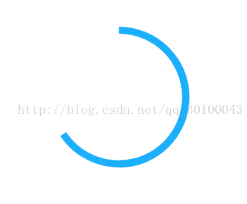
下面先上一个实现后的效果的代码,然后我还会再写一个封装好的代码,以便懒人使用。
下午因为项目需求,书写了一个构造函数,支持一些属性的修改,由于用了一下午,比较粗糙,凑合着用吧。只要把函数引入,实例化的时候设置将div的id传入,注意,一定要给div设置定位属性position为absolute或者fixed才管用。
<!doctype html>
<html>
<head>
<meta charset="UTF-8">
<meta name="viewport"
content="width=device-width, user-scalable=no, initial-scale=1.0, maximum-scale=1.0, minimum-scale=1.0">
<meta http-equiv="X-UA-Compatible" content="ie=edge">
<title>Document</title>
<style>
#circle{
position: absolute;
left:45%;
top:200px;
}
</style>
</head>
<body>
<div id="circle">
</div>
</body>
<script>
function Loading(setting) {
this.settings ={
animationTime:5,//动画执行时间
divId:"circle",//div盒子的id
divWidth:"200px",//盒子的宽度
divHeight:"200px", // 盒子的高度
divClassName: "active", //添加class名字后就会执行加载动画
leftDivName:"left", //第一个盒子的class名字
rightDivName:"right", //内部第二个盒子的class名字
infinite:true, // 是否循环
loadingWidth:"10px", //圆圈宽度
loadingColor:"#000" //圆圈的颜色
};
this.timeOut = null; //延迟器
if(setting){
for(var i in setting){
this.settings[i] = setting[i];
}
}
this.prefix = function () {
var div = document.createElement('div');
var cssText = '-webkit-transition:all .1s; -moz-transition:all .1s; -o-transition:all .1s; -ms-transition:all .1s; transition:all .1s;';
div.style.cssText = cssText;
var style = div.style;
if (style.webkitTransition) {
return '-webkit-';
}
if (style.MozTransition) {
return '-moz-';
}
if (style.oTransition) {
return '-o-';
}
if (style.msTransition) {
return '-ms-';
}
return '';
};
this.runOne = function (callback) {
var that = this;
//调用运行一次
this.div.classList.add(this.settings.divClassName);
this.timeOut = setTimeout(function () {
that.div.classList.remove(that.settings.divClassName);
callback.call(that.div,that.div);
},+that.settings.animationTime*1000)
};
this.runForever = function () {
this.div.classList.add(this.settings.divClassName);
};
var div = this.div = document.getElementById(this.settings.divId);
div.style.cssText = "border-radius:50%; width:"+this.settings.divWidth+"; height:"+this.settings.divHeight+"; clip:rect(0,"+div.offsetWidth+"px,"+div.offsetHeight+"px,"+div.offsetWidth/2+"px);;";
var left = document.createElement("div");
left.className = this.settings.leftDivName;
var right = document.createElement("div");
right.className = this.settings.rightDivName;
var style = document.createElement("style");
div.appendChild(left);
div.appendChild(right);
style.innerText = "" +
"@"+this.prefix()+"keyframes circle-animation {" +
" 0%{clip:rect(0,"+div.offsetWidth+"px,"+div.offsetHeight+"px,"+div.offsetWidth/2+"px);}" +
" 100%{clip:auto;}" +
"}\n" +
"@"+this.prefix()+"keyframes left-animation {" +
" 0%{transform: rotate(-45deg);}" +
" 50%{transform: rotate(135deg);}" +
" 100%{transform: rotate(315deg);}" +
"}\n" +
"@"+this.prefix()+"keyframes right-animation {" +
" 0%{transform: rotate(-45deg);}" +
" 50%{transform: rotate(135deg);}" +
" 100%{transform: rotate(135deg);}" +
"}\n" +
"#"+this.settings.divId+"."+this.settings.divClassName+"{" +
" "+this.prefix()+"animation: circle-animation "+this.settings.animationTime+"s linear "+(this.settings.infinite ? "infinite":"")+";" +
"}\n" +
"#"+this.settings.divId+" ."+this.settings.leftDivName+",#"+this.settings.divId+" ."+this.settings.rightDivName+"{" +
" border-left:"+this.settings.loadingWidth+" solid "+this.settings.loadingColor+";" +
" border-top:"+this.settings.loadingWidth+" solid "+this.settings.loadingColor+";" +
" border-right:"+this.settings.loadingWidth+" solid rgba(0,0,0,0);" +
" border-bottom:"+this.settings.loadingWidth+" solid rgba(0,0,0,0);" +
" transform: rotate(-45deg);" +
" position:absolute;" +
" left:0;" +
" top:0;" +
" width:100%;" +
" height:100%;" +
" border-radius:50%;" +
" box-sizing:border-box;" +
"}\n" +
"#"+this.settings.divId+"."+this.settings.divClassName+" ."+this.settings.leftDivName+"{" +
" "+this.prefix()+"animation: left-animation "+this.settings.animationTime+"s linear "+(this.settings.infinite ? "infinite":"")+
"}\n" +
"#"+this.settings.divId+"."+this.settings.divClassName+" ."+this.settings.rightDivName+"{" +
" "+this.prefix()+"animation: right-animation "+this.settings.animationTime+"s linear "+(this.settings.infinite ? "infinite":"")+
"}\n" +
"";
document.head.appendChild(style);
}
var obj = new Loading({divId:"circle"}); //实例化构造函数
obj.runOne(function () { //只运行一次,外加传入一个匿名函数
console.log("动画执行完成");
obj.runForever(); // 调用一直执行的函数
});
</script>
</html>
这个属性就是规定盒子内显示的区域,可以有的值有auto(默认),有inherit:从父类继承,还有就是添加rect(top,right,bottom,left)。就是规定一下显示区域,只有盒子内从盒子的左上角的顶点做位置对比,只有在这四个值内的区域才能够显示出来。
重点:这个属性必须在绝对定位absolute或基于浏览器定位时fixed情况下,才管用。
具体情况还是自己测试一下,就全明白了。这个属性没有过渡效果,如果写到动画当中,它会从切换开始时间和切换时间取中间值,直接切换过去。
下面先上一个实现后的效果的代码,然后我还会再写一个封装好的代码,以便懒人使用。
<!doctype html>
<html>
<head>
<meta charset="UTF-8">
<meta name="viewport"
content="width=device-width, user-scalable=no, initial-scale=1.0, maximum-scale=1.0, minimum-scale=1.0">
<meta http-equiv="X-UA-Compatible" content="ie=edge">
<title>Document</title>
<style>
.div{
position: absolute;
left:0;
top:0;
width:100%;
height: 100%;
border-radius: 50%;
border:10px solid rgba(0,0,0,0);
box-sizing: border-box;
}

.left,.right{
border-right-color: rgba(0,0,0,0);
border-bottom-color: rgba(0,0,0,0);
transform: rotate(-45deg);
}

#circle.hover .left{
border-left:10px solid #1caffc;
border-top:10px solid #1caffc;
animation: left-animation 5s linear;
}

#circle.hover .right{
border-left:10px solid #1caffc;
border-top:10px solid #1caffc;
animation: right-animation 5s linear;
}

#circle{
top:200px;
left:40%;
width:200px;
height: 200px;
border-width: 0;
clip:rect(0px,200px,200px,100px);
}

#circle.hover{
animation: circle-animation 5s linear;
}

@keyframes circle-animation {
0%{clip:rect(0px,200px,200px,100px);}
100%{clip:auto;}
}

@keyframes left-animation {
0%{transform: rotate(-45deg);}
50%{transform: rotate(135deg);}
100%{transform: rotate(315deg);}
}

@keyframes right-animation {
0%{transform: rotate(-45deg);}
50%{transform: rotate(135deg);}
100%{transform: rotate(135deg);}
}

</style>
</head>
<body>
<div class="div hover" id="circle">
<div class="right div"></div>
<div class="left div"></div>
</div>
</body>
</html>
下午因为项目需求,书写了一个构造函数,支持一些属性的修改,由于用了一下午,比较粗糙,凑合着用吧。只要把函数引入,实例化的时候设置将div的id传入,注意,一定要给div设置定位属性position为absolute或者fixed才管用。
<!doctype html>
<html>
<head>
<meta charset="UTF-8">
<meta name="viewport"
content="width=device-width, user-scalable=no, initial-scale=1.0, maximum-scale=1.0, minimum-scale=1.0">
<meta http-equiv="X-UA-Compatible" content="ie=edge">
<title>Document</title>
<style>
#circle{
position: absolute;
left:45%;
top:200px;
}
</style>
</head>
<body>
<div id="circle">
</div>
</body>
<script>
function Loading(setting) {
this.settings ={
animationTime:5,//动画执行时间
divId:"circle",//div盒子的id
divWidth:"200px",//盒子的宽度
divHeight:"200px", // 盒子的高度
divClassName: "active", //添加class名字后就会执行加载动画
leftDivName:"left", //第一个盒子的class名字
rightDivName:"right", //内部第二个盒子的class名字
infinite:true, // 是否循环
loadingWidth:"10px", //圆圈宽度
loadingColor:"#000" //圆圈的颜色
};
this.timeOut = null; //延迟器
if(setting){
for(var i in setting){
this.settings[i] = setting[i];
}
}
this.prefix = function () {
var div = document.createElement('div');
var cssText = '-webkit-transition:all .1s; -moz-transition:all .1s; -o-transition:all .1s; -ms-transition:all .1s; transition:all .1s;';
div.style.cssText = cssText;
var style = div.style;
if (style.webkitTransition) {
return '-webkit-';
}
if (style.MozTransition) {
return '-moz-';
}
if (style.oTransition) {
return '-o-';
}
if (style.msTransition) {
return '-ms-';
}
return '';
};
this.runOne = function (callback) {
var that = this;
//调用运行一次
this.div.classList.add(this.settings.divClassName);
this.timeOut = setTimeout(function () {
that.div.classList.remove(that.settings.divClassName);
callback.call(that.div,that.div);
},+that.settings.animationTime*1000)
};
this.runForever = function () {
this.div.classList.add(this.settings.divClassName);
};
var div = this.div = document.getElementById(this.settings.divId);
div.style.cssText = "border-radius:50%; width:"+this.settings.divWidth+"; height:"+this.settings.divHeight+"; clip:rect(0,"+div.offsetWidth+"px,"+div.offsetHeight+"px,"+div.offsetWidth/2+"px);;";
var left = document.createElement("div");
left.className = this.settings.leftDivName;
var right = document.createElement("div");
right.className = this.settings.rightDivName;
var style = document.createElement("style");
div.appendChild(left);
div.appendChild(right);
style.innerText = "" +
"@"+this.prefix()+"keyframes circle-animation {" +
" 0%{clip:rect(0,"+div.offsetWidth+"px,"+div.offsetHeight+"px,"+div.offsetWidth/2+"px);}" +
" 100%{clip:auto;}" +
"}\n" +
"@"+this.prefix()+"keyframes left-animation {" +
" 0%{transform: rotate(-45deg);}" +
" 50%{transform: rotate(135deg);}" +
" 100%{transform: rotate(315deg);}" +
"}\n" +
"@"+this.prefix()+"keyframes right-animation {" +
" 0%{transform: rotate(-45deg);}" +
" 50%{transform: rotate(135deg);}" +
" 100%{transform: rotate(135deg);}" +
"}\n" +
"#"+this.settings.divId+"."+this.settings.divClassName+"{" +
" "+this.prefix()+"animation: circle-animation "+this.settings.animationTime+"s linear "+(this.settings.infinite ? "infinite":"")+";" +
"}\n" +
"#"+this.settings.divId+" ."+this.settings.leftDivName+",#"+this.settings.divId+" ."+this.settings.rightDivName+"{" +
" border-left:"+this.settings.loadingWidth+" solid "+this.settings.loadingColor+";" +
" border-top:"+this.settings.loadingWidth+" solid "+this.settings.loadingColor+";" +
" border-right:"+this.settings.loadingWidth+" solid rgba(0,0,0,0);" +
" border-bottom:"+this.settings.loadingWidth+" solid rgba(0,0,0,0);" +
" transform: rotate(-45deg);" +
" position:absolute;" +
" left:0;" +
" top:0;" +
" width:100%;" +
" height:100%;" +
" border-radius:50%;" +
" box-sizing:border-box;" +
"}\n" +
"#"+this.settings.divId+"."+this.settings.divClassName+" ."+this.settings.leftDivName+"{" +
" "+this.prefix()+"animation: left-animation "+this.settings.animationTime+"s linear "+(this.settings.infinite ? "infinite":"")+
"}\n" +
"#"+this.settings.divId+"."+this.settings.divClassName+" ."+this.settings.rightDivName+"{" +
" "+this.prefix()+"animation: right-animation "+this.settings.animationTime+"s linear "+(this.settings.infinite ? "infinite":"")+
"}\n" +
"";
document.head.appendChild(style);
}
var obj = new Loading({divId:"circle"}); //实例化构造函数
obj.runOne(function () { //只运行一次,外加传入一个匿名函数
console.log("动画执行完成");
obj.runForever(); // 调用一直执行的函数
});
</script>
</html>

相关文章推荐
- css3实现圆形加载动画的js插件
- 纯CSS3实现圆形进度条动画
- 利用css3动画和border来实现圆形进度条
- css3实现圆环加载进度条动画
- 几行css3代码实现超炫加载动画
- Android实现3D页面加载进度条动画
- CSS3实现大小不一的粒子旋转加载动画
- 一款利用纯css3实现的win8加载动画的实例分析
- 纯css3实现 正在加载 动画
- iOS 进度条、加载、安装动画的简单实现
- 重构技巧二:解说css3 实现加载小动画。
- 纯css3实现的动画加载条
- 使用CSS3实现超炫的Loading(加载)动画效果
- 8款使用 CSS3 实现超炫的 Loading(加载)的动画效果
- 使用CSS3实现超炫的Loading(加载)动画效果
- android开发过程中自定义动画加载进度条实现过程
- 纯css3实现的动画加载特效
- CSS3实现的图片加载动画效果