matplotlib绘图可视化知识点整理(一)
2017-02-28 21:46
741 查看
参考网址:
http://blog.csdn.net/panda1234lee/article/details/52311593
http://liam0205.me/2014/09/11/matplotlib-tutorial-zh-cn/
http://www.datahub.top/coursedetail/?id=29
http://www.cnblogs.com/vamei/archive/2013/01/30/2879700.html#commentform
官网:http://matplotlib.org/2.0.0/users/pyplot_tutorial.html
这两个命令都可以在绘图时,将图片内嵌在交互窗口,而不是弹出一个图片窗口,但是,有一个缺陷:除非将代码一次执行,否则,无法叠加绘图,因为在这两种模式下,是要有plt出现,图片会立马show出来,因此:推荐在ipython notebook时使用,这样就能很方便的一次编辑完代码,绘图。
使用参数字典(rcParams)
调用matplotlib.rc()命令 通过传入关键字元祖,修改参数
如果不想每次使用matplotlib时都在代码部分进行配置,可以修改matplotlib的文件参数。可以用matplot.get_config()命令来找到当前用户的配置文件目录。
配置文件包括以下配置项:
axex: 设置坐标轴边界和表面的颜色、坐标刻度值大小和网格的显示
backend: 设置目标暑促TkAgg和GTKAgg
figure: 控制dpi、边界颜色、图形大小、和子区( subplot)设置
font: 字体集(font family)、字体大小和样式设置
grid: 设置网格颜色和线性
legend: 设置图例和其中的文本的显示
line: 设置线条(颜色、线型、宽度等)和标记
patch: 是填充2D空间的图形对象,如多边形和圆。控制线宽、颜色和抗锯齿设置等。
savefig: 可以对保存的图形进行单独设置。例如,设置渲染的文件的背景为白色。
verbose: 设置matplotlib在执行期间信息输出,如silent、helpful、debug和debug-annoying。
xticks和yticks: 为x,y轴的主刻度和次刻度设置颜色、大小、方向,以及标签大小。
D.plot(kind=’box’): line(线) ,bar(条形图)等
pie() 饼图
hist() 二维条形直方图,显示数据的分配情形
boxplot() 箱形图
plot(logy=True) 绘制y轴的对数图形
plot(yerr=error) 绘制误差条形图
-
在上面的图中,你也许会疑惑为什么y的取值是1-4而x的取值是0-3.如果你向plot()指令提供了一维的数组或列表,那么matplotlib将默认它是一系列的y值,并自动为你生成x的值。默认的x向量从0开始并且具有和y同样的长度,因此x的数据是[0,1,2,3].
plot()一个通用的命令,可以输入任意多的参数。例如,画y和x的关系,你可以使用如下指令:
对于每对x,y参数,都可以加上一个可选的第三参数,控制画图中的颜色和线型。控制字符的字母与matlab是统一的,并且颜色控制和线型控制可以叠加。默认的控制字符串是’b-‘,是蓝色实线。假如,你想画红色圆点,你可以通过以下指令来实现:
上面例子里的axis()命令给定了坐标范围,格式是[xmin, xmax, ymin, ymax]
实际上,matplotlib不仅可以用于画向量,还可以用于画多维数据数组。下面,我们将演示用一条指令画多条不同格式的线。
上面我们都只画了一条线。这里,我们采用lines = plot(x1,y1,x2,y2)来画两条线。可以使用setp()命令,可以像MATLAB一样设置几条线的性质。 setp可以使用python 关键词,也可用MATLAB格式的字符串。
Line2D的性质包括.
线型:
线标记
颜色
我们可以通过xlim(xmin, xmax)和ylim(ymin, ymax)来调整x,y坐标范围,见下图
xlable(), ylable()用于添加x轴和y轴标签
title()用于添加图的题目
axes() by itself creates a default full subplot(111) window axis.
axes(rect, ax
cd2f
isbg=’w’) where rect = [left, bottom, width, height] in normalized (0, 1) units. axisbg is the background color for the axis, default white.
axes(h) where h is an axes instance makes h the current axis. An Axes instance is returned.
rect=[左, 下, 宽, 高] 规定的矩形区域,rect矩形简写,这里的数值都是以figure大小为比例,因此,若是要两个axes并排显示,那么axes[2]的左=axes[1].左+axes[1].宽,这样axes[2]才不会和axes[1]重叠。
plt.gca 获取当前子图(axes)
array([ 1. , 1.5, 2. , 2.5, 3. ])
我们可以使用程序为Axis对象设置不同的Locator对象,用来手工设置刻度的位置;设置Formatter对象用来控制刻度文本的显示
记住,set_xticks是设定标签的实际数字,而set_xticklabels则是设定我们希望他显示的结果。
http://blog.csdn.net/panda1234lee/article/details/52311593
http://liam0205.me/2014/09/11/matplotlib-tutorial-zh-cn/
http://www.datahub.top/coursedetail/?id=29
http://www.cnblogs.com/vamei/archive/2013/01/30/2879700.html#commentform
官网:http://matplotlib.org/2.0.0/users/pyplot_tutorial.html
matplotlib图标正常显示中文
import matplotlib mpl
mpl.rcParams['font.sans-serif']=['SimHei'] #用来正常显示中文标签
mpl.rcParams['axes.unicode_minus']=False #用来正常显示负号
matplotlib inline和pylab inline
可以使用ipython –pylab打开ipython命名窗口matplotlib inline和pylab inline
这两个命令都可以在绘图时,将图片内嵌在交互窗口,而不是弹出一个图片窗口,但是,有一个缺陷:除非将代码一次执行,否则,无法叠加绘图,因为在这两种模式下,是要有plt出现,图片会立马show出来,因此:推荐在ipython notebook时使用,这样就能很方便的一次编辑完代码,绘图。
为项目设置matplotlib参数
在代码执行过程中,有两种方式更改参数:使用参数字典(rcParams)
调用matplotlib.rc()命令 通过传入关键字元祖,修改参数
如果不想每次使用matplotlib时都在代码部分进行配置,可以修改matplotlib的文件参数。可以用matplot.get_config()命令来找到当前用户的配置文件目录。
配置文件包括以下配置项:
axex: 设置坐标轴边界和表面的颜色、坐标刻度值大小和网格的显示
backend: 设置目标暑促TkAgg和GTKAgg
figure: 控制dpi、边界颜色、图形大小、和子区( subplot)设置
font: 字体集(font family)、字体大小和样式设置
grid: 设置网格颜色和线性
legend: 设置图例和其中的文本的显示
line: 设置线条(颜色、线型、宽度等)和标记
patch: 是填充2D空间的图形对象,如多边形和圆。控制线宽、颜色和抗锯齿设置等。
savefig: 可以对保存的图形进行单独设置。例如,设置渲染的文件的背景为白色。
verbose: 设置matplotlib在执行期间信息输出,如silent、helpful、debug和debug-annoying。
xticks和yticks: 为x,y轴的主刻度和次刻度设置颜色、大小、方向,以及标签大小。
统计作图函数举例
plot() 绘制线性二维图,折线图D.plot(kind=’box’): line(线) ,bar(条形图)等
pie() 饼图
hist() 二维条形直方图,显示数据的分配情形
boxplot() 箱形图
plot(logy=True) 绘制y轴的对数图形
plot(yerr=error) 绘制误差条形图
-
绘制最基本的图行
%matplotlib inline
import matplotlib.pyplot as plt
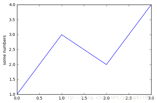
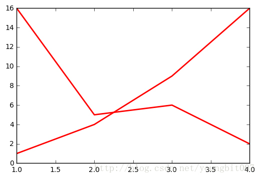
plt.plot([1,3,2,4])
plt.ylabel('some numbers')
plt.show()在上面的图中,你也许会疑惑为什么y的取值是1-4而x的取值是0-3.如果你向plot()指令提供了一维的数组或列表,那么matplotlib将默认它是一系列的y值,并自动为你生成x的值。默认的x向量从0开始并且具有和y同样的长度,因此x的数据是[0,1,2,3].
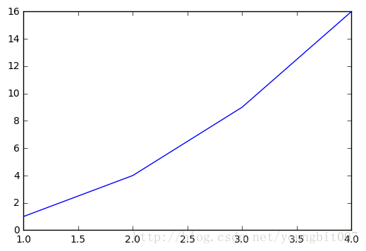
plot()一个通用的命令,可以输入任意多的参数。例如,画y和x的关系,你可以使用如下指令:
plt.plot([1,2,3,4], [1,4,9,16])
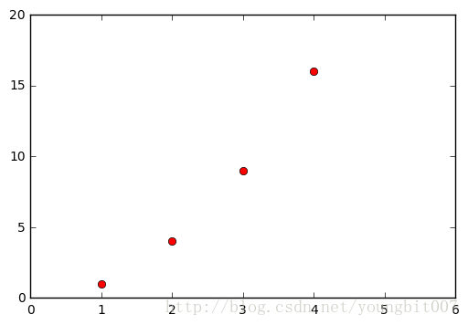
对于每对x,y参数,都可以加上一个可选的第三参数,控制画图中的颜色和线型。控制字符的字母与matlab是统一的,并且颜色控制和线型控制可以叠加。默认的控制字符串是’b-‘,是蓝色实线。假如,你想画红色圆点,你可以通过以下指令来实现:
plt.plot([1,2,3,4], [1,4,9,16], 'ro')
plt.axis([0, 6, 0, 20])
plt.show()
上面例子里的axis()命令给定了坐标范围,格式是[xmin, xmax, ymin, ymax]
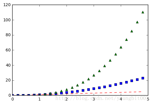
实际上,matplotlib不仅可以用于画向量,还可以用于画多维数据数组。下面,我们将演示用一条指令画多条不同格式的线。
import numpy as np
import matplotlib.pyplot as plt

# evenly sampled time at 200ms intervals
t = np.arange(0., 5., 0.2)

# red dashes, blue squares and green triangles
plt.plot(t, t, 'r--', t, t**2, 'bs', t, t**3, 'g^', linewidth=2.0)
plt.show()
上面我们都只画了一条线。这里,我们采用lines = plot(x1,y1,x2,y2)来画两条线。可以使用setp()命令,可以像MATLAB一样设置几条线的性质。 setp可以使用python 关键词,也可用MATLAB格式的字符串。
Line2D的性质包括.
| 性质 | 数据类型 |
|---|---|
| alpha | float |
| animated | [True / False] |
| antia 4000 liased or aa | [True / False] |
| clip_box | a matplotlib.transform.Bbox instance |
| clip_on | [True / False] |
| clip_path | a Path instance and a Transform instance, a Patch |
| color or c | any matplotlib color |
| contains | the hit testing function |
| dash_capstyle | [‘butt’ / ‘round’ / ‘projecting’] |
| dash_joinstyle | [‘miter’ / ‘round’ / ‘bevel’] |
| dashes | sequence of on/off ink in points |
| data | (np.array xdata, np.array ydata) |
| figure | a matplotlib.figure.Figure instance |
| label | any string |
| linestyle or ls | [ ‘-’ / ‘–’ / ‘-.’ / ‘:’ / ‘steps’ / …] |
| linewidth or lw | float value in points |
| lod | [True or False] |
| marker | [ ‘+’ / ‘,’ / ‘.’ / ‘1’ / ‘2’ / ‘3’ / ‘4’ ] |
| markeredgecolor or mec | any matplotlib color |
| markeredgewidth or mew | float value in points |
| markerfacecolor or mfc | any matplotlib color |
| markersize or ms | float |
| markevery | [ None / integer / (startind, stride) ] |
| picker | used in interactive line selection |
| pickradius | the line pick selection radius |
| solid_capstyle | [‘butt’ / ‘round’ / ‘projecting’] |
| solid_joinstyle | [‘miter’ / ‘round’ / ‘bevel’] |
| transform | a matplotlib.transforms.Transform instance |
| visible | [True / False] |
| xdata | np.array |
| ydata | np.array |
| zorder | any number |
| 性质 | 数据类型 |
|---|---|
| ‘-‘ | 实线 |
| ‘–’ | 虚线 |
| ‘-.’ | 点划线 |
| ‘:’ | 点 |
| ‘None’, ”, | 不画 |
| 标记 | 描述 |
|---|---|
| ‘o’ | 圆圈 |
| ‘D’ | 钻石 |
| ‘h’ | 六边形1 |
| ‘H’ | 六边形2 |
| ‘x’ | X |
| ”, ‘None’ | 不画 |
| ‘8’ | 八边形 |
| ‘p’ | 五角星 |
| ‘,’ | 像素点 |
| ‘+’ | 加号 |
| ‘.’ | 点 |
| ’s’ | 正方形 |
| ‘*’ | 星型 |
| ‘d’ | 窄钻石 |
| ‘v’ | 下三角 |
| ‘<’ | 左三角 |
| ‘>’ | 右三角 |
| ‘^’ | 上三角 |
| 颜色 | 描述 |
|---|---|
| ‘b’ | 蓝色 |
| ‘g’ | 绿色 |
| ‘r’ | 红色 |
| ‘c’ | 蓝绿色 |
| ‘m’ | 品红 |
| ‘y’ | 黄色 |
| ‘k’ | 黑色 |
| ‘w’ | 白色 |
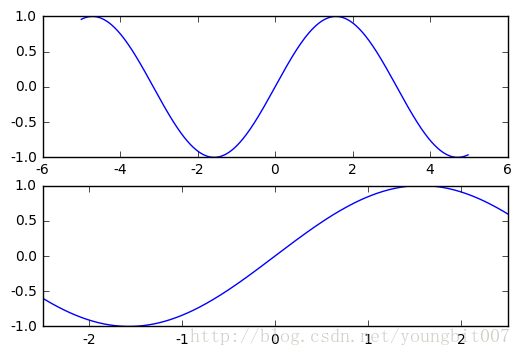
修改坐标范围
默认情况下,坐标轴的最小值和最大值与输入数据的最小、最大值一致。也就是说,默认情况下整个图形都能显示在所画图片上我们可以通过xlim(xmin, xmax)和ylim(ymin, ymax)来调整x,y坐标范围,见下图
%matplotlib inline
import numpy as np
import matplotlib.pyplot as plt
from pylab import *

x = np.arange(-5.0, 5.0, 0.02)
y1 = np.sin(x)

plt.figure(1)
plt.subplot(211)
plt.plot(x, y1)

plt.subplot(212)
#设置x轴范围
plt.xlim(-2.5, 2.5)
#设置y轴范围
plt.ylim(-1, 1)
plt.plot(x, y1)
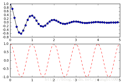
创建子图
你可以通过plt.figure创建一张新的图,plt.subplot来创建子图。subplot()指令包含numrows(行数), numcols(列数), fignum(图像编号),其中图像编号的范围是从1到行数 * 列数。在行数 * 列数\<10时,数字间的逗号可以省略。def f(t): return np.exp(-t) * np.cos(2*np.pi*t) t1 = np.arange(0.0, 5.0, 0.1) t2 = np.arange(0.0, 5.0, 0.02) plt.figure(1) plt.subplot(211) plt.plot(t1, f(t1), 'bo', t2, f(t2), 'k') plt.subplot(212) plt.plot(t2, np.cos(2*np.pi*t2), 'r--') plt.show()
plt.figure(1)                # 第一张图
plt.subplot(211)             # 第一张图中的第一张子图
plt.plot([1,2,3])
plt.subplot(212)             # 第一张图中的第二张子图
plt.plot([4,5,6])

plt.figure(2)                # 第二张图
plt.plot([4,5,6])            # 默认创建子图subplot(111)

plt.figure(1)                # 切换到figure 1 ; 子图subplot(212)仍旧是当前图
plt.subplot(211)             # 令子图subplot(211)成为figure1的当前图
plt.title('Easy as 1,2,3')   # 添加subplot 211 的标题
使用text添加文字
text()可以在图中的任意位置添加文字,并支持LaTex语法xlable(), ylable()用于添加x轴和y轴标签
title()用于添加图的题目
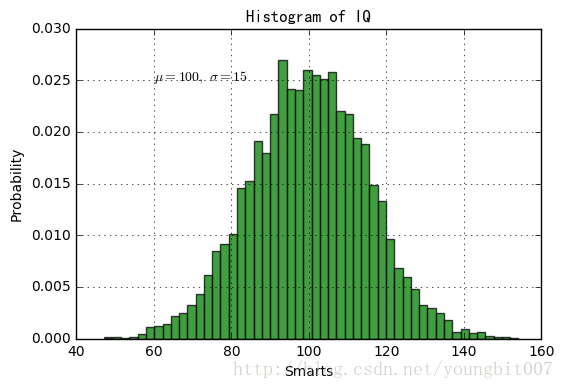
mu, sigma = 100, 15
x = mu + sigma * np.random.randn(10000)
# 数据的直方图
n, bins, patches = plt.hist(x, 50, normed=1, facecolor='g', alpha=0.75)
plt.xlabel('Smarts')
plt.ylabel('Probability')
#添加标题
plt.title('Histogram of IQ')
#添加文字
plt.text(60, .025, r'$\mu=100,\ \sigma=15$')
plt.axis([40, 160, 0, 0.03])
plt.grid(True)
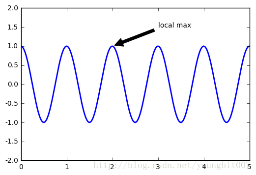
plt.show()注释文本
在数据可视化的过程中,图片中的文字经常被用来注释图中的一些特征。使用annotate()方法可以很方便地添加此类注释。在使用annotate时,要考虑两个点的坐标:被注释的地方xy(x, y)和插入文本的地方xytext(x, y)。ax = plt.subplot(111)
t = np.arange(0.0, 5.0, 0.01)
s = np.cos(2*np.pi*t)
line, = plt.plot(t, s, lw=2)
plt.annotate('local max', xy=(2, 1), xytext=(3, 1.5),
arrowprops=dict(facecolor='black', shrink=0.05),
)
plt.ylim(-2,2)
plt.show()plt.xticks()/plt.yticks()设置轴记号
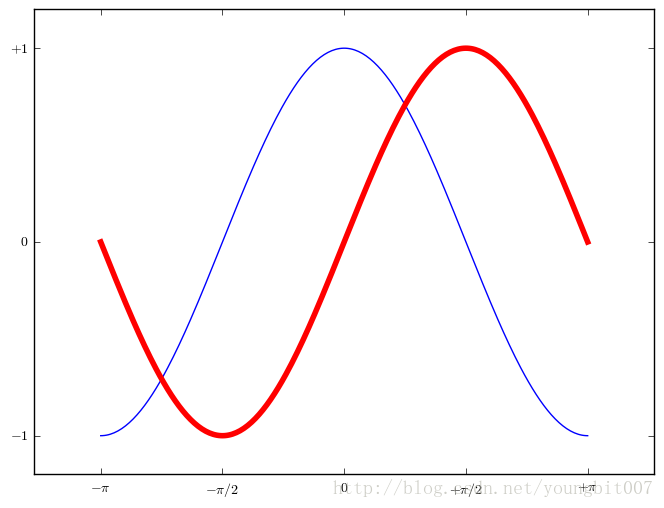
就是人为设置坐标轴的刻度显示的值# 创建一个 8 * 6 点(point)的图,并设置分辨率为 80 figure(figsize=(8,6), dpi=80) # 创建一个新的 1 * 1 的子图,接下来的图样绘制在其中的第 1 块(也是唯一的一块) subplot(1,1,1) X = np.linspace(-np.pi, np.pi, 256,endpoint=True) C,S = np.cos(X), np.sin(X) # 绘制余弦曲线,使用蓝色的、连续的、宽度为 1 (像素)的线条 plot(X, C, color="blue", linewidth=1.0, linestyle="-") # 绘制正弦曲线,使用绿色的、连续的、宽度为 1 (像素)的线条 plot(X, S, color="r", lw=4.0, linestyle="-") plt.axis([-4,4,-1.2,1.2]) # 设置轴记号 xticks([-np.pi, -np.pi/2, 0, np.pi/2, np.pi], [r'$-\pi$', r'$-\pi/2$', r'$0$', r'$+\pi/2$', r'$+\pi$']) yticks([-1, 0, +1], [r'$-1$', r'$0$', r'$+1$']) # 在屏幕上显示 show()
plt.axes()
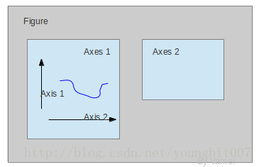
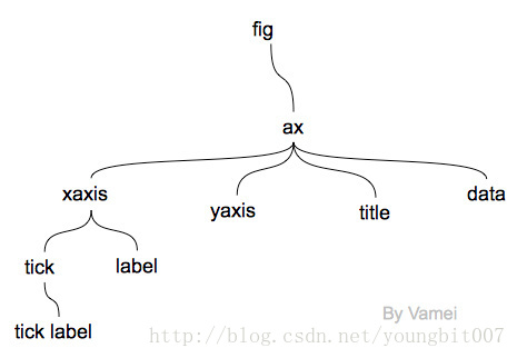
我们先来看什么是Figure和Axes对象。在matplotlib中,整个图像为一个Figure对象。在Figure对象中可以包含一个,或者多个Axes对象。每个Axes对象都是一个拥有自己坐标系统的绘图区域。其逻辑关系如下axes() by itself creates a default full subplot(111) window axis.
axes(rect, ax
cd2f
isbg=’w’) where rect = [left, bottom, width, height] in normalized (0, 1) units. axisbg is the background color for the axis, default white.
axes(h) where h is an axes instance makes h the current axis. An Axes instance is returned.
rect=[左, 下, 宽, 高] 规定的矩形区域,rect矩形简写,这里的数值都是以figure大小为比例,因此,若是要两个axes并排显示,那么axes[2]的左=axes[1].左+axes[1].宽,这样axes[2]才不会和axes[1]重叠。
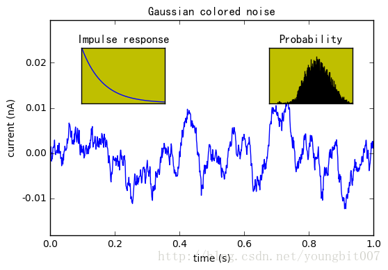
dt = 0.001
t = np.arange(0.0, 10.0, dt)
r = np.exp(-t[:1000]/0.05) # impulse response
x = np.random.randn(len(t))
s = np.convolve(x, r)[:len(x)]*dt # colored noise
# the main axes is subplot(111) by default
plt.plot(t, s)
plt.axis([0, 1, 1.1*np.amin(s), 2*np.amax(s)])
plt.xlabel('time (s)')
plt.ylabel('current (nA)')
plt.title('Gaussian colored noise')
# this is an inset axes over the main axes
a = plt.axes([.65, .6, .2, .2], axisbg='y')
n, bins, patches = plt.hist(s, 400, normed=1)
plt.title('Probability')
plt.xticks([])
plt.yticks([])
# this is another inset axes over the main axes
a = plt.axes([0.2, 0.6, .2, .2], axisbg='y')
plt.plot(t[:len(r)], r)
plt.title('Impulse response')
plt.xlim(0, 0.2)
plt.xticks([])
plt.yticks([])
plt.gcf()与plt.gca()
plt.gcf函数获取当前的绘图对象(figure)plt.gca 获取当前子图(axes)
Axis容器
Axis容器包括坐标轴上的刻度线、刻度文本、坐标网格以及坐标轴标题等内容。刻度包括主刻度和副刻度,分别通过Axis.get_major_ticks和Axis.get_minor_ticks方法获得。每个刻度线都是一个XTick或者YTick对象,它包括实际的刻度线和刻度文本。为了方便访问刻度线和文本,Axis对象提供了get_ticklabels和get_ticklines方法分别直接获得刻度线和刻度文本:fig = plt.figure()
ax = fig.add_axes([0.15, 0.1, 0.7, 0.3])
line, = ax.plot([1,2,3],[1,2,1])
# ax.lines
# line
ax.set_xlabel("time")
axis=ax.xaxis
axis.get_ticklocs() # 获得刻度的位置列表array([ 1. , 1.5, 2. , 2.5, 3. ])
axis.get_ticklabels() # 获得刻度标签列表
# <a list of 5 Text major ticklabel objects>
[x.get_text() for x in axis.get_ticklabels()]

axis.get_minor_locator() # 计算副刻度的对象
axis.get_major_locator() # 计算主刻度的对象
我们可以使用程序为Axis对象设置不同的Locator对象,用来手工设置刻度的位置;设置Formatter对象用来控制刻度文本的显示
记住,set_xticks是设定标签的实际数字,而set_xticklabels则是设定我们希望他显示的结果。
x轴时间显示
from matplotlib.dates import AutoDateLocator, DateFormatter
autodates = AutoDateLocator()
yearsFmt = DateFormatter('%Y-%m-%d %H:%M:%S')
figure.autofmt_xdate()        #设置x轴时间外观
ax.xaxis.set_major_locator(autodates)       #设置时间间隔
ax.xaxis.set_major_formatter(yearsFmt)      #设置时间显示格式
ax.set_xticks() #设置x轴间隔
ax.set_xlim()   #设置x轴范围

ax.xaxis.set_major_locator(autodates)
ax.set_xlabel("date")
ax.set_ylabel("values")
ax.xaxis.set_major_locator(DayLocator(bymonthday=range(1,32), interval=1))
ax.xaxis.set_major_formatter(DateFormatter('%Y%m%d'))
plt.xticks(rotation=60)

相关文章推荐
- Python--matplotlib绘图可视化知识点整理
- Python--matplotlib绘图可视化知识点整理
- Python--matplotlib绘图可视化知识点整理
- Python--matplotlib绘图可视化知识点整理
- matplotlib 绘图可视化知识点整理
- Python--matplotlib绘图可视化知识点整理
- Python--matplotlib绘图可视化知识点整理
- Python--matplotlib绘图可视化知识点整理
- Python--matplotlib绘图可视化知识点整理
- Python--matplotlib绘图可视化知识点整理
- [置顶] matplotlib 绘图可视化知识点整理
- matplotlib 绘图可视化知识点整理
- Python--matplotlib绘图可视化知识点整理
- Python--matplotlib绘图可视化知识点整理
- Python matplotlib绘图可视化知识点整理(小结)
- Python--matplotlib绘图可视化知识点整理
- Python--matplotlib绘图可视化知识点整理
- Python--matplotlib绘图可视化知识点整理
- Python--matplotlib绘图可视化知识点整理
- Python--matplotlib绘图可视化知识点整理