ReactNative制作Component控件并且复用(二)
2017-02-26 23:56
246 查看
上一篇博客ReactNative制作Component控件并且复用(一)简单介绍了一下如何定义一个可复用的控件,并且引用他。这篇博客继续上一篇,介绍怎样在使用自定义控件的时候传递数据,设置样式等一些问题。OK
开始吧:
上一篇博客中我们制作了一个长得还算过得去的Button:
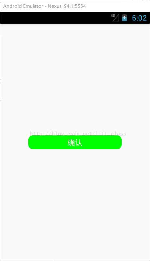
接着提出了这样一个疑问:不可能我所有的按钮都叫确认、背景颜色都是绿色、文本都是白色、都长这个体型……吧……
当然了,这个时候第一个想到的就是给他设置样式!好,那接下来写一个style并且设置给button:[index.android.js]
先加一个叫button的样式,暂时就先改个背景颜色吧:
const styles = StyleSheet.create({
container: {
flex: 1,
justifyContent: 'center',
alignItems: 'center',
},
button: {
backgroundColor: '#f00',//红色背景
}
});
接下来给Button设置style:
return (
<View
style = { styles.container }>
{/*通过import引入了Button控件后,就可以像下面这样直接使用这个控件*/}
<Button
style = { styles.button }>
</Button>
</View>
);
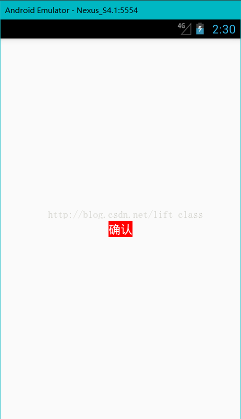
这样是不是就给Button换了一下背景颜色呢?先看一下吧,double r:
我去,怎么没变化呀?那我设置宽高等其他属性再试试!(你尽管试,能起作用算我输)
那么,这个按钮的样式到底要怎么控制呢?还记得在【Button.js】中写的样式吗?来回顾一下:
看见了吧,按钮的样式是【Button.js】里<TouchableOpacity>的style控制的,文本的样式在在<Text>的style控制
的!
那难道每需要一个按钮都要新建一个【XXButon.js】来满足不同地方的需求?当然不是啦,还记得Props(属性)
吗?(这里是Props的示例)ReactNative中的Props,这个得会才能往下看噢。
既然Props可以传递数据,那么我当然可以在【index.andorid.js】中通过<Button>传递数据!再来看一遍刚刚写
的:
咦,这不就是相当于给<Button>的style属性设定了一个值(样式对象)吗?可是这个值在哪儿接收呢?当然是
在定义这个控件的地方了:【Button.js】!这样的话,就能在【Button.js】中取到这个”styles.button”,将他设置给
<TouchableOpacity>就行了。机智!马上来一发:【Button.js】
来,double r:
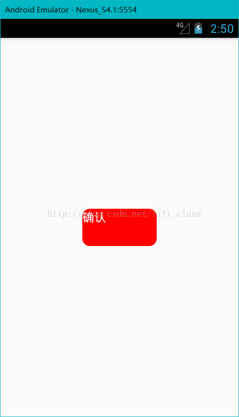
哇66666背景色成功设置!等会儿……为什么宽高和圆角不见了??what??回头看下代码,噢,原来
<TouchableOpacity>设置了style={this.props.style},而这个style从调用这个button的地方传来,我们刚刚只设置
了backgroundColor,所以只有背景色一个样式……好,那返回【index.android.js】给这个按钮修改一下样式:
……
button: {
backgroundColor: '#f00',
width: 100,
height: 50,
borderRadius: 10,
}
……
额……好吧,有点小尴尬,文本没居中……那继续写样式??我的天,这样的话,每次使用<Button>都要写
文本居中的代码?!诶,有了:给Button设置一个默认的样式,每次引用的时候我只修改我需要修改的某几个样式
属性,这样不就OK了?【Button.js】:
发现没,style还可以这样赋值!赋一个样式对象数组!原来这样写的作用是取两个样式对象的合集,而写在前面
的样式对象(styles.button)的属性,会被写在后面的样式对象(this.props.style)的同名属性覆盖,这样说可能太抽象了,
拿这个例子来说:
styles.button(这段代码在【Button.js】中)是这样的:
this.props.style(这段代码在【index.android.js】中)是这样的:
这两个样式对象[合并]后应该是这样的:
{
height: 30,// styles.button特有
width: 200,// styles.button特有
backgroundColor: ‘#f00’,//两个都有,但是值会取后面的!前者会被后者覆盖!
borderRadius: 10,//这个其实也是被覆盖,只是两个都写了10而已,你可以试试把其中任意一个10换成其他的,看看效果
justifyContent: ‘center’,// styles.button特有
alignItems: ‘center’// styles.button特有
}
当然了,如果是this.props.style中特有的属性,肯定也是会出现在合并后的样式中的,因为这还是类似于取并集,
但稍微有丢丢不一样,因为会“覆盖”。本例子中,this.props.style中的borderRadius其实可以不用写,因为默认样
式(styles.button)已经设置了!
说了这么多,看下这样写的效果到底是怎么样的吧:double r
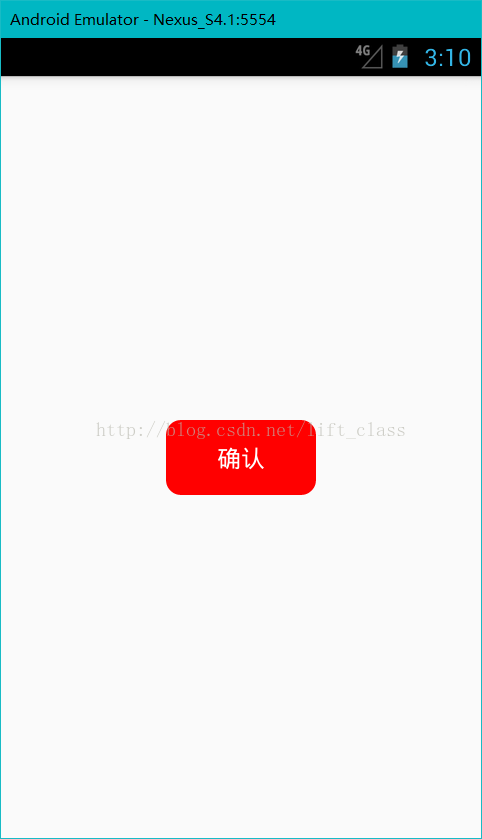
OK,近乎完美!
那接下来,设定文本内容和文本样式的过程就不多说了,都是一样的,直接甩上所有代码!:
(注意代码中多写的onPress事件触发的函数也是一样通过这个方法传递的!可以自己分析并优化一下代码!)
【index.android.js】:
/**
* Sample React Native App
* https://github.com/facebook/react-native * @flow
*/
import React, { Component } from 'react';
import {
AppRegistry,
StyleSheet,
View,
} from 'react-native';
// 注意了!!就是这句话把刚刚写的Button.js引入使用!
// 导入 Button 从 './component/Button'(Buton.js文件的路径)
// ----最后Button不需要写成Button.js
import Button from './component/Button';
export default class button extends Component {
render() {
return (
<View
style = { styles.container }>
<Button
style = { styles.button }
{/*通过textStyle属性传递了文本内容*/}
textStyle = { styles.txStyle }
{/*通过text属性传递了文本内容*/}
text = {"引用设置"}
{/*通过onPress属性传递了一个弹窗函数*/}
onPress = { () => {alert("你点击了按钮");} }>
</Button>
</View>
);
}
}
const styles = StyleSheet.create({
container: {
flex: 1,
justifyContent: 'center',
alignItems: 'center',
},
button: {
backgroundColor: '#f00',
width: 100,
height: 50,
},
txStyle: {
color: '#00f',
fontSize: 20,
}
});
AppRegistry.registerComponent('button', () => button);
【Button.js】:
/**
* Sample React Native App
* https://github.com/facebook/react-native * @flow
*/
import React, { Component } from 'react';
import {
StyleSheet,
Text,
TouchableOpacity,
} from 'react-native';
// 这里特别注意 export default 关键字,只有加上关键字才能在其他文件引用本文件
// 注意class Button 是大写,与Button.js保持一致
export default class Button extends Component {
render() {
return (
<TouchableOpacity
style={[styles.button,this.props.style]}
// 将接收到的onPress(即this.props.onPress)设置给TouchableOpacity的onPress
onPress={this.props.onPress}>
<Text
// 设置文本样式
style={ [styles.btText,this.props.textStyle] }>
{/*设置文本内容*/}
{this.props.text}
</Text>
</TouchableOpacity>
);
}
}
const styles = StyleSheet.create({
// button默认样式
button: {
height: 30,
width: 200,
backgroundColor: '#0f0',
borderRadius: 10,
justifyContent: 'center',
alignItems: 'center',
},
// 文本内容默认样式
btText: {
color: '#fff',
fontSize: 16,
},
});
完成效果是这样的:
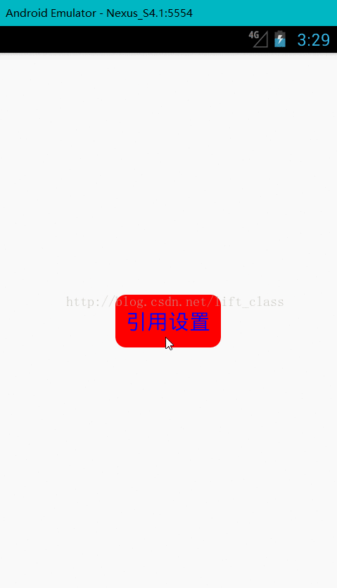
开始吧:
上一篇博客中我们制作了一个长得还算过得去的Button:
接着提出了这样一个疑问:不可能我所有的按钮都叫确认、背景颜色都是绿色、文本都是白色、都长这个体型……吧……
当然了,这个时候第一个想到的就是给他设置样式!好,那接下来写一个style并且设置给button:[index.android.js]
先加一个叫button的样式,暂时就先改个背景颜色吧:
const styles = StyleSheet.create({
container: {
flex: 1,
justifyContent: 'center',
alignItems: 'center',
},
button: {
backgroundColor: '#f00',//红色背景
}
});
接下来给Button设置style:
return (
<View
style = { styles.container }>
{/*通过import引入了Button控件后,就可以像下面这样直接使用这个控件*/}
<Button
style = { styles.button }>
</Button>
</View>
);
这样是不是就给Button换了一下背景颜色呢?先看一下吧,double r:
我去,怎么没变化呀?那我设置宽高等其他属性再试试!(你尽管试,能起作用算我输)
那么,这个按钮的样式到底要怎么控制呢?还记得在【Button.js】中写的样式吗?来回顾一下:
/**
* Sample React Native App
* https://github.com/facebook/react-native * @flow
*/

import React, { Component } from 'react';
import {
StyleSheet,
Text,
TouchableOpacity,
} from 'react-native';

export default class Button extends Component {
render() {
return (
<TouchableOpacity
style={styles.button}>
<Text
style={ styles.btText }>
{"确认"}
</Text>
</TouchableOpacity>
);
}
}

const styles = StyleSheet.create({
button: {
height: 30,
width: 200,
backgroundColor: '#0f0',
borderRadius: 10,
justifyContent: 'center',
alignItems: 'center',
},
btText: {
color: '#fff',
fontSize: 16,
},
});
看见了吧,按钮的样式是【Button.js】里<TouchableOpacity>的style控制的,文本的样式在在<Text>的style控制
的!
那难道每需要一个按钮都要新建一个【XXButon.js】来满足不同地方的需求?当然不是啦,还记得Props(属性)
吗?(这里是Props的示例)ReactNative中的Props,这个得会才能往下看噢。
既然Props可以传递数据,那么我当然可以在【index.andorid.js】中通过<Button>传递数据!再来看一遍刚刚写
的:
<Button
style = { styles.button }>
</Button>
咦,这不就是相当于给<Button>的style属性设定了一个值(样式对象)吗?可是这个值在哪儿接收呢?当然是
在定义这个控件的地方了:【Button.js】!这样的话,就能在【Button.js】中取到这个”styles.button”,将他设置给
<TouchableOpacity>就行了。机智!马上来一发:【Button.js】
……
return (
<TouchableOpacity
style={this.props.style}>
<Text
style={ styles.btText }>
{"确认"}
</Text>
</TouchableOpacity>
);
……
来,double r:
哇66666背景色成功设置!等会儿……为什么宽高和圆角不见了??what??回头看下代码,噢,原来
<TouchableOpacity>设置了style={this.props.style},而这个style从调用这个button的地方传来,我们刚刚只设置
了backgroundColor,所以只有背景色一个样式……好,那返回【index.android.js】给这个按钮修改一下样式:
……
button: {
backgroundColor: '#f00',
width: 100,
height: 50,
borderRadius: 10,
}
……
额……好吧,有点小尴尬,文本没居中……那继续写样式??我的天,这样的话,每次使用<Button>都要写
文本居中的代码?!诶,有了:给Button设置一个默认的样式,每次引用的时候我只修改我需要修改的某几个样式
属性,这样不就OK了?【Button.js】:
<TouchableOpacity
style={[styles.button,this.props.style]}>
<Text
style={ styles.btText }>
{"确认"}
</Text>
</TouchableOpacity>
发现没,style还可以这样赋值!赋一个样式对象数组!原来这样写的作用是取两个样式对象的合集,而写在前面
的样式对象(styles.button)的属性,会被写在后面的样式对象(this.props.style)的同名属性覆盖,这样说可能太抽象了,
拿这个例子来说:
styles.button(这段代码在【Button.js】中)是这样的:
button: {
height: 30,
width: 200,
backgroundColor: '#0f0',
borderRadius: 10,
justifyContent: 'center',
alignItems: 'center',
}
this.props.style(这段代码在【index.android.js】中)是这样的:
button: {
backgroundColor: '#f00',
width: 100,
height: 50,
borderRadius: 10,
}
这两个样式对象[合并]后应该是这样的:
{
height: 30,// styles.button特有
width: 200,// styles.button特有
backgroundColor: ‘#f00’,//两个都有,但是值会取后面的!前者会被后者覆盖!
borderRadius: 10,//这个其实也是被覆盖,只是两个都写了10而已,你可以试试把其中任意一个10换成其他的,看看效果
justifyContent: ‘center’,// styles.button特有
alignItems: ‘center’// styles.button特有
}
当然了,如果是this.props.style中特有的属性,肯定也是会出现在合并后的样式中的,因为这还是类似于取并集,
但稍微有丢丢不一样,因为会“覆盖”。本例子中,this.props.style中的borderRadius其实可以不用写,因为默认样
式(styles.button)已经设置了!
说了这么多,看下这样写的效果到底是怎么样的吧:double r
OK,近乎完美!
那接下来,设定文本内容和文本样式的过程就不多说了,都是一样的,直接甩上所有代码!:
(注意代码中多写的onPress事件触发的函数也是一样通过这个方法传递的!可以自己分析并优化一下代码!)
【index.android.js】:
/**
* Sample React Native App
* https://github.com/facebook/react-native * @flow
*/
import React, { Component } from 'react';
import {
AppRegistry,
StyleSheet,
View,
} from 'react-native';
// 注意了!!就是这句话把刚刚写的Button.js引入使用!
// 导入 Button 从 './component/Button'(Buton.js文件的路径)
// ----最后Button不需要写成Button.js
import Button from './component/Button';
export default class button extends Component {
render() {
return (
<View
style = { styles.container }>
<Button
style = { styles.button }
{/*通过textStyle属性传递了文本内容*/}
textStyle = { styles.txStyle }
{/*通过text属性传递了文本内容*/}
text = {"引用设置"}
{/*通过onPress属性传递了一个弹窗函数*/}
onPress = { () => {alert("你点击了按钮");} }>
</Button>
</View>
);
}
}
const styles = StyleSheet.create({
container: {
flex: 1,
justifyContent: 'center',
alignItems: 'center',
},
button: {
backgroundColor: '#f00',
width: 100,
height: 50,
},
txStyle: {
color: '#00f',
fontSize: 20,
}
});
AppRegistry.registerComponent('button', () => button);
【Button.js】:
/**
* Sample React Native App
* https://github.com/facebook/react-native * @flow
*/
import React, { Component } from 'react';
import {
StyleSheet,
Text,
TouchableOpacity,
} from 'react-native';
// 这里特别注意 export default 关键字,只有加上关键字才能在其他文件引用本文件
// 注意class Button 是大写,与Button.js保持一致
export default class Button extends Component {
render() {
return (
<TouchableOpacity
style={[styles.button,this.props.style]}
// 将接收到的onPress(即this.props.onPress)设置给TouchableOpacity的onPress
onPress={this.props.onPress}>
<Text
// 设置文本样式
style={ [styles.btText,this.props.textStyle] }>
{/*设置文本内容*/}
{this.props.text}
</Text>
</TouchableOpacity>
);
}
}
const styles = StyleSheet.create({
// button默认样式
button: {
height: 30,
width: 200,
backgroundColor: '#0f0',
borderRadius: 10,
justifyContent: 'center',
alignItems: 'center',
},
// 文本内容默认样式
btText: {
color: '#fff',
fontSize: 16,
},
});
完成效果是这样的:

相关文章推荐
- ReactNative制作Component控件并且复用(一)
- ReactNative Component 生命周期
- react native ios添加ART.xcodeproj(ReactNative No component found for view with name “ARTSurfaceView”)
- React Native 中 component 生命周期
- React Native 中 component 生命周期
- 使用react-native bundle制作离线包
- React-Native学习笔记之:WebView控件使用
- 【React Native开发】React Native控件之Image组件解说与美团首页顶部效果实例(10)
- silverlight 制作可拖动控件,并且在控件上添加右键菜单
- react-native 报错 RawText "" must be wrapped in an explicit <Text> component
- React Native——Component(组件)
- React Native控件之Listview
- ReactNative 学习笔记 Component - View,Text
- 【React Native开发】React Native控件之Image组件讲解与美团首页顶部效果实例(10)
- 【React Native开发】React Native控件之ViewPagerAndroid讲解以及美团首页顶部效果实例(17)
- ReactNative学习之控件:react-native-elements
- React Native控件之ToolbarAndroid工具栏控件讲解以及使用
- React Native 中 component 生命周期
- React-Native学习之制作RN版的微博app(一)
- React Native 控件封装