纯css3实现美化复选框和手风琴效果(详细)
2017-02-04 11:43
645 查看
关键技术点和原理:
原理就是把 checkbox或 radio 给隐藏掉 ,然后给选框 绑定一个label标签。然后用label标签作为容器,在里面放一个:before或一个after
用before模拟选框的框,用after来模拟选框的填充
通过
.magic-checkbox:checked + label:after {/*选框被选中时  显示after填充*/
display: block;
}
来确定是否选中复选框,如果checked就把after的显示。
先贴出html的代码
<div id="main">
<div class="demo">
<div class="col">
<h4>Checkbox(复选按钮)</h4>

<div class="opt">
<input class="magic-checkbox" type="checkbox" name="layout" id="c1">
<label for="c1">Normal</label>
</div>
<div class="opt">
<input class="magic-checkbox" type="checkbox" name="layout" id="c2" checked>
<label for="c2">Checked</label>
</div>
<div class="opt">
<input class="magic-checkbox" type="checkbox" name="layout" id="c3" value="option2" disabled>
<label for="c3" style="color:#ccc">Disabled</label>
</div>
<div class="opt">
<input class="magic-checkbox" type="checkbox" name="layout" id="c4" checked disabled>
<label for="c4" style="color:#ccc">Checked && Disabled</label>
</div>

</div>

<div class="col">
<h4>Radio(单选按钮)</h4>
<div class="opt">
<input class="magic-radio" type="radio" name="radio" id="r1" value="option1">
<label for="r1">Normal</label>
</div>
<div class="opt">
<input class="magic-radio" type="radio" name="radio" id="r2" value="option2" checked>
<label for="r2">Checked</label>
</div>
<div class="opt">
<input class="magic-radio" type="radio" name="radio" id="r3" value="option3" disabled>
<label for="r3" style="color:#ccc">禁用</label>
</div>
<div class="opt">
<input class="magic-radio" type="radio" id="r4" value="option4" checked disabled>
<label for="r4" style="color:#ccc">Checked && Disabled</label>
</div>
</div>
</div>

</div>
首先html的结构必须是
<div class="opt">
<input class="magic-checkbox" type="checkbox" name="layout" >
<label for="c1">Normal</label>
</div>
切记
<input class="magic-checkbox" type="checkbox" name="layout" color: #ff6600">c1">
<label for="c1">Normal</label>
id和for的值一定要一致 这是通用写法 为了把label和input绑定在一块
下面给出css代码
/*--相关的单选复选按钮--*/
@keyframes hover-color {       /**复选框或单选框  边框 hover**/
from {
border-color: #c0c0c0; }
to {
border-color: #3e97eb; } }

.magic-radio,
.magic-checkbox {           /**必须要把    radio和 checkbox的隐藏或者切割掉**/
position: absolute;
display: none; }

.magic-radio[disabled],           /**radio   checkbox   指定disabled   html属性时的鼠标指针**/
.magic-checkbox[disabled] {
cursor: not-allowed; }

.magic-radio + label,
.magic-checkbox + label {
position: relative;
display: block;
padding-left: 30px;
cursor: pointer;
vertical-align: middle;
}
.magic-radio + label:hover:before,     /*选矿的 hover边框动画  */
.magic-checkbox + label:hover:before {
animation-duration: 0.4s;
animation-fill-mode: both;
animation-name: hover-color; }
.magic-radio + label:before,
.magic-checkbox + label:before {/*用before来模拟选框的框*/
position: absolute;
top: 0;
left: 0;
display: inline-block;
width: 20px;
height: 20px;
content: '';
border: 1px solid #c0c0c0; }
.magic-radio + label:after,
.magic-checkbox + label:after {/*用after模拟选框的 对号或园点    默认先隐藏*/
position: absolute;
display: none;
content: '';
}

.magic-radio[disabled] + label,
.magic-checkbox[disabled] + label {/*选框  被禁用时的外观*/
cursor: not-allowed;
color: #e4e4e4;
}
.magic-radio[disabled] + label:hover, .magic-radio[disabled] + label:before, .magic-radio[disabled] + label:after,
.magic-checkbox[disabled] + label:hover,
.magic-checkbox[disabled] + label:before,
.magic-checkbox[disabled] + label:after {
cursor: not-allowed; }/*禁用时的指针*/
.magic-radio[disabled] + label:hover:before,
.magic-checkbox[disabled] + label:hover:before {
border: 1px solid #e4e4e4;
animation-name: none; }/*禁用时的选框和填充*/
.magic-radio[disabled] + label:before,
.magic-checkbox[disabled] + label:before {
border-color: #e4e4e4; }

.magic-radio:checked + label:before,
.magic-checkbox:checked + label:before {
animation-name: none; }/*选框被选中时  去掉hover 动画*/

.magic-radio:checked + label:after,
.magic-checkbox:checked + label:after {/*选框被选中时  显示after填充*/
display: block;
}

.magic-radio + label:before {/*radio的选框应该是个圆形*/
border-radius: 50%; }

.magic-radio + label:after {/*模拟出radio的园点填充*/
top: 7px;
left: 7px;
width: 8px;
height: 8px;
border-radius: 50%;
background: #3e97eb; }

.magic-radio:checked + label:before {
border: 1px solid #3e97eb; }

.magic-radio:checked[disabled] + label:before {
border: 1px solid #c9e2f9; }

.magic-radio:checked[disabled] + label:after {
background: #c9e2f9; }

.magic-checkbox + label:before {
border-radius: 3px; }

.magic-checkbox + label:after {/*模拟出checkbox选框的对号填充*/
top: 2px;
left: 7px;
box-sizing: border-box;
width: 6px;
height: 12px;
transform: rotate(45deg);
border-width: 2px;
border-style: solid;
border-color: #fff;
border-top: 0;
border-left: 0; }

.magic-checkbox:checked + label:before {
border: #3e97eb;
background: #3e97eb; }

.magic-checkbox:checked[disabled] + label:before {
border: #c9e2f9;
background: #c9e2f9; }
下面是 代码运行效果
demo: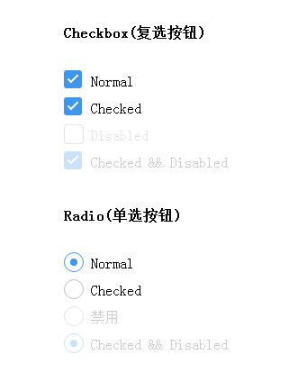
下面附赠一个手风琴效果(原理基本上也差不多)
也是在 :check的时候做一些事情
demo 用checkbox和radio实现手风琴效果


相关文章推荐
- 纯css3实现美化复选框和手风琴效果(详细)
- 纯css3实现美化复选框和手风琴效果(详细)
- 纯css3实现美化复选框和手风琴效果(详细)
- 纯css3实现效果超级炫的checkbox复选框和radio单选框
- CSS3实现可关闭的下拉手风琴菜单效果
- 使用 jQuery & CSS3 实现优雅的手风琴效果
- 11种超酷CSS3复选框样式美化效果
- css3实现的手风琴效果
- css3实现手风琴效果
- jQuery实现手风琴效果【详细注解】
- 用css3实现自定义效果复选框--不用js
- Js+CSS3实现手风琴效果
- 纯css3单选框和复选框样式美化效果
- CSS3实现手风琴效果-------Day88
- jQuery实现手风琴效果【详细注解】
- 纯css3单选框和复选框样式美化效果
- 2011年最新使用CSS3实现各种独特悬浮效果的教程
- 用CSS3的 box-shadow 来轻松实现图层阴影效果
- jquery实现简单的手风琴效果
- [转]详细解说:简单CSS3实现炫酷读者墙