用python画箱体图-python学习笔记21
2016-12-10 22:12
344 查看
函数:d.plot()
Type: FramePlotMethods
String form: <pandas.tools.plotting.FramePlotMethods object at 0x08FC8510>
File: c:\program files (x86)\python35-32\lib\site-packages\pandas\tools\plotting.py
Signature: d.plot(x=None, y=None, kind='line', ax=None, subplots=False, sharex=None, sharey=False, layout=None, figsize=None, use_index=True, title=None, grid=None, legend=True, style=None, logx=False, logy=False, loglog=False, xticks=None, yticks=None,
xlim=None, ylim=None, rot=None, fontsize=None, colormap=None, table=False, yerr=None, xerr=None, secondary_y=False, sort_columns=False, **kwds)
Docstring:
DataFrame plotting accessor and method
Examples
--------
df.plot.line()
df.plot.scatter('x', 'y')
df.plot.hexbin()
These plotting methods can also be accessed by calling the accessor as a
method with the ``kind`` argument:
``df.plot(kind='line')`` is equivalent to ``df.plot.line()``
Call docstring:
Make plots of DataFrame using matplotlib / pylab.
*New in version 0.17.0:* Each plot kind has a corresponding method on the
``DataFrame.plot`` accessor:
``df.plot(kind='line')`` is equivalent to
``df.plot.line()``.
Parameters
----------
data : DataFrame
x : label or position, default None
y : label or position, default None
Allows plotting of one column versus another
kind : str
- 'line' : line plot (default)
- 'bar' : vertical bar plot
- 'barh' : horizontal bar plot
- 'hist' : histogram
- 'box' : boxplot
- 'kde' : Kernel Density Estimation plot
- 'density' : same as 'kde'
- 'area' : area plot
- 'pie' : pie plot
- 'scatter' : scatter plot
- 'hexbin' : hexbin plot
ax : matplotlib axes object, default None
subplots : boolean, default False
Make separate subplots for each column
sharex : boolean, default True if ax is None else False
In case subplots=True, share x axis and set some x axis labels to
invisible; defaults to True if ax is None otherwise False if an ax
is passed in; Be aware, that passing in both an ax and sharex=True
will alter all x axis labels for all axis in a figure!
sharey : boolean, default False
In case subplots=True, share y axis and set some y axis labels to
invisible
layout : tuple (optional)
(rows, columns) for the layout of subplots
figsize : a tuple (width, height) in inches
use_index : boolean, default True
Use index as ticks for x axis
title : string
Title to use for the plot
grid : boolean, default None (matlab style default)
Axis grid lines
legend : False/True/'reverse'
Place legend on axis subplots
style : list or dict
matplotlib line style per column
logx : boolean, default False
Use log scaling on x axis
logy : boolean, default False
Use log scaling on y axis
loglog : boolean, default False
Use log scaling on both x and y axes
xticks : sequence
Values to use for the xticks
yticks : sequence
Values to use for the yticks
xlim : 2-tuple/list
ylim : 2-tuple/list
rot : int, default None
Rotation for ticks (xticks for vertical, yticks for horizontal plots)
fontsize : int, default None
Font size for xticks and yticks
colormap : str or matplotlib colormap object, default None
Colormap to select colors from. If string, load colormap with that name
from matplotlib.
colorbar : boolean, optional
If True, plot colorbar (only relevant for 'scatter' and 'hexbin' plots)
position : float
Specify relative alignments for bar plot layout.
From 0 (left/bottom-end) to 1 (right/top-end). Default is 0.5 (center)
layout : tuple (optional)
(rows, columns) for the layout of the plot
table : boolean, Series or DataFrame, default False
If True, draw a table using the data in the DataFrame and the data will
be transposed to meet matplotlib's default layout.
If a Series or DataFrame is passed, use passed data to draw a table.
yerr : DataFrame, Series, array-like, dict and str
See :ref:`Plotting with Error Bars <visualization.errorbars>` for
detail.
xerr : same types as yerr.
stacked : boolean, default False in line and
bar plots, and True in area plot. If True, create stacked plot.
sort_columns : boolean, default False
Sort column names to determine plot ordering
secondary_y : boolean or sequence, default False
Whether to plot on the secondary y-axis
If a list/tuple, which columns to plot on secondary y-axis
mark_right : boolean, default True
When using a secondary_y axis, automatically mark the column
labels with "(right)" in the legend
kwds : keywords
Options to pass to matplotlib plotting method
Returns
-------
axes : matplotlib.AxesSubplot or np.array of them
Notes
-----
- See matplotlib documentation online for more on this subject
- If `kind` = 'bar' or 'barh', you can specify relative alignments
for bar plot layout by `position` keyword.
From 0 (left/bottom-end) to 1 (right/top-end). Default is 0.5 (center)
- If `kind` = 'scatter' and the argument `c` is the name of a dataframe
column, the values of that column are used to color each point.
- If `kind` = 'hexbin', you can control the size of the bins with the
`gridsize` argument. By default, a histogram of the counts around each
`(x, y)` point is computed. You can specify alternative aggregations
by passing values to the `C` and `reduce_C_function` arguments.
`C` specifies the value at each `(x, y)` point and `reduce_C_function`
is a function of one argument that reduces all the values in a bin to
a single number (e.g. `mean`, `max`, `sum`, `std`).
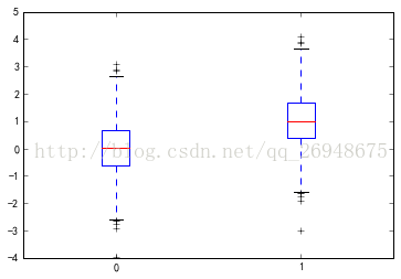
代码:
import matplotlib.pyplot as plt
import numpy as np
import pandas as pd
plt.rcParams['font.sans-serif']=['SimHei']
plt.rcParams['axes.unicode_minus']=False
plt.figure(figsize=(8,6))#以上为模板
x=np.random.randn(1000)
d=pd.DataFrame([x,x+1]).T
d.plot(kind='box')
图形:
Type: FramePlotMethods
String form: <pandas.tools.plotting.FramePlotMethods object at 0x08FC8510>
File: c:\program files (x86)\python35-32\lib\site-packages\pandas\tools\plotting.py
Signature: d.plot(x=None, y=None, kind='line', ax=None, subplots=False, sharex=None, sharey=False, layout=None, figsize=None, use_index=True, title=None, grid=None, legend=True, style=None, logx=False, logy=False, loglog=False, xticks=None, yticks=None,
xlim=None, ylim=None, rot=None, fontsize=None, colormap=None, table=False, yerr=None, xerr=None, secondary_y=False, sort_columns=False, **kwds)
Docstring:
DataFrame plotting accessor and method
Examples
--------
df.plot.line()
df.plot.scatter('x', 'y')
df.plot.hexbin()
These plotting methods can also be accessed by calling the accessor as a
method with the ``kind`` argument:
``df.plot(kind='line')`` is equivalent to ``df.plot.line()``
Call docstring:
Make plots of DataFrame using matplotlib / pylab.
*New in version 0.17.0:* Each plot kind has a corresponding method on the
``DataFrame.plot`` accessor:
``df.plot(kind='line')`` is equivalent to
``df.plot.line()``.
Parameters
----------
data : DataFrame
x : label or position, default None
y : label or position, default None
Allows plotting of one column versus another
kind : str
- 'line' : line plot (default)
- 'bar' : vertical bar plot
- 'barh' : horizontal bar plot
- 'hist' : histogram
- 'box' : boxplot
- 'kde' : Kernel Density Estimation plot
- 'density' : same as 'kde'
- 'area' : area plot
- 'pie' : pie plot
- 'scatter' : scatter plot
- 'hexbin' : hexbin plot
ax : matplotlib axes object, default None
subplots : boolean, default False
Make separate subplots for each column
sharex : boolean, default True if ax is None else False
In case subplots=True, share x axis and set some x axis labels to
invisible; defaults to True if ax is None otherwise False if an ax
is passed in; Be aware, that passing in both an ax and sharex=True
will alter all x axis labels for all axis in a figure!
sharey : boolean, default False
In case subplots=True, share y axis and set some y axis labels to
invisible
layout : tuple (optional)
(rows, columns) for the layout of subplots
figsize : a tuple (width, height) in inches
use_index : boolean, default True
Use index as ticks for x axis
title : string
Title to use for the plot
grid : boolean, default None (matlab style default)
Axis grid lines
legend : False/True/'reverse'
Place legend on axis subplots
style : list or dict
matplotlib line style per column
logx : boolean, default False
Use log scaling on x axis
logy : boolean, default False
Use log scaling on y axis
loglog : boolean, default False
Use log scaling on both x and y axes
xticks : sequence
Values to use for the xticks
yticks : sequence
Values to use for the yticks
xlim : 2-tuple/list
ylim : 2-tuple/list
rot : int, default None
Rotation for ticks (xticks for vertical, yticks for horizontal plots)
fontsize : int, default None
Font size for xticks and yticks
colormap : str or matplotlib colormap object, default None
Colormap to select colors from. If string, load colormap with that name
from matplotlib.
colorbar : boolean, optional
If True, plot colorbar (only relevant for 'scatter' and 'hexbin' plots)
position : float
Specify relative alignments for bar plot layout.
From 0 (left/bottom-end) to 1 (right/top-end). Default is 0.5 (center)
layout : tuple (optional)
(rows, columns) for the layout of the plot
table : boolean, Series or DataFrame, default False
If True, draw a table using the data in the DataFrame and the data will
be transposed to meet matplotlib's default layout.
If a Series or DataFrame is passed, use passed data to draw a table.
yerr : DataFrame, Series, array-like, dict and str
See :ref:`Plotting with Error Bars <visualization.errorbars>` for
detail.
xerr : same types as yerr.
stacked : boolean, default False in line and
bar plots, and True in area plot. If True, create stacked plot.
sort_columns : boolean, default False
Sort column names to determine plot ordering
secondary_y : boolean or sequence, default False
Whether to plot on the secondary y-axis
If a list/tuple, which columns to plot on secondary y-axis
mark_right : boolean, default True
When using a secondary_y axis, automatically mark the column
labels with "(right)" in the legend
kwds : keywords
Options to pass to matplotlib plotting method
Returns
-------
axes : matplotlib.AxesSubplot or np.array of them
Notes
-----
- See matplotlib documentation online for more on this subject
- If `kind` = 'bar' or 'barh', you can specify relative alignments
for bar plot layout by `position` keyword.
From 0 (left/bottom-end) to 1 (right/top-end). Default is 0.5 (center)
- If `kind` = 'scatter' and the argument `c` is the name of a dataframe
column, the values of that column are used to color each point.
- If `kind` = 'hexbin', you can control the size of the bins with the
`gridsize` argument. By default, a histogram of the counts around each
`(x, y)` point is computed. You can specify alternative aggregations
by passing values to the `C` and `reduce_C_function` arguments.
`C` specifies the value at each `(x, y)` point and `reduce_C_function`
is a function of one argument that reduces all the values in a bin to
a single number (e.g. `mean`, `max`, `sum`, `std`).
代码:
import matplotlib.pyplot as plt
import numpy as np
import pandas as pd
plt.rcParams['font.sans-serif']=['SimHei']
plt.rcParams['axes.unicode_minus']=False
plt.figure(figsize=(8,6))#以上为模板
x=np.random.randn(1000)
d=pd.DataFrame([x,x+1]).T
d.plot(kind='box')
图形:

相关文章推荐
- 【python学习笔记】21:numpy傅里叶变换
- python学习笔记21(正则表达式)
- 笨办法学Python学习笔记 练习21
- 【Python】学习笔记——-21、异步IO
- Python学习笔记21:数据库操作(sqlite3)
- python httplib urllib的使用 - 千月的python linux 系统管理指南学习笔记(21)
- python学习笔记(21-25)
- Python学习笔记21:Python数据库编程
- Python 学习笔记21
- python基础课程_学习笔记21:文件和材料
- Python学习笔记21:数据库操作(sqlite3)
- python基础教程_学习笔记21:文件和素材
- python学习笔记(21)--新建html乱码(给每本漫画生成一个html)
- Python 学习笔记 (转载)
- python学习笔记(2)
- Python学习笔记(1)
- python学习笔记(1)
- Asp.Net Ajax 学习笔记21 VS2008的JavaScript代码提示功能
- [原创]Ruby学习笔记(4)-闰年、季节和月份天数的Ruby版和Python版
- Python学习笔记 Module