html+js+highcharts绘制圆饼图表的简单实例
2016-08-04 11:17
1166 查看
实例如下:
<!DOCTYPE html PUBLIC "-//W3C//DTD XHTML 1.0 Strict//EN" "http://www.w3.org/TR/xhtml1/DTD/xhtml1-strict.dtd">
<html xmlns="http://www.w3.org/1999/xhtml">
<head>
<meta http-equiv="Content-Type" content="text/html; charset=gb2312" />
<title>html+js+highcharts绘制圆饼图表的简单实例</title>
<script type="text/javascript" src="jquery-1.4.2.min.js" ></script>
<script type="text/javascript" src="highcharts.js" ></script>
</head>
<body>
<div id="content">
<br><br><br>
<!--DEMO start-->
<div id="pie_chart" class="chart_combo"></div>
<script type="text/javascript">
var chart;
$(function () {
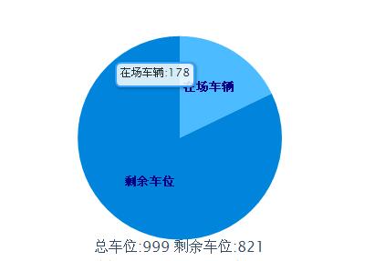
var totalMoney=999
<span style="white-space:pre"> </span>var zccw=178
<span style="white-space:pre"> </span>var sycw=821
$(document).ready(function() {
chart = new Highcharts.Chart({
chart: {
renderTo: 'pie_chart',
plotBackgroundColor: 'white',//背景颜色
plotBorderWidth: 0,
plotShadow: false
},
title: {
text: '总车位:'+totalMoney +' 剩余车位:'+ sycw ,
verticalAlign:'bottom',
y:-60
},
tooltip: {//鼠标移动到每个饼图显示的内容
pointFormat: '{point.name}: <b>{point.percentage}%</b>',
percentageDecimals: 1,
formatter: function() {
return this.point.name+':'+totalMoney*this.point.percentage/100;
}
},
plotOptions: {
pie: {
size:'60%',
borderWidth: 0,
allowPointSelect: true,
cursor: 'pointer',
dataLabels: {
enabled: true,
color: '#000',
distance: -50,//通过设置这个属性,将每个小饼图的显示名称和每个饼图重叠
style: {
fontSize: '10px',
lineHeight: '10px'
},
formatter: function(index) {
return '<span style="color:#00008B;font-weight:bold">' + this.point.name + '</span>';
}
},
padding:20
}
},
series: [{//设置每小个饼图的颜色、名称、百分比
type: 'pie',
name: null,
data: [
{name:'在场车辆',color:'#3DA9FF',y:zccw},
{name:'剩余车位',color:'#008FE0',y:sycw},
]
}]
});
});
});
</script>
</div>
</body>
</html>
以上这篇html+js+highcharts绘制圆饼图表的简单实例就是小编分享给大家的全部内容了,希望能给大家一个参考,也希望大家多多支持脚本之家。
您可能感兴趣的文章:

相关文章推荐
- cssplot - CSS 绘制图表
- Highcharts入门之基本属性
- C#实现绘制面形图表的方法详解
- C#绘制椭圆的方法
- C#绘制曲线图的方法
- C#绘制中国国旗的方法
- C#画笔Pen绘制光滑模式曲线的方法
- Highcharts学习之坐标轴
- Highcharts入门之简介
- 一个XML格式数据转换为图表的例子
- C#实现在图像中绘制文字图形的方法
- js绘制圆形和矩形的方法
- jQuery Chart图表制作组件Highcharts用法详解
- jQuery实现下拉菜单(内容为时间)的实时更新及图表的随动更新的方法
- Highcharts学习之数据列
- Highcharts使用简例及异步动态读取数据
- Highcharts 多个Y轴动态刷新数据的实现代码
- 讲解.NET环境下绘制模糊数学中隶属函数分布图第1/5页
- 浅析jquery的js图表组件highcharts
- FusionCharts图表显示双Y轴双(多)曲线