css的div垂直居中的方法,百分比div垂直居中
2016-07-21 09:12
666 查看
前言
我们都知道,固定高宽的div在网页中垂直居中很简单,相信大家也很容易的写出来,但是不是固定高宽的div如何垂直居中呢?我们在网页布局,特别是手机等web端网页经常是不固定高宽的div,那么这些div如何垂直居中呢?这篇文章,我总结一下。
固定高宽div垂直居中
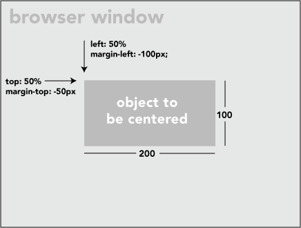
如上图,固定高宽的很简单,写法如下:
position: absolute;
left: 50%;
top: 50%;
width:200px;
height:100px;
margin-left:-100px;
margin-top:-50px;
不固定高宽div垂直居中的方法
方法一:用一个“ghost”伪元素(看不见的伪元素)和 inline-block / vertical-align 可以搞定居中,非常巧妙。但是这个方法要求待居中的元素是 inline-block,不是一个真正通用的方案。
html如下:
<div class="block" style="height: 300px;">

<div class="centered">
<h1>haorooms案例题目</h1>
<p>haorooms案例内容,haorooms案例内容haorooms案例内容haorooms案例内容haorooms案例内容haorooms案例内容haorooms案例内容haorooms案例内容haorooms案例内容</p>
</div>

</div>
css如下:
/* This parent can be any width and height */
.block {
text-align: center;
}

/* The ghost, nudged to maintain perfect centering */
.block:before {
content: '';
display: inline-block;
height: 100%;
vertical-align: middle;
margin-right: -0.25em; /* Adjusts for spacing */
}

/* The element to be centered, can
also be of any width and height */
.centered {
display: inline-block;
vertical-align: middle;
width: 50%;
}
方法二:
可以用table布局方法,但是这种方法也有局限性!
写法如下:
<table style="width: 100%;">
<tr>
<td style="text-align: center; vertical-align: middle;">
Unknown stuff to be centered.
</td>
</tr>
</table>
由于table写法比较费时,你也可以用div代替table,写法如下:
html:
<div class="something-semantic">
<div class="something-else-semantic">
Unknown stuff to be centered.
</div>
</div>
css:
.something-semantic {
display: table;
width: 100%;
}
.something-else-semantic {
display: table-cell;
text-align: center;
vertical-align: middle;
}
方法三,终极解决方法:
以上2中方法可能都有其局限性,我介绍的第三中方法是比较成熟的不是固定高宽div的垂直居中的方法!但是方法是css3的写法,想兼容IE8的童鞋们,建议用上面的方法!
方法和我们固定高宽的差不多,但是不用margin我们用的是 translate()
demo如下:
<!DOCTYPE html PUBLIC "-//W3C//DTD XHTML 1.0 Strict//EN" "http://www.w3.org/TR/xhtml1/DTD/xhtml1-strict.dtd">
<html xmlns="http://www.w3.org/1999/xhtml" xml:lang="en">
<head>
<meta http-equiv="Content-Type" content="text/html;charset=UTF-8">
<title>haorooms不固定高度div写法</title>

<style>
.center {
position: fixed;
top: 50%;
left: 50%;
background-color: #000;
width:50%;
height: 50%;
-webkit-transform: translateX(-50%) translateY(-50%);
}

</style>
</head>
<body>
<div class="center"></div>
</body>
</html>
我上面的css只是针对webkit内核的浏览器,其他内核浏览器写法如下:
-webkit-transform: translateX(-50%) translateY(-50%);
-moz-transform: translateX(-50%) translateY(-50%);
-ms-transform: translateX(-50%) translateY(-50%);
transform: translateX(-50%) translateY(-50%);
关于每个浏览器的写法,可以看看我之前的一篇文章:http://www.haorooms.com/post/css_common
有些弹出层的样式,也可以用这个方法居中
position: fixed;
top: 50%;
left: 50%;
width: 50%;
max-width: 630px;
min-width: 320px;
height: auto;
z-index: 2000;
visibility: hidden;
-webkit-backface-visibility: hidden;
-moz-backface-visibility: hidden;
backface-visibility: hidden;
-webkit-transform: translateX(-50%) translateY(-50%);
-moz-transform: translateX(-50%) translateY(-50%);
-ms-transform: translateX(-50%) translateY(-50%);
transform: translateX(-50%) translateY(-50%);
css3不定宽高水平垂直居中
只要三句话就可以实现不定宽高水平垂直居中。justify-content:center;//子元素水平居中 align-items:center;//子元素垂直居中 display:-webkit-flex;
在父级元素上面加上上面3句话,就可以实现子元素水平垂直居中。

相关文章推荐
- Web布局连载——两栏固定布局(五)
- [div+css]晒晒最新制作专题推广页模板
- 盒子模型
- CSS选择器
- CSS样式优先权
- [css] line-height 百分比单位和数值单位的区别
- css如何搞正方形
- Apple官网研究之使用Justify布局导航
- 关于前端的思考与感悟
- rem : web app适配的秘密武器
- jquery高级应用之Deferred对象
- 移动端点击事件全攻略,这里的坑你知多少?
- $q 实例分析 Angular 中的 Promise
- 浏览器中唤起native app || 跳转到应用商城下载
- Angular directive 实例详解
- 关于浮动与清除浮动,你应该知道的
- 数组reduce方法的高级技巧
- 设计更快的网页(三):字体和 CSS 调整