CSS之弧形阴影
2016-03-16 16:44
453 查看
简述
网页上经常会出现一些弧形的阴影效果,看起来很漂亮,下面我们来讲述下如何用CSS来实现一个弧形阴影。简述
阴影
效果
注释
标题
效果
源码
合并
效果
源码
阴影
效果

首先实现一个简单的阴影效果
<!DOCTYPE html>
<html>
<head>
<style type='text/css'>
div {
background: green;
box-shadow: 0 4px 10px rgba(0, 0, 0, 0.5);
border-radius: 150px/10px;
height: 20px;
width: 400px;
z-index: -1;
}
</style>
</head>
<body>
<div>
</div>
</body>
</html>
注释
box-shadow: 0 4px 10px rgba(0, 0, 0, 0.5)表示一个带外阴影的元素,阴影位置x轴偏移0,y轴偏移4px,模糊范围10px,阴影颜色rgba(0, 0, 0, 0.5)
border-radius: 150px/10px
表示水平方向的半径和垂直方向的半径分别为150px、10px
z-index: -1
z-index属性设置元素的堆叠顺序。拥有更高堆叠顺序的元素总是会处于堆叠顺序较低的元素的前面。
拥有更低的优先级,可用于将在一个元素放置于另一元素之后。
注释:z-index 仅能在定位元素上奏效(例如 position:absolute;)!
标题
效果

源码
设置背景色、字体、位置、行高等。下边框为蓝色部分可以暂时忽略,后面我们需要进行阴影显示用的。<!DOCTYPE html>
<html>
<head>
<meta charset="utf-8">
<style type='text/css'>
body {
/* 外边距:24像素 */
margin: 24px;
}
h1 {
/* 背景色 */
background: #139573;
/* 下边框:高4像素 实线 蓝色 */
border-bottom: 4px solid blue;
/* 文本色:白色 */
color: #fff;
/* 字体风格 */
font-family: sans-serif;
/* 字体大小:24像素 */
font-size: 24px;
/* 文本粗细:正常 */
font-weight: normal;
/* 行高:80像素 */
line-height: 80px;
margin: 0;
/* 文本位置:相对定位 */
position: relative;
/* 文本对齐方式:居中 */
text-align: center;
}
h1 strong {
font-weight: bold;
}
</style>
</head>
<body>
<h1>
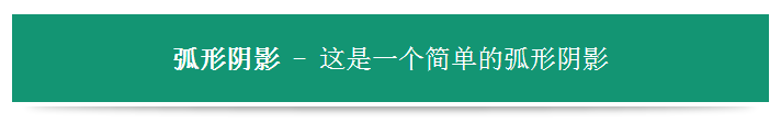
<strong>弧形阴影</strong> - 这是一个简单的弧形阴影
</h1>
</body>
</html>合并
效果
源码
这里我们将阴影的背景变为透明色,然后设置位置和大小来实现我们的效果。<!DOCTYPE html>
<html>
<head>
<meta charset="utf-8">
<style type='text/css'>
body {
margin: 24px;
}
h1 {
background: #139573;
border-bottom: 4px solid #fff;
color: #fff;
font-family: sans-serif;
font-size: 24px;
font-weight: normal;
line-height: 80px;
margin: 0;
position: relative;
text-align: center;
}
h1 strong {
font-weight: bold;
}
h1::before {
background: transparent;
box-shadow: 0 4px 10px rgba(0, 0, 0, 0.5);
border-radius: 800px/10px;
bottom: -2px;
content: "";
height: 8px;
left: 2%;
position: absolute;
width: 96%;
z-index: -1;
}
</style>
</head>
<body>
<h1>
<strong>弧形阴影</strong> - 这是一个简单的弧形阴影
</h1>
</body>
</html>CSS中存在两个伪类:before 和 :after,它们特有的属性content ,用于在 CSS 渲染中向元素逻辑上的头部或尾部添加内容。注意这些添加不会改变文档内容,不会出现在 DOM 中,不可复制,仅仅是在 CSS 渲染层加入。
所以,我们只需要配合position: absolute ,就可以将其当成容器,拼合成弧形阴影效果。

相关文章推荐
- Web布局连载——两栏固定布局(五)
- [div+css]晒晒最新制作专题推广页模板
- 盒子模型
- CSS选择器
- CSS样式优先权
- [css] line-height 百分比单位和数值单位的区别
- Apple官网研究之使用Justify布局导航
- 设计更快的网页(三):字体和 CSS 调整
- 纯CSS制作的新闻网站中的文章列表
- 10条影响CSS渲染速度的写法与使用建议第1/3页
- BS项目中的CSS架构_仅加载自己需要的CSS
- 很不错的 CSS Hack 又学了一招
- 发一个css比较清爽的写法
- CSS expression控制图片自动缩放效果代码[兼容 IE,Firefox]
- css布局网页水平居中常用方法
- CSS经典技巧十则第1/2页
- css 兼容性问题this.style.cursor=''hand''
- IE6不能正常解析CSS文件问题的解决方法及原因分析
- 欲练CSS ,必先解决IE的一些细节分析
- CSS文字截取功能实现代码