[DIV/CSS] 纯CSS制作各种图形(多图预警)
2016-03-11 16:51
666 查看
今天在国外一网站(The Shapes of CSS)看到的,看了一下 css,也不复杂,只是平时没有用心去思考~用心思考~埋头赶路~~
Square(正方形)

#square {
width: 100px;
height: 100px;
background: red;
}
复制代码
Rectangle(矩形)

#rectangle {
width: 200px;
height: 100px;
background: red;
}
复制代码
Circle(圆形)

#circle {
width: 100px;
height: 100px;
background: red;
-moz-border-radius: 50px;
-webkit-border-radius: 50px;
border-radius: 50px;
}
/* 可以使用百分比值(大于50%),但是低版本的Android不支持 */
复制代码
Oval(椭圆形)

#oval {
width: 200px;
height: 100px;
background: red;
-moz-border-radius: 100px / 50px;
-webkit-border-radius: 100px / 50px;
border-radius: 100px / 50px;
}
/* 可以使用百分比值(大于50%),但是低版本的Android不支持 */
http://www.nvzi91.cn/byjc/29923.html
复制代码
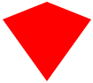
Triangle Up(向上的三角形)

#triangle-up {
width: 0;
height: 0;
border-left: 50px solid transparent;
border-right: 50px solid transparent;
border-bottom: 100px solid red;
}
复制代码
Triangle Down(向下)

#triangle-down {
width: 0;
height: 0;
border-left: 50px solid transparent;
border-right: 50px solid transparent;
border-top: 100px solid red;
}
复制代码
Triangle Left(向左)

#triangle-left {
width: 0;
height: 0;
border-top: 50px solid transparent;
border-right: 100px solid red;
border-bottom: 50px solid transparent;
}
复制代码
Triangle Right(向右)

#triangle-right {
width: 0;
height: 0;
border-top: 50px solid transparent;
border-left: 100px solid red;
border-bottom: 50px solid transparent;
}http://www.nvzi91.cn/baidaiyichang/29924.html
复制代码
Triangle Top Left(左上)

#triangle-topleft {
width: 0;
height: 0;
border-top: 100px solid red;
border-right: 100px solid transparent;
}
复制代码
Triangle Top Right(右上)

#triangle-topright {
width: 0;
height: 0;
border-top: 100px solid red;
border-left: 100px solid transparent;
}http://www.nvzi91.cn/rlyby/031129925.html
复制代码
Triangle Bottom Left(左下)

#triangle-bottomleft {
width: 0;
height: 0;
border-bottom: 100px solid red;
border-right: 100px solid transparent;
}
复制代码
Triangle Bottom Right(右下)

#triangle-bottomright {
width: 0;
height: 0;
border-bottom: 100px solid red;
border-left: 100px solid transparent;
}
复制代码
Curved Tail Arrow(弯尾箭头)


可以通过修改 #curvedarrow 的 rotate() 值来形成不同的方向
#curvedarrow {
position: relative;
width: 0;
height: 0;
border-top: 9px solid transparent;
border-right: 9px solid red;
-webkit-transform: rotate(10deg);
-moz-transform: rotate(10deg);
-ms-transform: rotate(10deg);
-o-transform: rotate(10deg);
}
#curvedarrow:after {
content: "";
position: absolute;
border: 0 solid transparent;
border-top: 3px solid red;
border-radius: 20px 0 0 0;
top: -12px;
left: -9px;
width: 12px;
height: 12px;
-webkit-transform: rotate(45deg);
-moz-transform: rotate(45deg);
-ms-transform: rotate(45deg);
-o-transform: rotate(45deg);
}http://www.nvzi91.cn/qinggan/29926.html
复制代码
Trapezoid(梯形)

#trapezoid {
border-bottom: 100px solid red;
border-left: 50px solid transparent;
border-right: 50px solid transparent;
height: 0;
width: 100px;
}
复制代码
Parallelogram(平行四边形)

#parallelogram {
width: 150px;
height: 100px;
-webkit-transform: skew(20deg);
-moz-transform: skew(20deg);
-o-transform: skew(20deg);
background: red;
}
复制代码
Star (6-points)(六角星)

#star-six {
width: 0;
height: 0;
border-left: 50px solid transparent;
border-right: 50px solid transparent;
border-bottom: 100px solid red;
position: relative;
}http://www.nvzi91.cn/gongwaiyun/29927.html
#star-six:after {
width: 0;
height: 0;
border-left: 50px solid transparent;
border-right: 50px solid transparent;
border-top: 100px solid red;
position: absolute;
content: "";
top: 30px;
left: -50px;
}
复制代码
Star (5-points)(五角星)

#star-five {
margin: 50px 0;
position: relative;
display: block;
color: red;
width: 0px;
height: 0px;
border-right: 100px solid transparent;
border-bottom: 70px solid red;
border-left: 100px solid transparent;
-moz-transform: rotate(35deg);
-webkit-transform: rotate(35deg);
-ms-transform: rotate(35deg);
-o-transform: rotate(35deg);
}http://www.kmrlyy.com/yindaoyan/dcxydy/33437.html
#star-five:before {
border-bottom: 80px solid red;
border-left: 30px solid transparent;
border-right: 30px solid transparent;
position: absolute;
height: 0;
width: 0;
top: -45px;
left: -65px;
display: block;
content: '';
-webkit-transform: rotate(-35deg);
-moz-transform: rotate(-35deg);
-ms-transform: rotate(-35deg);
-o-transform: rotate(-35deg);
}
#star-five:after {
position: absolute;
display: block;
color: red;
top: 3px;
left: -105px;
width: 0px;
height: 0px;
border-right: 100px solid transparent;
border-bottom: 70px solid red;
border-left: 100px solid transparent;
-webkit-transform: rotate(-70deg);
-moz-transform: rotate(-70deg);
-ms-transform: rotate(-70deg);
-o-transform: rotate(-70deg);
content: '';
}
复制代码
Pentagon(五边形)

#pentagon {
position: relative;
width: 54px;
border-width: 50px 18px 0;
border-style: solid;
border-color: red transparent;
}http://www.kmrlyy.com/zgnma/33438.html
#pentagon:before {
content: "";
position: absolute;
height: 0;
width: 0;
top: -85px;
left: -18px;
border-width: 0 45px 35px;
border-style: solid;
border-color: transparent transparent red;
}
复制代码
Hexagon(六边形)

#hexagon {
width: 100px;
height: 55px;
background: red;
position: relative;
}
#hexagon:before {
content: "";
position: absolute;
top: -25px;
left: 0;
width: 0;
height: 0;
border-left: 50px solid transparent;
border-right: 50px solid transparent;
border-bottom: 25px solid red;
}
#hexagon:after {
content: "";
position: absolute;
bottom: -25px;
left: 0;
width: 0;
height: 0;
border-left: 50px solid transparent;
border-right: 50px solid transparent;
border-top: 25px solid red;
}http://www.kmrlyy.com/fkjbcs/33439.html
复制代码
Octagon(八边形)

<br>#octagon {
width: 100px;
height: 100px;
background: red;
position: relative;
}
#octagon:before {
content: "";
position: absolute;
top: 0;
left: 0;
border-bottom: 29px solid red;
border-left: 29px solid #fff;
border-right: 29px solid #fff;
width: 42px;
height: 0;
}
#octagon:after {
content: "";
position: absolute;
bottom: 0;
left: 0;
border-top: 29px solid red;
border-left: 29px solid #fff;
border-right: 29px solid #fff;
width: 42px;
height: 0;
}
复制代码
Heart(心形)

#heart {
position: relative;
width: 100px;
height: 90px;
}
#heart:before,
#heart:after {
position: absolute;
content: "";
left: 50px;
top: 0;
width: 50px;
height: 80px;
background: red;
-moz-border-radius: 50px 50px 0 0;
border-radius: 50px 50px 0 0;
-webkit-transform: rotate(-45deg);
-moz-transform: rotate(-45deg);
-ms-transform: rotate(-45deg);
-o-transform: rotate(-45deg);
transform: rotate(-45deg);
-webkit-transform-origin: 0 100%;
-moz-transform-origin: 0 100%;
-ms-transform-origin: 0 100%;
-o-transform-origin: 0 100%;
transform-origin: 0 100%;
}http://www.kmrlyy.com/fujianyan/33440.html
#heart:after {
left: 0;
-webkit-transform: rotate(45deg);
-moz-transform: rotate(45deg);
-ms-transform: rotate(45deg);
-o-transform: rotate(45deg);
transform: rotate(45deg);
-webkit-transform-origin: 100% 100%;
-moz-transform-origin: 100% 100%;
-ms-transform-origin: 100% 100%;
-o-transform-origin: 100% 100%;
transform-origin :100% 100%;
}
复制代码
Infinity(无限符图形)

#infinity {
position: relative;
width: 212px;
height: 100px;
}
#infinity:before,
#infinity:after {
content: "";
position: absolute;
top: 0;
left: 0;
width: 60px;
height: 60px;
border: 20px solid red;
-moz-border-radius: 50px 50px 0 50px;
border-radius: 50px 50px 0 50px;
-webkit-transform: rotate(-45deg);
-moz-transform: rotate(-45deg);
-ms-transform: rotate(-45deg);
-o-transform: rotate(-45deg);
transform: rotate(-45deg);
}
#infinity:after {
left: auto;
right: 0;
-moz-border-radius: 50px 50px 50px 0;
border-radius: 50px 50px 50px 0;
-webkit-transform: rotate(45deg);
-moz-transform: rotate(45deg);
-ms-transform: rotate(45deg);
-o-transform: rotate(45deg);
transform: rotate(45deg);
}http://www.kmrlyy.com/gongjingmilan/33441.html
复制代码
Diamond Square(菱形)

#diamond {
width: 0;
height: 0;
border: 50px solid transparent;
border-bottom-color: red;
position: relative;
top: -50px;
}
#diamond:after {
content: '';
position: absolute;
left: -50px;
top: 50px;
width: 0;
height: 0;
border: 50px solid transparent;
border-top-color: red;
}
复制代码
Diamond Shield
#diamond-shield {
width: 0;
height: 0;
border: 50px solid transparent;
border-bottom: 20px solid red;
position: relative;
top: -50px;
}
#diamond-shield:after {
content: '';
position: absolute;
left: -50px; top: 20px;
width: 0;
height: 0;
border: 50px solid transparent;
border-top: 70px solid red;
}
复制代码
Diamond Narrow

#diamond-narrow {
width: 0;
height: 0;
border: 50px solid transparent;
border-bottom: 70px solid red;
position: relative;
top: -50px;
}http://m.nvzi91.cn/wutongrenliu/29342.html
#diamond-narrow:after {
content: '';
position: absolute;
left: -50px; top: 70px;
width: 0;
height: 0;
border: 50px solid transparent;
border-top: 70px solid red;
}
复制代码
Cut Diamond(砖石形)

#cut-diamond {
border-style: solid;
border-color: transparent transparent red transparent;
border-width: 0 25px 25px 25px;
height: 0;
width: 50px;
position: relative;
margin: 20px 0 50px 0;
}
#cut-diamond:after {
content: "";
position: absolute;
top: 25px;
left: -25px;
width: 0;
height: 0;
border-style: solid;
border-color: red transparent transparent transparent;
border-width: 70px 50px 0 50px;
}
复制代码
Egg(鸡蛋)

#egg {
display:block;
width: 126px;
height: 180px;
background-color: red;
-webkit-border-radius: 63px 63px 63px 63px / 108px 108px 72px 72px;
border-radius: 50% 50% 50% 50% / 60% 60% 40% 40%;
}
复制代码
Pac-Man(吃豆人)

#pacman {
width: 0px;
height: 0px;
border-right: 60px solid transparent;
border-top: 60px solid red;
border-left: 60px solid red;
border-bottom: 60px solid red;
border-top-left-radius: 60px;
border-top-right-radius: 60px;
border-bottom-left-radius: 60px;
border-bottom-right-radius: 60px;
}
复制代码
Talk Bubble

#talkbubble {
width: 120px;
height: 80px;
background: red;
position: relative;
-moz-border-radius: 10px;
-webkit-border-radius: 10px;
border-radius: 10px;
}http://m.nvzi91.cn/gongjingai/29343.html
#talkbubble:before {
content:"";
position: absolute;
right: 100%;
top: 26px;
width: 0;
height: 0;
border-top: 13px solid transparent;
border-right: 26px solid red;
border-bottom: 13px solid transparent;
}
复制代码
12 Point Burst

#burst-12 {
background: red;
width: 80px;
height: 80px;
position: relative;
text-align: center;
}
#burst-12:before, #burst-12:after {
content: "";
position: absolute;
top: 0;
left: 0;
height: 80px;
width: 80px;
background: red;
}
#burst-12:before {
-webkit-transform: rotate(30deg);
-moz-transform: rotate(30deg);
-ms-transform: rotate(30deg);
-o-transform: rotate(30deg);
}
#burst-12:after {
-webkit-transform: rotate(60deg);
-moz-transform: rotate(60deg);
-ms-transform: rotate(60deg);
-o-transform: rotate(60deg);
}
复制代码
8 Point Burst

#burst-8 {
background: red;
width: 80px;
height: 80px;
position: relative;
text-align: center;
-webkit-transform: rotate(20deg);
-moz-transform: rotate(20deg);
-ms-transform: rotate(20deg);
-o-transform: rotate(20eg);
}
#burst-8:before {
content: "";
position: absolute;
top: 0;
left: 0;
height: 80px;
width: 80px;
background: red;
-webkit-transform: rotate(135deg);
-moz-transform: rotate(135deg);
-ms-transform: rotate(135deg);
-o-transform: rotate(135deg);
}
复制代码
Yin Yang(阴阳图)

#yin-yang {
width: 96px;
height: 48px;
background: #eee;
border-color: red;
border-style: solid;
border-width: 2px 2px 50px 2px;
border-radius: 100%;
position: relative;
}
#yin-yang:before {
content: "";
position: absolute;
top: 50%;
left: 0;
background: #eee;
border: 18px solid red;
border-radius: 100%;
width: 12px;
height: 12px;
}
#yin-yang:after {
content: "";
position: absolute;
top: 50%;
left: 50%;
background: red;
border: 18px solid #eee;
border-radius:100%;
width: 12px;
height: 12px;
}
复制代码
Badge Ribbon(徽章丝带)

#badge-ribbon {
po
1a620
sition: relative;
background: red;
height: 100px;
width: 100px;
-moz-border-radius: 50px;
-webkit-border-radius: 50px;
border-radius: 50px;
}http://m.nvzi91.cn/liangxingjiankang/201603/11-29344.html
#badge-ribbon:before,
#badge-ribbon:after {
content: '';
position: absolute;
border-bottom: 70px solid red;
border-left: 40px solid transparent;
border-right: 40px solid transparent;
top: 70px;
left: -10px;
-webkit-transform: rotate(-140deg);
-moz-transform: rotate(-140deg);
-ms-transform: rotate(-140deg);
-o-transform: rotate(-140deg);
}
#badge-ribbon:after {
left: auto;
right: -10px;
-webkit-transform: rotate(140deg);
-moz-transform: rotate(140deg);
-ms-transform: rotate(140deg);
-o-transform: rotate(140deg);
}
复制代码
Space Invader

#space-invader{
box-shadow:
0 0 0 1em red,
0 1em 0 1em red,
-2.5em 1.5em 0 .5em red,
2.5em 1.5em 0 .5em red,
-3em -3em 0 0 red,
3em -3em 0 0 red,
-2em -2em 0 0 red,
2em -2em 0 0 red,
-3em -1em 0 0 red,
-2em -1em 0 0 red,
2em -1em 0 0 red,
3em -1em 0 0 red,
-4em 0 0 0 red,
-3em 0 0 0 red,
3em 0 0 0 red,
4em 0 0 0 red,
-5em 1em 0 0 red,
-4em 1em 0 0 red,
4em 1em 0 0 red,
5em 1em 0 0 red,
-5em 2em 0 0 red,
5em 2em 0 0 red,
-5em 3em 0 0 red,
-3em 3em 0 0 red,
3em 3em 0 0 red,
5em 3em 0 0 red,
-2em 4em 0 0 red,
-1em 4em 0 0 red,
1em 4em 0 0 red,
2em 4em 0 0 red;
background: red;
width: 1em;
height: 1em;
overflow: hidden;
margin: 50px 0 70px 65px;
}
复制代码
TV Screen

#tv {www.nvzi91.cn
position: relative;
width: 200px;
height: 150px;
margin: 20px 0;
background: red;
border-radius: 50% / 10%;
color: white;
text-align: center;
text-indent: .1em;
}
#tv:before {
content: '';
position: absolute;
top: 10%;
bottom: 10%;
right: -5%;
left: -5%;
background: inherit;
border-radius: 5% / 50%;
}
复制代码
Chevron

#chevron {
position: relative;
text-align: center;
padding: 12px;
margin-bottom: 6px;
height: 60px;
width: 200px;
}
#chevron:before {
content: '';
position: absolute;
top: 0;
left: 0;
height: 100%;
width: 51%;
background: red;
-webkit-transform: skew(0deg, 6deg);
-moz-transform: skew(0deg, 6deg);
-ms-transform: skew(0deg, 6deg);
-o-transform: skew(0deg, 6deg);
transform: skew(0deg, 6deg);
}
#chevron:after {
content: '';
position: absolute;
top: 0;
right: 0;
height: 100%;
width: 50%;
background: red;
-webkit-transform: skew(0deg, -6deg);
-moz-transform: skew(0deg, -6deg);
-ms-transform: skew(0deg, -6deg);
-o-transform: skew(0deg, -6deg);
transform: skew(0deg, -6deg);
}?
复制代码
Magnifying Glass

#magnifying-glass{
font-size: 10em; /* This controls the size. */
display: inline-block;
width: 0.4em;
height: 0.4em;
border: 0.1em solid red;
position: relative;
border-radius: 0.35em;
}
#magnifying-glass::before{
content: "";
display: inline-block;
position: absolute;
right: -0.25em;
bottom: -0.1em;
border-width: 0;
background: red;
width: 0.35em;
height: 0.08em;www.kmrlyy.com
-webkit-transform: rotate(45deg);
-moz-transform: rotate(45deg);
-ms-transform: rotate(45deg);
-o-transform: rotate(45deg);
}
复制代码
Facebook Icon

#facebook-icon {
background: red;
text-indent: -999em;
width: 100px;
height: 110px;
border-radius: 5px;
position: relative;
overflow: hidden;
border: 15px solid red;
border-bottom: 0;
}
#facebook-icon::before {
content: "/20";
position: absolute;
background: red;
width: 40px;
height: 90px;
bottom: -30px;
right: -37px;
border: 20px solid #eee;
border-radius: 25px;
}
#facebook-icon::after {
content: "/20";
position: absolute;
width: 55px;
top: 50px;
height: 20px;
background: #eee;
right: 5px;
}
复制代码
Cone(圆锥形)

#cone {
width: 0;
height: 0;
border-left: 70px solid transparent;
border-right: 70px solid transparent;
border-top: 100px solid red;
-moz-border-radius: 50%;
-webkit-border-radius: 50%;
border-radius: 50%;
}m.nvzi91.cn
复制代码
Moon(月亮)

#moon {
width: 80px;
height: 80px;
border-radius: 50%;
box-shadow: 15px 15px 0 0 red;
}
复制代码
Flag

#flag {
width: 110px;
height: 56px;
padding-top: 15px;
position: relative;
background: red;
color: white;
font-size: 11px;
letter-spacing: 0.2em;
text-align: center;
text-transform: uppercase;
}
#flag:after {
content: "";
position: absolute;
left: 0;
bottom: 0;
width: 0;
height: 0;
border-bottom: 13px solid #fff;
border-left: 55px solid transparent;
border-right: 55px solid transparent;
}
复制代码
Cross

#cross {
background: red;
height: 100px;
position: relative;
width: 20px;
}
#cross:after {
background: red;
content: "";
height: 20px;
left: -40px;
position: absolute;
top: 40px;
width: 100px;
}
复制代码
Base

#base {
background: red;
display: inline-block;
height: 55px;
margin-left: 20px;
margin-top: 55px;
position: relative;
width: 100px;
}
#base:before {
border-bottom: 35px solid red;
border-left: 50px solid transparent;
border-right: 50px solid transparent;
content: "";
height: 0;
left: 0;
position: absolute;
top: -35px;
width: 0;
}
Square(正方形)
#square {
width: 100px;
height: 100px;
background: red;
}
复制代码
Rectangle(矩形)
#rectangle {
width: 200px;
height: 100px;
background: red;
}
复制代码
Circle(圆形)
#circle {
width: 100px;
height: 100px;
background: red;
-moz-border-radius: 50px;
-webkit-border-radius: 50px;
border-radius: 50px;
}
/* 可以使用百分比值(大于50%),但是低版本的Android不支持 */
复制代码
Oval(椭圆形)
#oval {
width: 200px;
height: 100px;
background: red;
-moz-border-radius: 100px / 50px;
-webkit-border-radius: 100px / 50px;
border-radius: 100px / 50px;
}
/* 可以使用百分比值(大于50%),但是低版本的Android不支持 */
http://www.nvzi91.cn/byjc/29923.html
复制代码
Triangle Up(向上的三角形)
#triangle-up {
width: 0;
height: 0;
border-left: 50px solid transparent;
border-right: 50px solid transparent;
border-bottom: 100px solid red;
}
复制代码
Triangle Down(向下)
#triangle-down {
width: 0;
height: 0;
border-left: 50px solid transparent;
border-right: 50px solid transparent;
border-top: 100px solid red;
}
复制代码
Triangle Left(向左)
#triangle-left {
width: 0;
height: 0;
border-top: 50px solid transparent;
border-right: 100px solid red;
border-bottom: 50px solid transparent;
}
复制代码
Triangle Right(向右)
#triangle-right {
width: 0;
height: 0;
border-top: 50px solid transparent;
border-left: 100px solid red;
border-bottom: 50px solid transparent;
}http://www.nvzi91.cn/baidaiyichang/29924.html
复制代码
Triangle Top Left(左上)
#triangle-topleft {
width: 0;
height: 0;
border-top: 100px solid red;
border-right: 100px solid transparent;
}
复制代码
Triangle Top Right(右上)
#triangle-topright {
width: 0;
height: 0;
border-top: 100px solid red;
border-left: 100px solid transparent;
}http://www.nvzi91.cn/rlyby/031129925.html
复制代码
Triangle Bottom Left(左下)
#triangle-bottomleft {
width: 0;
height: 0;
border-bottom: 100px solid red;
border-right: 100px solid transparent;
}
复制代码
Triangle Bottom Right(右下)
#triangle-bottomright {
width: 0;
height: 0;
border-bottom: 100px solid red;
border-left: 100px solid transparent;
}
复制代码
Curved Tail Arrow(弯尾箭头)
可以通过修改 #curvedarrow 的 rotate() 值来形成不同的方向
#curvedarrow {
position: relative;
width: 0;
height: 0;
border-top: 9px solid transparent;
border-right: 9px solid red;
-webkit-transform: rotate(10deg);
-moz-transform: rotate(10deg);
-ms-transform: rotate(10deg);
-o-transform: rotate(10deg);
}
#curvedarrow:after {
content: "";
position: absolute;
border: 0 solid transparent;
border-top: 3px solid red;
border-radius: 20px 0 0 0;
top: -12px;
left: -9px;
width: 12px;
height: 12px;
-webkit-transform: rotate(45deg);
-moz-transform: rotate(45deg);
-ms-transform: rotate(45deg);
-o-transform: rotate(45deg);
}http://www.nvzi91.cn/qinggan/29926.html
复制代码
Trapezoid(梯形)
#trapezoid {
border-bottom: 100px solid red;
border-left: 50px solid transparent;
border-right: 50px solid transparent;
height: 0;
width: 100px;
}
复制代码
Parallelogram(平行四边形)
#parallelogram {
width: 150px;
height: 100px;
-webkit-transform: skew(20deg);
-moz-transform: skew(20deg);
-o-transform: skew(20deg);
background: red;
}
复制代码
Star (6-points)(六角星)
#star-six {
width: 0;
height: 0;
border-left: 50px solid transparent;
border-right: 50px solid transparent;
border-bottom: 100px solid red;
position: relative;
}http://www.nvzi91.cn/gongwaiyun/29927.html
#star-six:after {
width: 0;
height: 0;
border-left: 50px solid transparent;
border-right: 50px solid transparent;
border-top: 100px solid red;
position: absolute;
content: "";
top: 30px;
left: -50px;
}
复制代码
Star (5-points)(五角星)
#star-five {
margin: 50px 0;
position: relative;
display: block;
color: red;
width: 0px;
height: 0px;
border-right: 100px solid transparent;
border-bottom: 70px solid red;
border-left: 100px solid transparent;
-moz-transform: rotate(35deg);
-webkit-transform: rotate(35deg);
-ms-transform: rotate(35deg);
-o-transform: rotate(35deg);
}http://www.kmrlyy.com/yindaoyan/dcxydy/33437.html
#star-five:before {
border-bottom: 80px solid red;
border-left: 30px solid transparent;
border-right: 30px solid transparent;
position: absolute;
height: 0;
width: 0;
top: -45px;
left: -65px;
display: block;
content: '';
-webkit-transform: rotate(-35deg);
-moz-transform: rotate(-35deg);
-ms-transform: rotate(-35deg);
-o-transform: rotate(-35deg);
}
#star-five:after {
position: absolute;
display: block;
color: red;
top: 3px;
left: -105px;
width: 0px;
height: 0px;
border-right: 100px solid transparent;
border-bottom: 70px solid red;
border-left: 100px solid transparent;
-webkit-transform: rotate(-70deg);
-moz-transform: rotate(-70deg);
-ms-transform: rotate(-70deg);
-o-transform: rotate(-70deg);
content: '';
}
复制代码
Pentagon(五边形)
#pentagon {
position: relative;
width: 54px;
border-width: 50px 18px 0;
border-style: solid;
border-color: red transparent;
}http://www.kmrlyy.com/zgnma/33438.html
#pentagon:before {
content: "";
position: absolute;
height: 0;
width: 0;
top: -85px;
left: -18px;
border-width: 0 45px 35px;
border-style: solid;
border-color: transparent transparent red;
}
复制代码
Hexagon(六边形)
#hexagon {
width: 100px;
height: 55px;
background: red;
position: relative;
}
#hexagon:before {
content: "";
position: absolute;
top: -25px;
left: 0;
width: 0;
height: 0;
border-left: 50px solid transparent;
border-right: 50px solid transparent;
border-bottom: 25px solid red;
}
#hexagon:after {
content: "";
position: absolute;
bottom: -25px;
left: 0;
width: 0;
height: 0;
border-left: 50px solid transparent;
border-right: 50px solid transparent;
border-top: 25px solid red;
}http://www.kmrlyy.com/fkjbcs/33439.html
复制代码
Octagon(八边形)
<br>#octagon {
width: 100px;
height: 100px;
background: red;
position: relative;
}
#octagon:before {
content: "";
position: absolute;
top: 0;
left: 0;
border-bottom: 29px solid red;
border-left: 29px solid #fff;
border-right: 29px solid #fff;
width: 42px;
height: 0;
}
#octagon:after {
content: "";
position: absolute;
bottom: 0;
left: 0;
border-top: 29px solid red;
border-left: 29px solid #fff;
border-right: 29px solid #fff;
width: 42px;
height: 0;
}
复制代码
Heart(心形)
#heart {
position: relative;
width: 100px;
height: 90px;
}
#heart:before,
#heart:after {
position: absolute;
content: "";
left: 50px;
top: 0;
width: 50px;
height: 80px;
background: red;
-moz-border-radius: 50px 50px 0 0;
border-radius: 50px 50px 0 0;
-webkit-transform: rotate(-45deg);
-moz-transform: rotate(-45deg);
-ms-transform: rotate(-45deg);
-o-transform: rotate(-45deg);
transform: rotate(-45deg);
-webkit-transform-origin: 0 100%;
-moz-transform-origin: 0 100%;
-ms-transform-origin: 0 100%;
-o-transform-origin: 0 100%;
transform-origin: 0 100%;
}http://www.kmrlyy.com/fujianyan/33440.html
#heart:after {
left: 0;
-webkit-transform: rotate(45deg);
-moz-transform: rotate(45deg);
-ms-transform: rotate(45deg);
-o-transform: rotate(45deg);
transform: rotate(45deg);
-webkit-transform-origin: 100% 100%;
-moz-transform-origin: 100% 100%;
-ms-transform-origin: 100% 100%;
-o-transform-origin: 100% 100%;
transform-origin :100% 100%;
}
复制代码
Infinity(无限符图形)
#infinity {
position: relative;
width: 212px;
height: 100px;
}
#infinity:before,
#infinity:after {
content: "";
position: absolute;
top: 0;
left: 0;
width: 60px;
height: 60px;
border: 20px solid red;
-moz-border-radius: 50px 50px 0 50px;
border-radius: 50px 50px 0 50px;
-webkit-transform: rotate(-45deg);
-moz-transform: rotate(-45deg);
-ms-transform: rotate(-45deg);
-o-transform: rotate(-45deg);
transform: rotate(-45deg);
}
#infinity:after {
left: auto;
right: 0;
-moz-border-radius: 50px 50px 50px 0;
border-radius: 50px 50px 50px 0;
-webkit-transform: rotate(45deg);
-moz-transform: rotate(45deg);
-ms-transform: rotate(45deg);
-o-transform: rotate(45deg);
transform: rotate(45deg);
}http://www.kmrlyy.com/gongjingmilan/33441.html
复制代码
Diamond Square(菱形)
#diamond {
width: 0;
height: 0;
border: 50px solid transparent;
border-bottom-color: red;
position: relative;
top: -50px;
}
#diamond:after {
content: '';
position: absolute;
left: -50px;
top: 50px;
width: 0;
height: 0;
border: 50px solid transparent;
border-top-color: red;
}
复制代码
Diamond Shield
#diamond-shield {
width: 0;
height: 0;
border: 50px solid transparent;
border-bottom: 20px solid red;
position: relative;
top: -50px;
}
#diamond-shield:after {
content: '';
position: absolute;
left: -50px; top: 20px;
width: 0;
height: 0;
border: 50px solid transparent;
border-top: 70px solid red;
}
复制代码
Diamond Narrow
#diamond-narrow {
width: 0;
height: 0;
border: 50px solid transparent;
border-bottom: 70px solid red;
position: relative;
top: -50px;
}http://m.nvzi91.cn/wutongrenliu/29342.html
#diamond-narrow:after {
content: '';
position: absolute;
left: -50px; top: 70px;
width: 0;
height: 0;
border: 50px solid transparent;
border-top: 70px solid red;
}
复制代码
Cut Diamond(砖石形)
#cut-diamond {
border-style: solid;
border-color: transparent transparent red transparent;
border-width: 0 25px 25px 25px;
height: 0;
width: 50px;
position: relative;
margin: 20px 0 50px 0;
}
#cut-diamond:after {
content: "";
position: absolute;
top: 25px;
left: -25px;
width: 0;
height: 0;
border-style: solid;
border-color: red transparent transparent transparent;
border-width: 70px 50px 0 50px;
}
复制代码
Egg(鸡蛋)
#egg {
display:block;
width: 126px;
height: 180px;
background-color: red;
-webkit-border-radius: 63px 63px 63px 63px / 108px 108px 72px 72px;
border-radius: 50% 50% 50% 50% / 60% 60% 40% 40%;
}
复制代码
Pac-Man(吃豆人)
#pacman {
width: 0px;
height: 0px;
border-right: 60px solid transparent;
border-top: 60px solid red;
border-left: 60px solid red;
border-bottom: 60px solid red;
border-top-left-radius: 60px;
border-top-right-radius: 60px;
border-bottom-left-radius: 60px;
border-bottom-right-radius: 60px;
}
复制代码
Talk Bubble
#talkbubble {
width: 120px;
height: 80px;
background: red;
position: relative;
-moz-border-radius: 10px;
-webkit-border-radius: 10px;
border-radius: 10px;
}http://m.nvzi91.cn/gongjingai/29343.html
#talkbubble:before {
content:"";
position: absolute;
right: 100%;
top: 26px;
width: 0;
height: 0;
border-top: 13px solid transparent;
border-right: 26px solid red;
border-bottom: 13px solid transparent;
}
复制代码
12 Point Burst
#burst-12 {
background: red;
width: 80px;
height: 80px;
position: relative;
text-align: center;
}
#burst-12:before, #burst-12:after {
content: "";
position: absolute;
top: 0;
left: 0;
height: 80px;
width: 80px;
background: red;
}
#burst-12:before {
-webkit-transform: rotate(30deg);
-moz-transform: rotate(30deg);
-ms-transform: rotate(30deg);
-o-transform: rotate(30deg);
}
#burst-12:after {
-webkit-transform: rotate(60deg);
-moz-transform: rotate(60deg);
-ms-transform: rotate(60deg);
-o-transform: rotate(60deg);
}
复制代码
8 Point Burst
#burst-8 {
background: red;
width: 80px;
height: 80px;
position: relative;
text-align: center;
-webkit-transform: rotate(20deg);
-moz-transform: rotate(20deg);
-ms-transform: rotate(20deg);
-o-transform: rotate(20eg);
}
#burst-8:before {
content: "";
position: absolute;
top: 0;
left: 0;
height: 80px;
width: 80px;
background: red;
-webkit-transform: rotate(135deg);
-moz-transform: rotate(135deg);
-ms-transform: rotate(135deg);
-o-transform: rotate(135deg);
}
复制代码
Yin Yang(阴阳图)
#yin-yang {
width: 96px;
height: 48px;
background: #eee;
border-color: red;
border-style: solid;
border-width: 2px 2px 50px 2px;
border-radius: 100%;
position: relative;
}
#yin-yang:before {
content: "";
position: absolute;
top: 50%;
left: 0;
background: #eee;
border: 18px solid red;
border-radius: 100%;
width: 12px;
height: 12px;
}
#yin-yang:after {
content: "";
position: absolute;
top: 50%;
left: 50%;
background: red;
border: 18px solid #eee;
border-radius:100%;
width: 12px;
height: 12px;
}
复制代码
Badge Ribbon(徽章丝带)
#badge-ribbon {
po
1a620
sition: relative;
background: red;
height: 100px;
width: 100px;
-moz-border-radius: 50px;
-webkit-border-radius: 50px;
border-radius: 50px;
}http://m.nvzi91.cn/liangxingjiankang/201603/11-29344.html
#badge-ribbon:before,
#badge-ribbon:after {
content: '';
position: absolute;
border-bottom: 70px solid red;
border-left: 40px solid transparent;
border-right: 40px solid transparent;
top: 70px;
left: -10px;
-webkit-transform: rotate(-140deg);
-moz-transform: rotate(-140deg);
-ms-transform: rotate(-140deg);
-o-transform: rotate(-140deg);
}
#badge-ribbon:after {
left: auto;
right: -10px;
-webkit-transform: rotate(140deg);
-moz-transform: rotate(140deg);
-ms-transform: rotate(140deg);
-o-transform: rotate(140deg);
}
复制代码
Space Invader
#space-invader{
box-shadow:
0 0 0 1em red,
0 1em 0 1em red,
-2.5em 1.5em 0 .5em red,
2.5em 1.5em 0 .5em red,
-3em -3em 0 0 red,
3em -3em 0 0 red,
-2em -2em 0 0 red,
2em -2em 0 0 red,
-3em -1em 0 0 red,
-2em -1em 0 0 red,
2em -1em 0 0 red,
3em -1em 0 0 red,
-4em 0 0 0 red,
-3em 0 0 0 red,
3em 0 0 0 red,
4em 0 0 0 red,
-5em 1em 0 0 red,
-4em 1em 0 0 red,
4em 1em 0 0 red,
5em 1em 0 0 red,
-5em 2em 0 0 red,
5em 2em 0 0 red,
-5em 3em 0 0 red,
-3em 3em 0 0 red,
3em 3em 0 0 red,
5em 3em 0 0 red,
-2em 4em 0 0 red,
-1em 4em 0 0 red,
1em 4em 0 0 red,
2em 4em 0 0 red;
background: red;
width: 1em;
height: 1em;
overflow: hidden;
margin: 50px 0 70px 65px;
}
复制代码
TV Screen
#tv {www.nvzi91.cn
position: relative;
width: 200px;
height: 150px;
margin: 20px 0;
background: red;
border-radius: 50% / 10%;
color: white;
text-align: center;
text-indent: .1em;
}
#tv:before {
content: '';
position: absolute;
top: 10%;
bottom: 10%;
right: -5%;
left: -5%;
background: inherit;
border-radius: 5% / 50%;
}
复制代码
Chevron
#chevron {
position: relative;
text-align: center;
padding: 12px;
margin-bottom: 6px;
height: 60px;
width: 200px;
}
#chevron:before {
content: '';
position: absolute;
top: 0;
left: 0;
height: 100%;
width: 51%;
background: red;
-webkit-transform: skew(0deg, 6deg);
-moz-transform: skew(0deg, 6deg);
-ms-transform: skew(0deg, 6deg);
-o-transform: skew(0deg, 6deg);
transform: skew(0deg, 6deg);
}
#chevron:after {
content: '';
position: absolute;
top: 0;
right: 0;
height: 100%;
width: 50%;
background: red;
-webkit-transform: skew(0deg, -6deg);
-moz-transform: skew(0deg, -6deg);
-ms-transform: skew(0deg, -6deg);
-o-transform: skew(0deg, -6deg);
transform: skew(0deg, -6deg);
}?
复制代码
Magnifying Glass
#magnifying-glass{
font-size: 10em; /* This controls the size. */
display: inline-block;
width: 0.4em;
height: 0.4em;
border: 0.1em solid red;
position: relative;
border-radius: 0.35em;
}
#magnifying-glass::before{
content: "";
display: inline-block;
position: absolute;
right: -0.25em;
bottom: -0.1em;
border-width: 0;
background: red;
width: 0.35em;
height: 0.08em;www.kmrlyy.com
-webkit-transform: rotate(45deg);
-moz-transform: rotate(45deg);
-ms-transform: rotate(45deg);
-o-transform: rotate(45deg);
}
复制代码
Facebook Icon
#facebook-icon {
background: red;
text-indent: -999em;
width: 100px;
height: 110px;
border-radius: 5px;
position: relative;
overflow: hidden;
border: 15px solid red;
border-bottom: 0;
}
#facebook-icon::before {
content: "/20";
position: absolute;
background: red;
width: 40px;
height: 90px;
bottom: -30px;
right: -37px;
border: 20px solid #eee;
border-radius: 25px;
}
#facebook-icon::after {
content: "/20";
position: absolute;
width: 55px;
top: 50px;
height: 20px;
background: #eee;
right: 5px;
}
复制代码
Cone(圆锥形)
#cone {
width: 0;
height: 0;
border-left: 70px solid transparent;
border-right: 70px solid transparent;
border-top: 100px solid red;
-moz-border-radius: 50%;
-webkit-border-radius: 50%;
border-radius: 50%;
}m.nvzi91.cn
复制代码
Moon(月亮)
#moon {
width: 80px;
height: 80px;
border-radius: 50%;
box-shadow: 15px 15px 0 0 red;
}
复制代码
Flag
#flag {
width: 110px;
height: 56px;
padding-top: 15px;
position: relative;
background: red;
color: white;
font-size: 11px;
letter-spacing: 0.2em;
text-align: center;
text-transform: uppercase;
}
#flag:after {
content: "";
position: absolute;
left: 0;
bottom: 0;
width: 0;
height: 0;
border-bottom: 13px solid #fff;
border-left: 55px solid transparent;
border-right: 55px solid transparent;
}
复制代码
Cross
#cross {
background: red;
height: 100px;
position: relative;
width: 20px;
}
#cross:after {
background: red;
content: "";
height: 20px;
left: -40px;
position: absolute;
top: 40px;
width: 100px;
}
复制代码
Base
#base {
background: red;
display: inline-block;
height: 55px;
margin-left: 20px;
margin-top: 55px;
position: relative;
width: 100px;
}
#base:before {
border-bottom: 35px solid red;
border-left: 50px solid transparent;
border-right: 50px solid transparent;
content: "";
height: 0;
left: 0;
position: absolute;
top: -35px;
width: 0;
}

相关文章推荐
- CSS控制<a>标签样式
- DIV+CSS左右两列自适应高度的方法
- 为select 设置样式
- CSS 的导入方式 (link or import ?)
- css两行文字超出显示省略号
- css3 media媒体查询器用法总结
- css中元素的水平居中
- css3缩放功能实现0.5px的边框
- CSS网页布局模型
- CI框架整合Smarty模板时包含css,js文件的解决方法
- CSS选择器优先级
- 10030---CSS圆角效果
- CSS样式实现溢出超出DIV边框宽度高度的内容自动隐藏方法
- CSS布局中HTML标签元素分类
- css 动画 transition及animation
- CSS布局属性
- js、css、img等浏览器缓存问题的2种解决方案
- css优化篇
- 使用div+CSS将页脚始终控制在页面最下方的方法
- CSS颜色、长度值、字体