Android自定义点击下拉列表
2016-03-05 22:41
302 查看
以前看到点击下拉列表的以为是Spinner控件呢,去发现他们俩有很多不一样(下面图中所示),就自定义了一个View,大体实现了这个效果。
效果图:
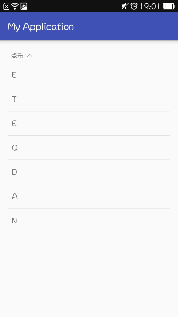
其实实现的思路还是比较清晰的,就是点击一下就会显示一个下拉的列表,或是两个列表,我这是点击那个箭头就会显示下面的一个试图,不过是啥视图,只要包含到一个GroupView里面就可以,实现起来就是先把下面的试图给隐藏,然后点击就显示出来而且上面的箭头在改变的时候也要加上动画。
把代码贴出来:
那个头部的View的layout文件代码:
另外要在values文件夹中新建一个attrs.xml存放自定义的属性:
好啦这样就可以自己改变他的背景和字体颜色和点击后的颜色了,还可以设置他的宽高。
效果图:
其实实现的思路还是比较清晰的,就是点击一下就会显示一个下拉的列表,或是两个列表,我这是点击那个箭头就会显示下面的一个试图,不过是啥视图,只要包含到一个GroupView里面就可以,实现起来就是先把下面的试图给隐藏,然后点击就显示出来而且上面的箭头在改变的时候也要加上动画。
把代码贴出来:
package com.liushuai.com.myapplication.view;

import android.content.Context;
import android.content.res.TypedArray;
import android.util.AttributeSet;
import android.util.Log;
import android.view.LayoutInflater;
import android.view.View;
import android.view.animation.RotateAnimation;
import android.widget.ImageView;
import android.widget.LinearLayout;
import android.widget.TextView;

import com.liushuai.com.myapplication.R;

/**
* 自定义下拉列表,自己往里面加视图必须只有一个视图
* Created by LiuShuai on 2016/3/3.
*/
public class MySpinnerSelect extends LinearLayout implements View.OnClickListener {

/**
* 头部点击的那个布局
*/
private LinearLayout mHeadLinearLayout;
/**
* 头部布局中的文字
*/
private TextView mTitleTextView;
/**
* 头部布局中的图标
*/
private ImageView mIconImageView;

/**
* 其包含的视图,只能有一个总的
*/
private View mContentView;

/**
* 是否加载过一次layout
*/
private boolean loadOnce;

/**
* 记录点击的状态
*/
private int i = 1;
private static final String TAG = "MySpinnerSelect";

/**
* 自定义属性的值
*/
private int mBackgroundColor, mTextColor, mSelectBackgroundColor, mSelectTextColor, mIconSrc;
private float mViewWidth, mViewHeight;

public MySpinnerSelect(Context context, AttributeSet attrs) {
super(context, attrs);
mHeadLinearLayout = (LinearLayout) LayoutInflater.from(context).inflate(R.layout.spinner_top, null, true);
mTitleTextView = (TextView) mHeadLinearLayout.findViewById(R.id.spinner_title);
mIconImageView = (ImageView) mHeadLinearLayout.findViewById(R.id.spinner_icon);

TypedArray typedArray = context.obtainStyledAttributes(attrs, R.styleable.MySpinnerSelect);
mBackgroundColor = typedArray.getColor(R.styleable.MySpinnerSelect_backgroundColor, getResources().getColor(R.color.white));
mTextColor = typedArray.getColor(R.styleable.MySpinnerSelect_textColor, getResources().getColor(R.color.blank));
mSelectBackgroundColor = typedArray.getColor(R.styleable.MySpinnerSelect_selectBackgroundColor, getResources().getColor(R.color.white));
mSelectTextColor = typedArray.getColor(R.styleable.MySpinnerSelect_selectTextColor, getResources().getColor(R.color.blank));
mIconSrc = typedArray.getResourceId(R.styleable.MySpinnerSelect_iconSrc, R.mipmap.icon_arrow_down);
mViewWidth = typedArray.getDimensionPixelSize(R.styleable.MySpinnerSelect_viewWidth, 100);
mViewHeight = typedArray.getDimensionPixelSize(R.styleable.MySpinnerSelect_viewHeight, 60);

mHeadLinearLayout.setBackgroundColor(mBackgroundColor);
mTitleTextView.setTextColor(mTextColor);
mIconImageView.setImageResource(mIconSrc);

LinearLayout.LayoutParams layoutParams = new LayoutParams((int) mViewWidth, (int) mViewHeight);
mHeadLinearLayout.setLayoutParams(layoutParams);
setOrientation(VERTICAL);
addView(mHeadLinearLayout, 0);
mHeadLinearLayout.setOnClickListener(this);

typedArray.recycle();
}

@Override
protected void onLayout(boolean changed, int l, int t, int r, int b) {
super.onLayout(changed, l, t, r, b);
if (changed && !loadOnce) {
mContentView = getChildAt(1);
if (mContentView != null)
mContentView.setVisibility(GONE);
loadOnce = true;

}
}

public int getBackgroundColor() {
return mBackgroundColor;
}

public int getIconSrc() {
return mIconSrc;
}

public int getSelectBackgroundColor() {
return mSelectBackgroundColor;
}

public int getSelectTextColor() {
return mSelectTextColor;
}

public int getTextColor() {
return mTextColor;
}

@Override
public void onClick(View v) {
switch (v.getId()) {
case R.id.spinner_top:
changeView();
break;
}
}

@Override
public void setBackgroundColor(int backgroundColor) {
mBackgroundColor = backgroundColor;
}

public void setIconSrc(int iconSrc) {
mIconSrc = iconSrc;
}

public void setSelectBackgroundColor(int selectBackgroundColor) {
mSelectBackgroundColor = selectBackgroundColor;
}

public void setSelectTextColor(int selectTextColor) {
mSelectTextColor = selectTextColor;
}

public void setTextColor(int textColor) {
mTextColor = textColor;
}

public float getViewHeight() {
return mViewHeight;
}

public float getViewWidth() {
return mViewWidth;
}

public void setViewHeight(float viewHeight) {
mViewHeight = viewHeight;
}

public void setViewWidth(float viewWidth) {
mViewWidth = viewWidth;
}

/**
* 改变视图的状态,发生在点击事件中(提供给外部想让其改变时,调用该方法)
*/
public void changeView() {
changeViewVisiblity();
changeIconAnimation();
i *= -1;
}

/**
* 改变视图的状态
*/
private void changeViewVisiblity() {
//i>0说明包含的视图是隐藏的,需要把它显示出来
if (i > 0) {
if (mContentView != null)
mContentView.setVisibility(VISIBLE);
mHeadLinearLayout.setBackgroundColor(mSelectBackgroundColor);
mTitleTextView.setTextColor(mSelectTextColor);
} else if (i < 0) {
if (mContentView != null)
mContentView.setVisibility(GONE);
mHeadLinearLayout.setBackgroundColor(mBackgroundColor);
mTitleTextView.setTextColor(mTextColor);
}
}

/**
* 根据当前状态改变上面箭头的方向
*/
private void changeIconAnimation() {
Log.i(TAG, "-->changeIconAnimation");
float pivotX = mIconImageView.getWidth() / 2f;
float pivotY = mIconImageView.getHeight() / 2f;
float fromDegree = 0f;
float toDegree = 0f;
if (i > 0) {
fromDegree = 0f;
toDegree = 180f;
} else if (i < 0) {
fromDegree = 180f;
toDegree = 360f;
}

RotateAnimation animation = new RotateAnimation(fromDegree, toDegree, pivotX, pivotY);

animation.setDuration(100);
animation.setFillAfter(true);

mIconImageView.startAnimation(animation);
}
}
那个头部的View的layout文件代码:
<?xml version="1.0" encoding="utf-8"?>
<LinearLayout
android:id="@+id/spinner_top"
xmlns:android="http://schemas.android.com/apk/res/android"
android:layout_width="100dp"
android:layout_height="60dp"
android:orientation="horizontal">

<TextView
android:id="@+id/spinner_title"
android:layout_width="0dp"
android:layout_height="wrap_content"
android:layout_gravity="center"
android:layout_weight="3"
android:gravity="center"
android:text="点击"/>

<ImageView
android:id="@+id/spinner_icon"
android:layout_width="0dp"
android:layout_height="wrap_content"
android:layout_gravity="center"
android:layout_weight="1"
android:gravity="center"
android:src="@mipmap/icon_arrow_down"
/>
</LinearLayout>
另外要在values文件夹中新建一个attrs.xml存放自定义的属性:
<?xml version="1.0" encoding="utf-8"?>
<resources>
//自定义控件的属性设置
<declare-styleable name="MySpinnerSelect">
<attr name="backgroundColor" format="color"/>
<attr name="textColor" format="color"/>
<attr name="selectBackgroundColor" format="color"/>
<attr name="selectTextColor" format="color"/>
<attr name="viewWidth" format="dimension"/>
<attr name="viewHeight" format="dimension"/>
<attr name="iconSrc" format="reference"/>
</declare-styleable>
</resources>
好啦这样就可以自己改变他的背景和字体颜色和点击后的颜色了,还可以设置他的宽高。

相关文章推荐
- android 数据文件存取至储存卡
- Android实现随触摸移动而变化的效果
- 利用泛型实现一个简单的android orm小例子
- android之textview属性介绍
- Android Material Design学习之四CardView
- Android中design包中的新控件1
- Android 隐藏API
- Android 短信的收发及在android模拟器之间实践
- android中Manifest讲解
- 二个android模拟器互发短信程序演示
- android 布局实例解析 格子菜单效果
- Android事件传递机制(二)
- Android学习笔记----实现强制下线功能
- 仿专题订阅功能
- Android事件传递机制(一)
- Jenkins+Gradle实现android开发持续集成、打包
- 安卓初学四之控件初步(三)
- SQLite 在 Android 的应用
- android中加载第二个布局之LayoutInflater
- Android5.0-新特性(续)