Android中使用shape来定义控件
2016-01-10 16:36
706 查看
本文章转接于:/article/6935971.html
Android中常常使用shape来定义控件的一些显示属性,今天看了一些shape的使用,对shape有了大体的了解,稍作总结:
先看下面的代码:
<shape>
<!-- 实心 -->
<solid android:color="#ff9d77"/>
<!-- 渐变 -->
<gradient
android:startColor="#ff8c00"
android:endColor="#FFFFFF"
android:angle="270" />
<!-- 描边 -->
<stroke
android:width="2dp"
android:color="#dcdcdc" />
<!-- 圆角 -->
<corners
android:radius="2dp" />
<padding
android:left="10dp"
android:top="10dp"
android:right="10dp"
android:bottom="10dp" />
</shape>
solid:实心,就是填充的意思
android:color指定填充的颜色
gradient:渐变
android:startColor和android:endColor分别为起始和结束颜色,ndroid:angle是渐变角度,必须为45的整数倍。
另外渐变默认的模式为android:type="linear",即线性渐变,可以指定渐变为径向渐变,android:type="radial",径向渐变需要指定半径android:gradientRadius="50"。
stroke:描边
android:width="2dp" 描边的宽度,android:color 描边的颜色。
我们还可以把描边弄成虚线的形式,设置方式为:
android:dashWidth="5dp"
android:dashGap="3dp"
其中android:dashWidth表示'-'这样一个横线的宽度,android:dashGap表示之间隔开的距离。
corners:圆角
android:radius为角的弧度,值越大角越圆。
我们还可以把四个角设定成不同的角度,方法为:
<corners
android:topRightRadius="20dp" 右上角
android:bottomLeftRadius="20dp" 左下角
android:topLeftRadius="1dp" 左上角
android:bottomRightRadius="0dp" 右下角
/>
这里有个地方需要注意,bottomLeftRadius是右下角,而不是左下角,这个有点郁闷,不过不影响使用,记得别搞错了就行。
还有网上看到有人说设置成0dp无效,不过我在测试中发现是可以的,我用的是2.2,可能修复了这个问题吧,如果无效的话那就只能设成1dp了。
padding:间隔
这个就不用多说了,XML布局文件中经常用到。
大体的就是这样,以下是一个使用的具体示例:用在Selector中作为Button的背景,分别定义了按钮的一般状态、获得焦点状态和按下时的状态,具体代码如下:
main.xml:
<Button
android:layout_width="wrap_content"
android:layout_height="wrap_content"
android:text="TestShapeButton"
android:background="@drawable/button_selector"
/>
button_selector.xml:
<?xml version="1.0" encoding="utf-8"?>
<selector
xmlns:android="http://schemas.android.com/apk/res/android">
<item android:state_pressed="true" >
<shape>
<!-- 渐变 -->
<gradient
android:startColor="#ff8c00"
android:endColor="#FFFFFF"
android:type="radial"
android:gradientRadius="50" />
<!-- 描边 -->
<stroke
android:width="2dp"
android:color="#dcdcdc"
android:dashWidth="5dp"
android:dashGap="3dp" />
<!-- 圆角 -->
<corners
android:radius="2dp" />
<padding
android:left="10dp"
android:top="10dp"
android:right="10dp"
android:bottom="10dp" />
</shape>
</item>
<item android:state_focused="true" >
<shape>
<gradient
android:startColor="#ffc2b7"
android:endColor="#ffc2b7"
android:angle="270" />
<stroke
android:width="2dp"
android:color="#dcdcdc" />
<corners
android:radius="2dp" />
<padding
android:left="10dp"
android:top="10dp"
android:right="10dp"
android:bottom="10dp" />
</shape>
</item>
<item>
<shape>
<solid android:color="#ff9d77"/>
<stroke
android:width="2dp"
android:color="#fad3cf" />
<corners
android:topRightRadius="5dp"
android:bottomLeftRadius="5dp"
android:topLeftRadius="0dp"
android:bottomRightRadius="0dp"
/>
<padding
android:left="10dp"
android:top="10dp"
android:right="10dp"
android:bottom="10dp" />
</shape>
</item>
</selector>
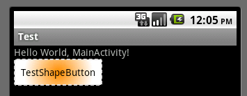
运行效果如下图:
一般状态:
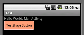
获得焦点状态:
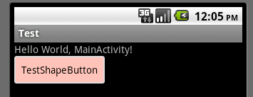
按下状态:
Android中常常使用shape来定义控件的一些显示属性,今天看了一些shape的使用,对shape有了大体的了解,稍作总结:
先看下面的代码:
<shape>
<!-- 实心 -->
<solid android:color="#ff9d77"/>
<!-- 渐变 -->
<gradient
android:startColor="#ff8c00"
android:endColor="#FFFFFF"
android:angle="270" />
<!-- 描边 -->
<stroke
android:width="2dp"
android:color="#dcdcdc" />
<!-- 圆角 -->
<corners
android:radius="2dp" />
<padding
android:left="10dp"
android:top="10dp"
android:right="10dp"
android:bottom="10dp" />
</shape>
solid:实心,就是填充的意思
android:color指定填充的颜色
gradient:渐变
android:startColor和android:endColor分别为起始和结束颜色,ndroid:angle是渐变角度,必须为45的整数倍。
另外渐变默认的模式为android:type="linear",即线性渐变,可以指定渐变为径向渐变,android:type="radial",径向渐变需要指定半径android:gradientRadius="50"。
stroke:描边
android:width="2dp" 描边的宽度,android:color 描边的颜色。
我们还可以把描边弄成虚线的形式,设置方式为:
android:dashWidth="5dp"
android:dashGap="3dp"
其中android:dashWidth表示'-'这样一个横线的宽度,android:dashGap表示之间隔开的距离。
corners:圆角
android:radius为角的弧度,值越大角越圆。
我们还可以把四个角设定成不同的角度,方法为:
<corners
android:topRightRadius="20dp" 右上角
android:bottomLeftRadius="20dp" 左下角
android:topLeftRadius="1dp" 左上角
android:bottomRightRadius="0dp" 右下角
/>
这里有个地方需要注意,bottomLeftRadius是右下角,而不是左下角,这个有点郁闷,不过不影响使用,记得别搞错了就行。
还有网上看到有人说设置成0dp无效,不过我在测试中发现是可以的,我用的是2.2,可能修复了这个问题吧,如果无效的话那就只能设成1dp了。
padding:间隔
这个就不用多说了,XML布局文件中经常用到。
大体的就是这样,以下是一个使用的具体示例:用在Selector中作为Button的背景,分别定义了按钮的一般状态、获得焦点状态和按下时的状态,具体代码如下:
main.xml:
<Button
android:layout_width="wrap_content"
android:layout_height="wrap_content"
android:text="TestShapeButton"
android:background="@drawable/button_selector"
/>
button_selector.xml:
<?xml version="1.0" encoding="utf-8"?>
<selector
xmlns:android="http://schemas.android.com/apk/res/android">
<item android:state_pressed="true" >
<shape>
<!-- 渐变 -->
<gradient
android:startColor="#ff8c00"
android:endColor="#FFFFFF"
android:type="radial"
android:gradientRadius="50" />
<!-- 描边 -->
<stroke
android:width="2dp"
android:color="#dcdcdc"
android:dashWidth="5dp"
android:dashGap="3dp" />
<!-- 圆角 -->
<corners
android:radius="2dp" />
<padding
android:left="10dp"
android:top="10dp"
android:right="10dp"
android:bottom="10dp" />
</shape>
</item>
<item android:state_focused="true" >
<shape>
<gradient
android:startColor="#ffc2b7"
android:endColor="#ffc2b7"
android:angle="270" />
<stroke
android:width="2dp"
android:color="#dcdcdc" />
<corners
android:radius="2dp" />
<padding
android:left="10dp"
android:top="10dp"
android:right="10dp"
android:bottom="10dp" />
</shape>
</item>
<item>
<shape>
<solid android:color="#ff9d77"/>
<stroke
android:width="2dp"
android:color="#fad3cf" />
<corners
android:topRightRadius="5dp"
android:bottomLeftRadius="5dp"
android:topLeftRadius="0dp"
android:bottomRightRadius="0dp"
/>
<padding
android:left="10dp"
android:top="10dp"
android:right="10dp"
android:bottom="10dp" />
</shape>
</item>
</selector>
运行效果如下图:
一般状态:
获得焦点状态:
按下状态:

相关文章推荐
- Android 修改 Toolbar 高度
- Android-隐式Intent的区别
- android:windowSoftInputMode属性介绍
- Android中ListView结合CheckBox实现数据批量选择(全选、反选、全不选)
- android的新闻显示。
- 总结2015
- Android点击Button水波纹效果
- 自定义录像机 没任何新意
- Android系统更改状态栏字体颜色
- android中通过ContentResolver获取媒体资源
- 东拼西凑写的android 相机例子,包含一些遇到的坑
- Android 的消息机制
- Android如何导入已有的外部数据库
- Android数据存储之SQLite使用
- Android Camera 找出屏幕的最佳尺寸大小
- Android插件化及动态加载
- android 系统级的开机启动程序
- android134 360 07 归属地查询
- android133 360 06 一键锁频,清楚数据
- android bitmap内存那些事