5.Android support design TabLayout
2015-10-25 16:39
609 查看
5.Android support design TabLayout
Android support design TabLayoutTabLayout介绍
gradle配置
TabLayout属性
TabLayout布局
正常版TabLayout FragmentPagerAdapter
正常版TabLayout Activity
正常版TabLayout 效果图
正常版TabLayout 总结
ImageSpan版TabLayout FragmentPagerAdapter
ImageSpan版TabLayout Activity
ImageSpan版TabLayout 效果图
ImageSpan版TabLayout 总结
SetIcon版TabLayout FragmentPagerAdapter
SetIcon版TabLayout Activity
SetIcon版TabLayout 效果图
SetIcon版TabLayout 总结
CustomView版TabLayout 介绍
CustomView版TabLayout FragmentPagerAdapter
CustomView版TabLayout TabItem布局
CustomView版TabLayout Activity
CustomView版TabLayout 效果图
CustomView版TabLayout 总结
全部版本总结
TabLayout介绍
Google 官方的 Android support design Library 也推出了 滑动标签页。它的名字叫TabLayout ,其实还是有些地方有Bug。如果涉及到 icon + text 的滑动标签页,建议不要用TabLayout 。推荐用我的 EasySlidingTabs ,哈哈。
gradle配置
compile 'com.android.support:design:23.0.1'或者更高版本
dependencies {
compile fileTree(dir: 'libs', include: ['*.jar'])
compile 'com.android.support:appcompat-v7:23.0.1'
compile 'com.android.support:design:23.0.1'
}
TabLayout属性
我们可以找到sdk/extras/android/support/design/res/values/attrs.xml,打开可以看到关于
TabLayout的属性
<declare-styleable name="TabLayout">
<attr name="tabIndicatorColor" format="color"/>
<attr name="tabIndicatorHeight" format="dimension"/>
<attr name="tabContentStart" format="dimension"/>

<attr name="tabBackground" format="reference"/>

<attr name="tabMode">
<enum name="scrollable" value="0"/>
<enum name="fixed" value="1"/>
</attr>

<!-- Standard gravity constant that a child supplies to its parent.
Defines how the child view should be positioned, on both the X and Y axes,
within its enclosing layout. -->
<attr name="tabGravity">
<enum name="fill" value="0"/>
<enum name="center" value="1"/>
</attr>

<attr name="tabMinWidth" format="dimension"/>
<attr name="tabMaxWidth" format="dimension"/>

<attr name="tabTextAppearance" format="reference"/>
<attr name="tabTextColor" format="color"/>
<attr name="tabSelectedTextColor" format="color"/>

<attr name="tabPaddingStart" format="dimension"/>
<attr name="tabPaddingTop" format="dimension"/>
<attr name="tabPaddingEnd" format="dimension"/>
<attr name="tabPaddingBottom" format="dimension"/>
<attr name="tabPadding" format="dimension"/>
</declare-styleable>
如果实现不行,直接打开TabLayout的源码:
public TabLayout(Context context, AttributeSet attrs, int defStyleAttr) {
super(context, attrs, defStyleAttr);
this.mTabs = new ArrayList();
this.mTabMaxWidth = 2147483647;
this.setHorizontalScrollBarEnabled(false);
this.setFillViewport(true);
this.mTabStrip = new TabLayout.SlidingTabStrip(context);
this.addView(this.mTabStrip, -2, -1);
TypedArray a = context.obtainStyledAttributes(attrs, styleable.TabLayout, defStyleAttr, style.Widget_Design_TabLayout);
this.mTabStrip.setSelectedIndicatorHeight(a.getDimensionPixelSize(styleable.TabLayout_tabIndicatorHeight, 0));
this.mTabStrip.setSelectedIndicatorColor(a.getColor(styleable.TabLayout_tabIndicatorColor, 0));
this.mTabTextAppearance = a.getResourceId(styleable.TabLayout_tabTextAppearance, style.TextAppearance_Design_Tab);
this.mTabPaddingStart = this.mTabPaddingTop = this.mTabPaddingEnd = this.mTabPaddingBottom = a.getDimensionPixelSize(styleable.TabLayout_tabPadding, 0);
this.mTabPaddingStart = a.getDimensionPixelSize(styleable.TabLayout_tabPaddingStart, this.mTabPaddingStart);
this.mTabPaddingTop = a.getDimensionPixelSize(styleable.TabLayout_tabPaddingTop, this.mTabPaddingTop);
this.mTabPaddingEnd = a.getDimensionPixelSize(styleable.TabLayout_tabPaddingEnd, this.mTabPaddingEnd);
this.mTabPaddingBottom = a.getDimensionPixelSize(styleable.TabLayout_tabPaddingBottom, this.mTabPaddingBottom);
this.mTabTextColors = this.loadTextColorFromTextAppearance(this.mTabTextAppearance);
if(a.hasValue(styleable.TabLayout_tabTextColor)) {
this.mTabTextColors = a.getColorStateList(styleable.TabLayout_tabTextColor);
}

if(a.hasValue(styleable.TabLayout_tabSelectedTextColor)) {
int selected = a.getColor(styleable.TabLayout_tabSelectedTextColor, 0);
this.mTabTextColors = createColorStateList(this.mTabTextColors.getDefaultColor(), selected);
}

this.mTabMinWidth = a.getDimensionPixelSize(styleable.TabLayout_tabMinWidth, 0);
this.mRequestedTabMaxWidth = a.getDimensionPixelSize(styleable.TabLayout_tabMaxWidth, 0);
this.mTabBackgroundResId = a.getResourceId(styleable.TabLayout_tabBackground, 0);
this.mContentInsetStart = a.getDimensionPixelSize(styleable.TabLayout_tabContentStart, 0);
this.mMode = a.getInt(styleable.TabLayout_tabMode, 1);
this.mTabGravity = a.getInt(styleable.TabLayout_tabGravity, 0);
a.recycle();
this.applyModeAndGravity();
}
反正都是Easy的英文,慢慢看,不难,真的!
TabLayout布局
<?xml version="1.0" encoding="utf-8"?>
<LinearLayout xmlns:android="http://schemas.android.com/apk/res/android"
xmlns:app="http://schemas.android.com/apk/res-auto"
android:layout_width="match_parent"
android:layout_height="match_parent"
android:orientation="vertical">

<!--
文字未选中的颜色 app:tabTextColor
文字选中的颜色 app:tabSelectedTextColor
指示器的颜色 app:tabIndicatorColor
-->
<android.support.design.widget.TabLayout
android:id="@+id/tab_layout_tl"
app:tabBackground="@color/tabLayoutBackground"
app:tabTextColor="@color/black"
app:tabSelectedTextColor="@color/red"
app:tabIndicatorColor="@color/yellow"
android:layout_width="match_parent"
android:layout_height="wrap_content" />

<android.support.v4.view.ViewPager
android:id="@+id/view_pager_vp"
android:layout_width="match_parent"
android:layout_height="0dp"
android:layout_weight="1" />

</LinearLayout>
正常版TabLayout FragmentPagerAdapter
public class NormalTabLayoutFragmentAdapter extends FragmentPagerAdapter {

private String[] tabTitles;
private Fragment[] fragments;

public NormalTabLayoutFragmentAdapter(FragmentManager fm, Fragment[] fragments, String[] tabTitles) {
super(fm);
this.fragments = fragments;
this.tabTitles = tabTitles;
}

/**
* Return the Fragment associated with a specified position.
*
* @param position
*/
@Override
public Fragment getItem(int position) {
return this.fragments[position];
}

/**
* Return the number of views available.
*/
@Override
public int getCount() {
return this.fragments.length;
}

/**
* This method may be called by the ViewPager to obtain a title string
* to describe the specified page. This method may return null
* indicating no title for this page. The default implementation returns
* null.
*
* @param position The position of the title requested
* @return A title for the requested page
*/
@Override
public CharSequence getPageTitle(int position) {
return this.tabTitles[position];
}

}
正常版TabLayout Activity
public class NormalTabLayoutActivity extends AppCompatActivity {

private TabLayout tabLayout;
private ViewPager viewPager;

private NormalTabLayoutFragmentAdapter fragmentAdapter;

@Override
protected void onCreate(Bundle savedInstanceState) {
super.onCreate(savedInstanceState);
this.setContentView(R.layout.tablayout_normal_activity);

this.viewPager = (ViewPager) this.findViewById(R.id.view_pager_vp);
this.tabLayout = (TabLayout) this.findViewById(R.id.tab_layout_tl);
this.initData();
}

private void initData() {
String[] tabTitles = {"一次元", "二次元", "三次元", "四次元"};
Fragment[] fragments = {
TabLayoutFirstFragment.getInstance(),
TabLayoutSecondFragment.getInstance(),
TabLayoutThirdFragment.getInstance(),
TabLayoutFourthFragment.getInstance()
};
this.fragmentAdapter = new NormalTabLayoutFragmentAdapter(this.getSupportFragmentManager(), fragments, tabTitles);
this.viewPager.setAdapter(this.fragmentAdapter);
this.tabLayout.setupWithViewPager(this.viewPager);
}

}
正常版TabLayout 效果图
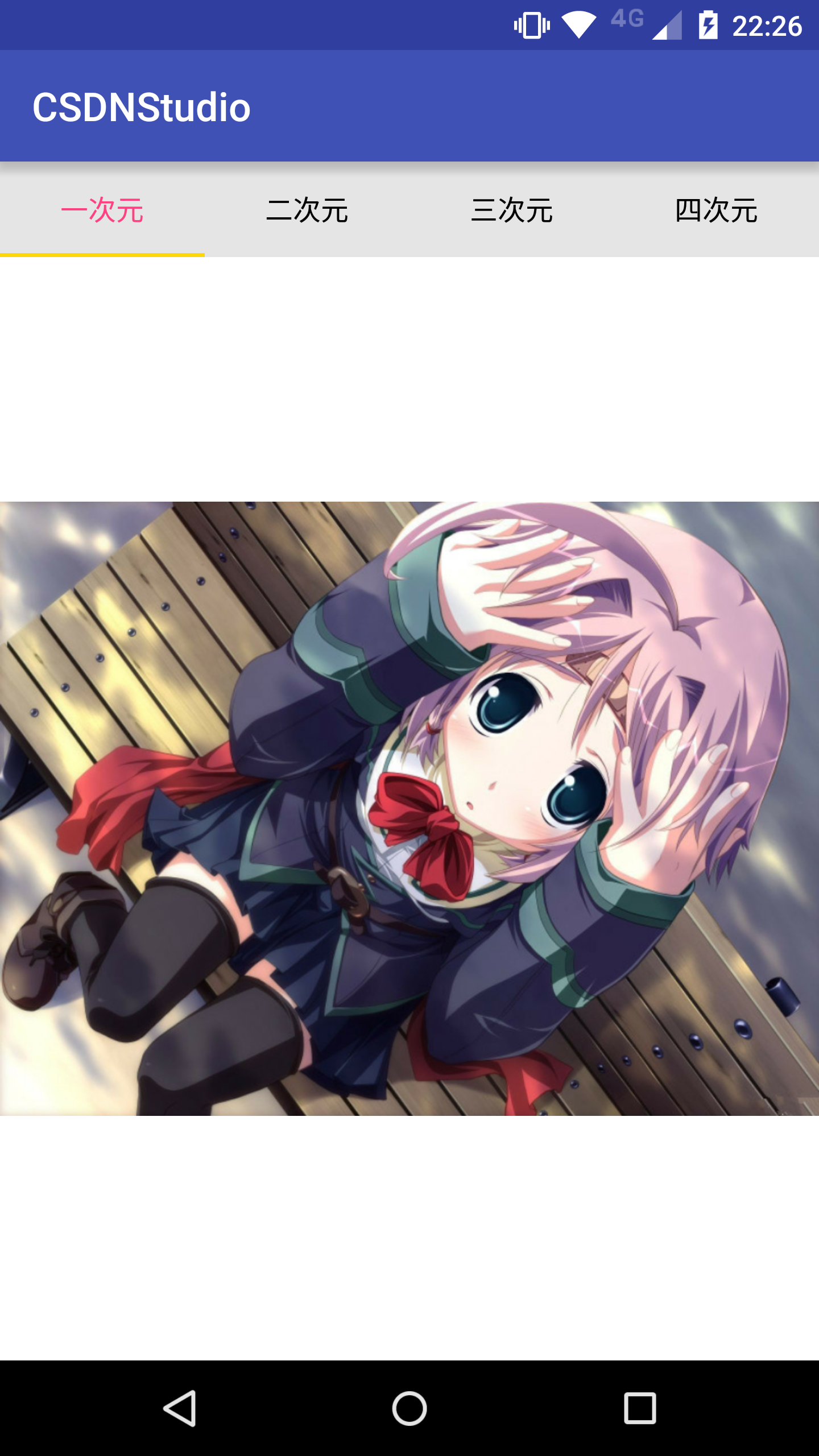
正常版TabLayout 总结
正常版呢,纯String的title,说实话,是无与伦比的选择,确实要比第三方库要好。但是有想过吗????
带icon会怎样?那么来看不正常版!一路解析到底
ImageSpan版TabLayout FragmentPagerAdapter
public class ImageSpanTabLayoutFragmentAdapter extends FragmentPagerAdapter {

private Context context;
private int[] icons;
private String[] tabTitles;
private Fragment[] fragments;

public ImageSpanTabLayoutFragmentAdapter(Context context, FragmentManager fm, Fragment[] fragments, String[] tabTitles, int[] icons) {
super(fm);
this.context = context;
this.icons = icons;
this.fragments = fragments;
this.tabTitles = tabTitles;
}

/**
* Return the Fragment associated with a specified position.
*
* @param position
*/
@Override
public Fragment getItem(int position) {
return this.fragments[position];
}

/**
* Return the number of views available.
*/
@Override
public int getCount() {
return this.fragments.length;
}

/**
* This method may be called by the ViewPager to obtain a title string
* to describe the specified page. This method may return null
* indicating no title for this page. The default implementation returns
* null.
*
* @param position The position of the title requested
* @return A title for the requested page
*/
@Override
public CharSequence getPageTitle(int position) {
Drawable drawable;
if (Build.VERSION.SDK_INT >= Build.VERSION_CODES.LOLLIPOP) {
drawable = this.context.getResources().getDrawable(this.icons[position], null);
} else {
drawable = this.context.getResources().getDrawable(this.icons[position]);
}
if (drawable == null) return "";
drawable.setBounds(0, 0, drawable.getIntrinsicWidth(), drawable.getIntrinsicHeight());
// 这里多设置5个空格
SpannableString spannableString = new SpannableString("     " + this.tabTitles[position]);
ImageSpan imageSpan = new ImageSpan(drawable, ImageSpan.ALIGN_BOTTOM);
//这里图片的开始和结束设置为0-3,根据上述的5个空格减去3个,然后有2个空格之间距离
spannableString.setSpan(imageSpan, 0, 3, Spannable.SPAN_EXCLUSIVE_EXCLUSIVE);
return spannableString;
}

}
在
getPageTitle里,实例了对应的Drawable,然后通过Drawable再实例ImageSpan,最后放入到SpannableString里。在实例SpannableString的时候,多加了几个空格,作为paddingLeft的作用。
ImageSpan版TabLayout Activity
public class ImageSpanTabLayoutActivity extends AppCompatActivity {

private TabLayout tabLayout;
private ViewPager viewPager;

private ImageSpanTabLayoutFragmentAdapter fragmentAdapter;

@Override
protected void onCreate(Bundle savedInstanceState) {
super.onCreate(savedInstanceState);
this.setContentView(R.layout.tablayout_image_span_activity);

this.viewPager = (ViewPager) this.findViewById(R.id.view_pager_vp);
this.tabLayout = (TabLayout) this.findViewById(R.id.tab_layout_tl);
this.initData();
}

private void initData() {
int[] icons = {R.mipmap.icon_msg_unread, R.mipmap.icon_remark, R.mipmap.icon_time, R.mipmap.icon_feedback};
String[] tabTitles = {"一次元", "二次元", "三次元", "四次元"};
Fragment[] fragments = {
TabLayoutFirstFragment.getInstance(),
TabLayoutSecondFragment.getInstance(),
TabLayoutThirdFragment.getInstance(),
TabLayoutFourthFragment.getInstance()
};
this.fragmentAdapter = new ImageSpanTabLayoutFragmentAdapter(this, this.getSupportFragmentManager(), fragments, tabTitles, icons);
this.viewPager.setAdapter(this.fragmentAdapter);
this.tabLayout.setupWithViewPager(this.viewPager);
}

}
ImageSpan版TabLayout 效果图

ImageSpan版TabLayout 总结
细心的同学都能发现,图片是不对齐的。其实这就是这种方法实现的坑处。
哎,这涉及到ImageSpan实例化时的
ImageSpan构造方法
/**
* @param verticalAlignment one of {@link DynamicDrawableSpan#ALIGN_BOTTOM} or
* {@link DynamicDrawableSpan#ALIGN_BASELINE}.
*/
public ImageSpan(Drawable d, int verticalAlignment) {
super(verticalAlignment);
mDrawable = d;
}
int verticalAlignment涉及到DynamicDrawableSpan里的两个常量
/**
* A constant indicating that the bottom of this span should be aligned
* with the bottom of the surrounding text, i.e., at the same level as the
* lowest descender in the text.
*/
public static final int ALIGN_BOTTOM = 0;

/**
* A constant indicating that the bottom of this span should be aligned
* with the baseline of the surrounding text.
*/
public static final int ALIGN_BASELINE = 1;
两种常量设置后,要么偏高要么偏低。总之,有居中强迫症的可以Over了。
SetIcon版TabLayout FragmentPagerAdapter
public class SetIconTabLayoutFragmentAdapter extends FragmentPagerAdapter {

private Context context;
private int[] icons;
private String[] tabTitles;
private Fragment[] fragments;

public SetIconTabLayoutFragmentAdapter(Context context, FragmentManager fm, Fragment[] fragments, String[] tabTitles, int[] icons) {
super(fm);
this.context = context;
this.icons = icons;
this.fragments = fragments;
this.tabTitles = tabTitles;
}

/**
* Return the Fragment associated with a specified position.
*
* @param position
*/
@Override
public Fragment getItem(int position) {
return this.fragments[position];
}

/**
* Return the number of views available.
*/
@Override
public int getCount() {
return this.fragments.length;
}

/**
* This method may be called by the ViewPager to obtain a title string
* to describe the specified page. This method may return null
* indicating no title for this page. The default implementation returns
* null.
*
* @param position The position of the title requested
* @return A title for the requested page
*/
@Override
public CharSequence getPageTitle(int position) {
// 多返回三个空格,作为padding的作用,挤开图片
return "  "+this.tabTitles[position];
}

}getPageTitle里面也多比正常版多了几个空格,作为paddingLeft的作用。
SetIcon版TabLayout Activity
public class SetIconTabLayoutActivity extends AppCompatActivity {

private TabLayout tabLayout;
private ViewPager viewPager;

private SetIconTabLayoutFragmentAdapter fragmentAdapter;

@Override
protected void onCreate(Bundle savedInstanceState) {
super.onCreate(savedInstanceState);
this.setContentView(R.layout.tablayout_set_icon_activity);

this.viewPager = (ViewPager) this.findViewById(R.id.view_pager_vp);
this.tabLayout = (TabLayout) this.findViewById(R.id.tab_layout_tl);
this.initData();
}

private void initData() {
int[] icons = {R.mipmap.icon_msg_unread, R.mipmap.icon_remark, R.mipmap.icon_time, R.mipmap.icon_feedback};
String[] tabTitles = {"一次元", "二次元", "三次元", "四次元"};
Fragment[] fragments = {
TabLayoutFirstFragment.getInstance(),
TabLayoutSecondFragment.getInstance(),
TabLayoutThirdFragment.getInstance(),
TabLayoutFourthFragment.getInstance()
};
this.fragmentAdapter = new SetIconTabLayoutFragmentAdapter(this, this.getSupportFragmentManager(), fragments, tabTitles, icons);
this.viewPager.setAdapter(this.fragmentAdapter);
this.tabLayout.setupWithViewPager(this.viewPager);
for (int i = 0; i < tabLayout.getTabCount(); i++) {
TabLayout.Tab tab = tabLayout.getTabAt(i);
if (tab == null) continue;
tab.setIcon(icons[i]);
}
}

}Google官方的TabLayout封装是很有意思的,每个标签页就是一个TabView,TabView的逐个生成是依赖于TabLayout.Tab这个类的所有数据,有兴趣的可以看看,解耦了数据与View之间的过度依赖。所以我们可以通过TabLayout.Tab拿到数据,并改变数据
SetIcon版TabLayout 效果图

SetIcon版TabLayout 总结
我个人认为,通过设置TabLayout.Tab.icon去实现 icon + text 的标签页是 TabLayout最合理的办法。只需要偏历每个TabLayout.Tab,设置icon就好了。主要,还是居中对齐的。
CustomView版TabLayout 介绍
如果觉得 纯text 或者 icon + text 无法满足要求,那么可以自定义View作为标签页的标签TabLayout.Tab是提供
setCustomView(@Nullable View view)这个方法的。
CustomView版TabLayout FragmentPagerAdapter
public class CustomViewTabLayoutFragmentAdapter extends FragmentPagerAdapter {

private Fragment[] fragments;

public CustomViewTabLayoutFragmentAdapter(FragmentManager fm, Fragment[] fragments) {
super(fm);
this.fragments = fragments;
}

/**
* Return the Fragment associated with a specified position.
*
* @param position
*/
@Override
public Fragment getItem(int position) {
return this.fragments[position];
}

/**
* Return the number of views available.
*/
@Override
public int getCount() {
return this.fragments.length;
}

}
CustomView版TabLayout的FragmentPagerAdapter连
getPageTitle方法也不用覆写。
CustomView版TabLayout TabItem布局
item_icon_tab_layout.xml<LinearLayout xmlns:android="http://schemas.android.com/apk/res/android" android:layout_width="match_parent" android:layout_height="match_parent" android:gravity="center" android:orientation="horizontal"> <ImageView android:id="@+id/tab_layout_title_left_iv" android:layout_width="wrap_content" android:layout_height="wrap_content" /> <TextView android:id="@+id/tab_layout_title_tv" android:layout_width="wrap_content" android:layout_height="wrap_content" android:textColor="@color/color_icon_tab_layout" android:layout_marginRight="5dp" android:layout_marginEnd="5dp" android:layout_marginStart="5dp" android:layout_marginLeft="5dp" /> <ImageView android:id="@+id/tab_layout_title_right_iv" android:layout_width="wrap_content" android:layout_height="wrap_content" /> </LinearLayout>
自定义View的话,TextView的颜色还要自己设置 T T。
color_icon_tab_layout.xml
<selector xmlns:android="http://schemas.android.com/apk/res/android">
<item android:state_selected="true" android:color="#ffFF4081" />
<item android:state_focused="true" android:color="#ffFF4081" />
<item android:state_pressed="true" android:color="#ffFF4081" />

<item android:color="#FF000000" />
</selector>
CustomView版TabLayout Activity
public class CustomViewTabLayoutActivity extends AppCompatActivity {

private TabLayout tabLayout;
private ViewPager viewPager;

private CustomViewTabLayoutFragmentAdapter fragmentAdapter;

@Override
protected void onCreate(Bundle savedInstanceState) {
super.onCreate(savedInstanceState);
this.setContentView(R.layout.tablayout_image_span_activity);

this.viewPager = (ViewPager) this.findViewById(R.id.view_pager_vp);
this.tabLayout = (TabLayout) this.findViewById(R.id.tab_layout_tl);
this.initData();
}

private void initData() {
int[] icons = {R.mipmap.icon_clean, R.mipmap.icon_remark, R.mipmap.icon_time, R.mipmap.icon_feedback};
String[] tabTitles = {"一次元", "二次元", "三次元", "四次元"};
Fragment[] fragments = {
TabLayoutFirstFragment.getInstance(),
TabLayoutSecondFragment.getInstance(),
TabLayoutThirdFragment.getInstance(),
TabLayoutFourthFragment.getInstance()
};
this.fragmentAdapter = new CustomViewTabLayoutFragmentAdapter(this.getSupportFragmentManager(), fragments);
this.viewPager.setAdapter(this.fragmentAdapter);
this.tabLayout.setupWithViewPager(this.viewPager);
for (int i = 0; i < tabLayout.getTabCount(); i++) {
View view = LayoutInflater.from(this).inflate(R.layout.item_icon_tab_layout, null);
TextView tabTV = (TextView) view.findViewById(R.id.tab_layout_title_tv);
ImageView tabLeftIV = (ImageView) view.findViewById(R.id.tab_layout_title_left_iv);
ImageView tabRightIV = (ImageView) view.findViewById(R.id.tab_layout_title_right_iv);
tabTV.setText(tabTitles[i]);
tabLeftIV.setImageResource(icons[i]);
tabRightIV.setImageResource(icons[i]);
TabLayout.Tab tab = tabLayout.getTabAt(i);
if (tab == null) continue;
tab.setCustomView(view);
}
}

}
CustomView版TabLayout 效果图
这样的话,一开始没滑动的时候,没触发事件是没有颜色,是没颜色。如果要改进的话,肯定是在事件出发后,设置当前选中标签为选中颜色,同时,还要设置其他没选中的标签为没选中的颜色,这就有点恶心了。刚进Activity,什么都没做,第一个是没颜色的

滑动后开始有颜色

CustomView版TabLayout 总结
CustomView版TabLayout,建议还是不要使用了可以使用EasySlidingTabs
全部版本总结
1.如果是纯Text,可以选择正常版。2.如果是 icon + text ,可以选择SetIcon版。
3.再复杂版本,请选择EasySlidingTabs。

相关文章推荐
- 使用C++实现JNI接口需要注意的事项
- Android IPC进程间通讯机制
- Android Manifest 用法
- [转载]Activity中ConfigChanges属性的用法
- Android之获取手机上的图片和视频缩略图thumbnails
- Android之使用Http协议实现文件上传功能
- Android学习笔记(二九):嵌入浏览器
- android string.xml文件中的整型和string型代替
- i-jetty环境搭配与编译
- android之定时器AlarmManager
- android wifi 无线调试
- Android Native 绘图方法
- Android java 与 javascript互访(相互调用)的方法例子
- android 代码实现控件之间的间距
- android FragmentPagerAdapter的“标准”配置
- Android"解决"onTouch和onClick的冲突问题
- android:installLocation简析
- android searchView的关闭事件
- SourceProvider.getJniDirectories