页面架构-布局解决方案
2015-10-05 09:40
489 查看
一、居中布局
水平居中
前提要求:父容器和子容器的宽度不定
方案一:inline-block+text-align
优点:兼容性好,在IE6\7上,用display:inline;zoom:1;模拟inline-block。
缺点:在父容器里设置了text-align:center;所以child也会继承这个属性,child容器里面的文字也会水平居中,因此要在child里重新设置text-align。
demo.css如下:
方案二:table+margin
设置了display:table的元素的宽度也是由内容决定。
优点:只需要对child进行设置;兼容性较好,display:table能兼容IE8及以上。
方案三:absolute+transform
优点:absolute的元素脱离文档流,不会对其他元素产生影响。
缺点:IE8不支持transform
方案四:flex+justify-content
缺点:对于display:flex;IE8\9不支持、IE10部分支持
或者
垂直居中
前提要求:父容器的高度和子容器的高度不定
方案一:table-cell+vertical-align
优点:IE8及以上支持table-cell
方案二:absolute+transform
优点:子元素设置了绝对定位,不会影响其他元素
缺点:IE8不支持transform
方案三:flex+align-items
优点:只需要对父元素设置样式
缺点:兼容性问题。对于display:flex;IE8\9不支持、IE10部分支持。对于align-items,IE8\9不支持,IE10部分支持。
水平垂直居中
前提要求:父容器的宽高不定,子容器的宽高不定
方案一:inline-block+text-align+table-cell+vertical-align
方案二:absolute+transform
方案三:flex+justify-content+align-items
[b] 做解决方案时,需要了解CSS属性和值的特性,对问题进行分解。[/b]
二、多列布局
一列定宽+一列自适应
方案一:float+margin
缺点:IE6里会产生3px bug;当right容器里有清除浮动的时,会产生bug。
方案二:float+margin+(fix)
方案三:float+overflow
方案四:table
方案五:flex
缺点:1.兼容性问题 2.性能问题,不适合做大范围布局
两列定宽+一列自适应
一列不定宽+一列自适应
方案一:float+overflow
方案二:table
方案三:flex
两列不定宽+一列自适应
等分布局
方案一:float+box-sizing:border-box
缺点:当列数发生变化时,需要修改结构和样式,即结构和样式具有耦合性
方案二:table
优点:结构和样式解耦
方案三:flex
此方案与方案一进行比较。flex分配的是除去margin-left后的父容器剩余空间。
优点:结构和样式解耦。
等高布局
方案一:table
table的特性就是每一列的单元格等宽,每一行的单元格等高。
方案二:flex
flex-items 默认的align-items:stretch,天生的等高。
方案三:float
三、全屏布局
需求1:

方案一:position
缺点:IE6不支持
demo.css
方案二:flex
缺点:IE8、9不支持,IE10部分支持
需求2:
把以上两个方案中的单位变成百分比即可。

需求3:
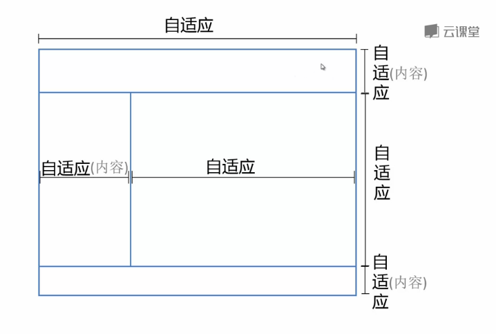
方案一:Flex
方案二:Grid
目前大部分的浏览器不能支持,方案略。

以上方案的比较:

水平居中
前提要求:父容器和子容器的宽度不定
方案一:inline-block+text-align
优点:兼容性好,在IE6\7上,用display:inline;zoom:1;模拟inline-block。
缺点:在父容器里设置了text-align:center;所以child也会继承这个属性,child容器里面的文字也会水平居中,因此要在child里重新设置text-align。
<!DOCTYPE html>
<html>
<head>
<meta charset="utf-8"/>
<title>水平居中</title>
<link rel="stylesheet" type="text/css" href="demo.css">
<style type="text/css">
body{margin:20px;}

.parent{
text-align: center;/*只对行内元素有效*/
}
.child{
display: inline-block;
}
</style>
</head>
<body>
<div class="parent">
<div class="child">用inline-block和text-align实现水平居中DEMO</div>
</div>
</body>
</html>
demo.css如下:
html,body,h1,h2,h3,h4,h5,h6,div,dl,dt,dd,ul,ol,li,p,blockquote,pre,hr,figure,table,caption,th,td,form,fieldset,legend,input,button,textarea,menu{margin:0;padding:0;}
header,footer,section,article,aside,nav,hgroup,address,figure,figcaption,menu,details{display:block;}
table{border-collapse:collapse;border-spacing:0;}
caption,th{text-align:left;font-weight:normal;}
html,body,fieldset,img,iframe,abbr{border:0;}
i,cite,em,var,address,dfn{font-style:normal;}
[hidefocus],summary{outline:0;}
li{list-style:none;}
h1,h2,h3,h4,h5,h6,small{font-size:100%;}
sup,sub{font-size:83%;}
pre,code,kbd,samp{font-family:inherit;}
q:before,q:after{content:none;}
textarea{overflow:auto;resize:none;}
label,summary{cursor:default;}
a,button{cursor:pointer;}
h1,h2,h3,h4,h5,h6,em,strong,b{font-weight:normal;}
del,ins,u,s,a,a:hover{text-decoration:none;}
body,textarea,input,button,select,keygen,legend{font:30px/1.5 'microsoft yahei';color:#333;outline:0;}
body{background:#fff;}
a,a:hover{color:#333;}
.parent{background:#ddd;}
.child{background:#666;color:#fff;}
方案二:table+margin
设置了display:table的元素的宽度也是由内容决定。
优点:只需要对child进行设置;兼容性较好,display:table能兼容IE8及以上。
.child{
display:table;
margin:0 auto;
}
方案三:absolute+transform
优点:absolute的元素脱离文档流,不会对其他元素产生影响。
缺点:IE8不支持transform
.parent{
position:relative;
}
.child{
position:absolute;
left:50%;  //相对于父容器的50%
transform:translateX(-50%); //相对于自身的50%
}
方案四:flex+justify-content
缺点:对于display:flex;IE8\9不支持、IE10部分支持
.parent{
display:flex;  //给父元素设置flex属性,那么子元素就是flex-item,子元素的宽度是  auto,即宽度由内容决定
justify-content:center;
}
或者
.parent{
display:flex;
}
.child{
margin:0 auto;
}
垂直居中
前提要求:父容器的高度和子容器的高度不定
方案一:table-cell+vertical-align
优点:IE8及以上支持table-cell
<!DOCTYPE html>
<html>
<head>
<meta charset="utf-8"/>
<title>垂直居中</title>
<link rel="stylesheet" type="text/css" href="demo.css">
<style type="text/css">
body{margin:20px;}
.parent{width:4em;height:500px;}
.child{width:100%;}

.parent{
display: table-cell;
vertical-align: middle;   /*vertical-align 只对行内元素有效*/
}
</style>
</head>
<body>
<div class="parent">
<div class="child">DEMO</div>
</div>
</body>
</html>
方案二:absolute+transform
优点:子元素设置了绝对定位,不会影响其他元素
缺点:IE8不支持transform
.parent{
position:relative;
}
.child{
position:absolute;
top:50%;
transform:translateY:-50%;
}
方案三:flex+align-items
优点:只需要对父元素设置样式
缺点:兼容性问题。对于display:flex;IE8\9不支持、IE10部分支持。对于align-items,IE8\9不支持,IE10部分支持。
.parent{
display:flex;
align-items:center;
}
水平垂直居中
前提要求:父容器的宽高不定,子容器的宽高不定
方案一:inline-block+text-align+table-cell+vertical-align
<!DOCTYPE html>
<html>
<head>
<meta charset="utf-8"/>
<title>居中</title>
<link rel="stylesheet" type="text/css" href="demo.css">
<style type="text/css">
body{margin:20px;}
.parent{width:200px;height:300px;}

.parent{
text-align: center;
display: table-cell; /*  此元素会变成一个行内元素,作为一个表格单元格显示(类似 <td> 和 <th>) */
vertical-align: middle;  /*  只对行内元素起作用 */

.child{
display: inline-block;
}
</style>
</head>
<body>
<div class="parent">
<div class="child">DEMO</div>
</div>
</body>
</html>
方案二:absolute+transform
.parent{
position: relative;
}
.child{
position: absolute;
left: 50%;
top: 50%;
transform: translate(-50%,-50%);
}
方案三:flex+justify-content+align-items
.parent{
display: flex;
justify-content: center;
align-items: center;
}
[b] 做解决方案时,需要了解CSS属性和值的特性,对问题进行分解。[/b]
二、多列布局
一列定宽+一列自适应
方案一:float+margin
缺点:IE6里会产生3px bug;当right容器里有清除浮动的时,会产生bug。
<!DOCTYPE html>
<html>
<head>
<meta charset="utf-8"/>
<title>多列布局</title>
<link rel="stylesheet" type="text/css" href="demo.css">
<style type="text/css">
body{margin:20px;}

.parent{

}
.left{
float: left;
width: 100px;
}
.right{
margin-left: 120px;
}
/*模拟bug*/
/*.right p:first-child{
clear:both;
background-color: red;
}*/
</style>
</head>
<body>
<div class="parent">
<div class="left">
<p>left</p>
</div>
<div class="right">
<p>right</p>
<p>right</p>
</div>
</div>
</body>
</html>
方案二:float+margin+(fix)
<!DOCTYPE html>
<html>
<head>
<meta charset="utf-8"/>
<title>多列布局</title>
<link rel="stylesheet" type="text/css" href="demo.css">
<style type="text/css">
body{margin:20px;}

.parent{

}
.left{
float: left;
width: 100px;
position: relative; //提高层级
}
.right-fix{
float: right; width: 100%;
margin-left: -100px;
}
.right{
margin-left: 120px;
}
</style>
</head>
<body>
<div class="parent">
<div class="left"><p>left</p></div>
<!-- 多了一层容器 -->
<div class="right-fix">
<div class="right">
<p>right</p><p>right</p>
</div>
</div>
</div>
</body>
</html>
方案三:float+overflow
<!DOCTYPE html>
<html>
<head>
<meta charset="utf-8"/>
<title>多列布局</title>
<link rel="stylesheet" type="text/css" href="demo.css">
<style type="text/css">
body{margin:20px;}

.parent{

}
.left{
float: left;
width: 100px;
margin-right: 20px;
}
.right{

overflow: hidden; /*  该设置很重要 ,触发BFC模式 */
}
</style>
</head>
<body>
<div class="parent">
<div class="left">
<p>left</p>
</div>
<div class="right">
<p>right</p>
<p>right</p>
</div>
</div>
</body>
</html>
方案四:table
<!DOCTYPE html>
<html>
<head>
<meta charset="utf-8"/>
<title>多列布局</title>
<link rel="stylesheet" type="text/css" href="demo.css">
<style type="text/css">
body{margin:20px;}

.parent{
display: table; /*  table导致容器宽度由内容决定,故需要在下面设置width:100%  */
width: 100%;
/*table-layout的好处:加速table的渲染;实现了布局优先
fixed  列宽由表格宽度和列宽度设定。*/
table-layout: fixed;
}
.left,.right{
display: table-cell; /*  以表格单元格的形式呈现,类似td  */

}
.left{
/*表格的特点就是每一列的宽度之和会等于table的宽度,因此right容器会填充剩余宽度*/
width: 100px;
padding-right: 20px; /*  表格中不能用margin设置距离,必须用padding  */

}
</style>
</head>
<body>
<div class="parent">
<div class="left">
<p>left</p>
</div>
<div class="right">
<p>right</p>
<p>right</p>
</div>
</div>
</body>
</html>
方案五:flex
缺点:1.兼容性问题 2.性能问题,不适合做大范围布局
<!DOCTYPE html>
<html>
<head>
<meta charset="utf-8"/>
<title>多列布局</title>
<link rel="stylesheet" type="text/css" href="demo.css">
<style type="text/css">
body{margin:20px;}
.parent{
display: flex;
}
.left{
width: 100px;
margin-right: 20px;
}
.right{
flex: 1; /* 子元素可伸缩值,使得其占据剩余的所有空间,而不是宽度由内容决定 */
}
</style>
</head>
<body>
<div class="parent">
<div class="left">
<p>left</p>
</div>
<div class="right">
<p>right</p>
<p>right</p>
</div>
</div>
</body>
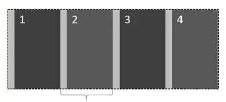
</html>两列定宽+一列自适应
<!DOCTYPE html>
<html>
<head>
<meta charset="utf-8"/>
<title>多列布局</title>
<link rel="stylesheet" type="text/css" href="demo.css">
<style type="text/css">
body{margin:20px;}

.parent{

}
.left,.center{
float: left;
width: 100px;
margin-right: 20px;
}
.right{
overflow: hidden; /*很重要、触发BFC模式*/
}
</style>
</head>
<body>
<div class="parent">
<div class="left">
<p>left</p>
</div>
<div class="center">
<p>center</p>
</div>
<div class="right">
<p>right</p>
<p>right</p>
</div>
</div>
</body>
</html>
一列不定宽+一列自适应
方案一:float+overflow
<!DOCTYPE html>
<html>
<head>
<meta charset="utf-8"/>
<title>多列布局</title>
<link rel="stylesheet" type="text/css" href="demo.css">
<style type="text/css">
body{margin:20px;}

.parent{

}
.left{
float: left;
margin-right: 20px;
}
.right{
overflow: hidden;
}
.left p{width: 200px;}
</style>
</head>
<body>
<div class="parent">
<div class="left">
<p>left</p>
</div>
<div class="right">
<p>right</p>
<p>right</p>
</div>
</div>
</body>
</html>
方案二:table
<!DOCTYPE html>
<html>
<head>
<meta charset="utf-8"/>
<title>多列布局</title>
<link rel="stylesheet" type="text/css" href="demo.css">
<style type="text/css">
body{margin:20px;}

.parent{
display: table;
width: 100%;
}
.left,.right{
display: table-cell;

}
.left{
width: 0.1%;    /*为了让right自适应剩余的宽度,这里不能用1px,因为在IE8里会有bug  */
padding-right: 20px;
}
.left p{
width:200px;
}
</style>
</head>
<body>
<div class="parent">
<div class="left">
<p>left</p>
</div>
<div class="right">
<p>right</p>
<p>right</p>
</div>
</div>
</body>
</html>
方案三:flex
<!DOCTYPE html>
<html>
<head>
<meta charset="utf-8"/>
<title>多列布局</title>
<link rel="stylesheet" type="text/css" href="demo.css">
<style type="text/css">
body{margin:20px;}

.parent{
display: flex;
}
.left{
margin-right: 20px;
}
.right{
flex: 1; /*  分配剩余宽度  */
}
.left p{width: 200px;}
</style>
</head>
<body>
<div class="parent">
<div class="left">
<p>left</p>
</div>
<div class="right">
<p>right</p>
<p>right</p>
</div>
</div>
</body>
</html>
两列不定宽+一列自适应
<!DOCTYPE html>
<html>
<head>
<meta charset="utf-8"/>
<title>多列布局</title>
<link rel="stylesheet" type="text/css" href="demo.css">
<style type="text/css">
body{margin:20px;}

.parent{

}
.left,.center{
float: left;
margin-right: 20px;
}
.right{
overflow: hidden;
}
.left p,.center p{
width: 100px;
}
</style>
</head>
<body>
<div class="parent">
<div class="left">
<p>left</p>
</div>
<div class="center">
<p>center</p>
</div>
<div class="right">
<p>right</p>
<p>right</p>
</div>
</div>
</body>
</html>
等分布局
方案一:float+box-sizing:border-box
缺点:当列数发生变化时,需要修改结构和样式,即结构和样式具有耦合性
<!DOCTYPE html>
<html>
<head>
<meta charset="utf-8"/>
<title>多列布局</title>
<link rel="stylesheet" type="text/css" href="demo.css">
<style type="text/css">
body{margin:20px;}

.parent{
margin-left: -20px;   /*父元素的宽度增加了20px*/
}
.column{
float: left;
width: 25%; /*  由于设置成了border-box,故这个25%包含padding的宽度*/
padding-left: 20px;/*  只能用padding设置距离  */
box-sizing: border-box;  /*box-sizing: content-box|border-box|inherit;
content-box 宽度和高度分别应用到元素的内容框。
在宽度和高度之外绘制元素的内边距和边框。
border-box  为元素设定的宽度和高度决定了元素的边框盒。
通过从已设定的宽度和高度分别减去边框和内边
距才能得到内容的宽度和高度。
*/
}
</style>
</head>
<body>
<div class="parent">
<div>
<div class="column"><p>1</p></div>
<div class="column"><p>2</p></div>
<div class="column"><p>3</p></div>
<div class="column"><p>3</p></div>
</div>
</div>
</body>
</html>
方案二:table
优点:结构和样式解耦
<!DOCTYPE html>
<html>
<head>
<meta charset="utf-8"/>
<title>多列布局</title>
<link rel="stylesheet" type="text/css" href="demo.css">
<style type="text/css">
body{margin:20px;}

.parent-fix{
margin-left: -20px;    /*为了解决table的宽度增加20px的问题*/
}
.parent{
display: table;
width:100%;
table-layout: fixed;  /*
假设单元格没有设置宽度,单元格将平分表格宽度
fixed  具有布局优先,加速渲染的效果
*/
}
.column{
display: table-cell;
padding-left: 20px;
}
</style>
</head>
<body>
<div class="parent-fix">
<div class="parent">
<div class="column"><p>1</p></div>
<div class="column"><p>2</p></div>
<div class="column"><p>3</p></div>
<div class="column"><p>4</p></div>
</div>
</div>
</body>
</html>
方案三:flex
此方案与方案一进行比较。flex分配的是除去margin-left后的父容器剩余空间。
优点:结构和样式解耦。
<!DOCTYPE html>
<html>
<head>
<meta charset="utf-8"/>
<title>多列布局</title>
<link rel="stylesheet" type="text/css" href="demo.css">
<style type="text/css">
body{margin:20px;}

.parent{
display: flex;
}
.column{
flex: 1; /*如果不设置flex,那么每一列的宽度就由内容决定。
设置flex之后,每一列的宽度就是平分了父元素的剩余空间*/
}
.column+.column{
margin-left:50px;
}
</style>
</head>
<body>
<div class="parent">
<div class="column"><p>1</p></div>
<div class="column"><p>2</p></div>
<div class="column"><p>3</p></div>
<div class="column"><p>4</p></div>
</div>
</body>
</html>
等高布局
方案一:table
table的特性就是每一列的单元格等宽,每一行的单元格等高。
方案二:flex
flex-items 默认的align-items:stretch,天生的等高。
方案三:float
<!DOCTYPE html>
<html>
<head>
<meta charset="utf-8"/>
<title>多列布局</title>
<link rel="stylesheet" type="text/css" href="demo.css">
<style type="text/css">
body{margin:20px;}
p{background: none!important;}
.left,.right{background: #444;}
.parent{
overflow: hidden;
}
.left,.right{
/*较难理解的伪等高*/
padding-bottom: 9999px;
margin-bottom: -9999px;
}
.left{
float: left;
width: 100px;
margin-right: 20px;
}
.right{
overflow: hidden;
}

</style>
</head>
<body>
<div class="parent">
<div class="left">
<p>left</p>
</div>
<div class="right">
<p>right</p>
<p>right</p>
</div>
</div>
</body>
</html>
三、全屏布局
需求1:
方案一:position
缺点:IE6不支持
<!DOCTYPE html>
<html>
<head>
<meta charset="utf-8"/>
<title>全屏布局</title>
<link rel="stylesheet" type="text/css" href="demo.css">
<style type="text/css">
/*overflow:hidden;禁用滚动条*/
html,body,.parent{margin:0;height:100%;overflow:hidden;}
body{color:white;}
.top{
/*left:0;right:0;能使宽度变成100%*/
position:absolute;top:0;left:0;right:0;height:100px;
background:blue;
}
.left{
position:absolute;left:0;top:100px;bottom:50px;width:200px;
background:red;
}
.right{
position:absolute;left:200px;top:100px;bottom:50px;right:0;
background:pink;overflow: auto;
}
.right .inner{min-height: 1000px;}
.bottom{
position:absolute;left:0;right:0;bottom:0;height:50px;
background: black;
}
</style>
</head>
<body>
<div class="parent">
<div class="top">top</div>
<div class="left">left</div>
<div class="right"><div class="inner">right</div></div>
<div class="bottom">bottom</div>
</div>
</body>
</html>
demo.css
html,body,h1,h2,h3,h4,h5,h6,div,dl,dt,dd,ul,ol,li,p,blockquote,pre,hr,figure,table,caption,th,td,form,fieldset,legend,input,button,textarea,menu{margin:0;padding:0;}
header,footer,section,article,aside,nav,hgroup,address,figure,figcaption,menu,details{display:block;}
table{border-collapse:collapse;border-spacing:0;}
caption,th{text-align:left;font-weight:normal;}
html,body,fieldset,img,iframe,abbr{border:0;}
i,cite,em,var,address,dfn{font-style:normal;}
[hidefocus],summary{outline:0;}
li{list-style:none;}
h1,h2,h3,h4,h5,h6,small{font-size:100%;}
sup,sub{font-size:83%;}
pre,code,kbd,samp{font-family:inherit;}
q:before,q:after{content:none;}
textarea{overflow:auto;resize:none;}
label,summary{cursor:default;}
a,button{cursor:pointer;}
h1,h2,h3,h4,h5,h6,em,strong,b{font-weight:normal;}
del,ins,u,s,a,a:hover{text-decoration:none;}
body,textarea,input,button,select,keygen,legend{font:30px/1.5 'microsoft yahei';color:#333;outline:0;}
body{background:#fff;}
a,a:hover{color:#333;}
.clearfix:after{content:'';clear:both;display:block;height:0;overflow:hidden;visibility:hidden;}
方案二:flex
缺点:IE8、9不支持,IE10部分支持
<!DOCTYPE html>
<html>
<head>
<meta charset="utf-8"/>
<title>全屏布局</title>
<link rel="stylesheet" type="text/css" href="demo.css">
<style type="text/css">
html,body,.parent{margin:0;height:100%;overflow:hidden;}
body{color: white;}
.parent{display: flex;flex-direction: column;}
.top{height:100px;background: blue;}
.bottom{height:50px;background: black;}
/*flex-direction的默认值是row*/
.middle{flex:1;display:flex;}
.left{width:200px;background: red;}
.right{flex: 1;overflow: auto;background:pink;}
.right .inner{min-height: 1000px;}
</style>
</head>
<body>
<div class="parent">
<div class="top">top</div>
<div class="middle">
<div class="left">left</div>
<div class="right">
<div class="inner">right</div>
</div>
</div>
<div class="bottom">bottom</div>
</div>
</body>
</html>
需求2:
把以上两个方案中的单位变成百分比即可。
需求3:
方案一:Flex
<!DOCTYPE html>
<html>
<head>
<meta charset="utf-8"/>
<title>全屏布局</title>
<link rel="stylesheet" type="text/css" href="demo.css">
<style type="text/css">
html,body,.parent{margin:0;height:100%;overflow:hidden;}
body{color:white;}
.parent{display:flex;flex-direction:column;}
.top{background:blue;}
.bottom{background:black;}
.middle{flex:1;display:flex;}
.left{background: red;}
.right{flex:1;overflow:auto;background: pink;}
.right .inner{min-height:1000px;}
</style>
</head>
<body>
<div class="parent">
<div class="top">top</div>
<div class="middle">
<div class="left">left</div>
<div class="right">
<div class="inner">right</div>
</div>
</div>
<div class="bottom">bottom</div>
</div>
</body>
</html>
方案二:Grid
目前大部分的浏览器不能支持,方案略。
以上方案的比较:

相关文章推荐
- 营销文案好有个毛用
- CDN对流媒体和应用分发的支持及优化 | 高可用CDN架构详解
- java 学习写架构必会几大技术点
- Web基础架构:负载均衡和LVS
- CLI架构开发
- Linux异步回调架构的实现
- 【Ogre引擎架构】第七讲 粒子系统-爆破特效
- dede 常用网站开发标签
- Hbase笔记二:简明系统架构
- Hadoop YARN架构设计要点
- Yahoo!团队实践分享:网站性能优化的34条黄金守则
- Loadrunner自带的网站WebTours打不开
- 网站关键词优化--如何确6定目标关键词
- 网站用户存在状态的session用法及例子
- 关注的网站
- MVC在Web系统中的模式与应用--架构模式
- <从编程到(架构)设计之路>的翻转式系列课程
- Heartbleed 实战:一个影响无数网站的缓冲区溢出漏洞
- JS控制网站样式改变的原理
- 网站字体影印代码!