纯CSS实现家谱树(组织架构树同理)
2015-09-09 14:08
579 查看
http://thecodeplayer.com/walkthrough/css3-family-tree
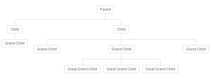
<!--
We will create a family tree using just CSS(3)
The markup will be simple nested lists
-->
<div class="tree">
<ul>
<li>
<a href="#">Parent</a>
<ul>
<li>
<a href="#">Child</a>
<ul>
<li>
<a href="#">Grand Child</a>
</li>
</ul>
</li>
<li>
<a href="#">Child</a>
<ul>
<li><a href="#">Grand Child</a></li>
<li>
<a href="#">Grand Child</a>
<ul>
<li>
<a href="#">Great Grand Child</a>
</li>
<li>
<a href="#">Great Grand Child</a>
</li>
<li>
<a href="#">Great Grand Child</a>
</li>
</ul>
</li>
<li><a href="#">Grand Child</a></li>
</ul>
</li>
</ul>
</li>
</ul>
</div>
/*Now the CSS*/
* {margin: 0; padding: 0;}

.tree ul {
padding-top: 20px; position: relative;

transition: all 0.5s;
-webkit-transition: all 0.5s;
-moz-transition: all 0.5s;
}

.tree li {
float: left; text-align: center;
list-style-type: none;
position: relative;
padding: 20px 5px 0 5px;

transition: all 0.5s;
-webkit-transition: all 0.5s;
-moz-transition: all 0.5s;
}

/*We will use ::before and ::after to draw the connectors*/

.tree li::before, .tree li::after{
content: '';
position: absolute; top: 0; right: 50%;
border-top: 1px solid #ccc;
width: 50%; height: 20px;
}
.tree li::after{
right: auto; left: 50%;
border-left: 1px solid #ccc;
}

/*We need to remove left-right connectors from elements without
any siblings*/
.tree li:only-child::after, .tree li:only-child::before {
display: none;
}

/*Remove space from the top of single children*/
.tree li:only-child{ padding-top: 0;}

/*Remove left connector from first child and
right connector from last child*/
.tree li:first-child::before, .tree li:last-child::after{
border: 0 none;
}
/*Adding back the vertical connector to the last nodes*/
.tree li:last-child::before{
border-right: 1px solid #ccc;
border-radius: 0 5px 0 0;
-webkit-border-radius: 0 5px 0 0;
-moz-border-radius: 0 5px 0 0;
}
.tree li:first-child::after{
border-radius: 5px 0 0 0;
-webkit-border-radius: 5px 0 0 0;
-moz-border-radius: 5px 0 0 0;
}

/*Time to add downward connectors from parents*/
.tree ul ul::before{
content: '';
position: absolute; top: 0; left: 50%;
border-left: 1px solid #ccc;
width: 0; height: 20px;
}

.tree li a{
border: 1px solid #ccc;
padding: 5px 10px;
text-decoration: none;
color: #666;
font-family: arial, verdana, tahoma;
font-size: 11px;
display: inline-block;

border-radius: 5px;
-webkit-border-radius: 5px;
-moz-border-radius: 5px;

transition: all 0.5s;
-webkit-transition: all 0.5s;
-moz-transition: all 0.5s;
}

/*Time for some hover effects*/
/*We will apply the hover effect the the lineage of the element also*/
.tree li a:hover, .tree li a:hover+ul li a {
background: #c8e4f8; color: #000; border: 1px solid #94a0b4;
}
/*Connector styles on hover*/
.tree li a:hover+ul li::after,
.tree li a:hover+ul li::before,
.tree li a:hover+ul::before,
.tree li a:hover+ul ul::before{
border-color:  #94a0b4;
}

/*Thats all. I hope you enjoyed it.
Thanks :)*/

相关文章推荐
- Web布局连载——两栏固定布局(五)
- [div+css]晒晒最新制作专题推广页模板
- 纯CSS制作的新闻网站中的文章列表
- 10条影响CSS渲染速度的写法与使用建议第1/3页
- BS项目中的CSS架构_仅加载自己需要的CSS
- 很不错的 CSS Hack 又学了一招
- 发一个css比较清爽的写法
- CSS expression控制图片自动缩放效果代码[兼容 IE,Firefox]
- css布局网页水平居中常用方法
- CSS经典技巧十则第1/2页
- css 兼容性问题this.style.cursor=''hand''
- IE6不能正常解析CSS文件问题的解决方法及原因分析
- 欲练CSS ,必先解决IE的一些细节分析
- CSS文字截取功能实现代码
- 支持IE6 IE7 Firefox 的纯CSS的下拉菜单
- 不同版本IE使用不同css(css条件注释语句用法)
- css类选择器的使用方法详解
- css文本框与按钮美化效果代码
- 解决ie动态修改link样式,import css不刷新的问题
- 用css filter做鼠标滑过图片效果