css3实现特殊动画,支持手机
2014-09-16 15:41
525 查看
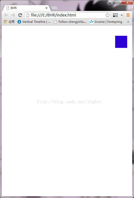
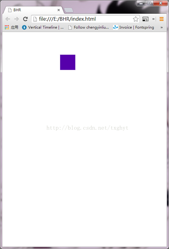
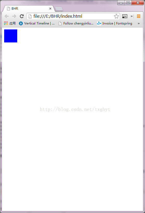
以上是效果图
<!doctype html>
<html>
<head>
<meta charset="utf-8">
<title>BHR</title>
<style>
.main{overflow:hidden;height:250px;}
.ball-arc {
-webkit-animation: ball-x 2.5s linear;
}
.ball {
-webkit-animation: ball-y 2.5s ;
width:50px;height:50px;background-color:blue;
}
/* cubic-bezier 函数的使用是用来调节动画运行的速度,这里我们使球慢慢减速*/
@-webkit-keyframes ball-x {
0% { -webkit-transform: translateX(0px); }
100% { -webkit-transform: translateX(100%); }
}
@-webkit-keyframes ball-y {
0% { -webkit-transf orm: translateY(0px);}
25% { -webkit-transform: translateY(200px);background-color:red;}
50% { -webkit-transform: translateY(0px);background-color:blue;}
75% { -webkit-transform: translateY(200px);background-color:red;}
100% { -webkit-transform: translateY(0px);background-color:blue;}
}
</style>
<meta name="viewport" content="width=device-width, initial-scale=1.0, maximum-scale=1.0, minimum-scale=1.0, user-scalable=0" />
</head>
<body>
<div class="main">
<div class="ball-arc">
<div class="ball"></div>
</div>
</div>
</body>
</html>

相关文章推荐
- 利用swiper和css3实现手机滑屏与动画效果
- css3实现手机菜单展开收起动画
- 手机网页 CSS3 animationg 动画 不支持度
- iphone手机桌面滑动效果使用css3实现
- HTML5 实现小车动画效果(Canvas/CSS3/JQuery)
- 用CSS3实现动画进度条
- 用CSS3实现动画进度条
- 使用Layer类和Sprite类实现手机游戏的动画效果
- 手把手教你在Android手机上实现蓝牙键盘的支持
- [置顶] HTML5 实现小车动画效果(Canvas/CSS3/JQuery)
- HTML5 实现小车动画效果(Canvas/CSS3/JQuery)
- Css3 3d animation Step1---介绍如何实现css动画
- 用Bootsplash 实现手机开关机动画
- 用CSS3实现动画进度条
- javascript动画对象支持加速、减速、缓入、缓出的实现代码
- CSS3+PNG实现GIF动画效果
- 基于rtsp的手机视频点播实现和研究(扩展支持android, ios平台)
- 用Bootsplash 实现手机开关机动画
- 通过javascript操作CSS3属性实现动画
- CSS3transition实现的简单动画菜单