【D3.js数据可视化系列教程】--(十三)坐标轴
2013-09-17 11:32
706 查看
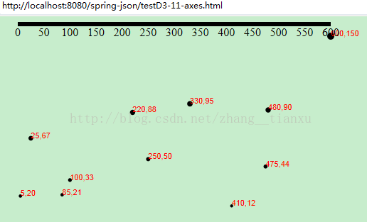
1. 定义和创建X轴
//定义X轴
var xAxis = d3.svg.axis()
.scale(xScale)
.orient("bottom");

//创建X轴
svg.append("g").call(xAxis);其中:scale函数用来指定坐标轴的比例尺。orient函数用来指定坐标轴的方位,可取值有
left,
right,
top,
bottom。
调用的时候任意的选择器call调用轴,或者xAxis(选择器)均可。
效果:
2. 调整X轴的样式
为显示刻度尺可以设置样式为:.axis path,
.axis line {
fill: none;
stroke: black;
shape-rendering: crispEdges;//这个属性用来显示轴
}
.axis text {
font-family: sans-serif;
font-size: 11px;
}并且把坐标轴平移到下面:svg.append("g")
.attr("class", "axis")
.attr("transform", "translate(0," + (h - padding) + ")")
.call(xAxis);效果: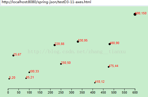
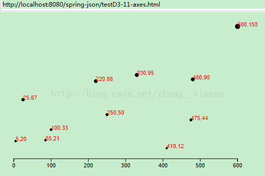
3. 设置刻度数
var xAxis = d3.svg.axis()
.scale(xScale)
.orient("bottom")
.ticks(5); //设置刻度数注意这个ticks函数指定的数字只是一个大概的数量,具体生成多少D3会自动调整。效果:
4. Y轴
//定义Y轴
var yAxis = d3.svg.axis()
.scale(yScale)
.orient("left")
.ticks(5);同样设置起始坐标//创建Y轴
svg.append("g")
.attr("class", "axis")
.attr("transform", "translate(" + padding + ",0)")
.call(yAxis);效果: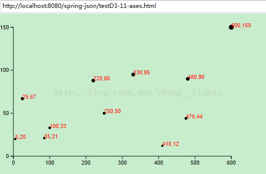
5. 设置刻度的格式
var format = d3.format(".1%");
xAxis.tickFormat(format);
6. 最后的源码
<!DOCTYPE html>
<html>
<head>
<meta charset="utf-8">
<title>testD3-11-axes.html</title>
<script type="text/javascript" src="d3.js"></script>
<style type="text/css">
.axis path,
.axis line {
fill: none;
stroke: black;
shape-rendering: crispEdges;
}
.axis text {
font-family: sans-serif;
font-size: 11px;
}
</style>
</head>
<body>
<script type="text/javascript">
// 高宽
var w = 500;
var h = 300;
var padding = 20;
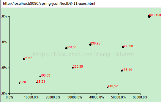
var dataset = [
[5, 20], [480, 90], [250, 50], [100, 33], [330, 95],
[410, 12], [475, 44], [25, 67], [85, 21], [220, 88],
[600, 150]
];
// 创建比例尺
var xScale = d3.scale.linear()
.domain([0, d3.max(dataset, function(d) { return d[0]; })])
.range([padding, w - padding * 2]);
var yScale = d3.scale.linear()
.domain([0, d3.max(dataset, function(d) { return d[1]; })])
.range([h - padding, padding]);
var rScale = d3.scale.linear()
.domain([0, d3.max(dataset, function(d) { return d[1]; })])
.range([2, 5]);
var formatAsPercentage = d3.format(".1%");//设置刻度的格式
// 创建SVG
var svg = d3.select("body")
.append("svg")
.attr("width", w)
.attr("height", h);
svg.selectAll("circle")
.data(dataset)
.enter()
.append("circle")
.attr("cx", function(d) {
return xScale(d[0])+30;//设置原点坐标,以及横轴位移量
})
.attr("cy", function(d) {
return yScale(d[1]);
})
.attr("r", function(d) {
return rScale(d[1]);
});
svg.selectAll("text")
.data(dataset)
.enter()
.append("text")
.text(function(d) {
return d[0] + "," + d[1];
})
.attr("x", function(d) {
return xScale(d[0])+30;
})
.attr("y", function(d) {
return yScale(d[1]);
})
.attr("font-family", "sans-serif")
.attr("font-size", "11px")
.attr("fill", "red");
// 定义X轴
var xAxis = d3.svg.axis()
.scale(xScale)
.ticks(5)//最多刻度数,连上原点
.orient("bottom")
.tickFormat(format);//添加刻度格式
// 定义Y轴
var yAxis = d3.svg.axis()
.scale(yScale)
.orient("left")
.ticks(5)
.tickFormat(format);
// 创建X轴
svg.append("g")
.attr("class", "axis")
.attr("transform", "translate(0," + (h - padding) + ")")//设置据下边界的距离
.call(xAxis);
// 创建Y轴
svg.append("g")
.attr("class", "axis")
.attr("transform", "translate(" + padding + ",0)")//设置轴据左边界的距离
.call(yAxis);
</script>
</body>
</html>7. 最后的效果:

相关文章推荐
- 【D3.js数据可视化系列教程】--(十五)SVG基本图形绘制
- 【D3.js数据可视化系列教程】(三十六)-- 冰柱图
- 【D3.js数据可视化系列教程】(三十)--力导向图之带文字
- 【D3.js数据可视化系列教程】--(一)简介
- 【D3.js数据可视化系列教程】(二十八)--弦图
- 【D3.js数据可视化系列教程】(二十五)--加载csv文件
- 【D3.V3.js数据可视化系列教程】--(十二)坐标尺度
- 【D3.js数据可视化系列教程】--(二)最简单的开始:添加元素
- 【D3.js数据可视化系列教程】--(十四)有路径的文字
- 【D3.js数据可视化系列教程】(二十一)--交互图表之条形图排序切换
- 【D3.js数据可视化系列教程】(二十二)--交互图表之提示条
- 【D3.js数据可视化系列教程】(二十六)--加载SVG文件
- 【D3.js数据可视化系列教程】(二十七)--径向树
- 【D3.js数据可视化系列教程】--(三)数据绑定
- 【D3.js数据可视化系列教程】(十七)--通过键联结数据
- 【D3.js数据可视化系列教程】(二十)--交互图表之条形图排序
- 【D3.js数据可视化系列教程】(二十八)--弦图
- 【D3.js数据可视化系列教程】(三十二)-- 力导向图之弧形箭头连线
- 【D3.js数据可视化系列教程】(三十四)-- sankey图
- 【D3.js数据可视化系列教程】(二十四)--力导向图