python人工智能human learn绘图可创建机器学习模型
目录
如今,数据科学家经常给带有标签的机器学习模型数据,以便它可以找出规则。
这些规则可用于预测新数据的标签。
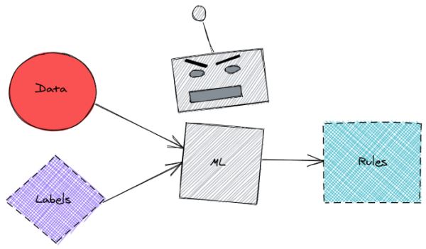
这很方便,但是在此过程中可能会丢失一些信息。也很难知道引擎盖下发生了什么,以及为什么机器学习模型会产生特定的预测。
除了让机器学习模型弄清楚所有内容之外,还有没有一种方法可以利用我们的领域知识来设置数据标记的规则?
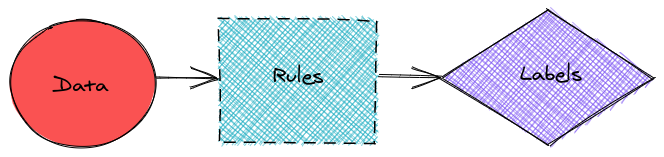
是的,这可以通过 human-learn 来完成。
什么是 human-learn
human-learn 是一种工具,可让你使用交互式工程图和自定义模型来设置数据标记规则。在本文中,我们将探索如何使用 human-learn 来创建带有交互式图纸的模型。
安装 human-learn
pip install human-learn
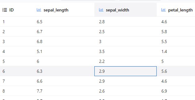
我将使用来自sklearn的Iris数据来展示human-learn的工作原理。
from sklearn.datasets import load_iris
from sklearn.model_selection import train_test_split
import pandas as pd
# Load data
X, y = load_iris(return_X_y=True, as_frame=True)
X.columns = ['sepal_length', 'sepal_width', 'petal_length', 'petal_width']
# Train test split
X_train, X_test, y_train, y_test = train_test_split(X, y, random_state=1)
# Concatenate features and labels of the training data
train = pd.concat([X_train, pd.DataFrame(y_train)], axis=1)
train
互动绘图
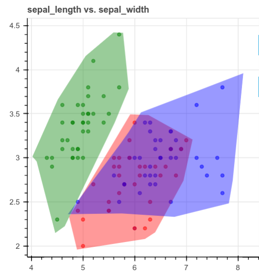
human-learn 允许你绘制数据集,然后使用工程图将其转换为模型。 为了演示这是如何有用的,想象一下如何创建数据集的散点图,如下所示:
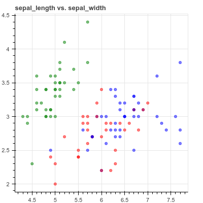
查看上面的图时,你会看到如何将它们分成3个不同的区域,如下所示:
但是,可能很难将图形编写为规则并将其放入函数中,human-learn的交互式绘图将派上用场。
from hulearn.experimental.interactive import InteractiveCharts
charts = InteractiveCharts(train, labels='target')
charts.add_chart(x='sepal_length', y='sepal_width')
– 动图01
绘制方法:使用双击开始绘制多边形。然后单击以创建多边形的边。再次双击可停止绘制当前多边形。
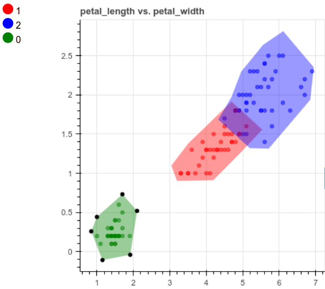
我们对其他列也做同样的事情:
charts.add_chart(x='petal_length', y='petal_width')
创建模型并进行预测
一旦完成对数据集的绘制,就可以使用以下方法创建模型:
from hulearn.classification import InteractiveClassifier
model = InteractiveClassifier(json_desc=charts.data())
preds = model.fit(X_train, y_train).predict_proba(X_train)
print(preds.shape) # Output: (150, 3)
cool! 我们将工程图输入InteractiveClassifier类,使用类似的方法来拟合sklearn的模型,例如fit和predict_proba。
让我们来看看pred的前5行:
print('Classes:', model.classes_)
print('Predictions:\n', preds[:5, :])
"""Output
Classes: [1, 2, 0]
Predictions:
[[5.71326574e-01 4.28530630e-01 1.42795945e-04]
[2.00079952e-01 7.99720168e-01 1.99880072e-04]
[2.00079952e-01 7.99720168e-01 1.99880072e-04]
[2.49812641e-04 2.49812641e-04 9.99500375e-01]
[4.99916708e-01 4.99916708e-01 1.66583375e-04]]
"""
需要说明的是,predict_proba给出了样本具有特定标签的概率。 例如,[5.71326574e-01 4.28530630e-01 1.42795945e-04]的第一个预测表示样本具有标签1的可能性为57.13%,样本具有标签2的可能性为42.85%,而样本为标签2的可能性为0.014% 该样本的标签为0。
预测新数据
# Get the first sample of X_test
new_sample = new_sample = X_test.iloc[:1]
# Predict
pred = model.predict(new_sample)
real = y_test[:1]
print("The prediction is", pred[0])
print("The real label is", real.iloc[0])
解释结果
为了了解模型如何根据该预测进行预测,让我们可视化新样本。
def plot_prediction(prediction: int, columns: list):
"""Plot new sample
Parameters
----------
prediction : int
prediction of the new sample
columns : list
Features to create a scatter plot
"""
index = prediction_to_index[prediction]
col1, col2 = columns
plt.figure(figsize=(12, 3))
plt.scatter(X_train[col1], X_train[col2], c=preds[:, index])
plt.plot(new_sample[col1], new_sample[col2], 'ro', c='red', label='new_sample')
plt.xlabel(col1)
plt.ylabel(col2)
plt.title(f"Label {model.classes_[index]}")
plt.colorbar()
plt.legend()
使用上面的函数在petal_length和petal_width绘图上绘制一个新样本,该样本的点被标记为0的概率着色。
plot_prediction(0, columns=['petal_length', 'petal_width'])
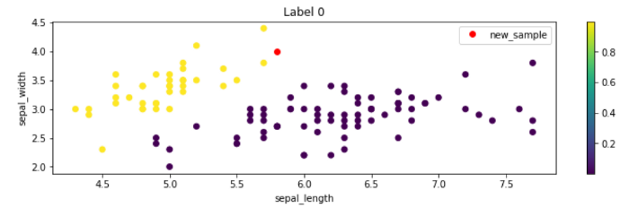
其他列也是如此,我们可以看到红点位于具有许多黄点的区域中! 这就解释了为什么模型预测新样本的标签为0。这很酷,不是吗?
预测和评估测试数据
现在,让我们使用该模型来预测测试数据中的所有样本并评估其性能。 开始使用混淆矩阵进行评估:
from sklearn.metrics import confusion_matrix, f1_score
predictions = model.predict(X_test)
confusion_matrix(y_test, predictions, labels=[0,1,2])
array([[13,  0,  0],
[ 0, 15,  1],
[ 0,  0,  9]])
我们还可以使用F1分数评估结果:
f1_score(y_test, predictions, average='micro')
结论
刚刚我们学习了如何通过绘制数据集来生成规则来标记数据。 这并不是说你应该完全消除机器学习模型,而是在处理数据时加入某种人工监督。
以上就是python人工智能human learn绘图可创建机器学习模型的详细内容,更多关于human learn绘图创建机器学习模型的资料请关注脚本之家其它相关文章!
您可能感兴趣的文章:
- 学习笔记(04):第三章:集成机器学习-Scikit-Learn中的随机森林模型
- scikit-learn系列之如何存储和导入机器学习模型
- 【Python】scikit-learn机器学习(一)——一元回归模型
- 【Python机器学习实战】一个案例迅速入门所有的Scikit-learn回归模型
- 机器学习之模型创建(一)
- 由OpenAI创建的大型机器学习模型
- 为你的机器学习模型创建一个API服务
- 创建一个容器化的机器学习模型
- Python数据分析与机器学习-scikit-learn模型建立与评估
- 创建一个容器化的机器学习模型 | Linux 中国
- Scikit-learn:模型评估Model evaluation 之绘图
- 创建一个容器化的机器学习模型 | Linux 中国
- Scikit-learn:模型评估Model evaluation 之绘图
- Scikit-learn:模型评估Model evaluation 之绘图
- 【机器学习笔记之五】用ARIMA模型做需求预测用ARIMA模型做需求预测
- 创建实体数据模型提示“事件日志已满”
- 机器学习填坑:你知道模型参数和超参数之间的区别吗?
- VB编程在AutoCAD绘图空间创建点
- 【Scikit-Learn 中文文档】使用 scikit-learn 介绍机器学习 | ApacheCN
- scikit-learn进行模型参数的选择