纯CSS3+DIV实现小三角形边框效果的示例代码
2020-08-18 04:09
1491 查看
具体代码如下所示:
html代码是这样的
<div class="arrow-up">
<!--向上的三角-->
</div>
<div class="arrow-down">
<!--向下的三角-->
</div>
<div class="arrow-left">
<!--向左的三角-->
</div>
<div class="arrow-right">
<!--向右的三角-->
</div>

下面用CSS3分别实现向上、下、左、右的三角形
/*箭头向上*/
.arrow-up {
width:0;
height:0;
border-left:30px solid transparent;
border-right:30px solid transparent;
border-bottom:30px solid #fff;
}

/*箭头向下*/
.arrow-down {
width:0;
height:0;
border-left:20px solid transparent;
border-right:20px solid transparent;
border-top:20px solid #0066cc;
}

/*箭头向左*/
.arrow-left {
width:0;
height:0;
border-top:30px solid transparent;
border-bottom:30px solid transparent;
border-right:30px solid yellow;
}

/*箭头向右*/
.arrow-right {
width:0;
height:0;
border-top:50px solid transparent;
border-bottom: 50px solid transparent;
border-left: 50px solid green;
}
小程序示例
wxml
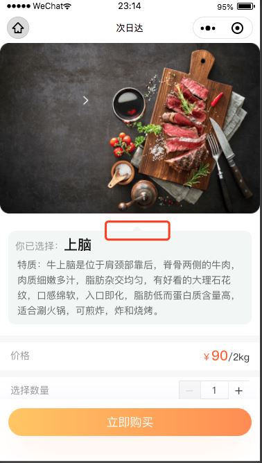
<view class="index_sale_lists">
<view class="sanjiao"></view>
<view class="index_sale_list">
<view class="index_sale_choice">你已选择:<text>上脑</text></view>
<view class="index_sale_tezhi">
<text>
特质:牛上脑是位于肩颈部靠后,脊骨两侧的牛肉,肉质细嫩多汁,脂肪杂交均匀,有好看的大理石花纹,口感绵软,入口即化,脂肪低而蛋白质含量高,适合涮火锅,可煎炸,炸和烧烤。
</text>
</view>
</view>
</view>
wxss
.index_sale_lists{
margin: 50rpx 24rpx 0;
background-color: #F2F6F4;
border-radius: 20rpx;
position: relative;
}
.sanjiao{
position: absolute;
left: 50%;
top:-15rpx;
width:0;
height:0;
border-left:10px solid transparent;
border-right:10px solid transparent;
border-bottom:10px solid #F2F6F4;
/* z-index:-1; */
}
总结
到此这篇关于纯CSS3+DIV实现小三角形边框的文章就介绍到这了,更多相关css div 实现三角形边框内容请搜索脚本之家以前的文章或继续浏览下面的相关文章,希望大家以后多多支持脚本之家!

相关文章推荐
- jquery Ajax 实现加载数据前动画效果的示例代码
- Android 新手引导蒙层效果实现代码示例
- JQuery实现文字无缝滚动效果示例代码(Marquee插件)
- GridView的几个事件(如实现: 行的双击/单击/捕捉键盘按键/鼠标悬浮/移出效果)(示例代码下载)
- Asp.net 2.0 GridView的几个事件(如实现: 行的双击/单击/捕捉键盘按键/鼠标悬浮/移出效果)(示例代码下载)
- Asp.net 2.0 GridView的几个事件(如实现: 行的双击/单击/捕捉键盘按键/鼠标悬浮/移出效果)(示例代码下载)
- Asp.net 2.0 自定义控件开发[实现GridView多行表头固定表体滚动效果][示例代码下载]
- Asp.net 2.0 自定义控件开发[实现GridView多行表头固定表体滚动效果][示例代码下载]
- Asp.net 2.0 自定义控件开发[实现GridView多行表头固定表体滚动效果][示例代码下载]
- 简单示例AJAX结合PHP代码实现登录效果代码-2
- Asp.net 2.0 GridView的几个事件(如实现: 行的双击/单击/捕捉键盘按键/鼠标悬浮/移出效果)(示例代码下载)
- jquery实现盒子下拉效果示例代码
- Vue 实现展开折叠效果的示例代码
- jQuery bxCarousel实现图片滚动切换效果示例代码
- angularjs实现时间轴效果的示例代码
- AjaxPanel自定义控件实现页面无刷新数据交互(做了个示例程序, 效果确实比较Cool, 用法非常简单! )(示例代码下载)
- 利用jQuary实现文字浮动提示效果示例代码
- Qt 实现画线笔锋效果详细原理及示例代码
- AjaxPanel自定义控件实现页面无刷新数据交互(做了个示例程序, 效果确实比较Cool, 用法非常简单! )(示例代码下载)
- [导入]AjaxPanel自定义控件实现页面无刷新数据交互(做了个示例程序, 效果确实比较Cool, 用法非常简单! )(示例代码下载)