swiftui_SwiftUI中的可扩展按钮
swiftui
In a previous article, I showed you how to build an expandable button with Swift and UIKit. With SwiftUI gaining traction, I decided to share an updated article showing how we can implement this same functionality using SwiftUI.
在上一篇文章中 ,我向您展示了如何使用Swift和UIKit构建可扩展按钮。 随着SwiftUI的吸引,我决定分享一篇更新的文章,展示如何使用SwiftUI实现相同的功能。
Implementing custom views with SwiftUI is extremely simple, and we will leverage its power to build an expandable button that will look like the one below:
使用SwiftUI实现自定义视图非常简单,我们将利用其强大功能来构建一个可扩展按钮,如下所示:
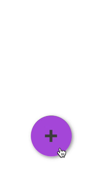 Animated expandable button. 动画的可扩展按钮。
 Our buttons will simply need to be embedded in a
VStack. Whenever the primary button is tapped, we will either show or hide the secondary buttons, signaled in the diagram below, depending on their current state.
我们的按钮只需要嵌入到
VStack。 每当点击主按钮时,我们将根据其当前状态显示或隐藏辅助按钮,如下图所示。
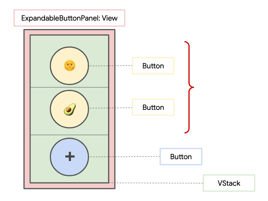 ExpandableButtonPanel view hierarchy. ExpandableButtonPanel视图层次结构。
 Let’s start by creating a custom
structcalled
ExpandableButtonItem, which will be used to represent the content for each of the buttons in our button panel. The
ExpandableButtonItemwill include a
labelto show on the button (an emoji
Stringin our case) and an optional
actionthat is executed whenever the button is tapped. We also have an
idin order to conform to the
Identifiableprotocol.
让我们开始创建一个名为
ExpandableButtonItem的自定义
struct,该
struct将用于表示按钮面板中每个按钮的内容。
ExpandableButtonItem将包括一个在按钮上显示的
label(在本例中为emoji
String),以及一个可选
action,该操作在每次点击按钮时都会执行。 我们也有一个
id,以符合可
Identifiable协议。
Then we’ll create another custom
structcalled
ExpandableButtonPanelwith two instance properties,
primaryItemand
secondaryItems. The
primaryItemcorresponds to the button that is always visible. The
secondaryItemsis a list correspond to each of the buttons that will be shown or hidden when the primary button is tapped.
然后,我们将创建另一个名为
ExpandableButtonPanel自定义
struct具有两个实例属性
primaryItem和
secondaryItems。
primaryItem对应于始终可见的按钮。
secondaryItems是与每个按钮相对应的列表,当点击主按钮时,这些按钮将显示或隐藏。
We will first embed the buttons for each of the
secondaryItemsin a
VStack, and the button for the
primaryItemlast.
首先,我们将嵌入每个的按钮
secondaryItems在
VStack,按钮的
primaryItem最后。
To show and hide the secondary buttons, we will add a
Stateboolean––
isExpanded––to keep track of the current expanded state. The
isExpandedboolean will be toggled whenever the primary button is tapped, causing the frame of each secondary button to change to handle showing/hiding.
为了显示和隐藏次要的按钮,我们将添加一个
Stateboolean--
isExpanded当前展开状态的--to跟踪。 只要轻按主按钮,就会切换
isExpanded布尔值,从而导致每个辅助按钮的框架都更改为处理显示/隐藏。
To animate the panel, all we need to do is embed the call to toggle
isExpandedinside a
withAnimationblock. This will automatically cause our secondary buttons to animate, since their frames depend on the
isExpanded
State. In the end, our
ExpandableButtonPanel
structwill look similar to this:
要为面板设置动画,我们需要做的就是将调用
isExpanded嵌入到
withAnimation块中。 这将自动使我们的辅助按钮具有动画效果,因为它们的帧取决于
isExpanded
State。 最后,我们的
ExpandableButtonPanel
struct将类似于以下内容:
You may notice I also added some styling to our panel by changing its background color, its corner radius (for rounded corners), its font size, and its shadow. Feel free to modify this as you like.
您可能会注意到,我还通过更改面板的背景色,圆角半径(圆角),字体大小和阴影为面板添加了一些样式。 随意修改它。
To use an
ExpandableButtonPanel, we can now do something like this:
要使用
ExpandableButtonPanel,我们现在可以执行以下操作:
ExpandableButtonPanel(
  primaryItem: ExpandableButtonItem(label: "➕"), // No action
  secondaryItems: [
    ExpandableButtonItem(label: "🌞") {
      // Can add action, if necessary
    },
    ExpandableButtonItem(label: "🥑") {
      // Can add action, if necessary
    }
  ]
)
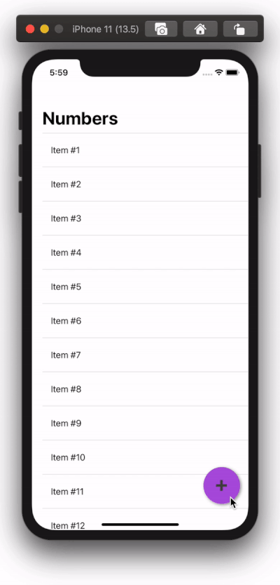
We can also use our expandable button as a Floating Action Button (FAB). To achieve this, we can embed our main view’s content on a
ZStack, making sure that the
ExpandableButtonPanelis the top-most subview. We can embed the
ExpandableButtonPanelin a
VStackand/or
HStackand use a
Spacerto achieve any positioning we want. For example, if we want the FAB to be on the bottom right corner of our screen, we can do something like so:
我们还可以将可扩展按钮用作浮动操作按钮(FAB)。 为此,我们可以将主视图的内容嵌入
ZStack,确保
ExpandableButtonPanel是最顶层的子视图。 我们可以将
ExpandableButtonPanel嵌入
VStack和/或
HStack并使用
Spacer来实现所需的任何定位。 例如,如果我们希望FAB位于屏幕的右下角,则可以执行以下操作:
If we run our app, we should see the following result:
如果运行我们的应用程序,我们应该看到以下结果:
Thanks for reading! I hope you found this article useful. You can find a finished demo on GitHub.
谢谢阅读! 希望本文对您有所帮助。 您可以在GitHub上找到完成的演示。
翻译自: https://medium.com/swlh/expandable-button-in-swiftui-d87ab23a83d8
swiftui

- 扩展GridView控件(3) - 根据按钮的CommandName设置其客户端属性
- [Delphi] 使用Delphi开发IE按钮扩展
- 使用Delphi开发IE按钮扩展
- MS CRM Customization - 在CRM Web中添加按钮及集成扩展程序
- 使用Delphi开发IE按钮扩展
- Swift - 自由调整图标按钮中的图标和文字位置(扩展UIButton)
- 扩展easyui dialog的两个方法.动态添加和删除buttons的按钮
- sencha touch Button Select(点击按钮进行选择)扩展
- 样式化复选框(Styling checkbox) & 扩展实现“开关按钮效果”
- 可扩展组合框按钮-----对应于书中的Shape-Changing Dialogs
- 扩展GridView控件(3) - 根据按钮的CommandName设置其客户端属性
- 使用Delphi开发IE按钮扩展
- 使用Delphi开发IE按钮扩展
- 使用Delphi开发IE按钮扩展
- 去掉停留在导航条里的 Chrome 扩展按钮的 Chrome 扩展
- ExtJS 4.2 Date组件扩展:添加清除按钮
- 扩展GridView控件(3) - 根据按钮的CommandName设置其客户端属性
- IIS安装时,添加/编辑应用程序扩展名映射 确定按钮不可用。
- 使用Delphi开发IE按钮扩展
- 使用Delphi开发IE按钮扩展