数据可视化pyecharts学习笔记---漏斗图、仪表盘、雷达图、平行坐标系
2020-07-12 16:45
281 查看
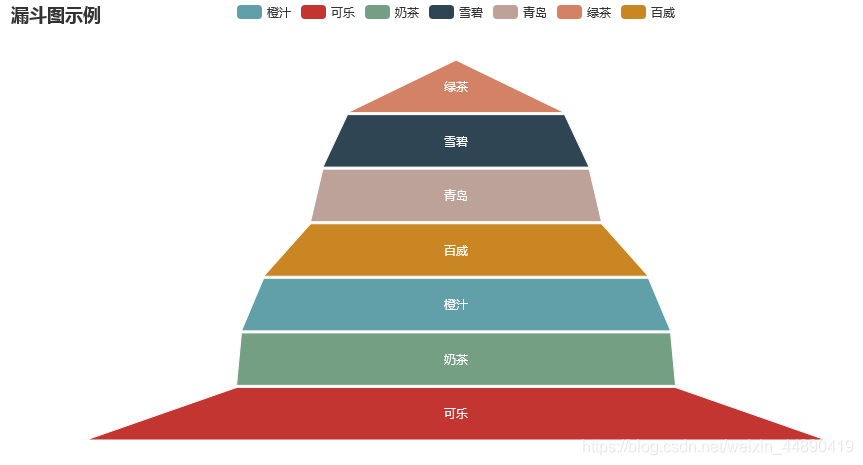
基本图表–漏斗图
from pyecharts.charts import Funnel
基本示例
from pyecharts import options as opts
from pyecharts.charts import Funnel
from pyecharts.faker import Faker

data = list(zip(Faker.choose(), Faker.values()))
f = Funnel()
f.add("商品",
data, # 系列数据项,格式为 [(key1, value1), (key2, value2)]
sort_="ascending",   # 数据排序,可取'ascending','descending','none'
gap=2)             # 数据图形间距
f.set_global_opts(title_opts=opts.TitleOpts(title="漏斗图示例"))
f.set_series_opts(label_opts=opts.LabelOpts(position="inside"))
f.render("./html/funnel_test.html")
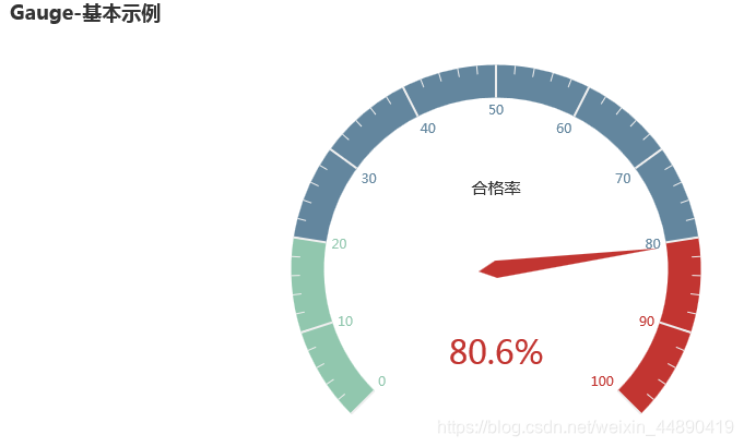
基本图例–仪表盘
from pyecharts.charts import Gauge
基本示例
from pyecharts import options as opts
from pyecharts.charts import Gauge

g = Gauge()
g.add("", [("合格率",80.6)])
g.set_global_opts(title_opts=opts.TitleOpts(title="Gauge-基本示例"))
g.render("./html/gauge_test.html")
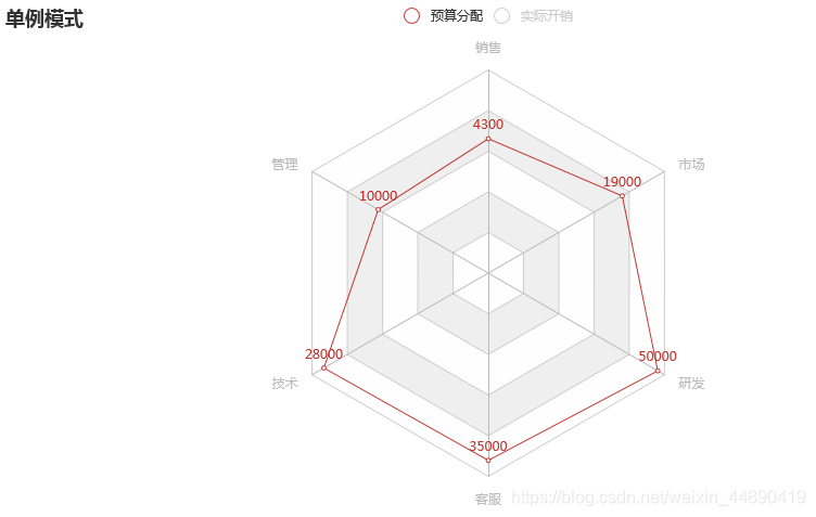
基本图例–雷达图
from pyecharts.charts import Radar
1、基本示例
from pyecharts import options as opts
from pyecharts.charts import Radar
c_schema = [
{"name": "销售", "max": 6500},
{"name": "管理", "max": 16000},
{"name": "技术", "max": 30000},
{"name": "客服", "max": 38000},
{"name": "研发", "max": 52000},
{"name": "市场", "max": 25000}]
v1 = [[4300, 10000, 28000, 35000, 50000, 19000]]
v2 = [[5000, 14000, 28000, 31000, 42000, 21000]]
radar = Radar()
radar.add_schema(schema=c_schema,    # 雷达指示器配置项列表
splitarea_opt=opts.SplitAreaOpts(
is_show=True,
areastyle_opts=opts.AreaStyleOpts(opacity=1))  # 分隔区域
radar.add("预算分配", v1)
radar.add("实际开销", v2)
radar.set_global_opts(
title_opts=opts.TitleOpts(title="单例模式"),
legend_opts=opts.LegendOpts(selected_mode="single"))
radar.render("./html/radar_f1.html")
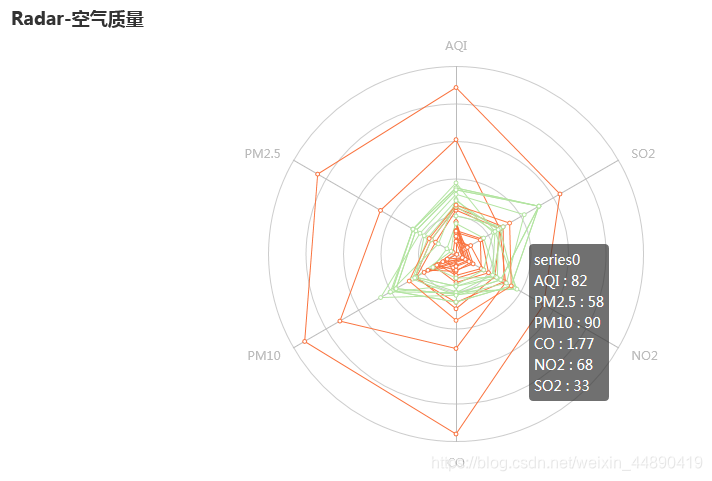
2、多例模式
from pyecharts import options as opts
from pyecharts.charts import Radar

c_schaema = [
{"name": "AQI", "max": 300, "min": 5},
{"name": "PM2.5", "max": 250, "min": 20},
{"name": "PM10", "max": 300, "min": 5},
{"name": "CO", "max": 5},
{"name": "NO2", "max": 200},
{"name": "SO2", "max": 100},]
v1 = [
[55, 9, 56, 0.46, 18, 6, 1],[25, 11, 21, 0.65, 34, 9, 2],
[56, 7, 63, 0.3, 14, 5, 3],[33, 7, 29, 0.33, 16, 6, 4],
[42, 24, 44, 0.76, 40, 16, 5],[82, 58, 90, 1.77, 68, 33, 6],
[74, 49, 77, 1.46, 48, 27, 7],[78, 55, 80, 1.29, 59, 29, 8],
[267, 216, 280, 4.8, 108, 64, 9],[185, 127, 216, 2.52, 61, 27, 10],
[39, 19, 38, 0.57, 31, 15, 11],[41, 11, 40, 0.43, 21, 7, 12]]
v2 = [
[91, 45, 125, 0.82, 34, 23, 1], [65, 27, 78, 0.86, 45, 29, 2],
[83, 60, 84, 1.09, 73, 27, 3], [109, 81, 121, 1.28, 68, 51, 4],
[106, 77, 114, 1.07, 55, 51, 5], [109, 81, 121, 1.28, 68, 51, 6],
[106, 77, 114, 1.07, 55, 51, 7], [89, 65, 78, 0.86, 51, 26, 8],
[53, 33, 47, 0.64, 50, 17, 9], [80, 55, 80, 1.01, 75, 24, 10],
[117, 81, 124, 1.03, 45, 24, 11], [99, 71, 142, 1.1, 62, 42, 12]]
radar = Radar()
radar.add_schema(
schema=c_schaema,
shape="circle"
)
radar.add("",v1,color="#f9713c")
radar.add("",v2,color="#b3e4a1")
radar.set_series_opts(label_opts=opts.LabelOpts(is_show=False))
radar.set_global_opts(title_opts=opts.TitleOpts(title="Radar-空气质量"))
radar.render("./html/radar_test.html")
基本图例–平行坐标系
from pyecharts.charts import Parallel
基本示例
from pyecharts import options as opts
from pyecharts.charts import Parallel

parallel_axis = [
{"dim": 0, "name": "Price"},
{"dim": 1, "name": "Net Weight"},
{"dim": 2,"name": "Amount"},
{"dim": 3, "name": "Score"},
{
"dim": 4,
"name": "String",
"data": ["Excellent", "Good", "OK", "Bad"],
"type": "category"
}]
data = [
[12.99, 100, 82, 90,"Good"],
[9.99, 80, 77, 69,"OK"],
[20,120,60,82,"Bad"]]
p = Parallel()
p.add_schema(schema=parallel_axis)
p.add("", data)
p.set_global_opts(
title_opts=opts.TitleOpts(title="平行坐标系基本示例", pos_left="center"))
p.set_series_opts(linestyle_opts=opts.LineStyleOpts(width=3,opacity=0.5))
p.render("./html/parallel_base.html")


相关文章推荐
- 慕课—R语言之数据可视化—学习笔记 3.6ggplot2绘图系统
- ROS学习笔记(三)- 分布式节点与laser数据可视化
- 数据可视化学习笔记之Numpy2
- Caffe学习笔记(1):简单的数据可视化
- 【web】CodeIgniter框架学习笔记 之 使用ajax连接数据库实现Echarts动态数据可视化
- 学习笔记(07):Python可以这样学(第四季:数据分析与科学计算可视化)-补充:matplotlib可视化图例样式设置...
- ROS学习笔记(三)- 分布式节点与laser数据可视化
- Pandas学习笔记(3) 数据存取与可视化
- 数据可视化学习笔记(二)
- 数据可视化学习笔记工程实践1
- FIT5147 数据探索和可视化 学习笔记
- ROS学习笔记(三)- 分布式节点与laser数据可视化
- 数据科学学习笔记5 --- 数据可视化
- 转载]利用Python进行数据分析——绘图和可视化 xticks-学习笔记
- Python学习笔记(10)数据可视化-pygal
- Matlab学习笔记(五)——数据可视化
- Python数据可视化学习笔记:第一章 关联图 第一节 使用Python绘制简单的散点图
- Python数据分析与可视化学习笔记(一)数据分析与可视化概述
- 学习笔记(02):Python数据殿堂:数据分析与数据可视化-概述,数据类型,数组基础...
- Python数据可视化学习笔记:第一章 关联图 第二节 使用Python绘制多类别散点图