CSS实现超级炫酷的流光按钮效果
2020-06-04 06:11
519 查看
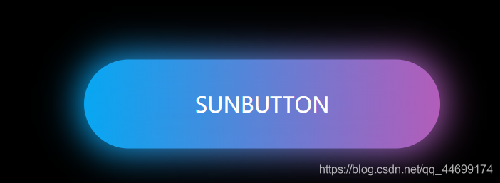
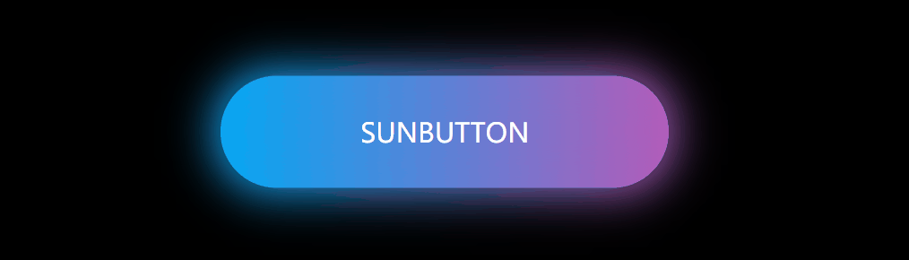
今天从小破站看了一个大神的作品,感觉好流批,自己忍不住也做了一下。
是完全用css实现流光特效,鼠标放在上面会有光波流动
这是鼠标没放在上面的颜色,放在上面的颜色太炫酷了,图片根本无法表达
哈哈哈哈来后续更新一下:刚知道了一款可以截GIF的软件,感觉太方便了,想要压缩包的评论哦
下面上菜:
[code]<!DOCTYPE html>
<html lang="en">
<head>
<meta charset="UTF-8">
<meta name="viewport" content="width=device-width, initial-scale=1.0">
<title>Document</title>
<link rel="stylesheet" href="css/index.css">
</head>
<body>
<a href="#">sunbutton</a>
</body>
</html>
css代码:
下面有详解
[code]*{
margin: 0;
padding: 0;

}
body{
background-color: #000;
}
a{  /*去掉下划线*/
text-decoration: none;
position: absolute;
left: 50%;
top: 50%;
transform: translate(-50%,-50%);
/* 设置字体大小 */
font-size: 24px;
background: linear-gradient(90deg,#03a9f4,#f441a5,#ffeb3b,#03a9f4);
background-size: 400%;
width: 400px;
height: 100px;
line-height: 100px;
text-align: center;
color: #fff;
/* 字母变大写 */
text-transform: uppercase;
/* 设置成胶囊状 */
border-radius: 50px;
z-index: 1;
}
/* 设置发光 */
a::before{
content: "";
position: absolute;
left: -5px;
right: -5px;
top: -5px;
bottom: -5px;
background: linear-gradient(90deg,#03a9f4,#f441a5,#ffeb3b,#03a9f4);
background-size: 400%;
border-radius: 50px;
filter: blur(20px);
z-index: -1;
}
a:hover::before{
animation: sun 8s infinite;
}
a:hover{
animation: sun 8s infinite;
}
/* 设置流光 */
@keyframes sun{
100%{
background-position: -400% 0;
}
}
css详解:
[code]*{     /*清除样式*/
margin: 0;
padding: 0;

}
body{
/* 设置整体背景颜色 */
background-color: #000;
}
a{  /*去掉下划线*/
text-decoration: none;
/* 绝对定位,东西放在那就不动了 */
position: absolute;
/* 下面三个实现彻底居中,left和top是以左上角为原点,所以不是中心,用translate实现自身移动50% */
left: 50%;
top: 50%;
transform: translate(-50%,-50%);
/* 设置字体大小 */
font-size: 24px;
/* 实现渐变色,90deg表示一个角度开始 */
background: linear-gradient(90deg,#03a9f4,#f441a5,#ffeb3b,#03a9f4);
/* 背景色放大 */
background-size: 400%;
/* 图形大小 */
width: 400px;
height: 100px;
/* 行高 */
line-height: 100px;
/* 文本居中 */
text-align: center;
/* 字体颜色 */
color: #fff;
/* 字母变大写 */
text-transform: uppercase;
/* 设置成胶囊状 */
border-radius: 50px;
/* 值为正数在上面显示,反之 */
z-index: 1;
}
/* 设置发光 */

a::before{
content: "";
position: absolute;
/* 设置发光范围 */
left: -5px;
right: -5px;
top: -5px;
bottom: -5px;
/* 设置发光颜色 */
background: linear-gradient(90deg,#03a9f4,#f441a5,#ffeb3b,#03a9f4);
background-size: 400%;
border-radius: 50px;
/* filter实现高斯模糊 */
filter: blur(20px);
z-index: -1;
}

a:hover::before{
animation: sun 8s infinite;
}
/* 鼠标经过产生的效果 */
a:hover{
/* 产生8秒的效果,sun是名称*/
animation: sun 8s infinite;
}
/* 设置流光 */
@keyframes sun{
100%{
/* 以x轴为基准向左移动4个自身大小 */
background-position: -400% 0;
}
}

相关文章推荐
- 使用html+css实现流光效果按钮
- Android高级控件(四)——VideoView 实现引导页播放视频欢迎效果,超级简单却十分的炫酷
- 使用CSS实现按钮点击波纹效果
- 【转】纯CSS实现3D效果的按钮
- Html+css、javascript和JQuery三种方法实现导航条下拉菜单的炫酷效果
- 用CSS实现的一张图完成的按钮效果
- 用CSS实现圆角按钮的效果
- css实现按钮点击效果(超简单)
- 用CSS实现的一张图完成的按钮效果
- VideoView 实现引导页播放视频欢迎效果,超级简单却十分的炫酷
- css实现按钮点击效果(超简单)
- css实现鼠标悬浮字体流光背景模糊效果
- Android高级控件(四)——VideoView 实现引导页播放视频欢迎效果,超级简单却十分的炫酷
- 使用CSS实现按钮点击波纹效果
- Jquery左右滑动插件之实现超级炫酷动画效果附源码下载
- 纯CSS实现3D按钮效果
- 用CSS实现的一张图完成的按钮效果
- 巧妙的实现 CSS 斜线(炫酷的小效果)
- 用CSS实现的一张图完成的按钮效果
- 使用CSS实现按钮点击波纹效果