Python数据可视化之matplotlib实践(1.入门②)
1.3.8函数annotate()
函数功能:添加图形内容细节的指向型注释文本
函数样例:
plt. plt.annotate(string, xy = (np.pi/2, 1.0),
xytext = ( np.pi/2+1, 0.8 ), weight = ‘bold’, color = ‘y’, arrowprops = dict( arrowstyle = ‘->’, connectionstyle = ‘arc3’, color = ‘b’ ))
参数说明:
string:图形内容注释文本
xy:被注释图形内容的位置坐标
xytext:注释文本的字体颜色
weight:注释文本的字体粗细风格
color:注释文本的颜色
arrowprops:指示箭头的属性字典
代码样例:
#-*-coding: UTF-8 -*-
import matplotlib.pyplot as plt
import numpy as np
x = np.linspace(0.05, 10, 1000)
y = np.sin(x)
plt.plot(x,y,ls = '-.', lw = 2, c = 'c', label = 'plot figure')
plt.legend()
plt.annotate('maximum',
xy = (np.pi/2, 1.0),
xytext = ( np.pi/2+1, 0.8 ),
weight = 'bold',
color = 'y',
arrowprops = dict( arrowstyle = '->', connectionstyle = 'arc3', color = 'b' )
#arrowprops = {'arrowstyle': '->', 'connectionstyle': 'arc3', 'color': 'b' }
)
运行结果:

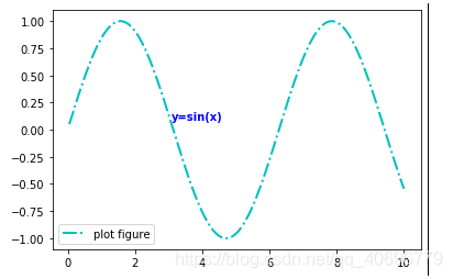
1.3.9函数text()
函数功能:添加图形内容细节的无指向型注释文本
函数样例:plt.text(x, y, string, weight=’bold’, color=’b’)
参数说明:
x:注释文本内容所在位置横坐标
y:注释文本内容所在位置纵坐标
string:注释文本内容
weight:注释文本内容的粗细风格
color:注释文本内容的颜色字体
代码样例:
#-*-coding: UTF-8 -*-
import matplotlib.pyplot as plt
import numpy as np
x = np.linspace(0.05, 10, 1000)
y = np.sin(x)
plt.plot(x, y, ls='-.', lw =2, c='c', label='plot figure')
plt.legend()
plt.text(3.1, 0.09, 'y=sin(x)', color = 'b', weight = 'bold')
#plt.text(x,y,string,weight,color)
#无指向型注释文本
plt.show()
运行结果:
1.3.10函数title()
函数功能:添加图形标题
函数样例:plt.title(string)
参数说明:
string:图形内容的标题文本
代码样例:
#-*-coding: UTF-8 -*-
import matplotlib.pyplot as plt
import numpy as np
x = np.linspace(0.05, 10, 1000)
y = np.sin(x)
plt.plot(x, y, ls='-.', lw =2, c='c', label='plot figure')
plt.legend()
plt.title('y=sin(x)')
#添加标题
plt.show()
运行结果:

1.3.11函数legend()
函数功能:标示不同图形的文本标签图例
函数样例:plt.legend(loc=’lower left’)
参数说明:
loc:图例在图中的地理位置
代码样例:
#-*-coding: UTF-8 -*-
import matplotlib.pyplot as plt
import numpy as np
x = np.linspace(0.05, 10, 1000)
y = np.sin(x)
plt.plot(x, y, ls='-.', lw =2, c='c', label='plot figure')
plt.legend(loc='lower right')
#loc:legend窗口的位置
#loc='upper left'
#loc='center'
plt.show()
运行结果:

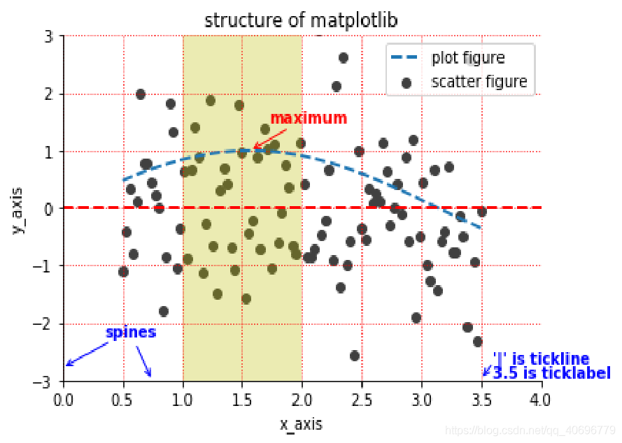
1.4 函数组合应用
将1.3所绘制的重要组成元素的函数放在一起做出一次简单的可视化操作
案例代码:
# -*- coding: utf-8 -*-
"""
Created on Sun Mar  1 08:19:56 2020

@author: 16502
"""

#-*-coding: UTF-8 -*-
import matplotlib.pyplot as plt
import numpy as np
#difine data
x = np.linspace(0.5, 3.5, 100)
y = np.sin(x)
y1 = np.random.randn(100)
plt.scatter(x,y1,c='0.25',label='scatterfigure')
plt.plot(x,y,ls='--',lw=2,label='plot figure')
for spine in plt.gca().spines.keys():
print(spine)
if spine == 'top' or spine == 'right':
plt.gca().spines[spine].set_color('none')
plt.gca().xaxis.set_ticks_position('bottom') #设置刻度标签
plt.gca().xaxis.set_ticks_position('left')
plt.xlim(0,4)
plt.ylim(-3,3)
plt.ylabel('y_axis')
plt.xlabel('x_axis')
plt.grid(True, ls=':', color='r')
plt.axhline(y=0, c='r', ls='--', lw=2)
plt.axvspan(xmin=1, xmax=2, facecolor='y', alpha=.3)
plt.annotate('maximum',
xy = (np.pi/2, 1.0),
xytext = ( np.pi/2+0.15, 1.5 ),
weight = 'bold',
color = 'r',
arrowprops = dict( arrowstyle = '->', connectionstyle = 'arc3', color = 'r' )
)
plt.annotate("",
xy = (3.5, -2.98),
xytext = ( 3.6, -2.7 ),
#weight = 'bold',
#color = 'r',
arrowprops = dict( arrowstyle = '->', connectionstyle = 'arc3', color = 'b' )
)
plt.annotate("spines",
xy = (0.75, -3),
xytext = ( 0.35, -2.25 ),
weight = 'bold',
color = 'b',
arrowprops = dict( arrowstyle = '->', connectionstyle = 'arc3', color = 'b' )
)
plt.annotate("",
xy = (0, -2.78),
xytext = ( 0.4, -2.32 ),
#weight = 'bold',
#color = 'b',
arrowprops = dict( arrowstyle = '->', connectionstyle = 'arc3', color = 'b' )
)
plt.text(3.6, -2.7, "'|' is tickline", weight='bold', color='b')
plt.text(3.6, -2.95, '3.5 is ticklabel', weight='bold', color='b')
plt.title('structure of matplotlib')
plt.legend()
plt.show()
运行结果:
- 点赞
- 收藏
- 分享
- 文章举报
 zhuzuhezil
发布了4 篇原创文章 · 获赞 1 · 访问量 154
私信
关注
zhuzuhezil
发布了4 篇原创文章 · 获赞 1 · 访问量 154
私信
关注

- 基于Python数据可视化利器Matplotlib,绘图入门篇,Pyplot详解
- matplotlib--python的数据可视化入门
- Python教程Matplotlib数据可视化入门篇
- matplotlib数据可视化入门-python
- Python数据可视化利器Matplotlib,绘图入门篇,Pyplot介绍
- python数据可视化[3] matplotlib(箱线图)
- python 数据可视化 matplotlib学习二 : 对折线图使用颜色映射
- python—matplotlib数据可视化实例注解系列-----之plot图线型设置
- Python使用matplotlib实现数据可视化教程
- python的数据可视化库 matplotlib 和 pyecharts
- Python数据分析与应用 第三章 Matplotlib数据可视化基础 (直方图,饼图,箱线图) 下
- [python之数据分析] 基础篇1- Numpy,Scipy,Matplotlib 快速入门攻略
- 数据可视化-Python之Matplotlib
- Python数据可视化之Matplotlib实现各种图表
- Python数据可视化:Matplotlib 直方图、箱线图、条形图、热图、折线图、散点图。。。
- python数据可视化分析库matplotlib
- python的数据可视化库 matplotlib 和 pyecharts
- Matplotlib入门:Python的可视化绘制工具包
- 2.Python数据分析与应用——Matplotlib数据可视化基础
- python数据挖掘课程 十一.Pandas、Matplotlib结合SQL语句可视化分析