Android 圆角button
2019-08-05 16:54
107 查看
版权声明:本文为博主原创文章,遵循 CC 4.0 BY-SA 版权协议,转载请附上原文出处链接和本声明。
本文链接:https://blog.csdn.net/u014714188/article/details/98498414
Android 圆角button
在android开发中,我们会用到许多有特色的按钮,对话框,弹出框等。很多时候这些类似的特色显示都是通过XML来实现。
圆角button的XML实现
在drawable下新建button_circle_shape:
<?xml version="1.0" encoding="UTF-8"?>
<shape
xmlns:android="http://schemas.android.com/apk/res/android"
android:shape="rectangle">
<!--圆角button-->
<!-- 填充的颜色 -->
<solid android:color="#0099CC" />
<!-- android:radius 弧形的半径 -->
<!-- 设置按钮的四个角为弧形 -->
<corners
android:radius="5dip" />
<!--也可单独设置-->
<!-- <corners -->
<!-- android:topLeftRadius="10dp"-->
<!-- android:topRightRadius="10dp"-->
<!-- android:bottomRightRadius="10dp"-->
<!--  android:bottomLeftRadius="10dp"-->
<!--   />  -->
**设置文字padding**
<!-- padding:Button里面的文字与Button边界的间隔 -->
<padding
android:left="10dp"
android:top="10dp"
android:right="10dp"
android:bottom="10dp"
/>
</shape>
圆角button的调用
直接引用为button的背景即可。
<Button
android:layout_below="@+id/memoName"
android:id="@+id/submit_name"
android:layout_width="match_parent"
android:layout_height="45dp"
android:layout_marginLeft="10dp"
android:layout_marginTop="20dp"
android:gravity="center_vertical|center"
android:background="@drawable/button_circle_shape"
android:textColor="@color/white"
android:text="@string/submit_group_name"
android:onClick="ChangeMemoName"/>
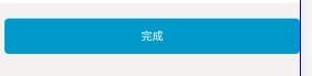
最后我们来看看效果:

相关文章推荐
- Android Button 实现 描边、颜色渐变、圆角等
- Android笔记(4)TextView/Button/ImageView的圆角矩形/圆形控件
- Android 自己定义ImageView实现圆角/圆形 附加OnTouchListener具体凝视以及Button圆角
- Android 自定义ImageView实现圆角/圆形 附加OnTouchListener详细注释以及Button圆角
- android代码的形式让button变成圆角 透明,如图
- Android之实现TextView控件圆角以及Button点击、焦点效果
- Android 给Button加圆角
- Android Demo---如何敲出圆角的Button+圆角头像
- Android Button 带点击效果的圆角
- Android 自定义ImageView实现圆角/圆形 附加OnTouchListener详细注释以及Button圆角
- Android怎样设置圆角button
- android中如何给button加圆角
- Android-自定义反色圆角Button
- Android开发--圆角 Button 按钮 xml 实现
- Android Button 边框、圆角、点击效果
- 【Android】圆角边框Button的实现
- Android学习——Button填充颜色及实现圆角
- Android button按钮带圆角点击效果的样式
- android客户端学习-button按钮边框及圆角