数据分析 NO.15 数据可视化
2019-06-05 16:30
344 查看
第二十一天~第二十三天:数据可视化
先创建一个画布,然后往画布填充元素,然后展现出来
import numpy as np
import matplotlib.pyplot as plt
%matplotlib inline

X = np.linspace(0, 2*np.pi,100)# 均匀的划分数据 ,  0到2pi  100份均分
Y = np.sin(X)
Y1 = np.cos(X)

plt.title("Hello World!!")
plt.plot(X,Y)
plt.plot(X,Y1)
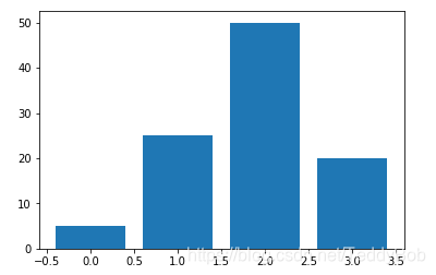
- BAR CHART 柱状图
统计某个特征的频率或者数值
data = [5,25,50,20]
plt.bar(range(len(data)),data)    #逗号前面是X,后面是Y
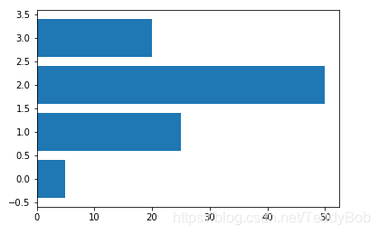
data = [5,25,50,20]
plt.barh(range(len(data)),data)
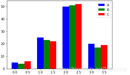
3.多个Bar
data = [[5,25,50,20],
[4,23,51,17],
[6,22,52,19]]
X = np.arange(4)

plt.bar(X + 0.00, data[0], color = 'b', width = 0.25,label = "A")
plt.bar(X + 0.25, data[1], color = 'g', width = 0.25,label = "B")
plt.bar(X + 0.50, data[2], color = 'r', width = 0.25,label = "C")    #横轴的移动

plt.legend()   #加了label就要用.legend()
np.arange:

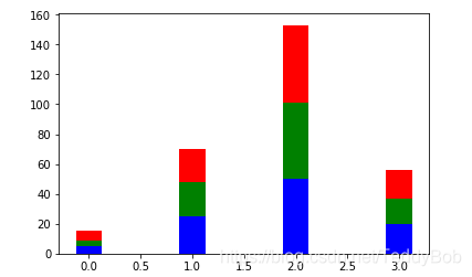
data = [[5,25,50,20],
[4,23,51,17],
[6,22,52,19]]
X = np.arange(4)

plt.bar(X, data[0], color = 'b', width = 0.25)
plt.bar(X, data[1], color = 'g', width = 0.25,bottom = data[0])
plt.bar(X, data[2], color = 'r', width = 0.25,bottom = np.array(data[0]) + np.array(data[1]))    #纵轴的移动。

plt.show()
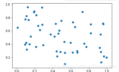
3.散点图
散点图用来衡量两个连续变量之间的相关性
N = 50
x = np.random.rand(N)
y = np.random.rand(N)

plt.scatter(x, y)
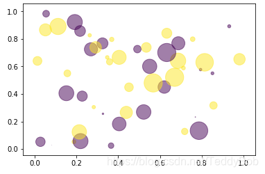
N = 50
x = np.random.rand(N)
y = np.random.rand(N)
colors = np.random.randn(N)
area = np.pi * (15 * np.random.rand(N))**2  #  调整大小

plt.scatter(x, y, c=colors, alpha=0.5, s = area)   #alpha  透明度

N = 50
x = np.random.rand(N)
y = np.random.rand(N)
colors = np.random.randint(0,2,size =50)
plt.scatter(x, y, c=colors, alpha=0.5,s = area)
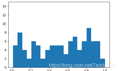
4.直方图
直方图是用来衡量连续变量的概率分布的。在构建直方图之前,我们需要先定义好bin(值的范围),也就是说我们需要先把连续值划分成不同等份,然后计算每一份里面数据的数量。
(例子:比如把年龄分好)
a = np.random.rand(100)
plt.hist(a,bins= 20)   #bins 是把下面切成多少块
plt.ylim(0,15)
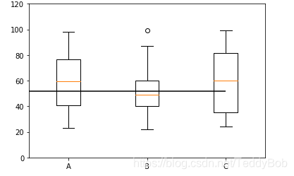
5.BOXPLOTS 线箱图
boxlot用于表达连续特征的百分位数分布。统计学上经常被用于检测单变量的异常值,或者用于检查离散特征和连续特征的关系
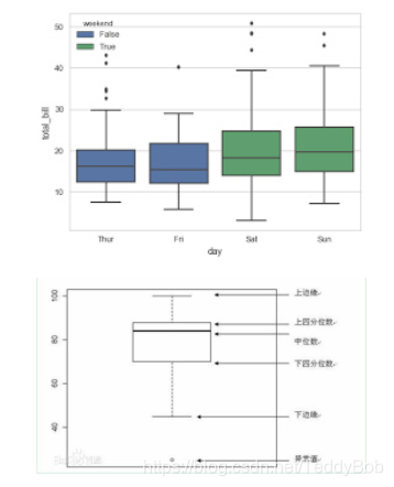
上四分位数:是%75分位数 下四分位数:是%25分位数
x = np.random.randint(20,100,size = (30,3))

plt.boxplot(x)
plt.ylim(0,120)
plt.xticks([1,2,3],['A','B','C'])  #xticks   在X轴上的什么位置填入一个label

plt.hlines(y = np.mean(x,axis = 0)[1] ,xmin =0,xmax=3)
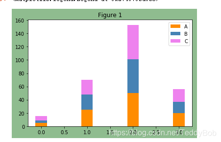
6.颜色的调整和文字的增加
颜色代码:颜色代码
fig, ax = plt.subplots(facecolor='darkseagreen')
data = [[5,25,50,20],
[4,23,51,17],
[6,22,52,19]]
X = np.arange(4)

plt.bar(X, data[0], color = 'darkorange', width = 0.25,label = 'A')
plt.bar(X, data[1], color = 'steelblue', width = 0.25,bottom = data[0],label = 'B')
plt.bar(X, data[2], color = 'violet', width = 0.25,bottom = np.array(data[0]) + np.array(data[1]),label = 'C')
ax.set_title("Figure 1")
plt.legend()
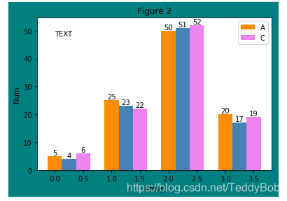
增加文字:
plt.text(0
W = [0.00,0.25,0.50]
for i in range(3):
for a,b in zip(X+W[i],data[i]):
plt.text(a,b,"%.0f"% b,ha="center",va= "bottom")  #a是X轴,b是Y轴。  "%.0f"% b显示文字格式
plt.xlabel("Group")
plt.ylabel("Num")
plt.text(0.0,48,"TEXT")
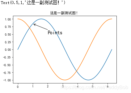
在数据可视化的过程中,图片中的文字经常被用来注释图中的一些特征。使用annotate()方法可以很方便地添加此类注释。在使用annotate时,要考虑两个点的坐标:被注释的地方xy(x, y)和插入文本的地方xytext(x, y)
X = np.linspace(0, 2*np.pi,100)# 均匀的划分数据
Y = np.sin(X)
Y1 = np.cos(X)

plt.plot(X,Y)
plt.plot(X,Y1)
plt.annotate('Points',
xy=(1, np.sin(1)),
xytext=(2, 0.5), fontsize=16,
arrowprops=dict(arrowstyle="->"))
plt.title("这是一副测试图!")

7.Subplots 在一块画布上画出多个图形
%pylab.inline
pylab.rcParams['figure.figsize'] = (10, 6) # 调整图片大小
fig, axes = plt.subplots(nrows=2, ncols=2,facecolor='darkslategray')   #把画布分成2行,2列
ax0, ax1, ax2, ax3 = axes.flatten()  #展开     这两行代码相当于底图       也可以通过索引进行选择

colors = ['red', 'tan', 'lime']
ax0.hist(x, n_bins, normed=1, histtype='bar', color=colors, label=colors)
ax0.legend(prop={'size': 10})
ax0.set_title('bars with legend')

ax1.hist(x, n_bins, normed=1, histtype='bar', stacked=True)
ax1.set_title('stacked bar')

ax2.hist(x, n_bins, histtype='step', stacked=True, fill=False)
ax2.set_title('stack step (unfilled)')

Make a multiple-histogram of data-sets with different length.
x_multi = [np.random.randn(n) for n in [10000, 5000, 2000]]
ax3.hist(x_multi, n_bins, histtype='bar')
ax3.set_title('different sample sizes')

fig.tight_layout()       # Adjust subplot parameters to give specified padding.  调整好看的大小
plt.show()
8.共享X 轴,Y轴
# ShareX or ShareY
N_points = 100000
n_bins = 20

# Generate a normal distribution, center at x=0 and y=5
x = np.random.randn(N_points)
y = .4 * x + np.random.randn(100000) + 5

fig, axs = plt.subplots(1, 2, sharey=True, tight_layout=True)   #sharey 共享Y轴, tight_layout更紧凑,为了更好看。

# We can set the number of bins with the `bins` kwarg
axs[0].hist(x, bins=n_bins)
axs[1].hist(y, bins=n_bins)
- Pandas API
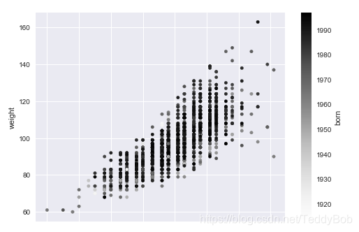
df.plot.scatter(x = "height",y = "weight",c = "born")
或
df.plot(kind="scatter",x="180",y="77",c="1918")
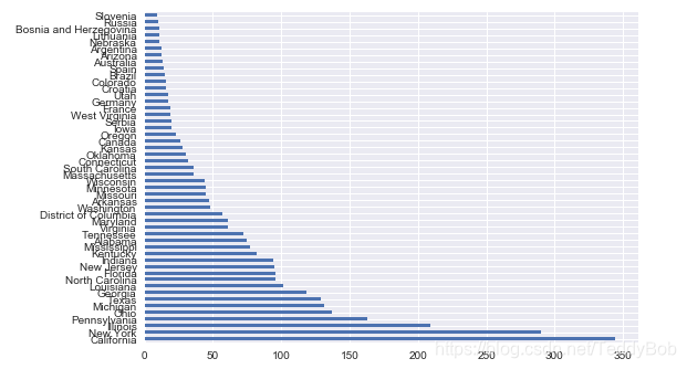
df['birth_state'].value_counts()[:50].plot.barh()
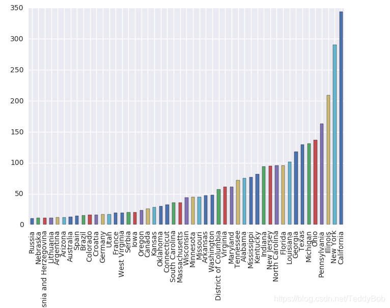
grouped = df.groupby("birth_state")
gs = grouped.size()
gs[gs >=10].sort_values().plot.bar()
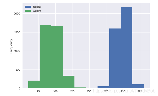
df[['height','weight']].plot.hist()
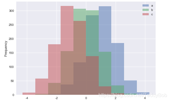
df4 = pd.DataFrame({'a': np.random.randn(1000) + 1, 'b': np.random.randn(1000),
'c': np.random.randn(1000) - 1}, columns=['a', 'b', 'c'])
df4.plot.hist(alpha=0.5)
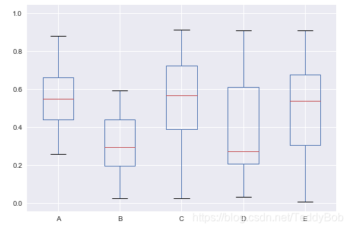
df = pd.DataFrame(np.random.rand(10, 5), columns=['A', 'B', 'C', 'D', 'E'])
df.plot(kind = "box")
10. seaborn
displot() 做单个连续变量的数据分布
import seaborn as sns
sns.set()   #全局设置
tips = sns.load_dataset("tips")
iris = sns.load_dataset("iris") #导入数据
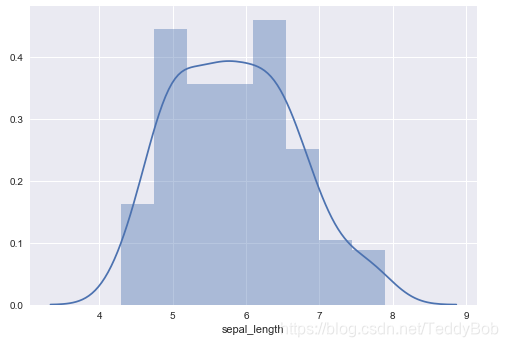
sns.distplot(iris.sepal_length) #单变量的直方图
notebook 中
!+ 空格 #表示这行代码是在终端中进行的!
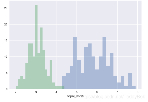
# 多个变量在一幅图中比较
sns.distplot(iris.sepal_length,bins = 20,kde = False)
sns.distplot(iris.sepal_width,bins = 20,kde = False)
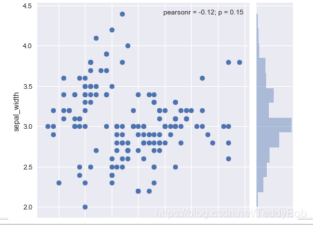
.jointplot() 返回两个变量之间的关系的
# 返回的结果是散点图,以及两个变量的直方图
sns.jointplot(x = "sepal_length",y = "sepal_width",data=iris)  #返回3个,一个是他们的关系,然后是两个数据的分别直方图
或

sns.jointplot(x=tips["total_bill"],y=tips["tip"])
.pairplot() 传入一个数据,会把数据的所有特征以两两的之间的关系都做出来
sns.pairplot(iris)
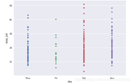
离散分类的变量
sns.stripplot(x="day", y="total_bill", data=tips);
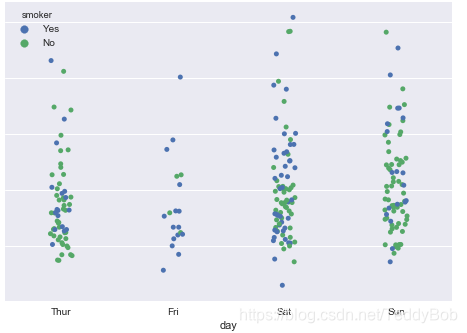
sns.stripplot(x="day", y="total_bill", data=tips, jitter=True,hue = "smoker"); #jitter=True 上密集的线部分打散 #hue="" 对后面的分组
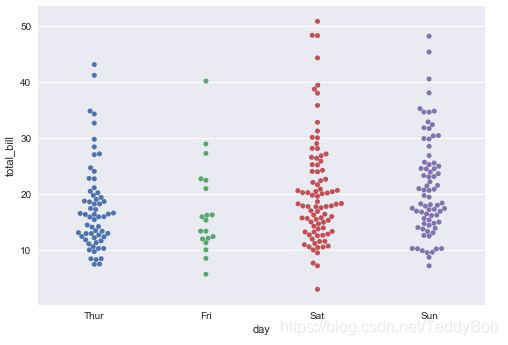
# POINT不会重叠
sns.swarmplot(x="day", y="total_bill", data=tips);  #点 完全不重叠
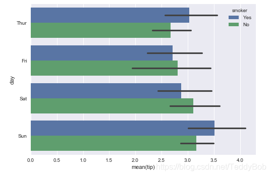
sns.barplot(x="tip", y="day",hue = "smoker", data=tips,estimator=np.median) #横轴默认的是平均数,可以用estimator进行修改。
linear relationships
展示两个连续性变量的关系
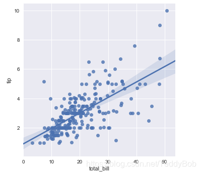
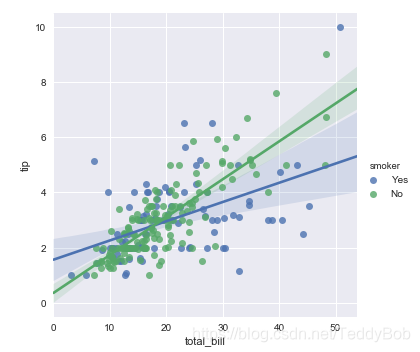
sns.lmplot(x="total_bill", y="tip", data=tips) #输入两个连续性变量
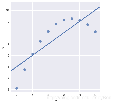
sns.lmplot(x="x", y="y", data=anscombe.query("dataset == 'I'"),scatter_kws={"s": 80})
#data=anscombe.query("dataset == 'I'") 选择数据中“i”, scatter_kws= 设置点的大小
sns.lmplot(x="x", y="y", data=anscombe.query("dataset == 'II'"),
ci=None, scatter_kws={"s": 80});     # ci=None  不展示置信区间
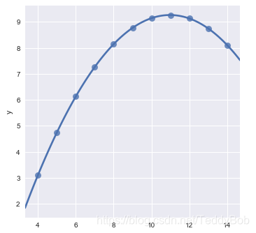
sns.lmplot(x="x", y="y", data=anscombe.query("dataset == 'II'"),
order=2, ci=None, scatter_kws={"s": 80});     #order =2 表示最高到2次项   y=wx+b+w1X**2   作用是进行拟合
sns.lmplot(x="x", y="y", data=anscombe.query("dataset == 'III'"),
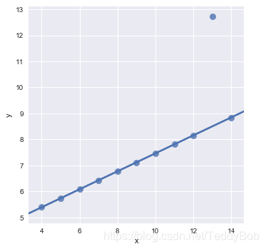
robust=True, ci=None, scatter_kws={"s": 80}); #robust=True 不拟合异常点!!
sns.lmplot(x="total_bill", y="tip", hue="smoker", data=tips)

相关文章推荐
- 白话空间统计十二:R语言对点数据分析的实现(2)可视化
- 2017 年 机器学习之数据挖据、数据分析,可视化,ML,DL,NLP等知识记录和总结
- 22个免费的数据可视化和分析工具推荐
- 基于30多万条招聘信息的热门城市、地域 、薪资、人才要求的R语言数据可视化分析
- [置顶] 【R语言 数据处理和可视化】一个手游公司销售额数据分析
- 动态可视化 数据可视化之魅D3,Processing,pandas数据分析,科学计算包Numpy,可视化包Matplotlib,Matlab语言可视化的工作,Matlab没有指针和引用是个大问题
- 数据分析和数据可视化(第一讲)
- Spark SQL 笔记(15)——实战网站日志分析(5)数据可视化
- 利用python进行数据分析之绘图和可视化
- Python数据可视化:2018年电影分析
- 数据可视化与数据分析之间不可替代性
- Python数据分析(可视化)
- 天池体验(二)——新人离线赛数据可视化分析
- 如何用FineReport报表进行数据可视化分析?
- python数据分析之数据可视化matplotlib
- python数据分析之:绘图和可视化
- 【Matplotlib】数据可视化实例分析
- 利用python进行数据分析之绘图和可视化
- 基于pandas python的美团某商家的评论销售数据分析(可视化)
- 智慧机场大数据可视化分析系统建设解决方案